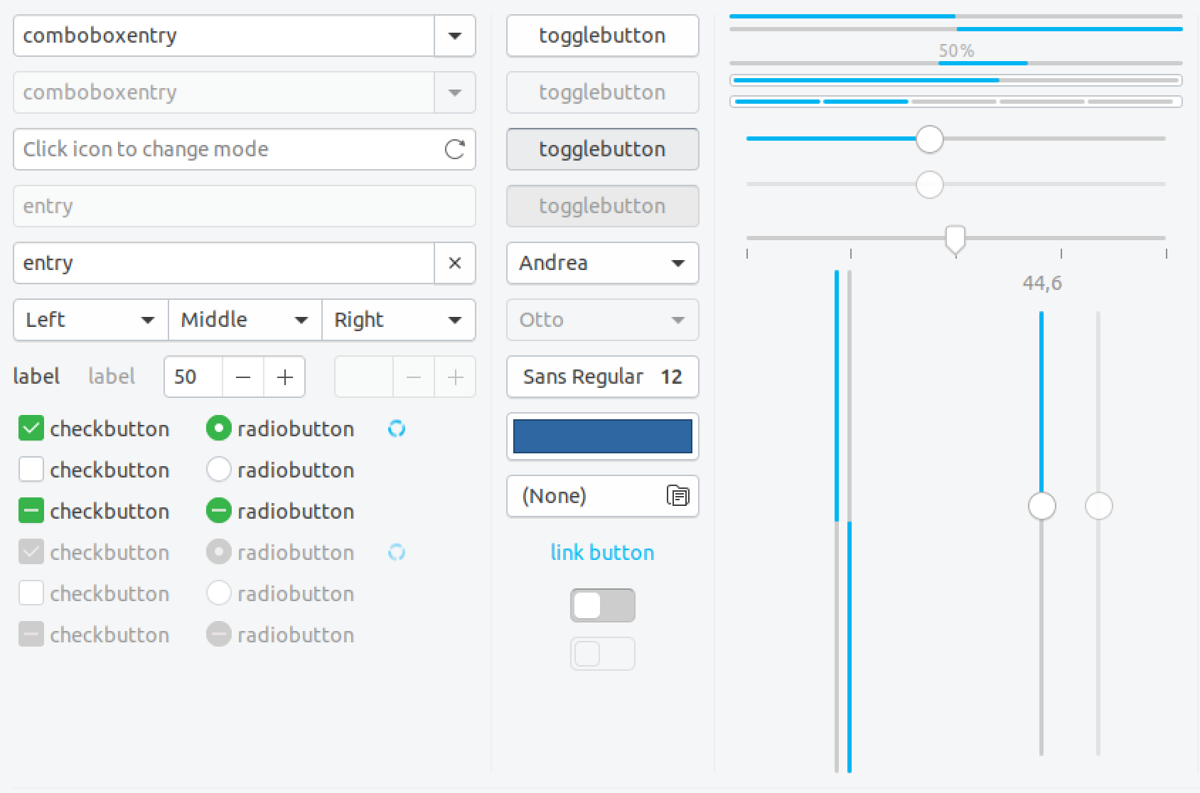
Yaru: Switches stick out visually in both regular and dark theme variant (background)
I think the background of switches really makes them stick out in both theme variants as either to dark or bright compared to other elements. My proposed solution would be to try to use the background of toggled buttons which should work for both light and dark.
Current state:
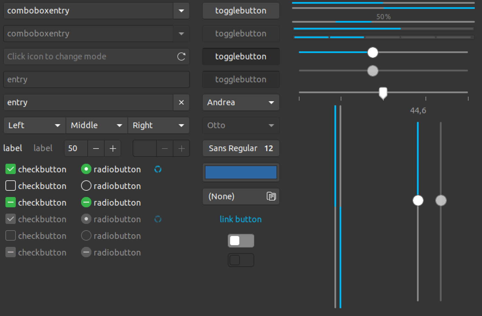
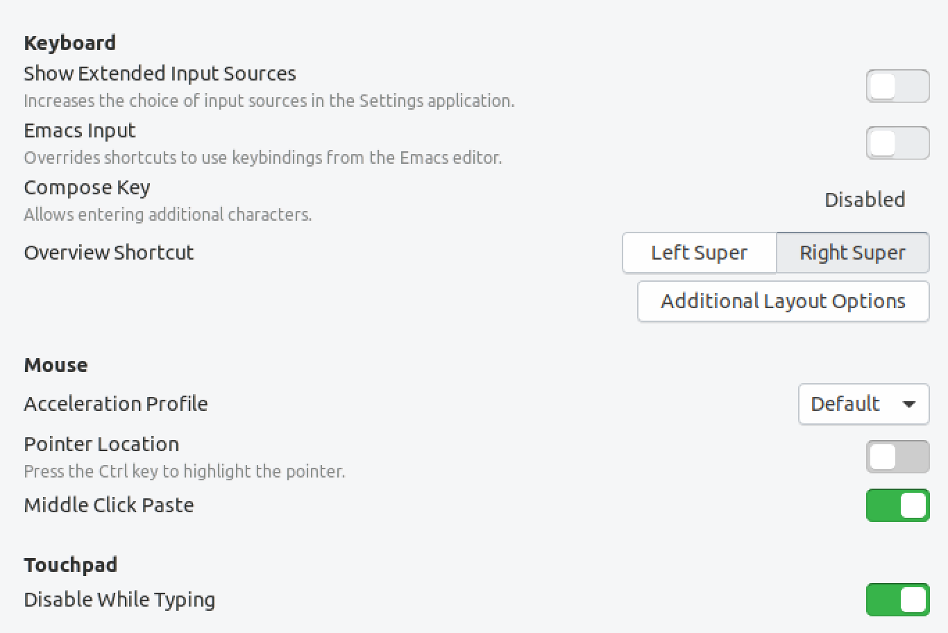
Rough Mockup (Tweaks >> Keyboard & Mouse – see Pointer location for current):
(I remember this was discussed before but probably even with the old button style. I didn't have much time to follow your discussions for weeks though and hope to not have missed anything…)
 ya-d
ya-d
All 5 comments
I don't know. The insensitive border part is discussed in the other issue and I think that's valid.
I must say that I would prefer the current gray for switched-off switches : /
I don't think that a transparent background is a good idea. I fear that they get lost and look somehow unuseable.
I am -1 for this and would like to keep them as they are
 Feichtmeier
on 28 Aug 2018
Feichtmeier
on 28 Aug 2018
I don't think that a transparent background is a good idea. I fear that they get lost and look somehow unuseable.
My proposal was to use the (background) color of toggled buttons which is a bit darker than (window) bg color. 😉
ya-d
on 28 Aug 2018
+1 for keeping the current
 Paz-it
on 28 Aug 2018
Paz-it
on 28 Aug 2018
IMO the two first switches looks unclickable (insensitive) rather than just disabled.
The current color may "stick out" but it makes it obvious that this element is clickable.
 madsrh
on 1 Sep 2018
madsrh
on 1 Sep 2018
There will be some tweaking in switches do to #746, so I am closing this
 clobrano
on 1 Sep 2018
clobrano
on 1 Sep 2018
Related issues
Feichtmeier
·
3Comments
Feichtmeier
·
3Comments
Feichtmeier
·
3Comments
madsrh
·
3Comments
 snydox
·
3Comments
snydox
·
3Comments
Most helpful comment
I don't know. The insensitive border part is discussed in the other issue and I think that's valid.
I must say that I would prefer the current gray for switched-off switches : /
I don't think that a transparent background is a good idea. I fear that they get lost and look somehow unuseable.
I am -1 for this and would like to keep them as they are