This should be the discussion of the implementation of almost black colored ($jet) Gtk menus for the dark and/or light theme which can be seen here:
https://community.ubuntu.com/t/mockups-new-design-discussions/1898/305 and
https://community.ubuntu.com/t/mockups-new-design-discussions/1898/311
before I make any new branch.
Why do I open this here on github?
I had that weird branch that needs to be re-created after the recent code clean-ups by @clobrano
But before I start this work, I want to be sure that most (there is always someone with a different view) of you like this.
I had the impression from the responses on the hub that many people like it.
However, I know from some off-topic talk on the pull request I made to test the branch on my host, that there can be people who dislike this design.
Reasons for the dark menus which I either remember reading from other people than me or which are from my brain:
1) Be consistent with the $jet menus of the shell theme (shell popups, shell OSD popups, shell context menus)
2) Have a good contrast on any of the backgrounds (it's $jet with an additional box-shadow)
3) Reduce the number of menu colors in the whole desktop from three (shell, light gtk, dark gtk) to one and thus be consistent again (it's basically the same reason as 1) but a bit more detailed
Variations I could imagine
1) jet menus+popovers for light gtk theme and dark gtk theme
2) jet menus+popovers only for the dark gtk theme
4) Color only the dark theme menus in jet
Just to get some thumbs up/down, please comment why you would appreciate such design or why you would not like this design
@didrocks @3v1n0 @clobrano @madsrh @godlyranchdressing @ubuntujaggers @luxamman
@paz-it @taciturasa @eaglersdeveloper or anyone else who can be polite, rational and un-emotional.
_(Would be great if you could exclude any "we are on reddit", "I speak for more people than myself", "the community" or any other unprofessional comments from this discussion and just try to be rational and un-emotional.)_
Thanks in advance
 Feichtmeier
All 47 comments
I am mostly in favor of this change, the only drawback I can think of is that notification popups might look out of place, being the only white popup left
 clobrano
on 22 Nov 2018
clobrano
on 22 Nov 2018
Shell dialogues are also white and light gtk theme app notifications :)
Feichtmeier
on 22 Nov 2018
Well, dialogs are not popus :)
clobrano
on 22 Nov 2018
Yes, but the reason to have white dialogues is that they look more friendly + they have the dark overlay from the upstream design and that they are similiar to notifications (that have buttons)
Light notifications were nessecary to have a better contrast on the dark header bar. But we could try to make both look transparent jet, too and see how it looks now. Many things changed over the months
Feichtmeier
on 22 Nov 2018
Dont' get me wrong, I believe that white notifications are an improvement. I only wanted to pointed out a possible incongruence
clobrano
on 22 Nov 2018
Not to derail the conversation, but I'm +1 for keeping the light notifications for the reasons @Feichtmeier just mentioned. Considering the orange vs blue mix we've got going, I hardly see dark menus and light notifications as a problem ;)
 madsrh
on 22 Nov 2018
madsrh
on 22 Nov 2018
You are right. We also have that notification emoji problem so it's maybe worth a try?
As I said we could try different variations.
I could make a foundation branch with the code for dark menus available for @ extend and then make different sub branches which use the different combinations.
From full dark, to only dark context menus or something like that
Edit: @clobrano which would be the best place to put the dark menu code in your opinion?
I could either
a) add a $menu: false argument to the drawing functions, add menu colours to _colors.scss and then put the %dark_popover and %dark_menu into _apps.scss
b) Put the full code into a big %dark_popup and %dark_menu block into the end of _commons.scss
c) a mix of a) and b)
Feichtmeier
on 22 Nov 2018
I need to have a look at the code again, to build my idea
clobrano
on 22 Nov 2018
Okay I send you the ziped old branch :D
Feichtmeier
on 22 Nov 2018
I've made it clear before why I completely dislike this entire idea, so I'll abstain from this conversation.
 polyjitter
on 22 Nov 2018
polyjitter
on 22 Nov 2018
Like most of you already know, I do like the idea very much. @Feichtmeier mentioned all the good reasons and I can't do it better then him :smile:
Only one question and clarification I have/need:
When talking about $jet you mean #353535?
I would have liked it to be #2B2929(headerbar_color) and falling back to #353535 But it can be only me.. !?
 Paz-it
on 23 Nov 2018
Paz-it
on 23 Nov 2018
@Paz-it it is actually lighter than $jet
you can see the correct color by opening one of the shell popups :) Thats the color
Feichtmeier
on 23 Nov 2018
OK, Thanks @Feichtmeier .
Another question popped up: menu-bar in the light theme also will change to dark?
Paz-it
on 23 Nov 2018
Yes just want to get a picture. It's a bunch of work and I want to be sure that it's wanted
Feichtmeier
on 24 Nov 2018
I will say that if you do continue on with this, you should consider first how it will impact applications using custom widgets inside popovers. This will almost end up being like maintaining a complete third theme, as really anything can be in that popover.
polyjitter
on 24 Nov 2018
Yes, that's true. I covered up any widget (I hope) in the old branch. But if an application uses hard coded colours .... Which some gtk apps sadly do... It becomes tricky
Feichtmeier
on 24 Nov 2018
I like the idea of dark menus, especially they were used in Unity 8. But I think the popovers should left white.
 eaglersdeveloper
on 24 Nov 2018
eaglersdeveloper
on 24 Nov 2018
Yeah I think that is how it was in ambiance, too! I add this to the OP, thanks @eaglersdeveloper
Feichtmeier
on 24 Nov 2018
applications using custom widgets inside popovers.
@taciturasa, what do you mean by "custom widget". It looks like the app developer can have it's own widget other than button, switches, radio... etc.
Is that so?
clobrano
on 24 Nov 2018
Correct, in gtk app developers can create their own custom inplementations
or new widgets. For some good examples of this, look at GNOME Builder's
libdazzle, or elementary's granite. I'm not sure how common it is in
popovers, but it's still a consideration.
If, as eaglers suggested, it was limited to context menus and not popovers,
I would me much more in considerance of this idea. Although I have my own
visual concerns on the issue (currently, Yaru is very bright and airy, and
I feel with how much of the interface this affects, it's a step backwards
into a much more dense, broodier look), most of my concerns stem from
technical ones like this.
On Sat, Nov 24, 2018, 8:01 AM Carlo Lobrano notifications@github.com
wrote:
applications using custom widgets inside popovers.
@taciturasa https://github.com/taciturasa, what do you mean by "custom
widget". It looks like the app developer can have it's own widget other
than button, switches, radio... etc.
Is that so?—
You are receiving this because you were mentioned.
Reply to this email directly, view it on GitHub
https://github.com/ubuntu/yaru/issues/980#issuecomment-441366396, or mute
the thread
https://github.com/notifications/unsubscribe-auth/ARScQKqGRIwG9eR5JDZPf_CqTzkeG7Uzks5uyUNGgaJpZM4YvEFZ
.
polyjitter
on 24 Nov 2018
It's possible, but they should not do it tbh
There are the gnome hig and when you build an app with glade the widgets are predefined.
Or if you make it with vala you extend existing classes and receive the style class of the parent. But sure it's possible...
Feichtmeier
on 24 Nov 2018
Don't think this is an entirely viable way of thinking. One of the main
reasons a lot of the design team is currently against fully custom theming
is that custom widgets are intended to be usable for application
developers. Using them doesn't even mean that your app isn't HIG compliant;
Builder and Nautilus are both considered core apps, and both use custom
widgets - Builder with libdazzle and Nautilus with its new pathbar. I don't
think dismissing common practice and even recently suggested practice
amongst the ecosystem based off of a document that's frankly in need of a
little updating is an entirely great idea.
On Sat, Nov 24, 2018, 12:02 PM Feichtmeier notifications@github.com wrote:
It's possible, but they should not do it tbh
There are the gnome high and when you build an app with glade the widgets
are predefined.
Or if you make it with vala you extend existing classes and receive the
style class of the parent. But sure it's possible...—
You are receiving this because you were mentioned.
Reply to this email directly, view it on GitHub
https://github.com/ubuntu/yaru/issues/980#issuecomment-441381255, or mute
the thread
https://github.com/notifications/unsubscribe-auth/ARScQB5NL3__Dj-lAkx8PZhE9Lw6uSIzks5uyXuMgaJpZM4YvEFZ
.
polyjitter
on 24 Nov 2018
It is fine to create new widgets as long as they provide style classes :)
And don't use custom css files that overload the css theme, pretty simple if you ask me.
Edit: like the example of the nautilus pathbar shows. Custom widget but with a style class
Feichtmeier
on 24 Nov 2018
I'm against the idea, but I do have to say that it looks much nicer than I expected to in action. Though the "consistency with the Shell" argument kind of gets me as there's some things between the Shell and the GTK theme that are _purposefully_ different between the two. This change will really blur where we draw the line between the two. I'm also worried that this will end up being needless headache and change for the sake of it.
But also, maybe it won't be, who knows. Lol.
If the idea was proposed in the early days I'd be much more open to it.
 godlyranchdressing
on 24 Nov 2018
godlyranchdressing
on 24 Nov 2018
I posted this issue in the GNOME Design irc for some friendly discussion on this matter, since a lot of my qualms with it are relevant to the goals of that group in general. After a little bit of discussion, three viable points arose:
Custom widgets are not just common or encouraged practice, but there's a definite air within the GNOME development community of them being the most useful way to continue to extend and evolve the GNOME HIG. Someone does something cool and new as a custom widget, everyone either loves it or it's a terrible idea, the really good ideas get implemented officially as part of the HIG. As such, custom widgets are definitely supported and encouraged.
Tobias Bernard, a prominent member of the design team, pointed me towards his blog post about the state of theming: https://blogs.gnome.org/tbernard/2018/10/15/restyling-apps-at-scale/. Although it offers an opinion slightly further from our viewpoint on theming, it does do a good job of explaining how the state of theming is easy to break apart for a theme, as well as reasoning why it should be important to stay closer to the basic visual considerations of Adwaita, and why it should be treated as a base part of a toolset rather than a theme for one.
Included in this post is an example of how pop!os' theme broke the new Nautilus pathbar. Even though it was properly style classed and showed good practice as a custom widget, it still rendered incorrectly. Although we have our own fixes for this in development, and it looks good for us, even still there will be third party applications that will attempt to use custom widgets. If we stray far enough that breakage is quite a big consideration, we run the risk of driving off development for the larger platform, as Ubuntu still remains as one of the largest Linux distributions and we are partly responsible for how it is used.
I will bring up more about the general thoughts of this group as it may or may not be discussed further. I felt like this was an important group within the ecosystem we are designing in, and therefore wanted to gather their thoughts so we can better make a decision.
Lastly, there is some interest within that group of bringing Yaru development members on board to help with a new tentative visual design for GNOME. As that isn't as relevant to this issue, I will go ahead and post more detailed information towards that on the main thread on the Ubuntu discourse.
polyjitter
on 24 Nov 2018
Thanks @taciturasa
We would surely appreciate to help!!
(Answered on the hub more detailed)
Back to topic, I am thinking of organising the jet menu code in a way, we can simply enable or disable it in a certain area and/or in light/dark variant.
So we can try different combinations before anything touches master.
Feichtmeier
on 24 Nov 2018
Though the "consistency with the Shell" argument kind of gets me as there's some things between the Shell and the GTK theme that are purposefully different between the two. This change will really blur where we draw the line between the two.
Do we want that line? We've discussed this topic before and IMHO average Joe would not care. What is that purposefully thing you are thinking of @godlyranchdressing?
...I'm also worried that this will end up being needless headache...
I share your concerns. As @taciturasa said, everytime we differ from Adwaita (like the dark headerbar), we increase the risk of introducing some edge cases that we will never find in our testing.
madsrh
on 25 Nov 2018
IMO for the first argument there I actually think we'd need to do some user testing to see if it is actually a recognizable difference. Even if the user doesn't actively pick up on it, considerations like this can still make an unknowing impact. As an example, look at the perceived loading time with a spinner vs. a skeleton screen.
polyjitter
on 25 Nov 2018
Do we want that line? We've discussed this topic before and IMHO average Joe would not care. What is that purposefully thing you are thinking of @godlyranchdressing?
I don't care for the distinction, but _upstream_ ,etc. Off the top of my head (correct me if I'm wrong) I remember the reasoning behind the buttons for dialog boxes in the GTK3 theme and the Shell looking different is because we wanted distinction between the two.
godlyranchdressing
on 25 Nov 2018
Well let's ask this way:
What is still "like" upstream code? (For more details you need to use that "git diff ... ..." to see what is different.)
1) The "file structure" _common.scss, _colors.scss, _drawing.scss (I don't write this for carlo/aaron ;))
2) The structure within the files is hardly touched, like... we didn't move certain code blocks to other locations
What are bigger changes?
1) We added _ubuntu-colors.scss and _apps.scss
2) Because we do not have "fully light" and "fully dark" variants and a dark header bar we changed most of the functions/mixins in _drawing.scss
3) _apps.scss is completely new, because we fixed some stuff in there, which is sometimes not even fixed in adwaita (I think, didn't cross check everything)
So we should really not panic of a different menu color.
But I agree that it is good to stick to upstream design, as long as it makes sense and the design fits into our theme.
We also reduced many differences and can keep an eye on upstream changes pretty good (as long as the whole toolkit isn't changed, and from the comments I've read from people who are deep down in gtk, this won't change).
Ofc this change is not "needed". The theme works perfectly without dark menus. But there are several pros (I've listed in the OP).
Tbh, I think we changed stuff that were much bigger upstream/Yaru diffs than this one, so I was pretty surprised that explicitly this change would bring this topic up again :man_shrugging:
For example, the very different headerbar. (flat, no shadows/gradients, almost without borders and dark everywhere!)
Feichtmeier
on 25 Nov 2018
And I agree with @godlyranchdressing that we are a bit inconsistent in this design decision. One time we want the gtk/shell difference and the other time we don't :) Maybe a general "premise" would have been good, but it is not a big deal as long as the bigger picture isn't out of any logic.
Feichtmeier
on 25 Nov 2018
I'm with @godlyranchdressing here. Considering all the variety that popovers can bring in terms of widgets, it's a big change. all the app developers will test the new stuff on adwaita, by the way, and this means they're going to test everything in a white background which is pretty complicated for us if you want to change to dark menus.
clobrano
on 25 Nov 2018
@clobrano true, the variant==light stuff is a bit of a problem
I made the branch now, but currently the dark menus are only activated if the variant is dark. Have fun to test it
I need to move the code to _menu.scss
Feichtmeier
on 25 Nov 2018
I have no strong opinion, but I would favor the second variation you propose: "jet menus+popovers only for the dark gtk theme". That way, people can really make their mind between "I go all dark" and "I have some light/dark stronger differences between the themes".
Also, some 3rd party apps favors light themes by default (like chrome), so maybe, for the default user experience (light theme), there won't be a "why this application has a different pop-over menu color?".
That's only my 2 cents ;)
 didrocks
on 26 Nov 2018
didrocks
on 26 Nov 2018
As I proposed it, personally I'd like to have dark menus when they're children of a dark menubar, and so in general I'm fine to have them dark all the times for context menus.
Basically following what Ambiance was doing. I don't think this created problems in the past with any applications so far (also because they're mostly dropping real menus), so I'd be fine to use light theme + dark menus all the times.
 3v1n0
on 26 Nov 2018
3v1n0
on 26 Nov 2018
Moreover, we can always take Adwaita-dark as a reference
clobrano
on 27 Nov 2018
@clobrano true, the variant==light stuff is a bit of a problem
I made the branch now, but currently the dark menus are only activated if the variant is dark. Have fun to test it
I need to move the code to _menu.scss
Here the change I was thinking about might come to an help, that is making the variant an input to the mixin. If you like we can work together on this, let me know if you prefer solo coding or not :wink:
clobrano
on 27 Nov 2018
I never prefer solo coding 😄
I used a menu argument for the mixins and used menu-only-colours in colours.scss.
Real menus are pretty easy but popovers can use everything.
Take a look at the code and let's discuss in telegram how to make the implementation as "tight" as possible :D
If possible with "variation toggle"
Feichtmeier
on 27 Nov 2018
@ all
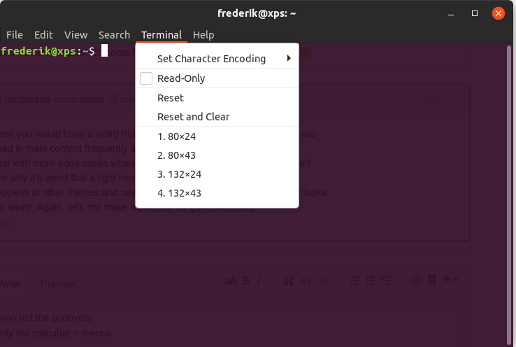
What about using the jet menus also for menus which are populated out of top menus for the light theme?
I think white menus which come from black menu bars look a bit weird. :thinking:
Feichtmeier
on 28 Nov 2018
Then you would have a weird mix of dark and light popovers. Popovers are
used in main content frequently and I can see it becing very difficult to
deal with more edge cases when the class doesn't detect correctly. I don't
see why it's weird that a light menu is currently from the headerbar- it
happens in other themes and oses and programs all the time and never looks
too weird. Again, let's not make life harder for gtk developers.
On Wed, Nov 28, 2018, 12:19 PM Feichtmeier notifications@github.com wrote:
@ all
What about using the jet menus also for menus which are populated out of
top menus for the light theme?
I think white menus which come from black menu bars look a bit weird. 🤔—
You are receiving this because you were mentioned.
Reply to this email directly, view it on GitHub
https://github.com/ubuntu/yaru/issues/980#issuecomment-442530092, or mute
the thread
https://github.com/notifications/unsubscribe-auth/ARScQB2LifoVhOGxyUE3I2zH_OkwZGp_ks5uzsWXgaJpZM4YvEFZ
.
polyjitter
on 28 Nov 2018
Nono not the popovers
Only the menubar > menus
->
Feichtmeier
on 28 Nov 2018
Ahh, I see. I suppose I see what you mean. I like the "fluffiness" per se of the white menus, but I do admit that the darker ones look a little better. The sight transparency in the dark and not the light may seem a little inconsistent, though.
I also want to note in general that one of the experiments or goals within gnome design is to move over to using a popover-driven system instead of legacy context menus for all core or hig compliant apps. Obviously not set in stone, and it's not apparent how this would be implemented, but good and important imo to consider when considering splitting colors on one particular theme.
polyjitter
on 28 Nov 2018
Update: I was looking wrong, didn't realize that there was no slight transparency. Mb. Disregard my statement there.
polyjitter
on 28 Nov 2018
Yes I would also prefer popovers. I don't like to navigate through menus at all. Yet, they are still present.
And you saw it correctly, currently in this branch, all popovers, menus and context-menus share the same transparency. The one that also the yaru shell theme has
Feichtmeier
on 28 Nov 2018
I understand and also share the interest for black menus/popovers/contexts. It would be good to have the same style for light/dark variant and also similar to shell, however I see a problem. The example is gnome-builder which lets the user decide to prefer dark variant even in a light Yaru/Adwaita and in order to do so has some important custom styling we cannot control, specifically in popovers. I am not even considering complex special widgets, in this case it's a simple GtkImage, an icon which is light only in the light variant inside a popover

Here is the same image with testing dark popover
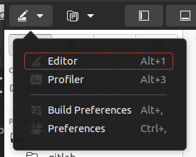
I believe Builder can even lead other applications to do the same, talking about fixed customization, and I say that even today, Builder looks broken with our dark popovers (in testing)
clobrano
on 29 Nov 2018
Yes let's keep the popovers light in the light theme!
Feichtmeier
on 29 Nov 2018
Recap of playing around with the jet menus in the past months:
1) The first idea to make Popovers + Menus black for Yaru-light and Yaru-dark fails with custom CSS in some applications, who auto-pump colors into their widgets which becomes activated when switching to the gtk light or gtk dark theme, resulting in invisible text or icons if the popovers are black for the light theme :-1:
2) One step down would be black menus for both light and dark, but Popovers are only black for the dark theme, which would result in a bit of an inconsistency within the theme with popovers and menus having a different color, since somehow popovers are menus, too. Ambiance uses this combination though, but overall the inconsistency would be a :-1: , too
3) One more step down would be keep the light theme as is with white menus and white popovers and only color the popovers and menus black/jet for the dark theme, which would the number of menu colors in the whole system from 3 (white, jet, gray) to 2 (white, jet). The white menus and popovers still have a good contrast on the white backgrounds because of their big shadow. This would be my favorite combination which brings more consistency to the shell and a better contrast for with black menus drawn upon a gray background in the dark theme. :+1:
4) The last combination would be white menus and white popovers in the light theme, gray popovers in the dark theme but with black menus, which would the weirdest mix of them all imho and thus a :-1:
Feichtmeier
on 4 Dec 2018
Related issues
 chrisjbillington
·
3Comments
Feichtmeier
·
3Comments
chrisjbillington
·
3Comments
Feichtmeier
·
3Comments
 pojntfx
·
3Comments
pojntfx
·
3Comments
 mivoligo
·
3Comments
Feichtmeier
·
3Comments
mivoligo
·
3Comments
Feichtmeier
·
3Comments
Most helpful comment
As I proposed it, personally I'd like to have dark menus when they're children of a dark menubar, and so in general I'm fine to have them dark all the times for context menus.
Basically following what Ambiance was doing. I don't think this created problems in the past with any applications so far (also because they're mostly dropping real menus), so I'd be fine to use light theme + dark menus all the times.