Yaru: Icon for Software Properties, aka Software & Updates, doesn't relate to the app
I've started my spring clean with the new templates and was reminded that the Software Properties icon is a bit unsatisfactory ("A" on a globe).
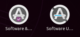
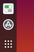
I wonder what you think of this concept: a similar icon to the Software Updater (because they're related apps) but with one of the new Yaru checkboxes to signify settings (and also because the app in question is full of them):
All 45 comments
I see what you're doing 😃
Remember to change the progress bar too ;)
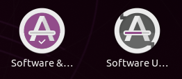
This just fun, but did you ever get this thought 😆

Nice idea!
And nice idea by mads. I like his purple circle a with a checkmark
I'm very open to purple, I tried it first but wondered if it was too much! Let me have a go again...
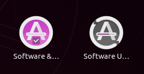
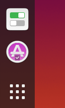
?
Maybe needs to be darker...
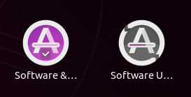
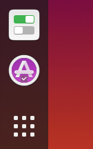
^^ It's not this saturated, it's just the compression on Github.
Is it because you want it to stand out from the checkbox? How about a dark aubergine? It is a bit colorful atm
Yeah, let's just use the checkbox aubergine for the backplate too, as per your mockup:
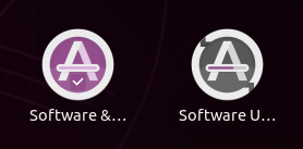
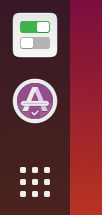
If you guys are happy with that, so am I :+1:
let's just use the checkbox aubergine
Could you just try the really dark aubergine? It might fit better with the gray icon next to it
I would just remove the background of the checkbox :D
let's just use the checkbox aubergine
Could you just try the really dark aubergine? It might fit better with the gray icon next to it
Dark Aubergine:
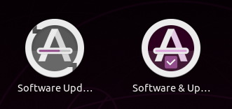
Medium Aubergine:
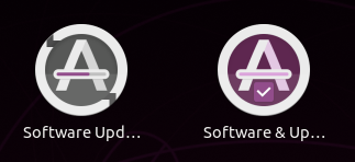
The dark one looks nice in this screenshot but is possibly too dark in reality.
If we're happy with this basic concept, we can choose a final aubergine and box versus non-box when we're trying the PR... the screenshots look more PURPLE!!!! because of the compression.
with one of the new Yaru checkboxes to signify settings (and also because the app in question is full of them):
While the checkbox looks interesting, won't a gear icon be more indicative ?
I am not sure how pleasing this would be. Trying to convey the idea

It is better when you have a non-white background

My personal choice would be a gear emblem over the icon. But since it was mentioned that we do not use emblems much, this is the only method I could think of now.
I really like these mockups :smile:. Probably I like more the one without checkmark, because it makes the design a little uneven :sweat_smile:, but it's a minor problem.
@meetdilip, the gear might recall some kind of option setting and I think it's better not to use it
Thanks for the response. I want to try something better. Let's say I got into a creative block. Tick icon is nice. I was trying to accommodate the " settings " part.
Allow me to add just one more mockup
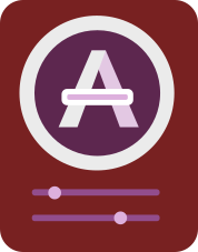

Uh... that would is kinda neat. If this would be on a standard yaru baseplate 🤔
@ubuntujaggers WDYT?
Nice idea, I'll give it a go 👍
First attempt:
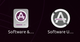
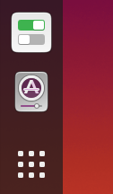
I really like the 48px, not sure about the full size yet.
No chance we can replace the grey background with something more closer to white ? Nice work :+1:
I prefer the colored background or the gear idea. Nothing wrong with your execution Stuart but this idea looks IMO a bit like a music player
There was this nice idea by eaglersdeveloper with the progressbar in the A being replaced by a gear, anyone remembers?
White looks a bit anaemic IMO, and strangely like a washing machine (if we put this with the casserole dish we can branch out into Yaru kitchenware):
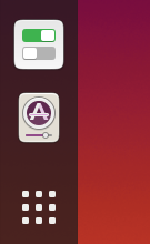
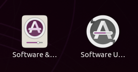
The coloured background looks great in the mockup (my favourite) but unfortunately the purple bleeds into pretty much any colour at small sizes at there's a sort of "glare" where the detail is lost :(
By the way, I can't believe I didn't think of at least trying this, given the "progress bar" metaphor on Software Updater:
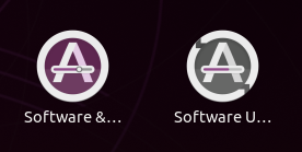
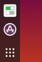
^^ So far my vote goes for this - it looks nice, gets round the problem with the tickbox (which isn't very recognisable when you remove the box) and nicely complements software-updater.
Last one is simply brilliant :)
On Wed, 19 Feb 2020 at 16:52, ubuntujaggers notifications@github.com
wrote:
White looks a bit anaemic IMO, and strangely like a washing machine (if we
put this with the casserole dish we can branch out into Yaru kitchenware):[image: washing machine 2]
https://user-images.githubusercontent.com/38893390/74848361-81888e80-532f-11ea-9f29-875e4ea35eb6.png[image: washing machine 1]
https://user-images.githubusercontent.com/38893390/74848366-82212500-532f-11ea-978c-4d3ba1a17916.pngThe coloured background looks great in the mockup (my favourite) but
unfortunately the purple bleeds into pretty much any colour at small sizes
at there's a sort of "glare" where the detail is lost :(By the way, I can't believe I didn't think of at least trying this, given
the "progress bar" metaphor on Software Updater:[image: image]
https://user-images.githubusercontent.com/38893390/74848524-a977f200-532f-11ea-9c0d-63ea45095027.png[image: image]
https://user-images.githubusercontent.com/38893390/74848576-b5fc4a80-532f-11ea-99c3-8afd359e04e9.png^^ So far my vote goes for this - it looks nice, gets round the problem
with the tickbox (which isn't very recognisable when you remove the box)
and nicely complements software-updater.—
You are receiving this because you commented.
Reply to this email directly, view it on GitHub
https://github.com/ubuntu/yaru/issues/1940?email_source=notifications&email_token=AAWAAHTQKIJ4VHCX5VH7V4TRDVIU5A5CNFSM4KXLOWK2YY3PNVWWK3TUL52HS4DFVREXG43VMVBW63LNMVXHJKTDN5WW2ZLOORPWSZGOEMIJL2Y#issuecomment-588289515,
or unsubscribe
https://github.com/notifications/unsubscribe-auth/AAWAAHTQ5DKO2ABFTIMTVK3RDVIU5ANCNFSM4KXLOWKQ
.
There was this nice idea by eaglersdeveloper with the progressbar in the A being replaced by a gear, anyone remembers?
I was working on this. I do not recall any old sample. But had this idea of 2 gears combo for this icon. At first, I thought not to put it here. I made a few tweaks. Let us see how it is now


I was trying to find a proper contrast between the gear and the background. If you can improve, most welcome.
Tried mockups. Looks fine on smaller sizes
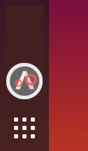
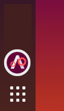
I tried an online colour palette tool. And it says this is the best choice for contrast for selected colours

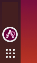
Not my best idea 🤷♂ I still prefer this one by Mr. Jaggers
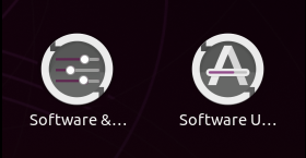
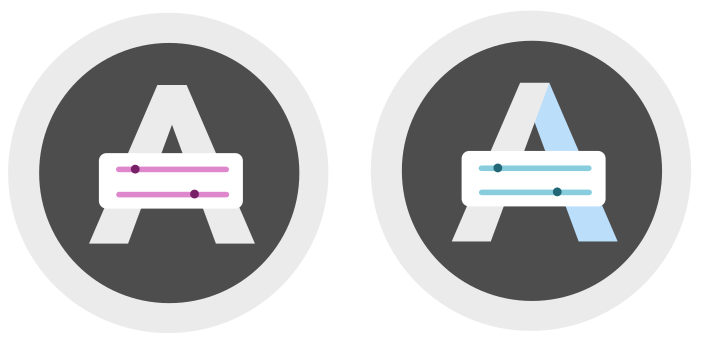
@madsrh I like the 3 slider one. Too cute.
I like the one from @ubuntujaggers too. Very smart idea. The only downside I see is that it looks mostly like software updater when it comes to smaller sizes.
Looks like grey background is the best if we are doing gears. Others have poor contrast
Blue looked much better than Aubergine. This one looks better even in smaller sizes

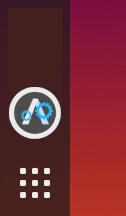
I do like this one, too.
@meetdilip can you try mocking up that design using the same gear shape as settings?
that design using the same gear shape as settings?
Sorry, didn't follow. Which design / one ?
Blue gears on grey background - see if it works using the existing gear shape from the settings-app icon :)
Tried these 2


Kindly let me know if you want any changes.
Settings-app gear in full

Yes, if we go with the gear, I would also prefer eagl e r s develop e r s approach
Something is wrong with my Inkscape. No matter what I draw, they are selectable but invisible. :(
No matter what I draw, they are selectable but invisible. :(
Maybe you've just set the layer to 0% in opacity
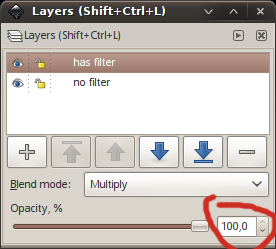
Thanks @madsrh . Fill opacity somehow got to zero
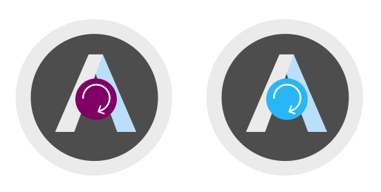
Aubergine looks fine here
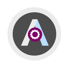
I went back to our old slider design. This one looks ok to me
Closing for now because we've got a new design in Master, but all icons are always up for review :+1:
Most helpful comment
I see what you're doing 😃
Remember to change the progress bar too ;)
This just fun, but did you ever get this thought 😆
