Any chance to revert 7579503954598f9fd913b3f0a7654d3e8876ef6f ?? I really much preferred the look of the buttons before.
- The side and top border of buttons is lighter now, reducing contrast
- There's a very dark line on the bottom - which looks odd
- On hover the button gets darker. If/when the background is darkened (#259), then I think this would make the hovered button blend in more with the background
- The previous highlight changed the border, which was sort of consistent with the focus rect, and focus of entry fields.
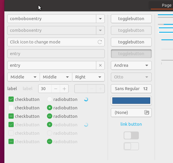
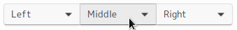
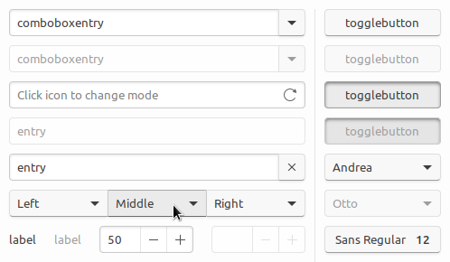
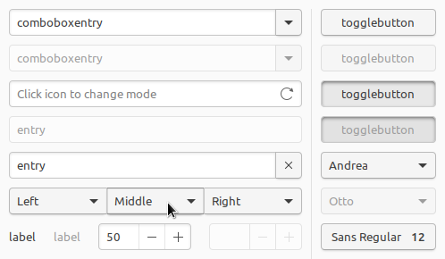
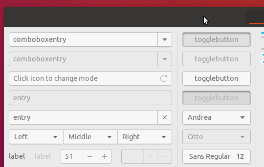
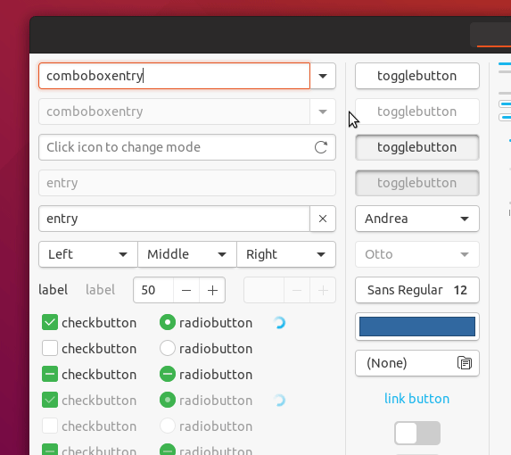
Now:
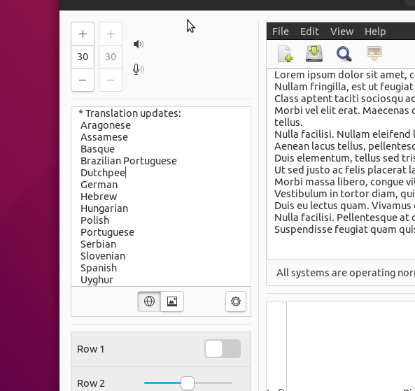
Before:
 CDrummond
All 42 comments
Ok, I'm working on another branch to try to fix the border highlight for linked buttons, so that if we decide to revert this we could. As @godlyranchdressing said it's complicated :disappointed:
 clobrano
on 26 Mar 2018
clobrano
on 26 Mar 2018
But the border highlight for linked buttons seems to be just as broken now as it was before these changes. So, I'm not sure what that has to do with reverting this.
Obviously, if more people prefer the current look then fair enough.
CDrummond
on 27 Mar 2018
But the border highlight for linked buttons seems to be just as broken now as it was before these changes.
That's right. Of course, having a change of the background on hover, we could remove the change in the borders (which didn't happened in that PR).
So, before showing the current state of this new branch, I'd like to explain why this fix is complicated.
As @godlyranchdressing said, in linked buttons, one of the borders (the right one) does not actually exists, so that buttons look connected. Only the last button on the right has all the 4 buttons, that's why on hover only 3 borders are highlighted.
Possible solutions
A. make the "missing" border appear on hover
B. let the shared border of the next button be highlighted as well
C. mimic border with box-shadow
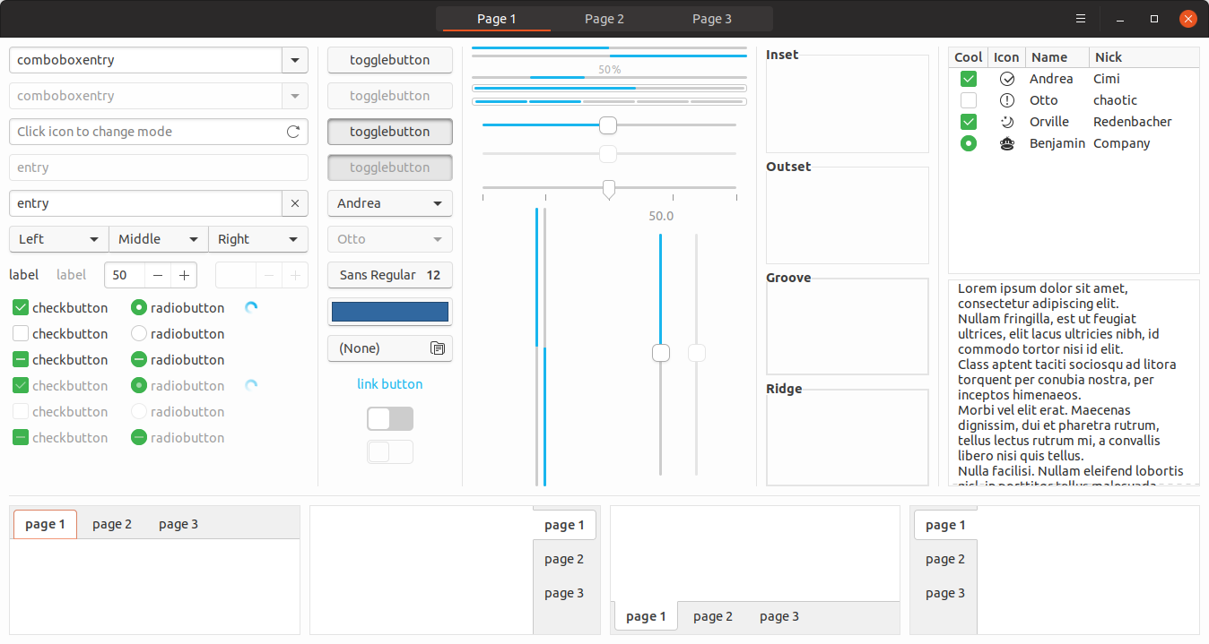
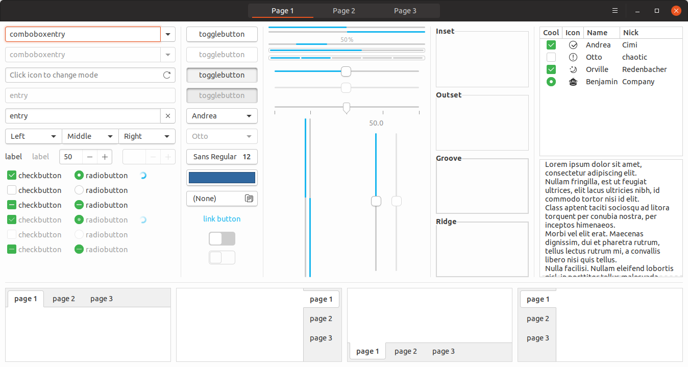
Solution A and B require the linked buttons to be siblings, which does not happen always (like in page 1 of Widget Factory for instance). Using those fixes effect will cause to have randomly again an incomplete border highlight or, worse, buttons that change size on hover.
Solution C is what I want to propose. It is not as nice as the previous version (bug a part), because to avoid making the border too thick, the highlight is less dark and a bit more blurry. I tried a lot of combinations of box-shadow thickness, color, position, etc, but at the very best the highlight is more pale and blurry.
So, sorry for this long message, this is current state:
I understand this might be not enough, but in this case we should work on other solution (by the way OSX's buttons do not even change on over :smile: )
clobrano
on 27 Mar 2018
Your 'current state' screenshots look nice. Apart from the fact that on hover, there is an innerborder also applied - which makes the border seem thicker. Not sure I like that. Is this really required?
CDrummond
on 27 Mar 2018
Yes, that's the point. The Inner border is the box-shadow I added to close the border highlight on hover. We cannot get rid of the normal border, so we have actually 2 borders, one very light made by the box-shadow.
@madsrh what's your opinion? I already think it's a compromise, so no worries, but otherwise we need to think again, either a background color change or maybe something like buttons linked to entries, which pop out on hover but with no border highlight
clobrano
on 28 Mar 2018
Solution C looks good to me 👍
Without sidetracking this issue, is that the new background and backdrop color? 😃
 madsrh
on 29 Mar 2018
madsrh
on 29 Mar 2018
I'd prefer the solution B, but without changing the size. Actually entry fields are doing that. :smiley:
I can help for that. Although it may conflict with #299, can I send the PR?
 nana-4
on 1 Apr 2018
nana-4
on 1 Apr 2018
I'd prefer the solution B, but without changing the size. Actually entry fields are doing that. smiley
I too prefer B, but I couldn't fix the size issue where widgets are not siblings (entry fields and buttons are siblings in the examples above). If you're able to, you're welcome :wink:
clobrano
on 1 Apr 2018
I wrote a message on #299 to avoid being merged while you're working on it
clobrano
on 1 Apr 2018
Hmm, I could change the shared border color of _ordinary_ linked buttons (.linked > button),
but linked combo buttons (.linked > combobox > box > button) and linked tool buttons (.inline-toolbar > toolbutton > button) could not be changed because their hierarchies are too deep. 😥
Even we can't change the border color of linked combo & tool buttons with _B_, I'm still thinking it's the best solution because linked combo & tool buttons are not so much used in actual apps.
What do you think? Is it alright?
nana-4
on 1 Apr 2018
but linked combo buttons (.linked > combobox > box > button) and linked tool buttons (.inline-toolbar > toolbutton > button) could not be changed because their hierarchies are too deep
That was my problem too.
What do you think? Is it alright?
I don't feel it is right to ignore this problem (even if current Ambiance does it :D), this is why I tried a way that does not involve siblings widgets to highlight the borders.
I'd suggest you to look at my solution, maybe you're able to improve it, making box-shadow less pale and blurry, but keeping the same thickness. Of course, if you like
clobrano
on 1 Apr 2018
I don't feel it is right to ignore this problem
I personally feel it can be ignored as a _minor_ bug. At least it's quite rare for the linked _combo_ buttons to be used in the gtk apps, even if it is used on Page 1 of gtk3-widget-factory :D
I also feel the inner box-shadow effect may look quite buggy, no matter how hard we try. At least I think A is better than C (if you think B is no longer an option).
nana-4
on 1 Apr 2018
Okay. Although I pushed the PR above, now I'm thinking of another solution.
As we already know, it's technically hard and painful to change the linked button's border color according to the states. So I would like to suggest not to change the border color while changing the button states.
This is the reworked button that I would like to propose:
Although it changes only the background color on hovering, I adjusted it to make it easy to notice.
How do you think about this proposal?
EDIT: The full screenshot can be seen here.
nana-4
on 2 Apr 2018
The shadows under buttons are too strong - especially on combo buttons. The sunken shadow is also much less. Really the buttons as stated to revert to were much nicer.
CDrummond
on 2 Apr 2018
The shadows under buttons are too strong
I personally don't think so. Just my taste, though :)
The sunken shadow is also much less.
I've felt that the current sunken shadow is too deep and does not fit the rest of the design much.
For your reference, these are the original button design of Unity 8:
IMHO thinner shadows of the buttons will match well with Suru design.
Really the buttons as stated to revert to were much nicer.
To me, the problem of the previous button was it's too bright. It was almost white, so it was destined to make the background-color darker on hovering. :(
nana-4
on 2 Apr 2018
I don't feel that the shadow is too strong. +1 from me for the latest button changes
I generally like the idea of only changing the hovered background and not the border
 Feichtmeier
on 2 Apr 2018
Feichtmeier
on 2 Apr 2018
Only personal opinion (and I'm no designer) - I'm fine with the darker button, but I preferred the original shadows (the external ones).
Eitherway, I think someone (and not me, as I'm not qualified) needs to make a definitive statement of what they should look like, implement and move on.
Not that it matters much, but I could live with the buttons in this mockup. I was originally looking at them in Firefox, and this seems to badly scale GIFs :-( Using a standard image viewer, they seem OK. (Still prefer the original, but this conversation needs to stop somewhere!)
CDrummond
on 2 Apr 2018
@nana-4 it is not clear now which changes this last 2 PRs of yours brought respect my original bright button version and the next one made by @godlyranchdressing, a part, I guess, the removal of wrong border highlights
clobrano
on 2 Apr 2018
@clobrano Well, I'm not very sure what you mean though.. #304 was just a try to solve the linked border problem without changing the current button design. Nothing more, nothing less.
IMHO, I personally prefer the a little darker buttons like Unity8 design (as @godlyranchdressing suggests/recommends) rather than the bright buttons without a darker bottom-border. (Although it is a very personal/unfounded opinion, I can feel _Ubuntu_ from the darker one, but cannot feel it from the bright one. 🤨)
If you and other designers are OK, I hope my redesigned (or restored?) button style will be merged.
nana-4
on 2 Apr 2018
@nana-4 the "white" button design only works, if there enough contrast between it and the background - there currently isn't. So white buttons on a gray background or gray buttons on a white background, both could work. Off the top of my head, I would say the gray buttons (as we initially had) will look less modern.
In my mind I was thinking of United or Matcha (white buttons vs. light gray background). Just to be clear, I'm only referring to the colors because these look too flat IMO and lacks a bit of shadow for them to look clickable.
The shadows under buttons are too strong - especially on combo buttons.
I (also) disagree. It's the shadow that makes this look like a button and not a text-field
madsrh
on 2 Apr 2018
Once I rephrase/summarize again, _to me_ the problems with white buttons are:
- too bright for my eyes (even if the background is light gray)
- easy to mistake as entry fields (especially on the linked buttons/entries)
- (if we decide not to change the border color) it's destined to make its background darker on hovering, since "white" is the brightest color
- less look like Ubuntu/Suru/Unity8
Off the top of my head, I would say the gray buttons (as we initially had) will look less modern.
For the initial buttons, I agree with that. But my reworked button is much _brighter_ than that and IMHO it looks much modern. :D
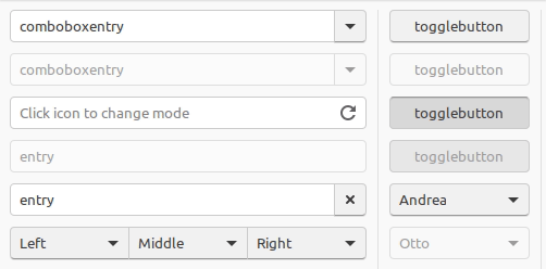
Let's line up for comparison:
My proposal:
Initial style:
Previous style _with light gray background_:
Current style:
@clobrano's PR (#299):
To remind; My proposal was made as a solution of the border color issue (and other various problems).
nana-4
on 3 Apr 2018
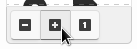
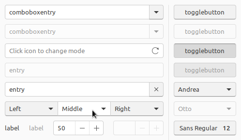
In most of the screenshots above, the combobox entry and entry field buttons have a shadow whilst the rest of the widget does not. This looks a little odd to me. What about placing the button inside the entry field? Kind of like the -/+ buttons on the spin boxes. e.g.
(This is just a quick mockup up, ignore the disabled combo)
CDrummond
on 3 Apr 2018
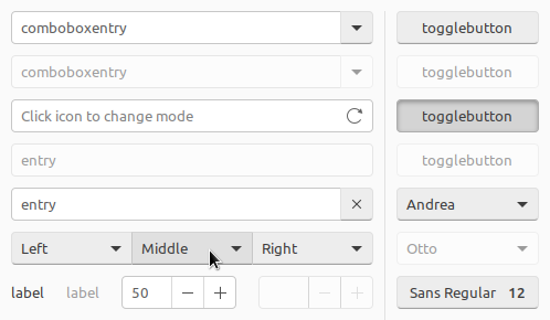
@CDrummond It's technically quite hard. spinbutton's inner structure is special, but normal buttons are not.
The biggest issue is the focus ring:
I personally feel we should not do that.
nana-4
on 3 Apr 2018
@nana-4 Ah, OK - was just a suggestion, I had no idea if it'd be difficult or not. Just seemed as a nice work-around for the shadows on buttons attached to entries. But yeah, if its hard then its not worth the effort.
CDrummond
on 3 Apr 2018
Sorry, I've been sick these days and couldn't keep up with these discussion.
It's complicated to come up with a decision, because I do want it to be definitive.
Summing up, @nana-4 proposal looks good to me, even if:
I still prefer the clicked state or "Previous style with light gray background". It's very clear that the button is pressed, while @nana-4's proposal the button shadow is not enough (I understand that this change has been made because the theme is mostly flat, but still)
The last month of development has been spent to avoid gray buttons :smile: . I take into account that the buttons might be too bright, but so I think that maybe it is better a darker background that a darker button, since most of the space is occupied by the first.
clobrano
on 3 Apr 2018
How cool is that OSX doesn't even bother making any hover animation on buttons 😄 ?
Anyway, I tried some updates on my branch, replacing the border change with a slight darker background
EDIT: I'm not saying that is really different than @nana-4's branch, just different colors and shadow in pressed button
clobrano
on 4 Apr 2018
@clobrano The only thing is the hover color is very similar to the background.
madsrh
on 4 Apr 2018
Yes, because background is still quite bright (#F7F7F7). What if we just work with shadow
clobrano
on 4 Apr 2018
@clobrano This LGTM
madsrh
on 4 Apr 2018
Am I the only one who doesn't like the white buttons? As usual, I can live with it, but the white buttons look too much like macOS' for me. :man_shrugging:
The #F2F2F2 in @nana-4's mockup looks like a good middle ground.
 godlyranchdressing
on 4 Apr 2018
godlyranchdressing
on 4 Apr 2018
white buttons look too much like macOS' for me.
Let me try with that color again, but I think that probably a bg change would be needed as well
clobrano
on 4 Apr 2018
Button #F2F2F2
Button #F2F2F2 + BG #EBEBEB
clobrano
on 4 Apr 2018
Am I the only one who doesn't like the white buttons?
Me too :slightly_smiling_face: Actually I was a fan of the initial style of the buttons. (Indeed it looked a bit less modern, though.)
@clobrano IMHO, the only subtle box-shadow change on hovering may be not easy to notice. I'd still prefer the background-color change of my proposal.
I still prefer the clicked state or "Previous style with light gray background". It's very clear that the button is pressed, while @nana-4's proposal the button shadow is not enough (I understand that this change has been made because the theme is mostly flat, but still)
(Sorry for the late reply.) Indeed the shadow will be changed slightly, but instead the background will be much darker. And IMHO it looks enough clear that the button is pressed. Although I can live with the big blurred inner shadow, I'd still feel it looks like out of place and less modern. :)
EDIT: I understand the big blurred inner shadow is also for consistency with the headerbar buttons, but IMHO normal buttons and headerbar buttons are _already_ look very different. So IMHO no need to hesitate to change only the normal button's shadow.
nana-4
on 5 Apr 2018
I would prefer the white ones. Gives a better contrast on the background
Feichtmeier
on 5 Apr 2018
@clobrano IMHO, the only subtle box-shadow change on hovering may be not easy to notice.
I am not sure is really necessary to be so evident, but I agree that your solution looks cleaner at the end. White background on button is hard to style on hover (and in fact OSX doesn't style it at all, last time I said that, promise :smile: )
So, we can go ahead with @nana-4's PR for me, could you just try add this?
I still prefer the clicked state or "Previous style with light gray background".
clobrano
on 5 Apr 2018
I would prefer the white ones. Gives a better contrast on the background
It depends on the background color, but to me light gray background (e.g. #F7F7F7) and the white buttons look even lower in contrast. :)
I am not sure is really necessary to be so evident
One of the reasons I said that is because the button's drop shadow is cut off in some apps. (see #284)
So, we can go ahead with @nana-4's PR for me, could you just try add this?
Of course. :) I'll post a screenshot here.
nana-4
on 5 Apr 2018
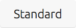
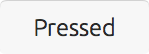
I tried that clicked state:
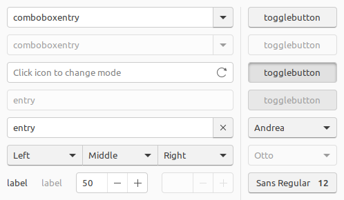
How about this?
@clobrano @madsrh @godlyranchdressing @Feichtmeier and others?
nana-4
on 5 Apr 2018
Looks quiet good. Do we plan to try the exact same toggled/clicked state shadow on dark buttons in the header bar?
There was a time when they both looked very alike (apart from the color ofc) which gave me a feeling of consistency.
Feichtmeier
on 5 Apr 2018
@Feichtmeier I'd say yes, even if shadows on dark backgrounds does not usually work fine as well
EDIT: I wanted to have the bright button stable, before changing the dark ones
clobrano
on 5 Apr 2018
@nana-4 is the last content you posted coming from #304?
clobrano
on 7 Apr 2018
I'm really sorry for my long silence. I had trouble in my real life and couldn't looked at this at all.
@clobrano No. I have created a new PR, so I will close the old PR.
nana-4
on 12 Apr 2018
Should this now be closed? I'm OK with the current button look - so no need to revert anything.
CDrummond
on 26 Apr 2018
Related issues
 matthewpaulthomas
·
3Comments
madsrh
·
3Comments
matthewpaulthomas
·
3Comments
madsrh
·
3Comments
 8none1
·
3Comments
madsrh
·
3Comments
8none1
·
3Comments
madsrh
·
3Comments
 chrisjbillington
·
3Comments
chrisjbillington
·
3Comments
Most helpful comment
I tried that clicked state:
How about this?
@clobrano @madsrh @godlyranchdressing @Feichtmeier and others?