Hello,
Congrats on all the improvements! I didn't use Ubuntu since 10.10, but I'll probably come back to it.
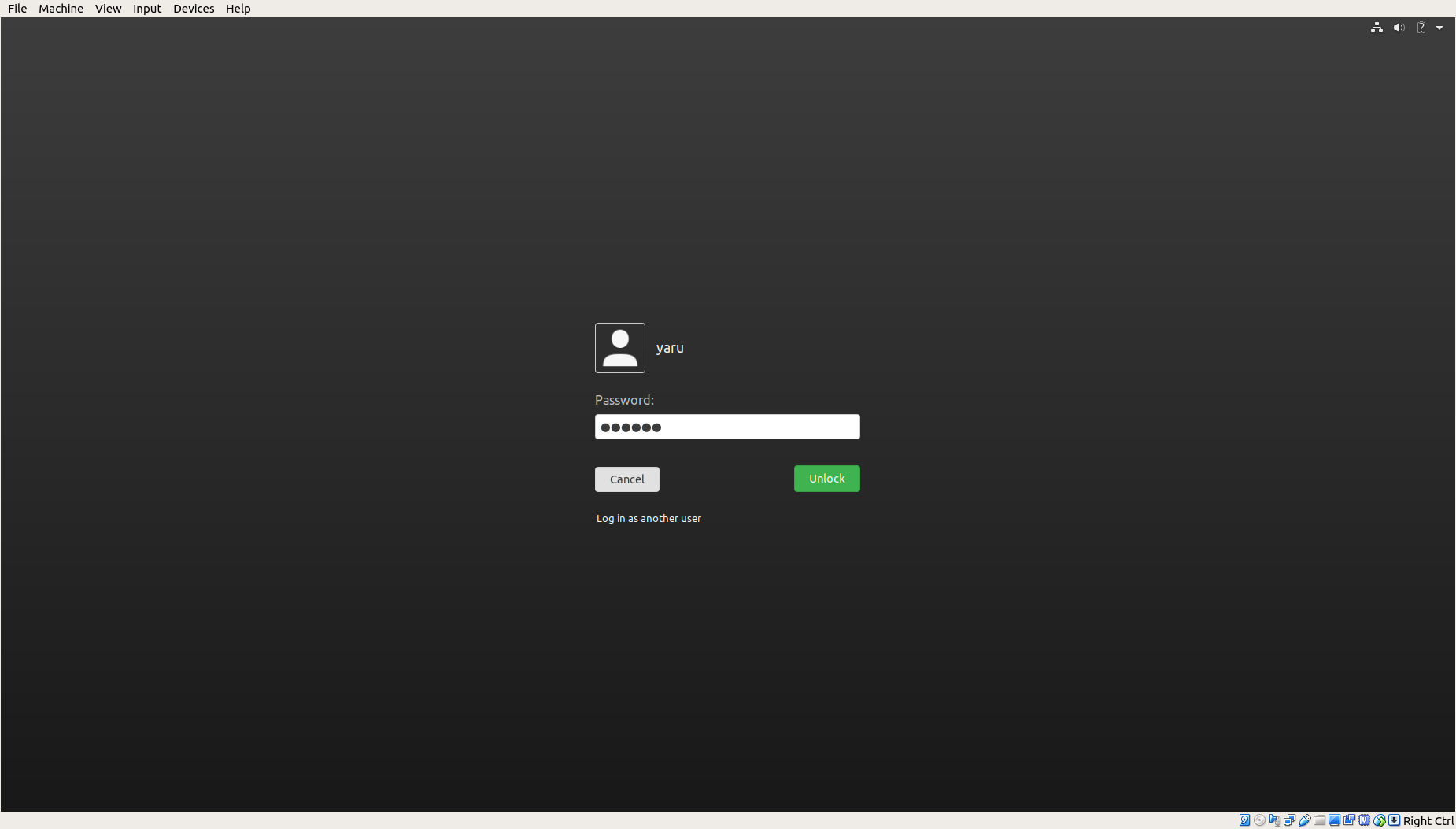
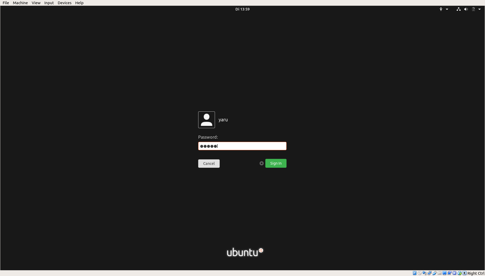
Yaru is incredibly beautiful while being subtle, however GDM theme is ugly and hurt eyes, not only for me when I read forums, reddit, etc... This pink/purple gradient looks like there's a visual glitch. Maybe just go plain black or dark grey?
_PS: I'm aware that we can tweak that ourselves in CSS or use gdm-alternatives_
 DarthWound
All 44 comments
Hi @DarthWound
We did some mockups with black and dark gray earlier in the process and found it to be too dull / cold, but I do agree with you that the current GDM isn't perfect.
We are bound by a lot of technical limitations here (no slanting gradient, no blur, no images, ...), so if it makes you feel better, you can think of the current GDM theme as a placeholder, while we wait for the new version to arrive:
https://blogs.gnome.org/aday/2018/05/09/redesigning-the-lock-screen/ _(although that's still very much work in progress)._
Thanks for the kind words! 😃
I will close this issue for now, but @clobrano @godlyranchdressing @Feichtmeier feel free to reopen if you think otherwise.
 madsrh
on 12 Nov 2018
madsrh
on 12 Nov 2018
I think it could do with a couple tweaks. I did this a while ago, modeling it after the current Ubuntu site. We don't know how long it'll be till that mockup becomes a reality.

I haven't touched the buttons yet though, obviously. Reopening for discussion.
EDIT: Someone just told me that the entry field looks disabled. :laughing:
I'll tweak it a bit and then repost.
 godlyranchdressing
on 13 Nov 2018
godlyranchdressing
on 13 Nov 2018
wow, @godlyranchdressing, that's beautiful
 clobrano
on 13 Nov 2018
clobrano
on 13 Nov 2018
I think that's a cool idea - especially considering that we want to be a bit different in 19.4!
Edit: however - I am not sure if this would solve the initial issue :smile: :
This pink/purple gradient looks like there's a visual glitch. Maybe just go plain black or dark grey?
 Feichtmeier
on 13 Nov 2018
Feichtmeier
on 13 Nov 2018
It's still a bit "agressive" IMO ^^ but seems better than what we currently have anyway.
Don't get me wrong, I know that Ubuntu has to keep a branding and a strong identity, but the problem here I think is that you've achieved that quite brillantly with a good Yaru theme but GDM is messed up and looks like a bug from the 90's. And, most important, GNOME' voluntary limitations are what they are so we can't easily apply another color or even an image, like some other DEs or even Windows. When default wallpapers are ugly, well, it's unfortunate but not a major issue, download another one and change it. Here it's a different story...
Working on a GNOME base is already difficult and will be even harder soon. They remove things everyday. They have their vision, and I liked GNOME3 until recently, honestly I don't know how much time it will be possible to please almost everyone with this DE, even with patches/hacks/extensions.
I distro-hop since 10.10 but always keeped an eye on Ubuntu and installed it on my family/friends computers. Since Unity's end I put Kubuntu and tweak it for them instead, I would have to tweak the GNOME desktop more than KDE nowadays, kinda ironic when GNOME devs tell us that they're simplifying stuff huh.
Ubuntu was THE distribution for beginners and people who wanted sane defaults, something usable almost immediatly after install. It shouldn't lose that.
I'm sorry, I digress badly. I guess it's natural when we love(d) something.
DarthWound
on 14 Nov 2018
Too dark.
How about this background? 👇

 eaglersdeveloper
on 14 Nov 2018
eaglersdeveloper
on 14 Nov 2018
@eaglersdeveloper, GNOME shell lock screen does not support images.
clobrano
on 14 Nov 2018
I managed to use a picture as a background (background-image).
eaglersdeveloper
on 14 Nov 2018
sorry, I meant login screen. Did you manage to change the login screen? That would be cool, could you share how?
clobrano
on 14 Nov 2018
I think mads also thought about something like these graphical approach for ubiquity.
Where is a link to the old issue? I think I remember that those images do not scale with the resolution and therefor can not be used but I could be wrong.
Feichtmeier
on 14 Nov 2018
Same as in CSS
background-image: url(/home/.../login-background.svg)
I think I remember that those images do not scale with the resolution and therefor can not be used but I could be wrong.
This is a vector picture.
eaglersdeveloper
on 14 Nov 2018
That'd should work then
Feichtmeier
on 14 Nov 2018
We can't use the snaps ATM because the CI build is not working but
Could you push the branch so I could test it on my development VM? @eaglersdeveloper
Feichtmeier
on 14 Nov 2018
OK, tomorrow
eaglersdeveloper
on 14 Nov 2018
Hmmm this one is pretty interesting:
https://community.ubuntu.com/t/monday-19th-november-2018/8701/6?u=frederik-f
->
https://gitlab.gnome.org/GNOME/mutter/merge_requests/308
@vanvugt made a fix for gradients in gnome shell/mutter (no idea about the technical difference)
Soooo we might pause this discussion for a while until this fix is applied?
Feichtmeier
on 19 Nov 2018
@Feichtmeier Sure, even with my mockup there's this weird left to right banding effect that's noticeable. Hopefully it'll fix that too.
On the gray/black gradient for the lockscreen, funnily enough, the old masthead I replicated for the earlier gradient has been replaced with this instead. I do think if we go gray/black it would let us use the green button color without it clashing.
godlyranchdressing
on 19 Nov 2018
That could look great!
Feichtmeier
on 19 Nov 2018
The fix to the login animation isn't really relevant here. That just fixes a bug exposed by the proposed gnome-shell version 3.30.1-2ubuntu1.18.10.1. Either way, that's just a hard-to-spot flicker bug.
That all said, I too dislike the gradient and logged a separate bug about its design. I agree that a flat colour or the old (upstream) noise texture would be nicer. But it's not up to me.
 vanvugt
on 20 Nov 2018
vanvugt
on 20 Nov 2018
Oh then I misunderstood!
Well at least you came here and shared your opinion which is good since we need opinions :)
I think the upstream distortion is not an option, for me at least it isn't since I think it does not fit to the rest of the theme.
We are currently quiet low in numbers and we like to discuss things before changing or at least get some thumbs up or down from @madsrh @luxamman or @ubuntujaggers. But imho there is no hurry and let's see what @godlyranchdressing or @eaglersdeveloper come up with and let's wait until we are a bit more in this discussion. I think there is no need to rush this only to close this issue.
I think this might be the third issue about the gdm screen and this was the one we ended up with for 19.4.
If upstream is not ready with the new design until 19.4 I think there is reasoning in discussing a new solution.
Otherwise I think this is a bit strange to change the gdm screen only for X months which will only land in the snap and the people with the snap need a bash command to change from the 18.04 gdm to the new one anyways.
But however no rush please :)
Feichtmeier
on 20 Nov 2018
Still hoping for the new login screen, not sure if the new one makes it into the 3.32 release. Hopefully we can use background pictures then, or even blur. The actual one didn't get much love because we knew it will be gone soon... but not soon enough^^
I remember that there wasn't a lot of options to work with, also there is still time like @Feichtmeier said.
However, I was just jumping back to the two color idea - one with gradient with the original colors and a second one with a overlay radial gradient (for more focus to the login). Both with also darker variations.


 Luxamman
on 20 Nov 2018
Luxamman
on 20 Nov 2018
@Feichtmeier, test it: #976
eaglersdeveloper
on 20 Nov 2018
Some fast alternatives inspired by @godlyranchdressing and the ubuntu site he linked
Dark entry, horizontal gradient $inkstone -> $jet

Light entry, horizontal gradient $inkstone -> $jet

Light entry, vertical gradient $inkstone -> $jet
Light entry, no gradient, just $inkstone
Light entry, no gradient, just $jet
My fav is solid inkstone
Feichtmeier
on 20 Nov 2018
No, it already looks like pure GNOME, which is what we don't need.
eaglersdeveloper
on 20 Nov 2018
I very much like the inkstone to jet and the solid colors, @Feichtmeier. The solid jet background in particular gives off really a luxurious vibe, but the light button works better with Inkstone. Those mockups are making me start to lean on scrapping the gradient and just using a solid color so in my case I'll +1 the inkstone lockscreen.
@eaglersdeveloper I did want it the lockscreen to be "different" for Yaru, but being different for the sake of it isn't always a good thing. In this case especially, it's a lockscreen where you want the design to be subtle and we also just don't have that many options right now.
godlyranchdressing
on 20 Nov 2018
Don't know really. We can try different things imho
But since some people do not like the gradients, I don't know what to do :laughing: (and the issue was made because the OP does not like gradients)
I could personally live with the current master, @Luxamman 's first idea, the solid inkstone one OR with @eaglersdeveloper PR ... IF it looks not messy/stretched in different resolutions (what I currently fear will happen but let's see)
In the end we should better not change our mind every X months. There is always someone who does not like this or that.
Feichtmeier
on 20 Nov 2018
Silly question. Isn't the original noise dark background an option anymore? Maybe with a jet color?
clobrano
on 20 Nov 2018
Well, it would not be bad but personally it wouldn't be my favourite neither
I could live with many backgrounds as long as we don't go back to 3d buttons evil face :D
It's up to you but maybe we need to see more ideas (we are sadly really limited :/ )
Feichtmeier
on 20 Nov 2018
...the original noise dark background...
If this is the one you are referring to, then I reallllllyyyy hope we can finde a better solution.

If in doubt, I'm -1 for the noise texture.
I like @Feichtmeier's ideas, but the gradients still has visible "stripes", so perhaps a solid color would be best?
madsrh
on 20 Nov 2018
Honestly, and I feel like I've said this before, but I really like that use of $jet. Sure, it's not exactly bright and splashy, but it doesn't look washed out and it looks bold, and considering that this will be servicing both the login screen AND lock screen, it sort of acts like a layer underneath the system.
The jet is pleasant on the eyes when waking up the computer in the middle of the night, or when starting the computer. Think of it like a sunrise - You're going from dark to slightly lighter to the vibrant colors of the default desktop as you get warmed up for the computer and everything wakes up for both you and the computer.
We could go lighter, but my issue with that is that whenever such colors are used in the theme, it's sparingly and not in black blocks. As such it looks a little pale and maybe a little ill. It would require a new color entirely imo and that's not a fantastic idea.
I'm also a fan of the wallpaper provided by @eaglersdeveloper as a secondary option.
 polyjitter
on 21 Nov 2018
polyjitter
on 21 Nov 2018
Solid $jet version is awesome. Blends well with Yaru and gives a good impression.
But since some people do not like the gradients, I don't know what to do 😆 (and the issue was made because the OP does not like gradients)
It's not that I don't like gradients, it's just that the current login screen is really disturbing and shouldn't be used on a first-class distro like Ubuntu, it fits something like HannahMontanaLinux better.
In the end we should better not change our mind every X months. There is always someone who does not like this or that.
As I said in my "issue", look at Reddit, forums... a lot of people are asking how to change this screen. If it would be for me, I wouldn't care as I know how to tweak my distros. I've opened an issue because we should have a better default GDM and it's not only me.
being different for the sake of it isn't always a good thing.
+1000
I know that desktop isn't main target of Ubuntu/Canonical anymore, but providing something that works and that is looking nice should be a priority anyway, because it's what made Ubuntu popular back in the days.
DarthWound
on 21 Nov 2018
I know that desktop isn't main target of Ubuntu/Canonical anymore
We are not from canonical. And please stop that offtopic drama in your posts, it's kind of unproductive :)
I think that solid jet might look too dark when you open the pop-ups from the panel. I rather tend to inkstone.
Feichtmeier
on 21 Nov 2018
We are not from canonical. And please stop that offtopic drama in your posts, it's kind of unproductive :)
I know that, and there's no drama, I'm just giving my reasoning because you think that I opened this issue only because I dislike the GDM screen. I use Ubuntu since 9.04 _(and distro-hopped like a freak since 10.10 but not because I hate this or that)_. Instead of drama, take it as motivation, that's all.
I'll keep silent now :no_mouth:
DarthWound
on 21 Nov 2018
I wonder, if the light to medium purple gradient looks too much "hannamontana" (.... Jesus) to you, how about a solid dark purple? @darthwound
Feichtmeier
on 22 Nov 2018
I wonder, if the light to medium purple gradient looks too much "hannamontana" (.... Jesus) to you, how about a solid dark purple? @DarthWound
Something like what we had in 17.10? Why not. Seems very acceptable imo and artistically consistent with Plymouth screen preceding the login . Cosmic' GDM theme is widely rejected but I didn't read a lot of complaints against it when Artful was released.
I repeat myself but I'm not against gradients. @godlyranchdressing mockup is fine. Just look at current Yaru GDM theme and compare.
DarthWound
on 23 Nov 2018
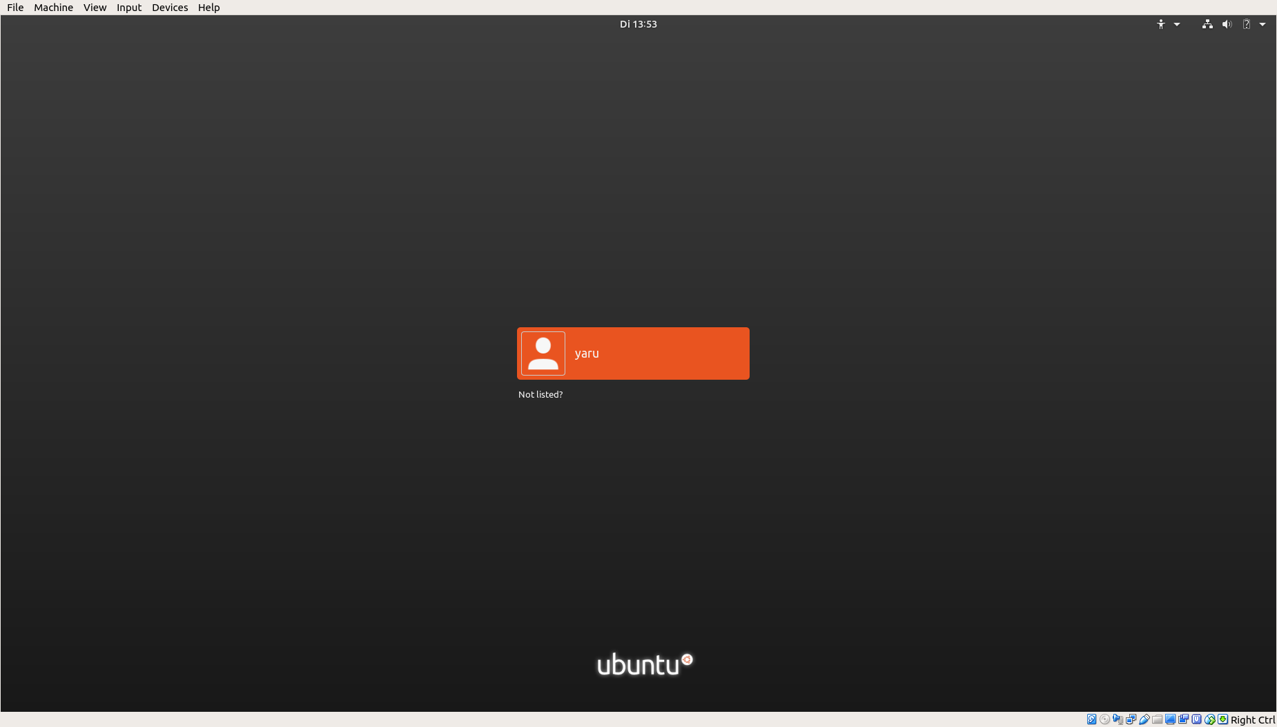
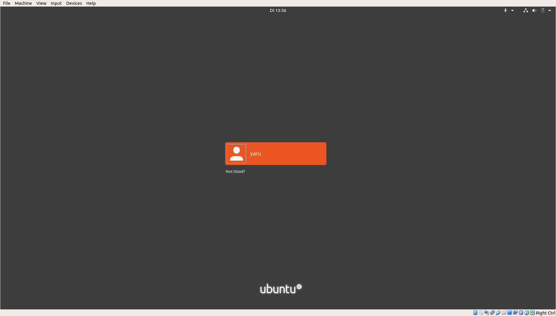
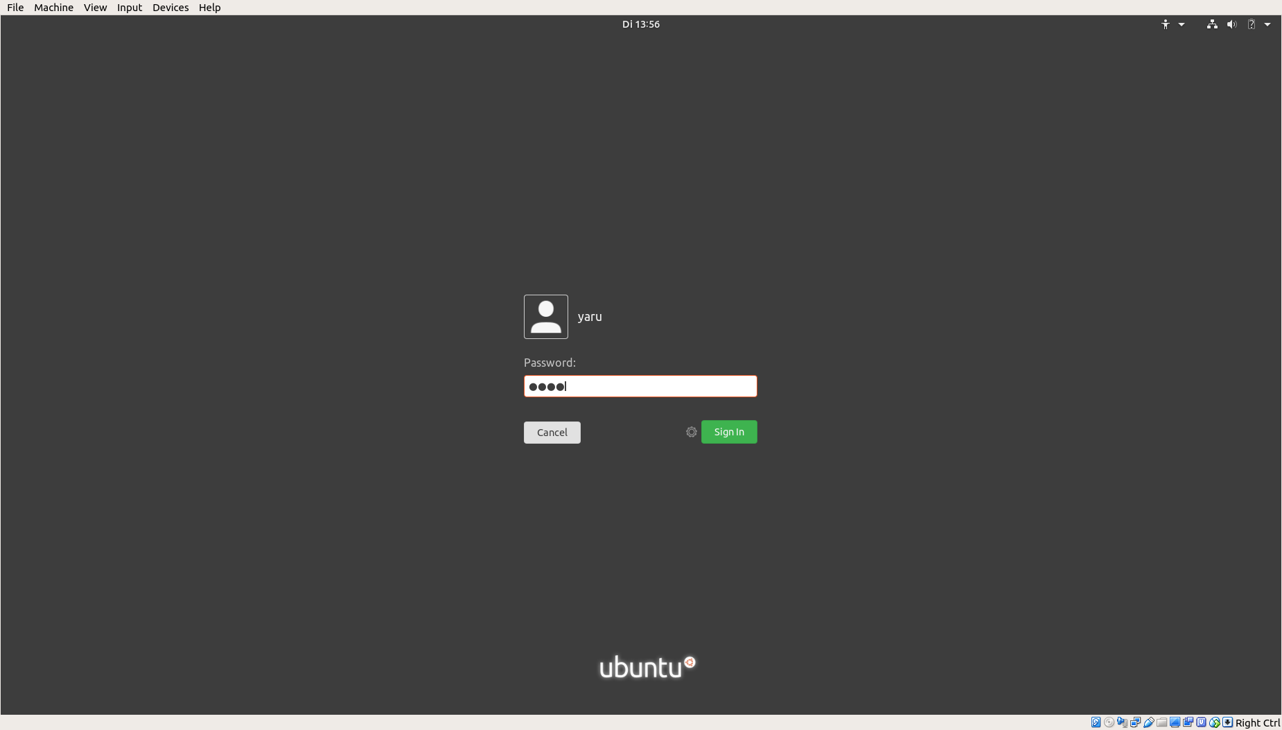
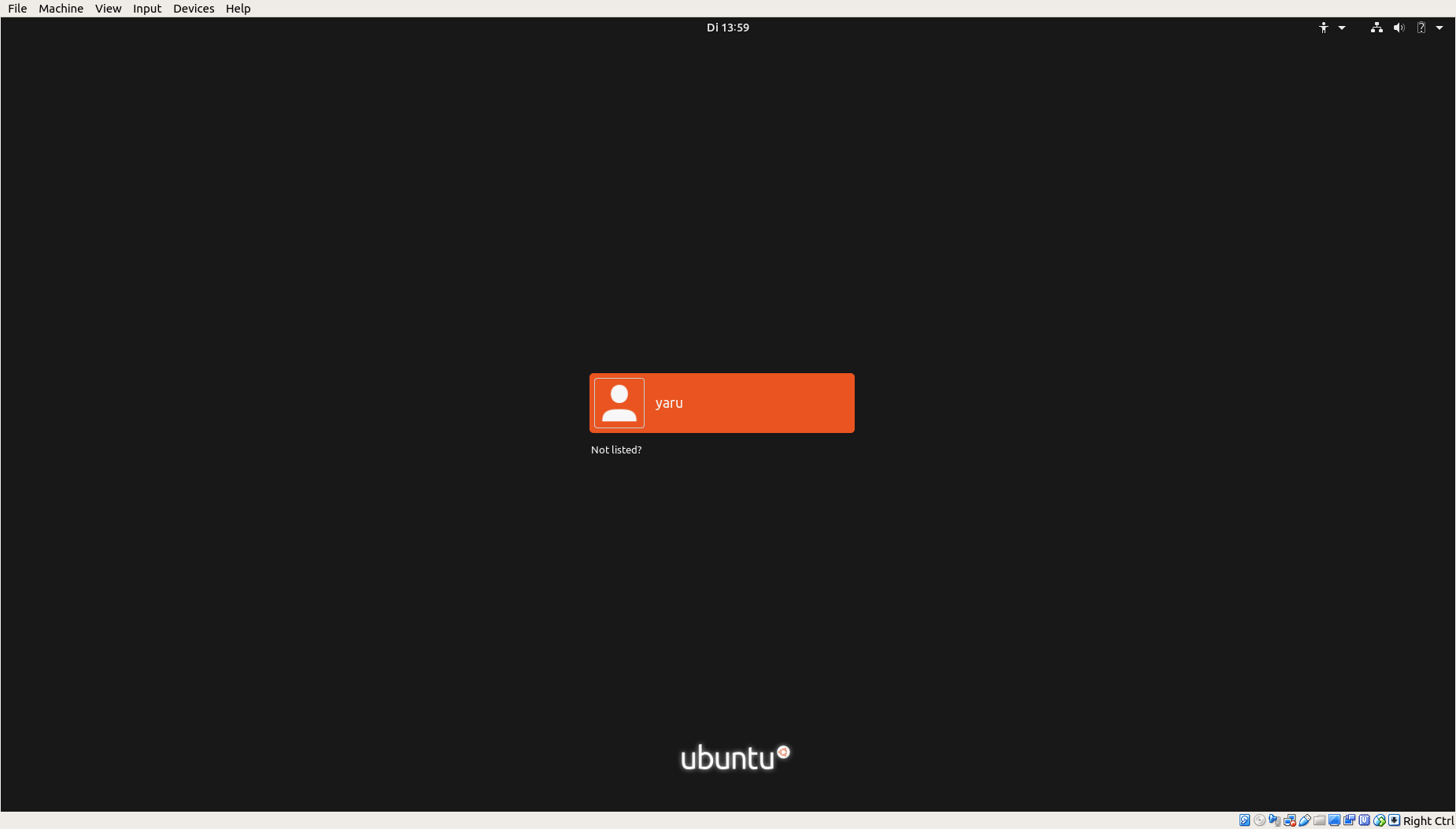
I'm only just getting to see the current login screen - until today I had a white box on flat purple. I uninstalled the Communitheme snap because it hasn't worked for me for a while, and I seem to have magically got a different login screen!
I think it's actually nice - especially given the limited design options here. The orange selection when you hover over the user to select it is a bit jarring because it's such a large area of orange. I think I'd slightly prefer to use the same shape as a white opacity (similar to the one when you hover on a launcher icon) rather than solid orange. But I'm not strongly averse.
All IMO as ever:
When I boot my PC, I see...
- A blank purple screen
- The exact same purple with "Ubuntu" and the five orange dots
- The login screen.
Given the limited options available, I think my personal preference is probably to use the same flat purple a third time on the login screen, for maximum continuity (power on --> login) and general Ubuntu feeling. I don't mind the gradient at all (and I like the mockup by @godlyranchdressing), but if it's divisive or has banding then you could just use the flat purple from previous screens.
The dark greys (jet etc.) are a nice choice in general design terms, but I think grey might look a bit "unthemed" after all the purple leading up to the login screen? And it would be a shame to de-purple the earlier screens because I think they're bold and branded, in a good way. The second the screen first flashes purple, it's really obvious that you're not booting into Windows. I can imagine someone thinking (in a good way): "Oho - this is a bit different!" Obviously, not everyone loves purple. But I feel like Ubuntu made a decision long ago to have a bold, fun look that some people would love, rather than going for a neutral look that no one would mind?
Aside from that, I feel like the grey options are smart and attractive but a bit cold and dark. To me, it looks like a distro for serious techies. IMO, one of Ubuntu's assets is the really fresh, friendly feel of Yaru. I think a Linux newbie would look at the default desktop and think, "wow, this is lovely." I'm not averse to grey, but it's not my personal favourite.
One thing I've never liked much is the default texture (the "noise") which early versions of the login screen inherited from default Gnome. It looks out of place to me because it doesn't appear anywhere else in the boot-up sequence or the desktop itself. I would say my strongest opinion on the login screen is preferring it to be noise-free. Other than that I'm fairly relaxed. I wouldn't be upset if it even stayed as it is, because it feels like you have limited scope to do much with this screen currently.
 ubuntujaggers
on 23 Nov 2018
ubuntujaggers
on 23 Nov 2018
@ubuntujaggers tbh, I think you nailed it. +1 for solid purple
Feichtmeier
on 23 Nov 2018
I think we should always go for maximum coherence for the boot up. If we opt for new visual styles, GRUB, Plymouth and all possible splashes should be adapted as well.
In my case the boot up is still not flicker-free thus I would prefer black as the background color personally.
 real-amano
on 26 Nov 2018
real-amano
on 26 Nov 2018
If one of @Luxamman options is not feasible I'll vote for solid purple then...
 Paz-it
on 26 Nov 2018
Paz-it
on 26 Nov 2018
You made some good points, overall black is way too much for me and maybe also grey is too much of a visual glitch - what after all is the point of discussing this here. Even if the grey can work, but also depends on what grey it is, same for the "solid purple".
For me it don't have to be a perfect fit to the boot process, because it is not part of it and when hibernating, there is no boot process. It should welcome the user with a nice, fresh, or cool touch - every time when unlocking.
Like the rest of the system - content is king. So maybe the way to go is to be darker, but not black or grey, to still have some accents, but not to unfocus the login form.
So a stong purple could unfocus the important login part, black could be too nerdy and grey not playful enough. The actual gradient is also too bright on second thought, maybe we can find a doable and feasible solution here to fit the system better.
Luxamman
on 27 Nov 2018
Pushed the same color as Grub uses in Ubuntu which you can test here https://github.com/ubuntu/yaru/pull/994
So it will be:
Booting - purple
Login - same purple + GDM entry/buttons
Gradients just do not work without strange effects. @vanvugt said some math could help, but I am not able to provide that math and I am not sure this math can be provided via CSS
So, since the new upstream login screen is on the horizon, my opinion is, that we should make the bg solid, get over this topic and wait for the upstream changes. :man_shrugging:
or
Keep master :man_shrugging:
Edit: please test the PR, maybe the purple should be brighter, but not too bright, otherwise "hannah montana"
Feichtmeier
on 30 Nov 2018
Sounds reasonable to me!
On Fri, Nov 30, 2018, 6:58 AM Feichtmeier notifications@github.com wrote:
Pushed the same color as Grub uses in Ubuntu which you can test here #994
https://github.com/ubuntu/yaru/pull/994So it will be:
Booting - purple
Login - same purple + GDM entry/buttonsGradients just do not work without strange effects. @vanvugt
https://github.com/vanvugt said some math could help, but I am not able
to provide that math and I am not sure this math can be provided via CSSSo, since the new upstream login screen is on the horizon, my opinion is,
that we should get over this topic now and wait for the upstream changes.
🤷♂️—
You are receiving this because you commented.
Reply to this email directly, view it on GitHub
https://github.com/ubuntu/yaru/issues/964#issuecomment-443182655, or mute
the thread
https://github.com/notifications/unsubscribe-auth/ARScQKGXs0Xk-sNOTf04iE4csM33k3P1ks5u0R1XgaJpZM4YZcow
.
polyjitter
on 30 Nov 2018

(https://design.ubuntu.com/brand/colour-palette/)
Chose =)
Feichtmeier
on 30 Nov 2018
The same color as Plymouth would be my choice. To be as close to a seamless boot as possible.
real-amano
on 30 Nov 2018
That's the third one. There's currently in the branch I linked, go and test it :)
Feichtmeier
on 30 Nov 2018
Related issues
 8none1
·
3Comments
Feichtmeier
·
3Comments
8none1
·
3Comments
Feichtmeier
·
3Comments
 mivoligo
·
3Comments
Feichtmeier
·
3Comments
mivoligo
·
3Comments
Feichtmeier
·
3Comments
 chrisjbillington
·
3Comments
chrisjbillington
·
3Comments
Most helpful comment
Honestly, and I feel like I've said this before, but I really like that use of $jet. Sure, it's not exactly bright and splashy, but it doesn't look washed out and it looks bold, and considering that this will be servicing both the login screen AND lock screen, it sort of acts like a layer underneath the system.
The jet is pleasant on the eyes when waking up the computer in the middle of the night, or when starting the computer. Think of it like a sunrise - You're going from dark to slightly lighter to the vibrant colors of the default desktop as you get warmed up for the computer and everything wakes up for both you and the computer.
We could go lighter, but my issue with that is that whenever such colors are used in the theme, it's sparingly and not in black blocks. As such it looks a little pale and maybe a little ill. It would require a new color entirely imo and that's not a fantastic idea.
I'm also a fan of the wallpaper provided by @eaglersdeveloper as a secondary option.