With dialogs, etc, there is no indication as to what is the 'default' button - i.e. the button that is activated with the return/enter key. At start there is a focus rect, but this can be 'tabbed' away.
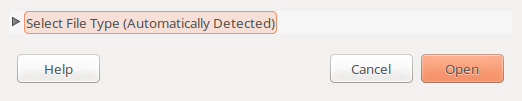
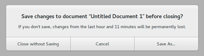
In the following screenshot, which is the default button?
Perhaps a bold font should be used to indicate the default?
 CDrummond
All 52 comments
Probably it's just missing the style for the selection ring
 clobrano
on 2 Apr 2018
clobrano
on 2 Apr 2018
Selection ring? You mean focus? As stated the dialog starts with a focus indicator, but if you press 'tab' then it will eventually lose it.
Most desktops (KDE, Windows, macOS) indicate the 'default' button somehow - different colour, border, etc. The default button can be different to the widget that currently has focus - as can be seen by the screenshot above, because one of those does receive the return/enter key.
CDrummond
on 2 Apr 2018
This is selection ring. So if the dialog starts with a focus indicator it's OK, if the user press tab is trying to move somewhere else in the window, so he/she cannot expect to press enter and activate the default action (which was the one selected at the start).
Or are you talking about suggest action?
clobrano
on 2 Apr 2018
That's what I said. Initially it has focus. If I press tab, it loses focus - but will still react to enter/return. Hence why needing to indicate this button somehow.
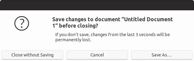
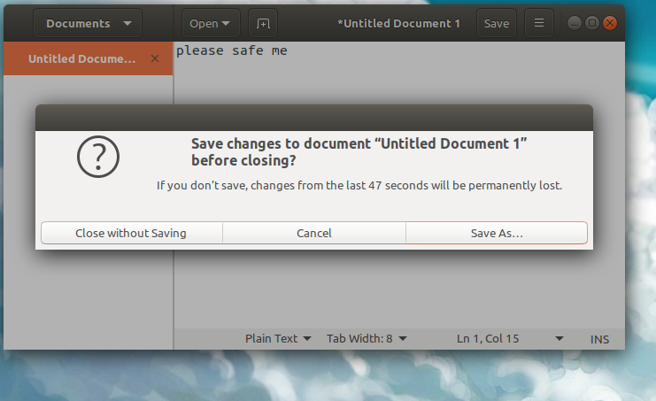
Steps to reproduce:
- Start GEdit
- Type some text
- Close GEdit
- Dialog appears -
Save As...has focus - Press
tabkey Save As...no longer has focus, so no focus/selection ring- Press
Return Save As...button is pressed, and save dialog appears
I know this is a contrived example, but demonstrates that there is a _default_ button and this should be indicated somehow.
CDrummond
on 2 Apr 2018
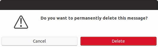
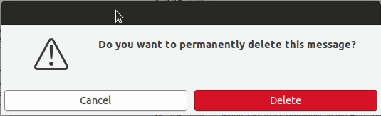
Also, with Geary's delete confirmation dialog, when tabbing from Cancel to Delete its no longer obvious where the focus is. Here, if the default button was indicated with bold text - then the text in Delete would turn bold.
CDrummond
on 2 Apr 2018
@clobrano ah! Interesting - so one could theme the focus ring for specifc classes? Like for tabs in the GtkNotebookBar ? This would be a solution to https://github.com/ubuntu/gtk-communitheme/issues/303
 Feichtmeier
on 3 Apr 2018
Feichtmeier
on 3 Apr 2018
Yes, selection ring is defined separately for different widgets.
The point here is that we don't know which is the "default" action, unless styled with "suggested-action", but it is a different thing. We just now which is the initially selected button (but for selection we already have selection ring). When one press Tabs the focus goes elsewhere, according to the structure it might go to another button and then press will be on that button, not on the initial one.
clobrano
on 3 Apr 2018
@clobrano great. Could you help me out on #303 ?
Whats the name of the property?
Feichtmeier
on 3 Apr 2018
Sorry, but I can't do that now. Try looking for active or checked state. Also you might double check the places where selection color is used
clobrano
on 3 Apr 2018
Perhaps these screenshots will make things clearer? They're from Gtk2 Ambiance.
In this screenshot Open is the default button (coloured orange), and it has focus (orange glow).
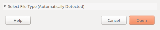
In this screenshot Open is the default button but it does not have focus.
CDrummond
on 3 Apr 2018
Ah yeah he is right, look this is ambiance GTK3 in Gedit
Just pressed closed and did not do any focus cycling via tab
Feichtmeier
on 3 Apr 2018
In this screenshot Open is the default button (coloured orange), and it has focus (orange glow).
This is because "Open" is styled as "suggested-action". We use green for those buttons, but "Save As..." is not a suggested action.
I understood what you are asking, but I am not convinced with the change. Default action is already highlighted at the beginning. On gedit if you press tab twice, selection ring goes to "close without saving" even on Adwaita.
At this point, the bold text on Save As does not make any sense anymore, since if you press enter the action would be to close, not to save. I think this tab behavior" is just a problem with the windows structure, not with the theme
clobrano
on 3 Apr 2018
The bold text would follow the default button. When a button has focus it is also the default button (therefore focus ring + 'default indicator'). When no button has focus - then the bold font (or some other indicator) would signify which is the default.
Focused buttons can be activated withe spacebar or return/enter key.
Default buttons can only be activated with return/enter key.
CDrummond
on 3 Apr 2018
therefore focus ring + 'default indicator'
So either one of focus ring or default indicator is redundant. Instead when a button other than default is selected, we will have two buttons styled differently. Which one will be activated on enter?
When no button has focus - then the bold font (or some other indicator) would signify which is the default.
Are we sure about that? I have no evidence that, for sure, if no button has focus, the default one is pressed on enter.
Current behavior looks fine to me. If you want to activate the default do not press tab first.
clobrano
on 3 Apr 2018
I think you are getting hung up on this one specific dialog. Look at Geary's Accounts settings dialog (the one with the IMAP settings, etc). Here Save is the default button - but it does not initially have focus. If I use the United-Ubuntu theme, this Save button is given an orange background. Pressing Enter does indeed activate the Save button even when another widget has focus.
CDrummond
on 3 Apr 2018
@clobrano
So either one of focus ring or default indicator is redundant. Instead when a button other than default is selected, we will have two buttons styled differently. Which one will be activated on enter?
Button with default indicator (e.g. bold) will be activated on Enter
Button with focus ring will be activated pressing Spacebar
Or do you think its better to just not indicate which will be activated with Enter?
CDrummond
on 3 Apr 2018
Button with default indicator (e.g. bold) will be activated on Enter
Button with focus ring will be activated pressing Spacebar
I didn't know this combination, but I cannot reproduce it. If I select another button and press enter, the default one is not activated, but the selected one is.
clobrano
on 3 Apr 2018
As stated, if a button has focus its is the current default button also. So:
No button has focus - there _can_ be a default button
A button has focus - it is the default button
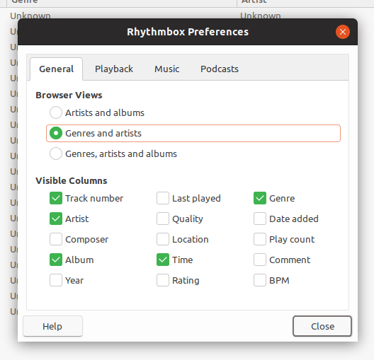
Look at Rhythmbox's preference dialog. Initially the notebook tab has focus, and not a button. But if you press enter Close is activated => Close is the default button. If I press the spacebar, nothing happens - as no button has focus. I can now tab to the Help button. If I press spacebar, it is activated. If I press Enter it is also activated (as it is the current default button).
In this situation we'd have:
- Initially tab has focus ring,
Closehas default button indicator - After tabbing to the
Helpbutton - it would have both the focus indicator and default button indicator (because it is the currently focused widget, and the current default button).
United-Ubuntu seems to theme Rhythmbox correctly - as in the _current_ default button is coloured orange
CDrummond
on 3 Apr 2018
What I said is that with a button selected, pressing spacebar did nothing. I guess it depends on the application.
Anyway, I'm a bit more convinced now, at least it should not harm
clobrano
on 3 Apr 2018
@clobrano Ah, OK - must admit I wasn't sure about your comment. But try Rhythombox's preferences dialog. Checks/radios react to spacebar, as well as buttons (in fact most widgets do).
CDrummond
on 3 Apr 2018
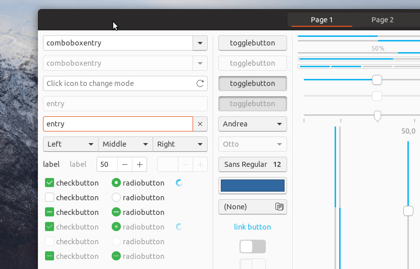
I made some tests. I was surprise to see that default style class moves from button to button pressing tab or arrow keys. Below I just changed the font to bold for "default" button, as you can see it moves with selection ring
using bold is not an option, since with small button it changes the size of the button itself.
Here again with a different color
It was OK for me to use bold style in theory, but changing color is weird, so I'm not sure what to do.
@madsrh any though?
clobrano
on 3 Apr 2018
Orange text is never the answer :joy:
Would a thicker dark border work as the default button indicator? My initial thought was gray just to avoid it stealing too much focus like in United.

...but it could be orange or green too 🤔
 madsrh
on 3 Apr 2018
madsrh
on 3 Apr 2018
The problem with the thick border is that you loose the shadow effect.
What about something more subtle? Kvantum on some styles draws a small rectangle in the bottom right corner of the default button:
CDrummond
on 4 Apr 2018
@CDrummond I was aiming for more subtle ;) but yes, that would be very non intrusive 👍
madsrh
on 4 Apr 2018
I'd like but it would be complicated to do, it's very likely a background-image
clobrano
on 5 Apr 2018
Since you digged a bit into it, I shamelessly assigned you to it :open_mouth: :grin:
Feichtmeier
on 20 Apr 2018
green (success-color) colored border.
You can see that there is a superposition with the orange selection. I tried also removing the orange from default button, but it looks weird when the window has other kind of widgets too
Here with ash ($ash: #878787;) in place of green. Better not use darker colors to don't compromise the box-shadow
clobrano
on 22 Apr 2018
Great work @clobrano 👍
The orange+green mix is weird to me and I agree with you on removing the orange selection.
I think ash looks really good 😄 It's sublte, but a good solution. What do you think @CDrummond ?
madsrh
on 22 Apr 2018
I'm no designer - but the ash version looks good to me. Its subtle, but does give an indication without being in your face.
CDrummond
on 22 Apr 2018
And ash be :+1:
clobrano
on 22 Apr 2018
Just one more thing. You might have noticed that I also changed selection ring style from continuous line to dashed, so that the superposition of border and selection ring itself is less strong. What do you think?
clobrano
on 22 Apr 2018
👍 I think it's easier to understand than the solid border for UX
madsrh
on 23 Apr 2018
I like that. Because I was already about to report my dislike of the selection ring xD
At the moment the position looks almost like there is another layer on the button. With the dotted line this impression should vanish :grin: +1
Feichtmeier
on 23 Apr 2018
Great :), so PR is ready, I'm going to propose it
On 23 April 2018 at 08:29, Feichtmeier notifications@github.com wrote:
I like that. Because I was already about to report my dislike of the
selection ring xD
At the moment the position looks almost like there is another layer on the
button. With the dotted line this impression should vanish 😁 +1—
You are receiving this because you were mentioned.
Reply to this email directly, view it on GitHub
https://github.com/ubuntu/gtk-communitheme/issues/306#issuecomment-383468436,
or mute the thread
https://github.com/notifications/unsubscribe-auth/ACwAHlBuqZvcePAZLfZkSSpMJRchFuOaks5trXThgaJpZM4TDbuT
.
clobrano
on 23 Apr 2018
closed by #355
clobrano
on 23 Apr 2018
Could we look at this black border one more time?
I think it looks a bit unfinished. Any other ideas @madsrh ? Maybe a green button?
Feichtmeier
on 8 Aug 2018
Maybe a green button?
It will clash with suggested action if available in the windows. Default action is very similar to selected button, since it can move from one button to the next pressing tab.
clobrano
on 8 Aug 2018
How about a bold font?
Edit: I've think this "default" button is also jumping around. Is this intended?
It seems like it jumps with the focus (press tab)
Feichtmeier
on 8 Aug 2018
How about a bold font?
Bold font will increase the label space, resulting in the button to expand if it's too small
Edit: I've think this "default" button is also jumping around. Is this intended?
yes, see my comment above ;)
Being a sort of indication, we can try with some blue, but I won't respond in case of mutiny :D
clobrano
on 8 Aug 2018
I think it is the combination of the dashed line with the black border that made me come up with all these annoying requests :)
I wonder why has adwaita not these default button indicators Oo
Maybe we can just remove it? :see_no_evil:
Feichtmeier
on 8 Aug 2018
Maybe we can just remove it? see_no_evil
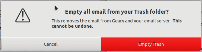
I don't think it would be a good move. It shows what happen if the user press enter without touching anything before. I know it's a bit annoying if the user press tab instead, but it's useful in cases like below...
...where I tabbed to move selection ring somewhere invisible, but if I do press enter, it's "save" button that is pressed
clobrano
on 8 Aug 2018
Ah, so it does not leave the part of the UI - okay.
How about moving the dashed line back to the outer line then? As long as the user tabs-around inside the buttons focus and default indicators have the same meaning.
We could use a dashed $border_color line for the default indicator and the orange dashed line for the focus ring. So they overlap each other and we dont have these two borders - which really mess up the wonderful button look in my opinion
Feichtmeier
on 8 Aug 2018
How about moving the dashed line back to the outer line then?
How would you remove the outline only if there is the default selector?
clobrano
on 8 Aug 2018
Simple suggestion - could a (light grey?) underline be added below the text? That would be a subtle indicator.
CDrummond
on 8 Aug 2018
Ah sorry bad writing skills:
Default indicator: Black solid border (now) -> Dashed $borders_color (idea)
Focus ring: Transparent orange dashed line with -3px margin (now) -> full orange or blue dashed line with 0 margin (idea =))
Feichtmeier
on 8 Aug 2018
Focus ring: Transparent orange dashed line with -3px margin (now) -> full orange or blue dashed line with 0 margin (idea =))
I think it's a nice idea, I was exploring it yesterday a little. The problem is the radius that, once the focus ring is big as the button border, looks different than the one of the button :(
maybe full orange is a little too much though
clobrano
on 8 Aug 2018
The current color looks again a bit like salmon :laughing:
Could you point me to the code so I can play around too? :play_or_pause_button: =D
Feichtmeier
on 8 Aug 2018
This one I guess
clobrano
on 8 Aug 2018
(it actually looks better on the real screen than with peek which is pretty low res)
Orange text color for the default button
Orange dashed line with -1px (that's actually right on the border) for the focus ring
@madsrh @clobrano better would be if you test it: https://github.com/ubuntu/yaru/pull/695
With peek everything looks washed out : /
Feichtmeier
on 8 Aug 2018
Sure it's more evident than current black border and I like orange label, but I'm not convinced by
- dashed selection ring over black button border
- orange is still the color of selection, while default is more indication, but this is a minor problem
With peek everything looks washed out : /
if you do a PR, I'll try it
clobrano
on 8 Aug 2018
I _think_ this issue should be re-opened. With the new Yaru being closer to Adwaita, this issue is now present once more. FWIW, I reported this Adwaita issue a few months ago - https://gitlab.gnome.org/GNOME/gtk/issues/1611
CDrummond
on 12 Sep 2019
I have the same idea expressed here :)
clobrano
on 12 Sep 2019
Related issues
madsrh
·
3Comments
 sicklylife-jp
·
3Comments
sicklylife-jp
·
3Comments
 chrisjbillington
·
3Comments
chrisjbillington
·
3Comments
 mivoligo
·
3Comments
Feichtmeier
·
3Comments
mivoligo
·
3Comments
Feichtmeier
·
3Comments
Most helpful comment
green (success-color) colored border.
You can see that there is a superposition with the orange selection. I tried also removing the orange from default button, but it looks weird when the window has other kind of widgets too
Here with ash ($ash: #878787;) in place of green. Better not use darker colors to don't compromise the box-shadow
