Scratch-gui: Alerts for hardware and other info: overall design
Overview
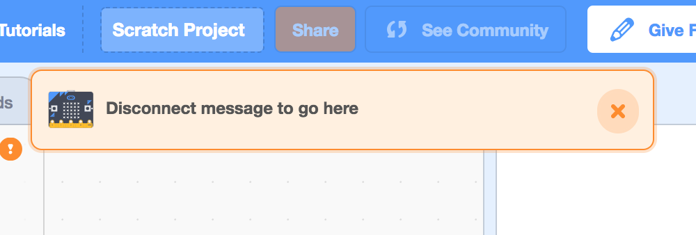
We need a way to tell Scratchers when their hardware extension device loses connection.
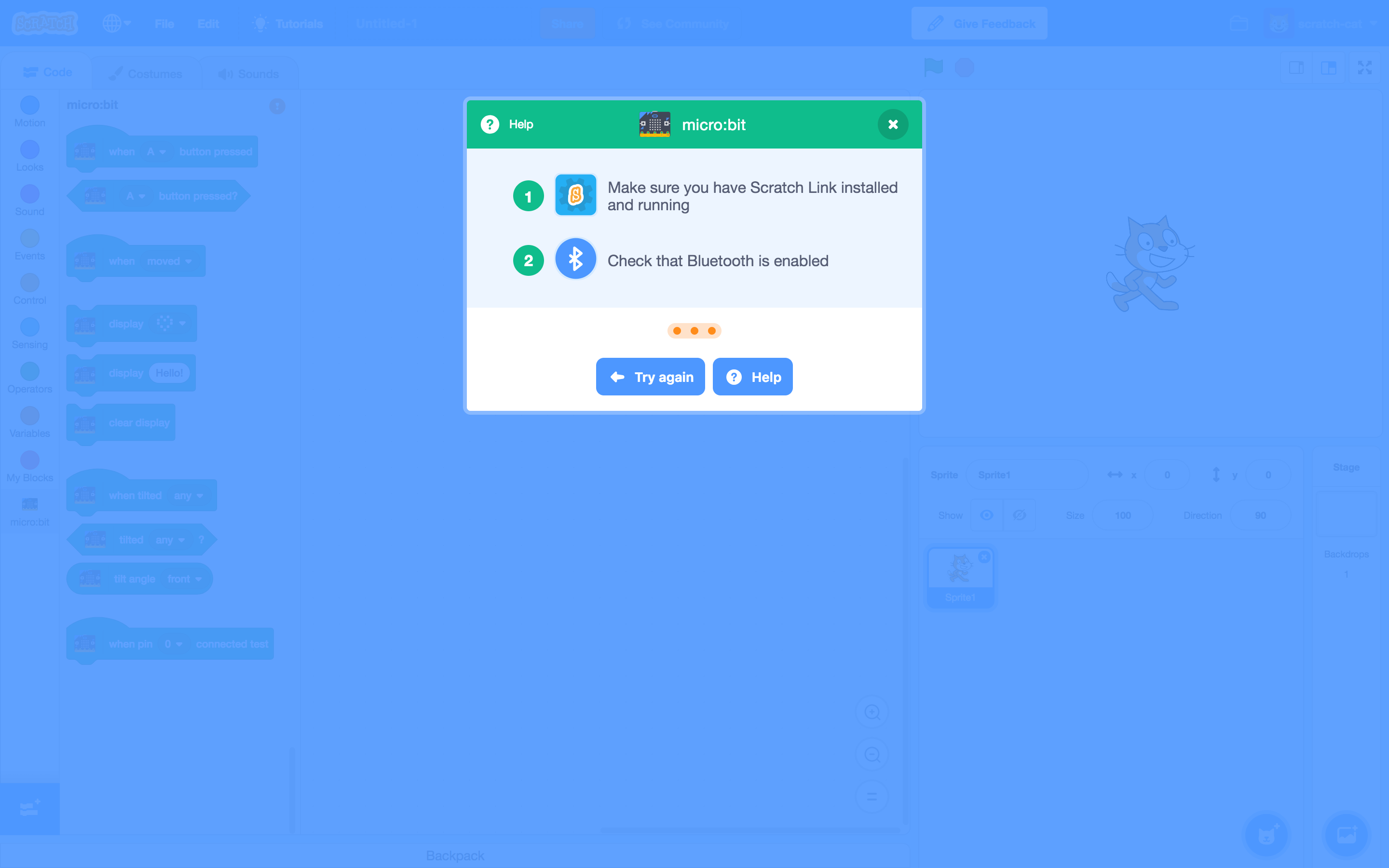
This design is for an alert message which directs users to the device modal.
Current Scope
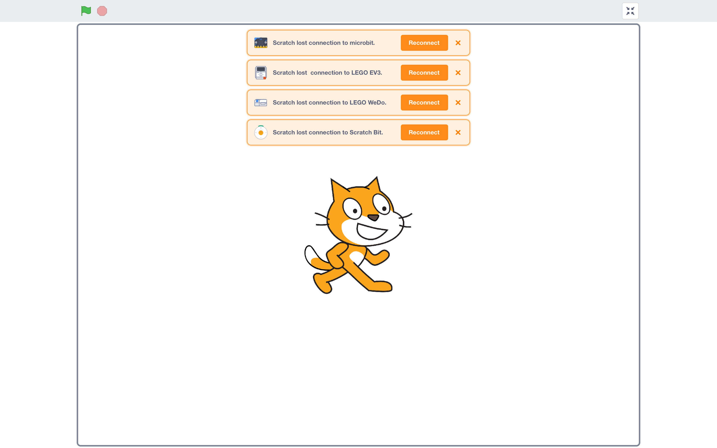
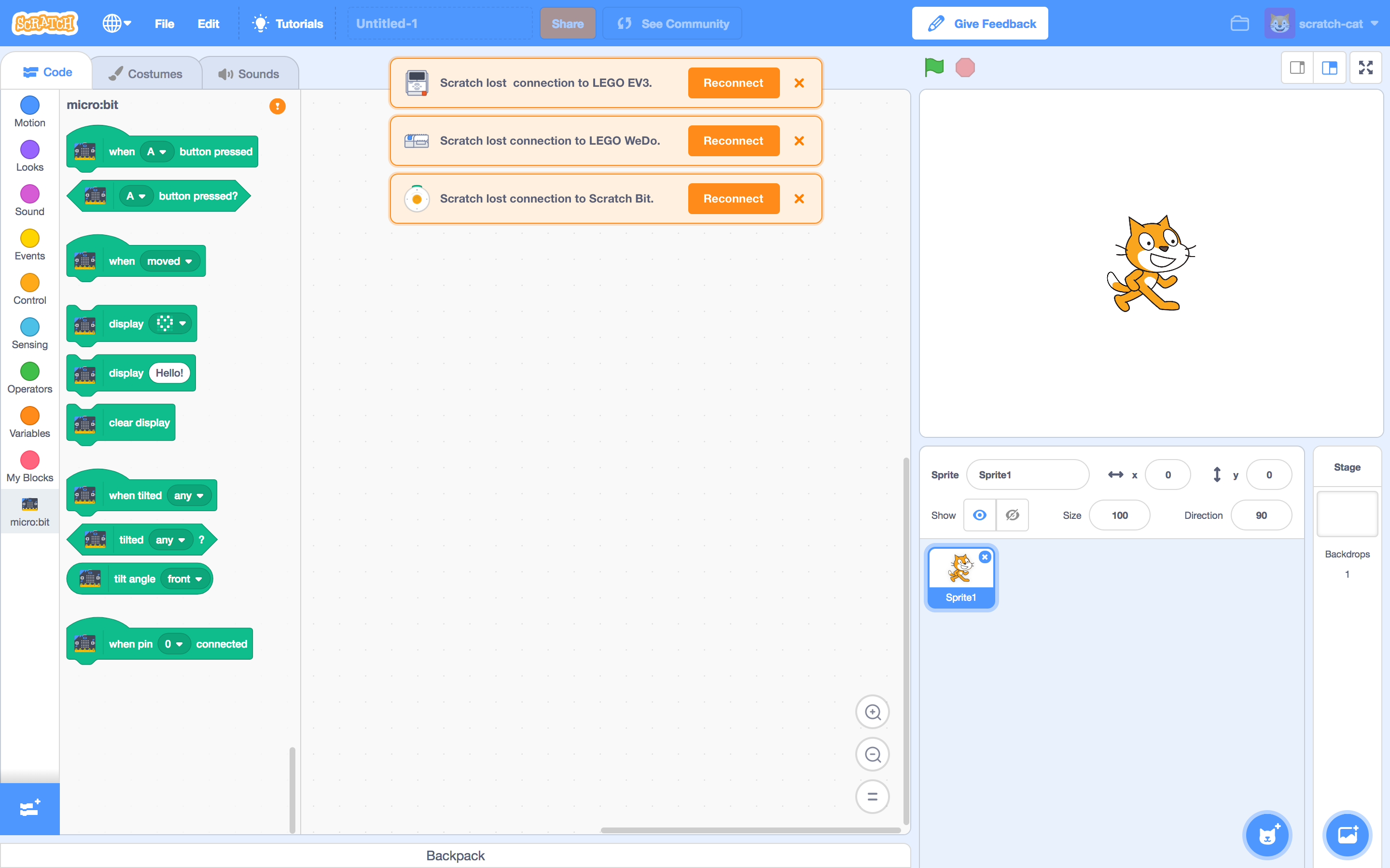
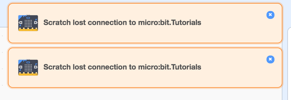
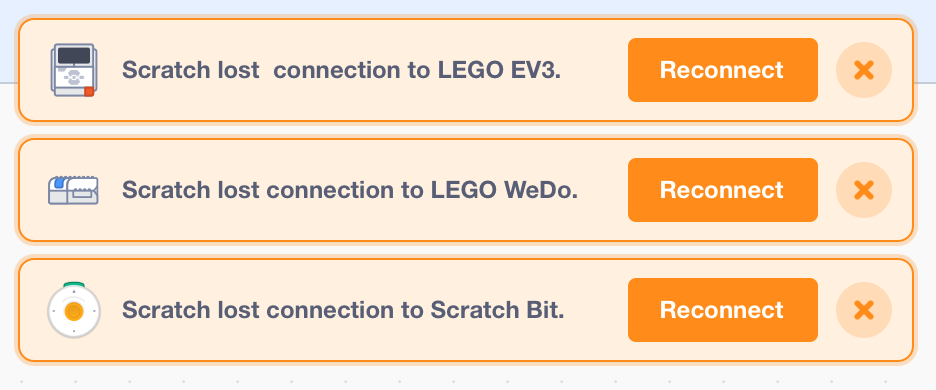
The alert appears when an extension device loses connection.
Clicking "x" dismisses the alert.

Clicking "reconnect" triggers the device modal. The original alert should disappear.
The alert can also appear in full screen stage mode.
Clicking "reconnect" takes you back to the editor page w/ device modal.

More than one alert can appear at once. Multiple alerts should stack.

Stacking behavior persists in full screen stage.
Although multiple alerts case is probably rare... the stacking solution isn't ideal. We might revisit a solution that doesn't dominate the entire workspace.
Future Considerations
Extensibility
Alerts could also be useful in other use cases:
- Downloading/uploading confirmations
This case includes a "progress" alert and a "success" alert.


(Success alert should disappear on a timer.)
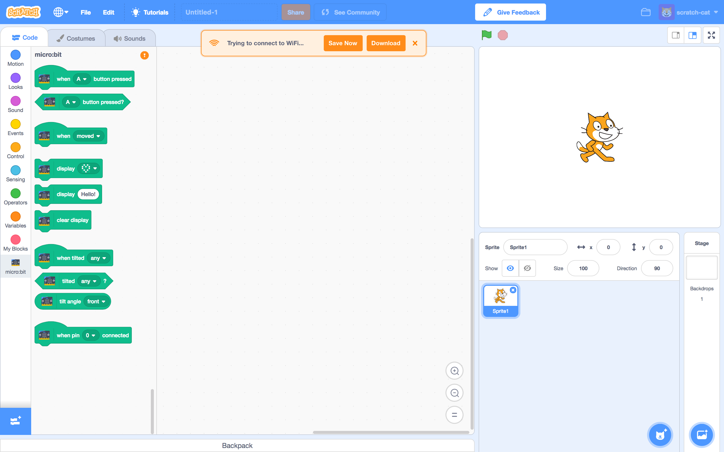
- Lost wifi connection
Other Extensions Messaging
There are a couple situations where we should communicate that hardware is not connected, with or without alerts.
- What happens if a Scratcher loads a project with hardware extensions, without a device already connected?
- Is this useful for other extension errors, e.g. video sensing?
- How does this system work with the project page?
Specs
Sizing + Colors
Minimum width is 448px. For the smaller size, min width is 200px.
Ideally, text shouldn't be longer than one line. If it needs to, it can wrap to a 2nd line.
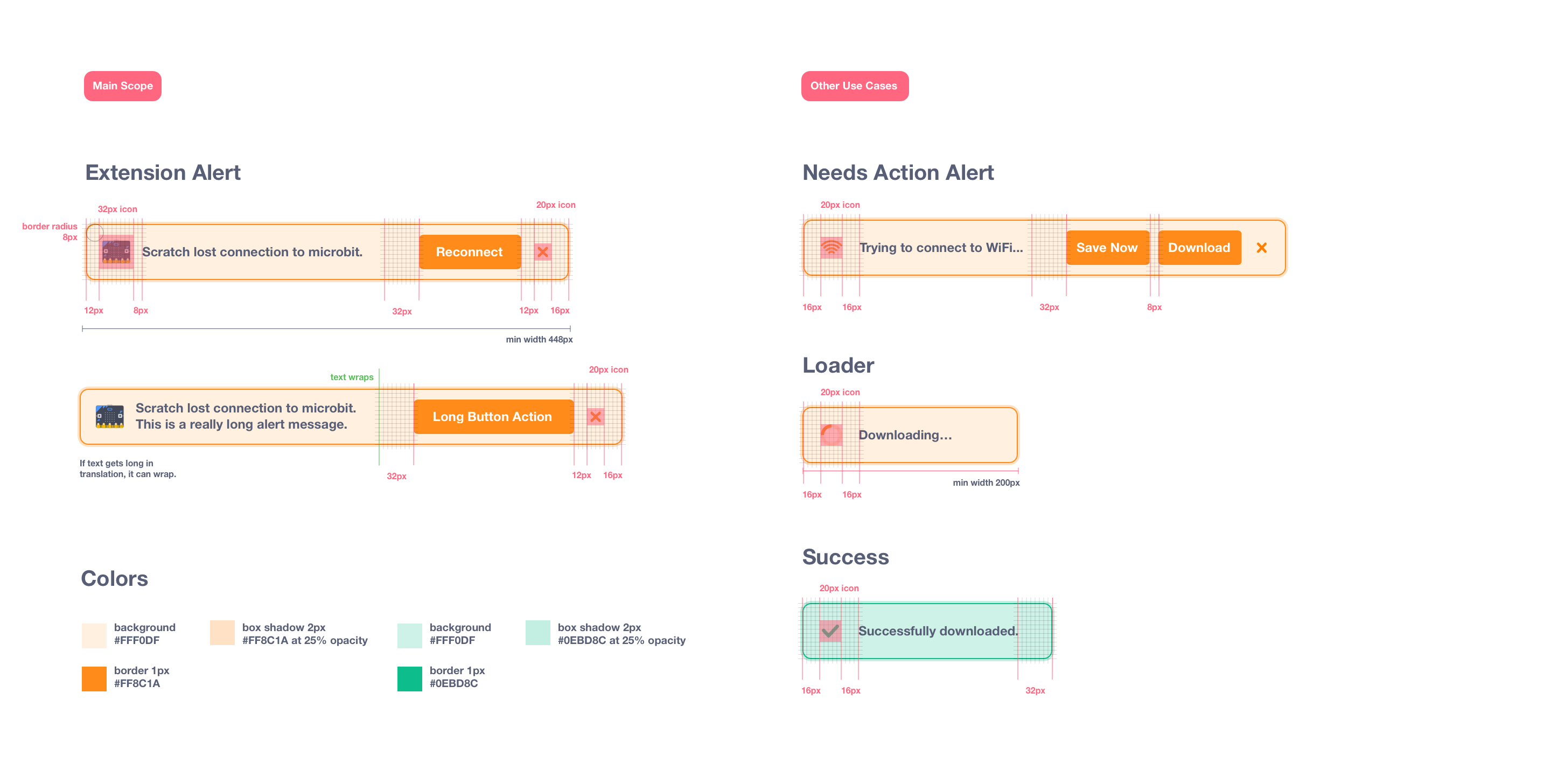
Positioning
Alerts are centered within the code stage.
First alert is 64px from the top of the page.
Multiple alerts have 8px of spacing between them.
When the code stage stage shrinks, the alert is centered within the entire window instead, so that it doesn't lose width.

R1 Animation: https://codepen.io/kathymakes/pen/BPXxWB
R1 Mockups: https://projects.invisionapp.com/d/main#/projects/prototypes/15193635
 kathymakes
All 17 comments
@kathymakes - Looks great! Thanks for speccing this out!
One more thing we should add to future considerations is the UX on the Project page view. Both when you first open a project that uses a hardware extension, but also once you have connected a device in the Editor view and then switch back to the Project page view (by clicking the "See Community" button).
 carljbowman
on 23 Aug 2018
carljbowman
on 23 Aug 2018
Other warnings:
- Cloud variables cannot have text
- Info about cloud variables when first created
 kyleplo
on 25 Aug 2018
kyleplo
on 25 Aug 2018
How about a red color, as well as orange/yellow and green.
Also, a "X" on success alerts, to close the alert before it times out.
 chexbox
on 25 Aug 2018
chexbox
on 25 Aug 2018
Reupdated spec & images.
kathymakes
on 27 Aug 2018
Progress is being made via PR https://github.com/LLK/scratch-gui/pull/3143.
Still to do in further PR's:
- hook up a Reconnect button to enable reconnecting to a disconnected peripheral
- multiple alerts
- add icons (for peripheral and for close button)
- add string localization
- add custom styling for different types of alerts (i.e., error, success, etc)
 evhan55
on 17 Sep 2018
evhan55
on 17 Sep 2018
Progress continued via PRs https://github.com/LLK/scratch-gui/pull/3209 and https://github.com/LLK/scratch-vm/pull/1607.
Still to do in further PR's:
- hook up a Reconnect button to enable reconnecting to a disconnected peripheral
- add string localization (i.e.
formatMessagecompatible) - add an API for different types of alerts? (e.g.
this._runtime.emitPeripheralError(this._extensionId)) - add custom styling for different types of alerts
evhan55
on 25 Sep 2018
Some styling notes from @kathymakes:
- the x has an icon that we can use instead of a typed "x"
- the dropshadow should be 0 y offset and 0 blur, and some amount of spread... maybe 4 px?
evhan55
on 27 Sep 2018
Thanks @evhan55 !
Here's the "X" icon, which is the same svg "X" we use for modals.
kathymakes
on 27 Sep 2018
Thanks very much @kathymakes !
evhan55
on 27 Sep 2018
@kathymakes do you know if the orange close icon appears elsewhere in the GUI already?
Also, does this border work for you (ignore the styling and 'Tutorials' 😄 ):
evhan55
on 28 Sep 2018
@evhan55 Yeah, border looks good! :)
The "X" svg I sent you is the same one we use for modals, but we dont have any orange ones elsewhere. It might be more extensible for more alerts in the future.
Here's the white "X" in all of our modal windows...
It's contained in a circle like this:
kathymakes
on 1 Oct 2018
@evhan55
I'm thinking it might also be good to style the "X"s same as the modal, for consistency.
Do you think we could try it with the circle?
These sketches have a 28x28 circle with orange at 20% opacity.
kathymakes
on 1 Oct 2018
@kathymakes Sure thing! Circle for consistency sounds good.
@rschamp , is it cool for me to make changes to CloseButton and it's CSS to add an orange mode?
evhan55
on 2 Oct 2018
@kathymakes How is this? When you hover over the x button, it grows the same way it grows on other close buttons:
evhan55
on 3 Oct 2018
@evhan55 Ah so sorry I never saw your message, it got lost in my notifications! Yeah, that sounds good for consistency - and it's looking really nice
kathymakes
on 16 Oct 2018
Unassigned myself as @benjiwheeler is taking over the generalized alerts system now
evhan55
on 5 Nov 2018
Closing because these are implemented in code; next, they need to have their CSS brought into line with this spec. Tracking that in https://github.com/LLK/scratch-gui/issues/3686
 benjiwheeler
on 14 Nov 2018
benjiwheeler
on 14 Nov 2018
Related issues
 ericrosenbaum
·
4Comments
ericrosenbaum
·
3Comments
ericrosenbaum
·
4Comments
ericrosenbaum
·
3Comments
 davidaylaian
·
4Comments
kyleplo
·
4Comments
davidaylaian
·
4Comments
kyleplo
·
4Comments
 chrisgarrity
·
4Comments
chrisgarrity
·
4Comments
Most helpful comment
Some styling notes from @kathymakes: