Openstreetmap-carto: Differentiating sport infrastructure (like pitches) by type of sport
Currently all sport fields are shown in the same style. It is very difficult to distinguish the different sports. Furthermore there are good sport icon sets out there: http://wiki.openstreetmap.org/wiki/Category:Sport_icon Comparing the different olympic pictograms http://www.nytimes.com/interactive/2010/02/24/sports/olympics/pictograms-interactive.html I suggest to take the icon sets of Olympic games 1972 (munich) http://olympic-museum.de/pictograms/Picto1972.htm adopted to the constraints of 16px
 matthijsmelissen
All 96 comments
For some sport (basketball, football, rugby, soccer, tennis) there are working line renderings available. This link show soccer and tennis lines:
http://tile.openstreetmap.fr/?zoom=19&lat=50.77898&lon=6.0707&layers=B0000000FFFFFFF
The code is here:
https://github.com/cquest/osmfr-cartocss
 HolgerJeromin
on 5 Aug 2014
HolgerJeromin
on 5 Aug 2014
The line rendering itself is fine and self-explanatory, though I would prefer not to add plenty new colours to the main map.
 polarbearing
on 6 Aug 2014
polarbearing
on 6 Aug 2014
I think a longer term goal (no pun intended) is for the osm fr style.
Icons might be nice but most of the well known ones will be copyrighted/trademarked.
 Rovastar
on 6 Aug 2014
Rovastar
on 6 Aug 2014
Oh meant to say the line style is for v3.x as it will require adding new stuff to the database.
Rovastar
on 6 Aug 2014
How about adding icons for the most used sports to begin with? Soccer, tennis, baseball, basketball, all have good icons that can be used from iD editor's icon set. Just like iD the icon can be put in the middle of the pitch.
https://github.com/bhousel/maki/blob/mb-pages/src/soccer-24.svg
https://github.com/bhousel/maki/blob/mb-pages/src/tennis-24.svg
https://github.com/bhousel/maki/blob/mb-pages/src/baseball-24.svg
https://github.com/bhousel/maki/blob/mb-pages/src/basketball-24.svg
 boothym
on 30 Sep 2016
boothym
on 30 Sep 2016
Unfortunately they all are 24px, while we use just 14px - this is huge difference. If you want to see how they would look in this style, try to rescale them and save as PNG.
 kocio-pl
on 30 Sep 2016
kocio-pl
on 30 Sep 2016
I linked to them because I thought you'd want the largest svg size available, but here's what they look like at 14px:


There's also https://github.com/mapbox/maki/tree/master/icons with more stick figures instead of the bat/ball icons.
boothym
on 30 Sep 2016
I'm surprised, they look quite nice and are perfectly recognizable! That's the power of skilled designer probably. =}
Still we need to decide if we want to use icons or field markings.
kocio-pl
on 30 Sep 2016
I'm very strongly for icons. Field markings are poorly recognizable and potentionally ambigious. Also, the field markings are not actually based on OSM data so they are basically lies, stricly spoken. The real field markings might either not exist at all or they are just wrong.
For example, not all soccer fields actually have field markings, especially small ones. Also, the field markings will be hard to be understood for people not knowing a particular sport very well.
Also, field markings do not fit into the “tradition” of the default OSM style of only showing what's actually there in the data, rather than “interpreting” stuff into the data which simply isn't there.
On the other hand, icons are WAY more recognizable, even by people not knowing awfully much about the sport. Also, the default style already uses icons for everything, so this just seems consequent. :-)
 Wuzzy2
on 30 Sep 2016
Wuzzy2
on 30 Sep 2016
For example, not all soccer fields actually have field markings, especially small ones.
Maps are no rendered satellite images.
Also, the field markings will be hard to be understood for people not knowing a particular sport very well.
On the other hand, icons are WAY more recognizable, even by people not knowing awfully much about the sport.
As an counter example there are many racket sports. I am not sure which is meant by the tennis icon from boothym. But the line marking is pretty unique.
Also, field markings do not fit into the “tradition” of the default OSM style of only showing what's actually there in the data, rather than “interpreting” stuff into the data which simply isn't there.
Think of the markings as a big icon :-P
HolgerJeromin
on 30 Sep 2016
For example, not all soccer fields actually have field markings, especially small ones.
Maps are no rendered satellite images.
Exactly. And I think field markings try way too hard to look “authentic”. Under the same logic, OSM could attempt to draw road markings on roads. I know, I know, field markings look cool, but they are not exactly useful for a map when you actually want to read information from it.
Icons are more abstract, therefore a more logical choice for a map.
As an counter example there are many racket sports. I am not sure which is meant by the tennis icon from boothym. But the line marking is pretty unique.
I guess the tennis icon stands for “tennis”. ;-) You already said “tennis” by yourselves! xD Also because this is probably the most well-known one.
Yes, it's probably hard to draw an icon for every sport in existance but OSM could just start with the most common ones while adding icons later. Sports without an icon could maybe get a generic icon or no icon.
The homepage really should improve its map key because the default style has so many different icons, but almost no icon is actually explained. :-( In fact, the map key is very, VERY incomplete (sadly).
Creating a key for the icons would (hopefully) not be too hard (it just needs to be done).
But creating a key for the markings or all sport pitches would be overkill and therefore it would be pretty unlikely to happen. I fear that Average Joe will fail to recognize the lion's share of possible sport pitches.
Think of the markings as a big icon :-P
Pfff, this is weak. The markings are nothing like icons. Icons are not rotated and have a fixed size and are always put on a point. Markings can be rotated, are made of lines and differ in size and take an area.
Wuzzy2
on 1 Oct 2016
As an counter example there are many racket sports. I am not sure which is meant by the tennis icon from boothym. But the line marking is pretty unique.
Other racket sports have slightly different rackets (e.g. longer handle in badminton) and most of them are played indoors. If you see a pitch in OSM with a racket and ball, and it's not inside a building it's highly likely to be tennis (given 230,000 courts have been mapped!).
Anyway, the main thing is that I think icons should be added as soon as possible for the most important sports in OSM. They presumably are easier to add than markings and would definitely improve the map styling.
boothym
on 1 Oct 2016
Is someone able to render these so we can see what they look like? @kocio-pl ?
boothym
on 6 Oct 2016
What should the colors be (re)used then?
I hope pitch color will be made less dominant soon, but green symbols with green label could be hardly readable.
kocio-pl
on 6 Oct 2016
I was thinking basically how they are just now - dark gray/black (with transparency)?
boothym
on 6 Oct 2016
Can you please also add an icon for riding arenas (tagged leisure=pitch + sport=equestrian :horse:) ?
The taginfo statistics for leisure=pitch + sport=* is:
soccer; 276k
tennis: 234k
baseball: 91k
basketball: 76k
multi: 32k
_golf: 23k (but golf courses shall not be tagged as pitches)_
equestrian: 15k :horse:
volleyball: 12k
athletics: 7k
The icon may be:
a) horse shoe
b) horse head :horse: _<- github horse head_
c) horse without rider
d) horse with rider :horse_racing: _<- github horse rider_
For a) and b) here are two possibilities shown together with the other icons:
 from http://publicdomainvectors.org/en/free-clipart/Horseshoe-silhouette-vector-graphics/14822.html
 from https://commons.wikimedia.org/wiki/File:1_Cav_Shoulder_Insignia.svg
 from https://github.com/bhousel/maki/blob/mb-pages/src/soccer-24.svg
 from https://github.com/bhousel/maki/blob/mb-pages/src/tennis-24.svg
 from https://github.com/bhousel/maki/blob/mb-pages/src/baseball-24.svg
 from https://github.com/bhousel/maki/blob/mb-pages/src/basketball-24.svg
For c) and d) I was not able yet to produce a good looking 14px png export from any of the free svg sources I have found. Perhaps my fault, I am not an experienced icon designer. But I nevertheless wanted to submit this request already. Here are some horse icons:
- https://commons.wikimedia.org/wiki/File:Horseicon.svg
- https://github.com/openstreetmap/iD/blob/c8e4f76c230512dc82dc060bf337e3ba489b113e/svg/iD-sprite.src.svg used in iD for bridleway and riding route
- https://github.com/mapbox/maki/blob/master/icons/horse-riding-15.svg for leisure=horse_riding
- https://de.wikipedia.org/wiki/Datei:Sinnbild_-_Reiter,_StVO_1970.svg
- https://commons.wikimedia.org/wiki/File:Sinnbild_Reiter.svg
- https://commons.wikimedia.org/wiki/File:Ratsastuspaikka_774f_tunnusosa.svg
Also please take into account that pitches can be indoors (in a hall or under a roof), in these cases markings can not be used, but icons probably can.
 Hufkratzer
on 1 Feb 2017
Hufkratzer
on 1 Feb 2017
We would need to be careful here because it might not be clear what feature the icon applies to, i.e. the pitch itself or the facility the pitch is part of.
Also note the horse as a symbol - no matter if with a rider or not - can mean a lot of different things and does not necessarily imply something sport related.
 imagico
on 1 Feb 2017
imagico
on 1 Feb 2017
Not every riding arena (equestrian pitch) is part of a riding facility or anything similar, like also not every other kind of pitch is part of a sports centre, leisure park or so. Especially in these cases it would be helpful if the map would show what kind of pitch it is.
I agree that it would be good if the icon would look related to equestrian sports, perhaps a jumping horse, but I don't know if that can be done in a 14px icon.
Hufkratzer
on 1 Feb 2017
@kocio-pl I know I've asked before but any chance the icons I posted could be rendered?
I noticed there is a 0.3 opacity white outline to the black icon in the svg which I had to remove first.
Preview I created in photoshop:

boothym
on 13 Nov 2017
Sorry, I'm currently busy with many other problems, which I think are more important.
It's not clear what people would decide, but the best chances would be to create 14 px versions of icons (leisure green is probably better than black - and we already have golf icon), create the code, test them and make a PR with renderings. Could you try to do it?
kocio-pl
on 13 Nov 2017
I was looking at Taginfo sport=* key list to choose which tags can have an special icon in combination with leisure=sport_centre / leisure=pitch . It's very interesting, beacuse there are some sports which I even didn't hear about earlier (eg. netball or gaelic games), more popular than eg. boxing or car racing. I think we should prepare a list of sport=* tags which we want special icon for, and for the rest use just generic leisure-green dot for leisure=sports_centre (see: https://github.com/gravitystorm/openstreetmap-carto/issues/2930) and current "blank" leisure=pitch rendering.
Which sport centres and pitches you would like to see with a special icon?
 Tomasz-W
on 11 Jul 2018
Tomasz-W
on 11 Jul 2018
Line markings are still not rejected #1126
HolgerJeromin
on 11 Jul 2018
@HolgerJeromin We need sport icons for pitches anyway:
- there are 32k of
leisure=pitchnodes - there are also examples of linear ways mapped between two soccer goals, because there is no psychical "pitch", but just these two goals placed somewhere on a bigger grass area.
Examples:
https://www.openstreetmap.org/way/488863988
https://www.openstreetmap.org/way/454349719

Unfortunely, most of mappers draw these "wild pitches" as leisure=pitch areas, which is wrong because theirs outlines are just imaginary and false.
Line markings propably won't resolve it (but of course we should try them on test renderings, besides of icons).
Tomasz-W
on 12 Jul 2018
there are also examples of linear ways mapped between two soccer goals,
This is not documented
https://wiki.openstreetmap.org/wiki/Tag:leisure%3Dpitch
HolgerJeromin
on 13 Jul 2018
As tagging pitches as nodes and ways was always allowed by infobox, but not described, I've added some tagging instructions and examples:
https://wiki.openstreetmap.org/wiki/Tag:leisure%3Dpitch
So now it's documented.
Tomasz-W
on 14 Jul 2018
@Tomasz-W any chance you could come up with usable icons for basketball and tennis? It would help a lot with mistagging if they could have icons.
 Adamant36
on 25 Jul 2018
Adamant36
on 25 Jul 2018
@Adamant36 rescaled Maki icons:
 (baseball) -> Gist link: https://gist.github.com/Tomasz-W/ddcd4bb1b24650206414c97862cf0a1c
 (basketball) -> Gist link: https://gist.github.com/Tomasz-W/ff099f115b9b164a2f911d90c6d46be4
 (soccer) -> Gist link: https://gist.github.com/Tomasz-W/0a3692589f27fb524977c47076a54e40
 (tennis) -> Gist link: https://gist.github.com/Tomasz-W/56ca838fbcc41cf22843e51fa6d06532
I'll upload my alternative icons proposals later.
Tomasz-W
on 25 Jul 2018
Before we go into detail, do we think it would be desirable to add icons for specific sports?
matthijsmelissen
on 25 Jul 2018
I agree. This is old question, but still relevant.
kocio-pl
on 25 Jul 2018
As former pro player I may be biassed here, but IMHO On z19 or z18, maybe even z17 they should not hurt anyone.
Related to that if someone is looking closely than on z13 and definitely with no issue on z15 could easily spot stadiums https://www.openstreetmap.org/#map=15/50.0288/21.9980
As I live in the city I know where the sport gym for ~5000 spectators is, but could anyone else know looking at the above link? My guess is that sport icons could help with it.
 wmyrda
on 25 Jul 2018
wmyrda
on 25 Jul 2018
Before we go into detail, do we think it would be desirable to add icons for specific sports?
Seems to fit all of the criteria that applies to other icons. Soccer, tennis, baseball and basketball are all used at least 113,000 times. It would also discourage people from tagging soccer pitches as football.
The only negative I can see is that sport=soccer;rugby_union or sport=cricket;australian_football would not render any icon - unless it's possible to explode by semi-colon and then render two or three icons together?
boothym
on 25 Jul 2018
As former pro player I may be biassed here, but IMHO On z19 or z18, maybe even z17 they should not hurt anyone.
Line markings hurts even less as they does not collide. Screenshot zoom 17:

HolgerJeromin
on 25 Jul 2018
I'll repeat my question: What other sports you would like to see a special icon with for pitches?
Tomasz-W
on 25 Jul 2018
american_football is very popular in the US.
I like the idea of line markings, but I think it breaks down with baseball diamonds. It would be very difficult to get the orientation right and will probably end up with some strange renderings.
FYI, Apple Maps is evidently trying to do this:
https://techcrunch.com/2018/06/29/apple-is-rebuilding-maps-from-the-ground-up/

 meased
on 25 Jul 2018
meased
on 25 Jul 2018
I've been dealing with names on the map going against the naming rule a lot lately. Especially as it relates to sports pitches and miss tagging like name=tennis court, name=basketball court, etc. I think adding icons so people can spot tell what kind of court they are on the map by the icon would solve a lot of that.
@Tomasz-W outside of the main ones 9pin and 10pin obviously. Archery, badminton, volleyball/beach volleyball, billiards, canoe, chess (but got rejected already), equestrian, golf, handball, horseshoes, judo (could adapt its already used symbol), rowing (same symbol as canoeing?), running, scuba diving, shooting, skateboard, table tennis, yoga.
@meased either the French or the German style already has line markings. So it would be semi easy to adapt. I think there's already an issue here for it too. It would be interesting to know how Apple is approaching it.
Adamant36
on 26 Jul 2018
The french style did not solve this issue, they just omitted baseball line markings:

The football and soccer pitches have line markings, but baseball does not. (They also screwed up the orientation for football and soccer and frankly, it looks terrible...)
meased
on 26 Jul 2018
@meased My bad. It worked for the few pitches I tried it on. So I thought they had. I agree that it looks terrible though. In light of that, I retract my earlier statement about it ;)
Adamant36
on 26 Jul 2018
@Tomasz-W If icons for sports mentioned in post above will be added than I will be satisfied. Most important from them for me would be the one for multi so it can be added later on for gyms. Gyms in most cases can be adjusted for many sports like basketball, volleyball, handball, futsal (soccer in gym), badminton to name just a few.
wmyrda
on 26 Jul 2018
The german style has some fixes for this problem:

HolgerJeromin
on 26 Jul 2018
I actually considered lines as quite good idea and fine alternative to the icons, but when I see football field and tennis court I made up my mind. I would much rather see the icon in this cases as those areas look like electric coil of some kind...
wmyrda
on 26 Jul 2018
Please move discussion about pitch markings there: https://github.com/gravitystorm/openstreetmap-carto/issues/1126 . Let's discuss just the icons here.
Tomasz-W
on 26 Jul 2018
Icons proposals:
sport=baseball
(Maki)
 (@Tomasz-W)
sport=basketball
(Maki)
 (@Tomasz-W)
sport=soccer
(Maki)
 (@Tomasz-W)
sport=tennis
(Maki)
 (@Tomasz-W)
sport=american_football

sport=9pin/ 10pin/ bowls

sport=archery

sport=badminton

sport=voleyball/ beachvolleyball

sport=billiards

sport=canoe/ rowing

sport=chess
 (for ground pitches)
 (for tables)
sport=equestrian
 (JOSM icon)
sport=handball

sport=running

sport=scuba_diving

sport=shooting

sport=skateboard

sport=table_tennis

As I support the idea to add man-made gray sport=* icons for pitches and tracks, I'm not sure about leisure-green icons for certain leisure=sports_centre types. Won't be a generic green dot enough there? I'm worried that special icons for combinations with leisure=sports_centre may clutter the map. What do you think?
Tomasz-W
on 27 Jul 2018
As I wrote in https://github.com/gravitystorm/openstreetmap-carto/issues/2344, the proposed JOSM icon for sport=equestrian needs refinement. The current version doesn't look sporty at all, but rather looks like a beginner just before he falls off his horse.
Hufkratzer
on 27 Jul 2018
Once more: before starting to think about concrete icons, we should first decide whether we consider it desirable to add an icon for every single sport.
matthijsmelissen
on 28 Jul 2018
I consider it desirable because, as you explained at the beginning:
Currently all sport fields are shown in the same style. It is very difficult to distinguish the different sports.
We have more than 60 different icons for different kinds of shops. So why should 20 sports icons be a problem?
Hufkratzer
on 28 Jul 2018
On the one hand we should render some similar features the same to avoid map cluttering, but on the other hand we should render different objects differently to show theirs functions properly.
In this case I'm sure we should add these icons for pitches, because function of eg. soccer pitch is totally different than a skateboard one, and now they are both rendered the same. I'm just considering do we need special icons for different sports centre types, because very often they are mentioned in a club name, eg. _"Repton Boxing Club"_, so dot-rendering may be enough there.
Tomasz-W
on 28 Jul 2018
First I thought that there could be a problem with too many icons if many table_tennis tables are near together like here:

(https://www.openstreetmap.org/way/302613825)
But then I saw that for other objects like picnic_tables and benches this problem seems to have been solved, see here:

(http://www.openstreetmap.org/node/1894660341 in iD;
the small icons are from iD, the bigger ones (less) from carto).
I wonder why this kind of solution wasn't/isn't applicable for swimming_pool's (https://github.com/gravitystorm/openstreetmap-carto/issues/2870).
Hufkratzer
on 30 Jul 2018
In case of somebody will be interested in making a test renderings:
Tomasz-W
on 3 Aug 2018
What about sport=horse_racing on leisure=track?
Wiki:
- https://wiki.openstreetmap.org/wiki/Tag:sport=horse_racing
- https://wiki.openstreetmap.org/wiki/Riding
sport=horse_racing has > 2k uses just on tracks which is more than scuba_diving, canoe / rowing and billiards.each have in total and these tracks for horse_racing are quite large objects.
Examples:
- Hippodrome de Nancy-Brabois contains track1 and track2
- Epsom Downs
Icon could be something like
 (just a rough draft)
(:horse_racing: <- github horse_racing icon)
Hufkratzer
on 12 Oct 2018
(🏇 <- github horse_racing icon)
No, this is the horse racing icon of your browser/ operating system (list).
Win 10 is quite colorful for example:

HolgerJeromin
on 12 Oct 2018
@Hufkratzer, I think we could render a horse racing icon sports centers that have the sport=horse_racing tag. I don't don't recommend it on on tracks though due to the current issues we have with icons positions not rendering well if the area is round etc. Otherwise, it will render it will render in the middle or some other weird spot. If I remember correctly it was an issue on the Maptnik side that was supposedly fixed, but I've still been seeing it around sometimes. Its been a while though.
Adamant36
on 15 Oct 2018
I think most tracks (running, athletics, horse_racing, skateboarding, also motorsport tracks (highway=raceway's)) are currently not in sports_centre's, examples https://www.openstreetmap.org/way/192989911
https://www.openstreetmap.org/relation/6154664
If you render icons for leisure=sports_centre instead of leisure=track you will somehow force mappers to map sports_centre's where no sports_centre's are (or to nest sports_centre's) if they want the sport specific icons on the map. Is that desirable?
Also leisure=stadium has no icon; if you render sports_centre with an icon and stadium not, you may encourage mappers to retag stadium's with leisure=sports_centre; is that desirable? Examples:
https://www.openstreetmap.org/way/258815225
https://www.openstreetmap.org/relation/8129847
https://www.openstreetmap.org/way/146537002.
I can imagine that the placement of an icon may often be more complicated for tracks than for pitches or for sports_centre's, but If it's just a mapnik bug that hinders you to render icons for tracks, it may be better to wait until this bug is fixed, rather than to do it for sports_centre's instead. But when I look at this sports_centre it seems that the placement of icons works quite well:
https://www.openstreetmap.org/relation/8695416
Hufkratzer
on 15 Oct 2018
If I remember correctly it was an issue on the Mapnik side that was supposedly fixed, but I've still been seeing it around sometimes. Its been a while though.
@Adamant36
This was #2457 and is fixed and deployed. https://www.openstreetmap.org/way/96821031#map=19/50.76494/6.07436
HolgerJeromin
on 15 Oct 2018
Woho, I finally got the code for sports icons working. So expect some test renderings any day now. This ones been on the top of my list for a while now.

Adamant36
on 13 Nov 2018
Maki versus Tomasz-W icons. If people don't mind I think I'll do a PR for the main sports just to get to it implement and do the rest later. Since there's like 16 of them and it will take a lot more time otherwise.
Maki baseball

Tomasz-W baseball

Maki basketball

Tomasz-W basketball

Maki soccer

Tomasz-W soccer
Maki tennis

Tomasz-W tennis

Personally, I'm leaning more toward Tomasz-W's icons because they aren't mostly solid black. So they don't stand out as much.
Adamant36
on 20 Nov 2018
@Adamant36 In combination with leisure=pitch icons should be _man-made-grey_ (and in combination with leisure=sports_centre _leisure-green_)
Tomasz-W
on 20 Nov 2018
@Tomasz-W How come you think they should be man-made-grey for pitches? Last time I checked names on pitches are currently rendered in green. Plus its a leisure tag. Eveeything else leisure is green. Also, I'm not dealing with sports centers at this point. I want to figure out the icons were using and get pitches implimented first.
Adamant36
on 21 Nov 2018
@Adamant36 Imagine a big soccer training centre - if we would render both pitches and sports centres icons in leisure green, there will be just a chaotic bunch of green balls around, in my vision there would be man-made-grey pitches and green ball icon in sports centre middle. It was actually proposed initially: https://github.com/gravitystorm/openstreetmap-carto/issues/844#issuecomment-343980174, so it's nothing new. Another thing is that for single objects we should use man-made-gray and for more complicated ones leisure-green. I know this ticket is about piches but we have to think long-term.
Tomasz-W
on 21 Nov 2018
I think https://github.com/gravitystorm/openstreetmap-carto/issues/844#issuecomment-343980174 was just a lazy photoshop example, not a request to use black icons. I find grey icons quite odd as I can't see how something like "baseball" would be categorized as "generic" and not "leisure".
Could you explain your vision a little better? Perhaps a mockup?
meased
on 21 Nov 2018
And what about multi or comma separated value. In your case you don't add name but I have lot of example with complexe name and sub parts with pitch name
 geostonemarten
on 21 Nov 2018
geostonemarten
on 21 Nov 2018
I would try with sport icons for pitches rendered as green, but stadiums or other bigger sport entities with a reversed white icon on a green background - something like we do with bus stops and bus stations:

kocio-pl
on 21 Nov 2018
I would try with sport icons for pitches rendered as green, but stadiums or other bigger sport entities with a reversed white icon on a green background - something like we do with bus stops and bus stations:
Why??? that is not the case for all other icons in openstreetmap carto ...
geostonemarten
on 21 Nov 2018
Because this way we would keep the color for pitches while at the same time indicating that they are special (bigger).
kocio-pl
on 21 Nov 2018
@Adamant36 agreed, though my only concern with the Tomasz-W icons is the basketball being too similar to the soccer ball?
Do you mind rendering a pitch which has a name as well as a sport?
@Tomasz-W my image further up the thread was just a quick photoshop to try and get some progress on this issue (first comment in 9 months!) 😉 I'd go for green now that I've seen it rendered.
As for a big soccer training centre - it would be good to have some example renderings of both pitches and sports centres with sport=*:
- https://www.openstreetmap.org/way/145858940
- https://www.openstreetmap.org/#map=15/53.4238/-2.3678
- https://www.openstreetmap.org/way/428742471 (weird that the name doesn't render)
boothym
on 21 Nov 2018
So, green for the icons it is then.........Any feedback besides @boothym's on which set of icons are better?
@boothym, they do kind of look similar. I'm willing to go with Maki's soccer ball, if there is wider agreement.
Also, as I said above, I'm not doing sports centers until pitches get done and rendered. Its a lot less complicated that way and it has a better chance of not getting derailed before it gets merged.
Plus, we haven't even figured out the icons we are going with yet anyway. So, its kind of putting the cart before the horse.
If there's a problem with that, someone else is free to work on the issue.
Adamant36
on 29 Nov 2018
My picks of icons after test renderings:
- baseball -> Tomasz-W
- basketball -> 50/50
- soccer -> Tomasz-W
- tennis -> Tomasz-W
@Adamant36 Anyway, I hope you will make tests of example places linked above in both versions (e.g. with simple green dot-rendering for sports centres) to compare and make a fair decision ;)
Tomasz-W
on 29 Nov 2018
@tomasz-W, OK.
I will eventually after pitches get done. Rendering on sports centers doesn't really affect how or what's rendered on pitches at this point though. Plus, The green dot-rendering is a different issue. It will get done at some point in its own PR.
Adamant36
on 29 Nov 2018
@Tomasz-W, btw, do you know of any sports centers tagged as one sport that contains pitches from another sport? Also, it seems like it would be a little redundant to have an icon for a sports center along with all the pitches there. It should be clear from the pitches what kind of sports center it is. Plus, they might block each other out.
P.S. Can you make icons for roller skating and ice skating? They both have numbers around 1000 each, but I feel like they could be added anyway. Since there probably aren't many places for them in the world anyway.
Adamant36
on 29 Nov 2018
my only concern with the Tomasz-W icons is the basketball being too similar to the soccer ball?
The maki basketball icon is hard to recongnize, therefore I would prefer the ball icon for basketball.
What about something like  ? This is from https://commons.wikimedia.org/wiki/File:Font_Awesome_5_solid_basketball-ball.svg,
not free, would have to be redrawn.
Hufkratzer
on 29 Nov 2018
@Adamant36 I was actually thinking the other way around - use Maki's basketball with the backboard, and Tomasz-W's soccer ball.
boothym
on 30 Nov 2018
Hello,
If having so many icons is an issue (#3651) or having field marking is too much (#1126), why don't you people reuse the leisure=fitness_station icon to represent all ground sports since most of them involve running or at least moving on a field?
I think having to distinguish a sport field from the rest of the map is more of an issue than distinguishing the fields from each other.
It would at least reduce the need of using generic names like "Soccer field" to identify a green rectangle in the middle of nowhere, like this https://www.openstreetmap.org/#map=17/-23.42452/-47.58841.
 IgorEliezer
on 10 Apr 2019
IgorEliezer
on 10 Apr 2019
@imagico, what would you think about @IgorEliezer suggestion? I was also thinking maybe it would doable to at least add icons for sports complexes. Since it wouldn't lead to that much more clutter, there's a few different kind of sports that have sports complexes in the first place, and there's already an icon for swimming centers. What's your opinion doing that? At least then we could not go off the cliff of rendering icons for everything from baseball to mud wrestling.
Adamant36
on 11 Aug 2019
This issue is about differentiating sport pitches by type of sport. I don't think the suggestion would do that.
The running figure symbol - which is currently used for fitness centres and sports shops - is one of the more problematic symbols currently used by this style. The running figure is internationally most commonly used for symbolizing emergency exits - see for example:
https://commons.wikimedia.org/wiki/File:Ketheltunnel_nooduitgang.jpg
https://commons.wikimedia.org/wiki/File:Slovenia_road_sign_III-122.1.svg
Using this to symbolize sports has a high probability of being misleading and confusing - already in how it is used right now but further if this use was extended.
imagico
on 11 Aug 2019
I believe basket icon has the same probability of confusion, because from what I remember it's commonly - if not exclusively - used as "shop" icon (not "convenience shop"). The context (being inside buildings or on the fresh air, not on the edges of buildings, plus we have totally different symbols for entries) makes running figure safe for me.
I don't have a strong opinion how to render sport grounds, both having individual icons (at high zoom level) or reusing running man icon is OK for me, I just prefer the first one.
kocio-pl
on 11 Aug 2019
Any updates on this?
 pqhf5kd
on 9 Feb 2020
pqhf5kd
on 9 Feb 2020
The current problem with this just like with any other POI symbol additions is the lack of consensus on #3635. The best chance if anyone wants to address this would probably be to work towards a symbolization other than a POI icon. There was fairly elaborate discussion also on #3651 that might be helpful in that regard.
imagico
on 9 Feb 2020
Any updates on this?
I tried it in #3651 and it was way to busy. As @imagico says, the best way forward is probably without it involving a POI icon. Which kind of makes me think this issue should be closed as wontfix.
Adamant36
on 9 Feb 2020
I changed the issue title to not imply a POI icon is necessarily the only solution. IMO differentiating sports would still be a useful feature if it can be implemented in a non-obtrusive way.
imagico
on 9 Feb 2020
What about just rendering the fill color of pitches based on the surface or what the sport tag is? I feel like pitch green is to all encompassing and has homogenized a bunch of things that barely share anything in common in real life. If all the sports where not connected through them having the pitch tag they would probably be rendered completely differently. There's more then enough uses for a lot of them to consider them as separate objects. I think pitch green works when its the main sports that take place on grass like baseball, football, and soccer. When it includes things like beach volleyball, horse ridding, or skate parks, none of which are usually done on grass or considered pitches, it's kind of to generalized and loses its thematic meaning.
Adamant36
on 9 Feb 2020
You are correct that some uses of leisure=pitch are not usually
covered in grass. However, there are some sports where more than one
surface is possible: for example, tennis courts are often grass, but
can also be artificial turf, concrete or clay. And many pitches which
are usually grass can be replaced by artificial turf, or might be just
dirt in less developed countries.
I would consider the sport to be the more important information: if
you want to play basketball you will be disappointed by a tennis or
volleyball court, whether it is grass, clay or concrete.
 jeisenbe
on 13 Feb 2020
jeisenbe
on 13 Feb 2020
I would consider the sport to be the more important information: if
you want to play basketball you will be disappointed by a tennis or
volleyball court, whether it is grass, clay or concrete.
At least with the main sports, I think most people can extrapolate what it is by the size, shape, and surrounding details. No one is going to confuse a baseball field for a basketball court, an American football field for a tennis court., an American football field for a baseball field or whatever. Having the leisure pitch green color on them just seems to add a pointless extra bit of cognitive load. Which isn't really that intuitive anymore with over 200 sports being tagged with it, that share nothing in common with each other, except for all being called "sports." But "sport" is mainly a mental category, not a cartographic (geographic) one. Whereas, the rendering is currently as if it's a cohesive, shared by all sports, landuse (called "pitches") or something similar. Which it isn't IMO. I do at least know the current pitch green isn't working or people wouldn't have asked for icons to supplement (clarify) it.
Adamant36
on 13 Feb 2020
See also https://wiki.openstreetmap.org/wiki/Talk:Tag:leisure%3Dpitch#Rendering_of_pitches_according_to_sport .
 jidanni
on 6 Apr 2020
jidanni
on 6 Apr 2020
@jidanni
This alternate solution in tracked in #1126
HolgerJeromin
on 6 Apr 2020
I have shown now a demonstration for a possible approach to this in
http://blog.imagico.de/single-symbol-patterns-in-maps/
I am not going to submit this as a PR here as is because i am not sure if this would be a good change under the goals we have and there are numerous issues that would need to be looked at. But it is a demonstration technically and design wise how you can approach this issue without resorting to the primitive POI symbol solution so far discussed which as is being discussed in #3635 is non-sustainable to extend further in this style. Someone interested in differentiating sport pitches might take this as inspiration to develop a solution here. In any case if you do so please consider the points mentioned in https://github.com/gravitystorm/openstreetmap-carto/pull/3651#issuecomment-455859844.
imagico
on 22 Jun 2020
Genius solution. How do you think it would conflict with the goals of the style and what issues need to be looked at before it can be implemented?
Adamant36
on 23 Jun 2020
Symbol examples:

Looks quite good. I would be happy to see a PR which implements this idea.
jeisenbe
on 23 Jun 2020
Rendering sample from the link above:

jeisenbe
on 23 Jun 2020
This sort of symbology could also be a good solution for dog parks, which currently have a repeated symbol which leads to an excessively strong pattern.
jeisenbe
on 23 Jun 2020
The issue of sport=* being tagged on nodes and on features other than leisure=pitch is not addressed by this - see https://github.com/gravitystorm/openstreetmap-carto/pull/3651#issuecomment-455859844.
imagico
on 24 Jun 2020
I like the way it looks for pitch areas - it enhances mapper feedback and at the same time is visually unobtrusive (unlike straight icons proposed earlier).
As of nodes - since we're currently not rendering them, we don't have to start to render them from now on.
kocio-pl
on 8 Sep 2020
How this rendering would work with named objects (~19% of sport=* tags have name)?
kocio-pl
on 26 Sep 2020
The change discussed does not modify label rendering for pitches - see https://github.com/gravitystorm/openstreetmap-carto/commit/fc2657db1b5325a669626081819857941d1ffea8.
Regarding labeling of pitches - see #4210.
imagico
on 26 Sep 2020
Is anybody willing to prepare such PR? I'd like to test it.
kocio-pl
on 26 Sep 2020
As already mentioned earlier (in https://github.com/gravitystorm/openstreetmap-carto/issues/844#issuecomment-276772643):
Please don't forget a symbol for sport=equestrian.
The current taginfo values for sport in combination with pitch are:
| value | frequency |
| ------------- | ------------- |
| soccer | 443k |
| tennis | 356k |
| basketball | 159k
| baseball | 134k |
| multi | 67k |
| equestrian | 32k |
| beachvolleyball | 21k |
| volleyball | 20k |
| skateboard | 16k |
| american_football | 16k |
| boules | 15k |
| table_tennis | 13k |
| bowls | 12k |
| athletics | 9k |
| cricket | 9k |
| shooting | 5k |
A possible symbol for "equestrian" may be found in https://github.com/gravitystorm/openstreetmap-carto/issues/2344#issuecomment-427694146
Hufkratzer
on 2 Oct 2020
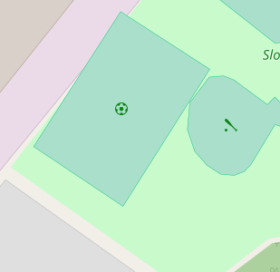
Hi, apologies for waking up this thread again, really liking your rendering design and often revisit to see how things come out, noticed that sometimes a pitch of a certain sport does not render, just the green square and wondered if there is some minimum size. Have a situation where a basketball pitch renders at a school, but not at a park 2 miles away where a same size tennis court does render. Another where a full size soccer pitch renders, but not the 'street soccer' sized at same school and park. Sample http://tile.openstreetmap.fr/?zoom=19&lat=42.46991&lon=14.20103&layers=B0000000FFFFFFF
thanks for reading.
 sekerob
on 24 Nov 2020
sekerob
on 24 Nov 2020
Your link goes to the french style (https://github.com/cquest/osmfr-cartocss). You will have to inquire about issues with their pitch rendering there.
imagico
on 29 Nov 2020
Related issues
 MarkusStue
·
4Comments
Tomasz-W
·
4Comments
MarkusStue
·
4Comments
Tomasz-W
·
4Comments
 d3netxer
·
4Comments
meased
·
3Comments
polarbearing
·
5Comments
d3netxer
·
4Comments
meased
·
3Comments
polarbearing
·
5Comments
Most helpful comment
This sort of symbology could also be a good solution for dog parks, which currently have a repeated symbol which leads to an excessively strong pattern.