Manageiq-ui-classic: a11y: Make the toolbars accessible
The toolbar buttons itself are accessible, but the dropdown items are only highlightable by using the arrow keys. I'm not sure if that's a good thing, so I need some guidance here. We also might need some additional aria/role attributes on them, will find that out.
 skateman
All 37 comments
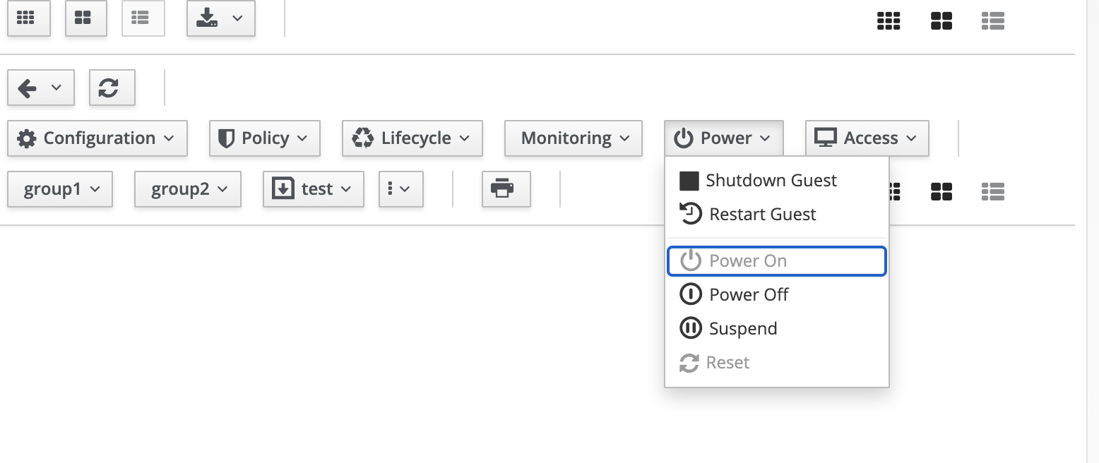
In toolbars, focus is going to disabled options too, Focus should not go to disabled buttons.
 kavyanekkalapu
on 19 Oct 2020
kavyanekkalapu
on 19 Oct 2020
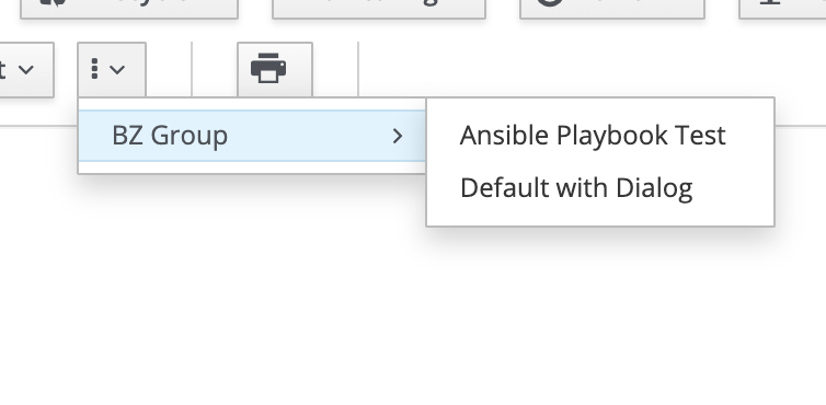
i am not sure if we have this type of functionality in MIQ ui, but these options from https://react-ui-components.surge.sh/?selectedKind=Toolbar&selectedStory=Toolbar&full=0&addons=1&stories=1&panelRight=0&addonPanel=storybook%2Fstories%2Fstories-panel are not accessible with keybaord.
kavyanekkalapu
on 19 Oct 2020
In toolbars, focus is going to disabled options too, Focus should not go to disabled buttons.
Ok I am taking back on this comment, according to https://www.w3.org/TR/wai-aria-practices-1.1/#kbd_disabled_controls, Disabled menu items are focusable but cannot be activated.so this is working as expected.
kavyanekkalapu
on 19 Oct 2020
Toolbar in react-ui-components is working fine, but toolbar in MIQ pages are not..
often when i am doing up/down arrows in MIQ UI dropdown, focus is skipping in multiple options...For example Services-->My services--> click on any Services--> configuration button dropdown, now try up/down arrow to go through options , middle option is skipping
same with many other drop downs on different pages too
i checked code and inspected page, all options are looking same but not really sure why focus is not going to some options...
cc fyi @himdel @skateman @h-kataria
kavyanekkalapu
on 20 Oct 2020
I verified this problem, whenever you have more than 1 item in the dropdown, the focus between elements using the arrow keys is undeterministic. This is not happening in the storybook, only in MiQ and there's no HTML markup difference between the two :confused: so I'm clueless :thinking:
skateman
on 21 Oct 2020
My guess is that the problem will be somewhere in this file as this is the only place where we might be altering the code coming from react-ui-components.
skateman
on 24 Oct 2020
MiQ:

Storybook:

skateman
on 24 Oct 2020
So, there are 4 different global keydown handlers in the UI...
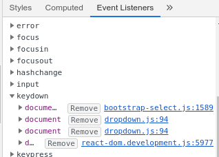
removing only the last one makes it work right,
removing any or all of the first three makes it work almost right, except it doesn't skip disabled
sounds like we have a double react+nonreact implementation, and the react version is not right
 himdel
on 27 Oct 2020
himdel
on 27 Oct 2020
that ToolbarListItem onKeyDown (in the React devtool) .. what happens when you rightclick and go to definition?
For some reason, it seems to point me to onClick .. sounds like us passing an onClick handler as a onKeyDown could certainly break things but I dont see where...
(except for app/javascript/menu/side-nav-menu-link.jsx <Link className={className} onClick={onClick} onKeyPress={onClick} tabIndex="0"> which is probably equally problematic, but not related to toolbars)
himdel
on 27 Oct 2020
ok, the bad version comes from react-bootstrap/es/DropdownMenu.js line 91..
used by ToolbarList via DropdownButton.
So, maybe we should just replace that DropdownButton with just a proper bootstrap dropdown button div, so that only the bootstrap implementation gets used.
(That, or use a non-bootstrap react dropdownbutton, so that the react code doesn't use the same classes the jquery code matches against.)
himdel
on 27 Oct 2020
@himdel i raised pr to remove that keydown event https://github.com/ManageIQ/react-ui-components/pull/183, with this manageiq-ui toolbars are working but not toolbars in react-ui-components demo, i tried debugging yesterday and couldn't find any difference between those two..
kavyanekkalapu
on 27 Oct 2020
@kavyanekkalapu that PR is removing an unused prop.. the problem is not in react-ui-components
(well, except in that the implemtnation of ToolbarList lives there, which uses the bad DropdownButton)
himdel
on 27 Oct 2020
The difference between react-ui-components demo and ui-classic is that react-ui-components doesn't load bootstrap javascript.
Which the UI has to load as long as we use any non-react code.
himdel
on 27 Oct 2020
Anyway, if there are any plans of rewriting toolbars to carbon, that should fix it.
If not, DropdownButton needs to be replaced, by html like in the Button dropdowns example.
himdel
on 27 Oct 2020
The difference between react-ui-components demo and ui-classic is that react-ui-components doesn't load bootstrap javascript.
Which the UI has to load as long as we use any non-react code.
:vomiting_face: jQuery messes it up? :disappointed:
skateman
on 27 Oct 2020
Not jquery. Bootstrap javascript. (but yes, jquery-based)
Bootstrap code needs the global JS handlers that match events based on the class of the element.
And patternfly-react (well, react-bootstrap) uses the same css classes, but assumes there's no bootstrap js, and tries to reimplement it, poorly :(.
himdel
on 27 Oct 2020
@kavyanekkalapu does Carbon have something like toolbars? Maybe it would be easier to rewrite this than deal with the bootstrap mess...
skateman
on 6 Nov 2020
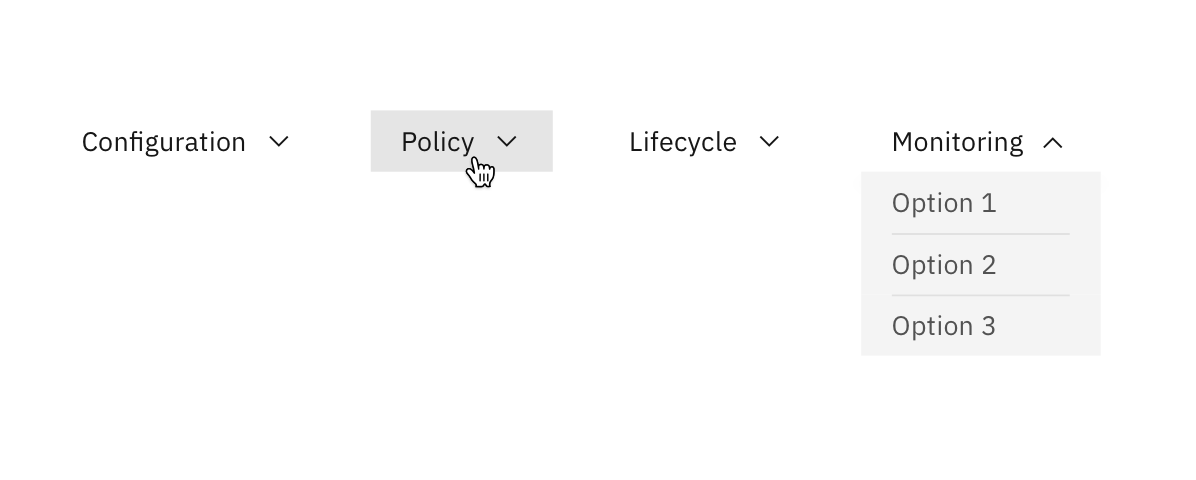
Brian (UX) comments on design:
- For dropdown items in toolbar, please use styling of an inline drop down. For simplicity, I would get rid of the icons in front.
- The width of each dropdown can vary to fit different text lengths. Ensure 24px of horizontal space between each dropdown.
- For accessibility, remember to include a hover state as shown below.
- Avoid using icon-only buttons without text
- As items in the dropdown are not “selected”, but rather “buttons” that perform actions, you might consider combining the styling of an inline drop down with the functionality of an overflow menu
kavyanekkalapu
on 10 Nov 2020
For simplicity, I would get rid of the icons in front.
Avoid using icon-only buttons without text
We can do neither, there will be custom buttons without text, so there would need to be a migration to convert icon-only buttons to ..what? The icon name?
(Clarification: I think it makes sense to remove toplevel icons from our toolbar, but not for second level icons, or for custom buttons.)
himdel
on 11 Nov 2020
@himdel @skateman For this issue/enhancement, I am thinking of adding carbon components in react-ui-components repo, and replace toolbar patternfly components with carbon components, what are your thoughts?
kavyanekkalapu
on 30 Nov 2020
@kavyanekkalapu I suggest going the more direct way of moving toolbar code to ui-classic first.
But either ordering probably works (as long as you can get carbon build working in react ui components).
As far as replacing toolbars with carbon components, :+1: :)
himdel
on 30 Nov 2020
I think we talked about this on the chat before, to reimplement these in carbon in the classic UI repo...
skateman
on 30 Nov 2020
Just heads up @kavyanekkalapu, the new implementation pretty much has to support icons for items, and icons only.
(I'm not saying we have to use it for regular toolbars, just that it's needed.)
Otherwise, we can't really use it, not without destroying all the customer custom buttons.
himdel
on 30 Nov 2020
Ok sure, i will reimplement toolbar component in ui-classic, thanks.
kavyanekkalapu
on 30 Nov 2020
@skateman @himdel I am trying to make dashboard toolbar accessible , right now screenshots are looking like this
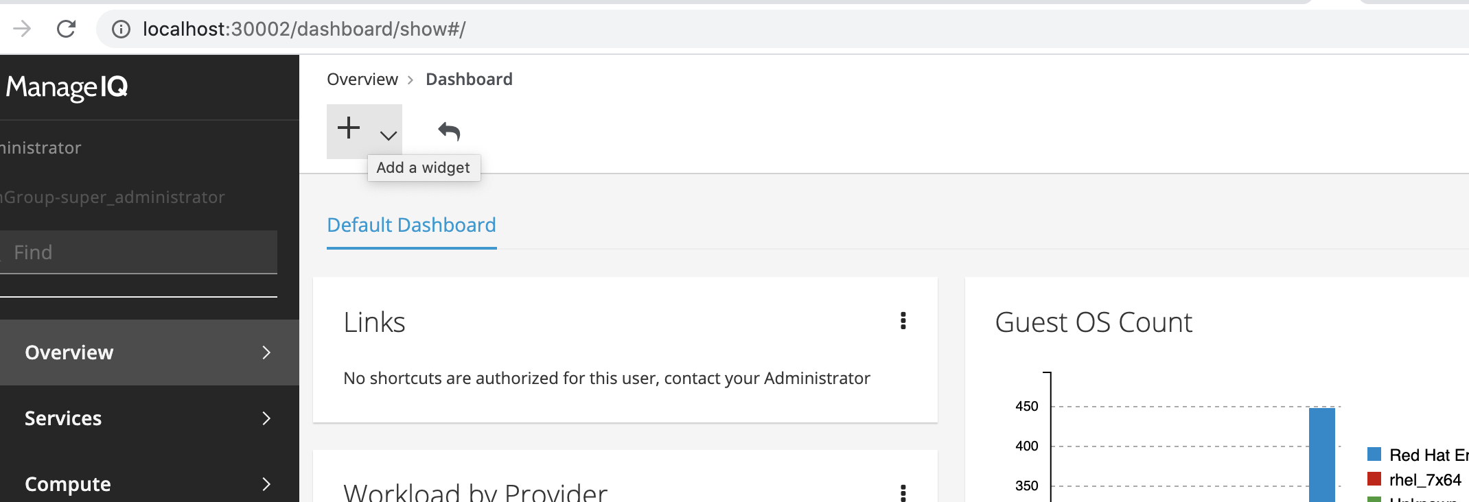
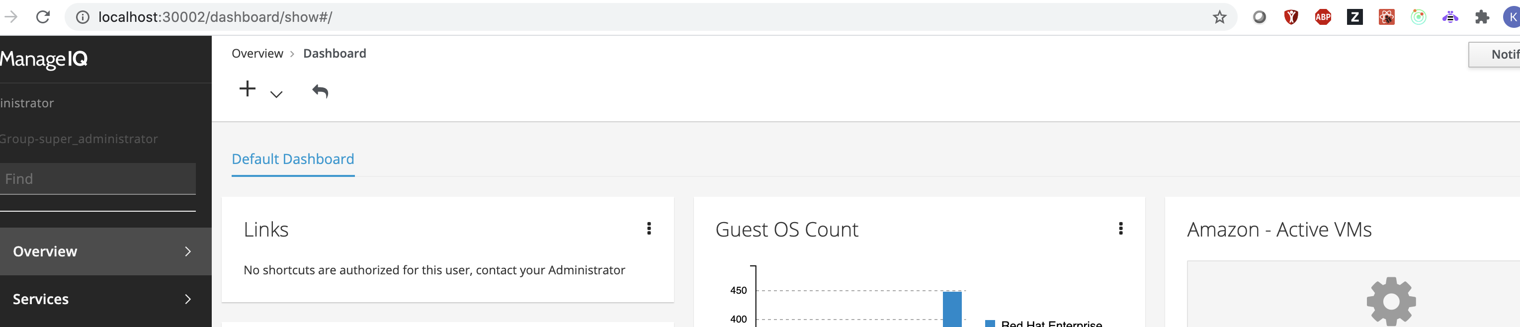
I feel it is better to have text beside + icon for A11y like Add Widget, right now button has only title property, I see that title change depending upon locked property
const title = locked
    ? __('Cannot add a Widget, this Dashboard has been locked by the Administrator')
    : __('Add a widget');
I am not really sure if Add Widget text makes sense in locked state , please suggest a button text for Add widget button.
kavyanekkalapu
on 4 Dec 2020
@himdel @skateman when you have time, can you please check above comment?
kavyanekkalapu
on 8 Dec 2020
Well, we need to tell the user why is it locked if it's locked...
skateman
on 8 Dec 2020
Well, we need to tell the user why is it locked if it's locked...
yes title property will still there, button name Add Widget is ok for locked state too?, in locked state, can we open dropdown at all?
kavyanekkalapu
on 8 Dec 2020
No, it's not okay. We want the Cannot add a Widget, this Dashboard has been locked by the Administrator when it's locked so the user knows why it is locked...
skateman
on 8 Dec 2020
Alright, then in locked state, shell i disable Add Widget button and show the title Cannot add a Widget, this Dashboard has been locked by the Administrator?
kavyanekkalapu
on 8 Dec 2020
Isn't how it is working right now in the old implementation?
skateman
on 8 Dec 2020
Ok nvm yes it is diabled in locked, got it , thanks. i was confused by this line
{ items.length === 0 ? renderDisabled() : renderContent() }
kavyanekkalapu
on 8 Dec 2020
The dashboard custom toolbar isn't sorted out AFAIK, please close if this is not true...
skateman
on 9 Dec 2020
Yes i started working on it, once that pr is merged, we can close this issue.
kavyanekkalapu
on 9 Dec 2020
Found another one, topology toolbars:

skateman
on 11 Dec 2020
Fixed topology toolbar and dashboard toolbar in https://github.com/ManageIQ/manageiq-ui-classic/pull/7539, there are still some enhancements can be done in topology toolbar ui, but accessibility wise these pr changes should be good.
kavyanekkalapu
on 5 Jan 2021
:tada:
skateman
on 5 Jan 2021
Related issues
 epwinchell
·
5Comments
epwinchell
·
5Comments
 miq-bot
·
7Comments
skateman
·
4Comments
miq-bot
·
7Comments
skateman
·
4Comments
 hstastna
·
11Comments
hstastna
·
11Comments
 h-kataria
·
5Comments
h-kataria
·
5Comments