Light-client: I want to know, that I have to withdraw the tokens from the UDC on the UDC screen
User Story
As Chris I want to know, that I have to withdraw the tokens from the UDC on the UDC screen so that I am not getting confused.
Acceptance criteria
- It should follow the design
- The information area on the top is not getting implemented
- We use the already existing color-variables (incl. new account screen button colors)
- No text is smaller than 12px
- User Contract Deposit Balance instead of USER CONTRACT DEPOSIT BALANCE
- Without the area "Withdrawals in progress" -> Issue #2308
Tasks
- [x] Meeting with @sashseurat
- [x] Design @sashseurat
Design
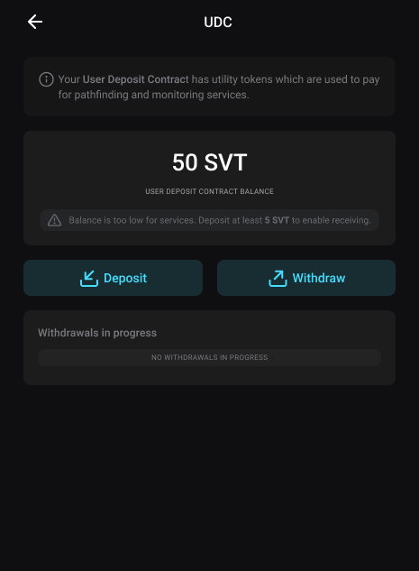
 christianbrb
All 8 comments
@christianbrb Not very obvious how to best solve this atm. Was thinking about the problem today and also discussing a bit with @weilbith . We decided to push this to when @sashseurat is back from vacations to discuss possible solutions with her.
 taleldayekh
on 22 Oct 2020
taleldayekh
on 22 Oct 2020
@sashseurat Design?
taleldayekh
on 23 Oct 2020
@christianbrb @taleldayekh @weilbith
Click-dummy showcasing the solutions for UX/UI issues is here ready for review:
https://www.figma.com/proto/5H8EOoC2SntoXZuTtUZsyY/LC-UDC-Screen-Optimisation?node-id=42%3A0&viewport=-96%2C461%2C0.25&scaling=min-zoom
The approach is:
- Defining the information hierarchy via clear visual structures.
- Using simple UX copy.
- The text giving info on the screen is not too prominent to minimize distraction from the main actionability on the screen.
- Balance is displayed in a dedicated, clear, and prominent location.
- Balance is the information users will need to have access to making informed decisions on this screen.
- Deposit / Withdraw buttons have labels for maximum accessibility and clearness.
- "Balance is too low" notice is shown in appropriate subtleness as it is not a critical error.
- Added planned withdrawal section dedicated to managing easily all items that are either pending or ready.
- When the user confirms withdrawal in the UDC screen via withdraw dialog - the planned withdrawal section has a new item in progress.
- Progress item has blocks countdown.
- When item is ready, it is visualized by colors, icon, and text.
- Ready item is clickable and leads to Withdrawal screen, where user can further withdraw to their main account.
 sashseurat
on 4 Nov 2020
sashseurat
on 4 Nov 2020
A fast and primitive feedback from my side: great work @sashseurat I'm impressed. Not that I've expected anything else. :grimacing:
 weilbith
on 4 Nov 2020
weilbith
on 4 Nov 2020
@sashseurat Thanks a lot for the new design and the detailed description :) It is a big improvement.
My remarks:
- Planned Withdrawals -> Withdrawals in progress / No withdrawals in progress
- No text smaller than 12px (I haven't checked)
- User Deposit Contract Balance -> no capital letters
- Buttons -> White text on turquoise as we do it on the other buttons as well
christianbrb
on 4 Nov 2020
@sashseurat Thanks a lot for the new design and the detailed description :) It is a big improvement.
My remarks:
- Planned Withdrawals -> Withdrawals in progress / No withdrawals in progress
I didnt get this
- No text smaller than 12px (I haven't checked)
There is a varty of reasons to have some text smaller than 12px - for example: when text is in all caps, the letter skeleton is higher and text is visually processed as bigger - 10px = 12px etc. This is common.
- User Deposit Contract Balance -> no capital letters
Why?
- Buttons -> White text on turquoise as we do it on the other buttons as well
I made a conscious decision to not have the same styling to the buttons as in the transfer screen. This screen is similar to a settings screen, and its functions should not seem to User as primary in the dApp. This is common.
Also, I will be very happy to test this with hired testers. We can use this click-dummy in this platform I use Maze. It allows us to prepare a test including the click dummy, questions, and more and get a detailed usability report with actual metrics we can refer to - instead of a personal opinion. As the click-dummy is ready - this won't take more than an hour to do, and in two hours approximately we can have all the data gathered from 25 testers (that have varied levels of technical proficiency, gender, age, etc.)
We can ALSO do A/B testing...
sashseurat
on 5 Nov 2020
Planned Withdrawals -> Withdrawals in progress / No withdrawals in progress
I didnt get this
I kina agree with Christian here. I hope it is fine to put feedback here as a developer.
So while on the contract implementation and from the protocol it is called a planned withdraw, I think is a bad naming for the user. I could imagine that it is way easier to understand that a withdrawal he triggered is in progress, rather than it is planned... But only because the whole UDC concept is not well known to the user in general. If he is used to this term, he understand it. But how it is now...
weilbith
on 5 Nov 2020
Ah sorry, I didn't get the comment but after reading it again I get it 😅 to change the label text.
I changed the click-dummy to have those labels, and here is a picture:
Withdrawals is a terrible word!
sashseurat
on 5 Nov 2020
Related issues
 nephix
·
4Comments
nephix
·
4Comments
 kelsos
·
4Comments
christianbrb
·
6Comments
kelsos
·
4Comments
christianbrb
·
6Comments
 andrevmatos
·
4Comments
christianbrb
·
6Comments
andrevmatos
·
4Comments
christianbrb
·
6Comments