Files: Concept design V2 - Different icons and a few more things
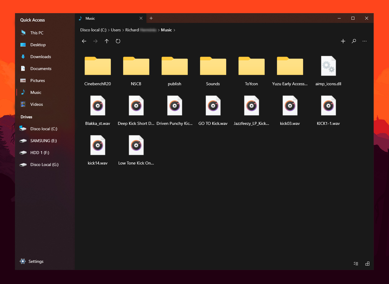
This time the font size of the sidebar is the original, I just changed the icons, replaced "Home" with "This PC", added "Quick Access" and moved them a bit to the right leaving a little more space between the red bar and icons, also reduces the size of the navigation bar.
 XPoppyX
All 10 comments
It would be a gigantic task for the devs, but personally I wouldn't mind if we could choose between MDL2 icons and Shell32 icons
 SOI7
on 8 Apr 2020
SOI7
on 8 Apr 2020
I think I overall like the new porposal 👍
But maybe we should think about adding new designed colorful icons instead of the old Win10 legacy file explorer icons to the sidebar?
BTW: shouldn't e.g. the music icon then also be on top of the tab? Seems to me like a mistake...
 szaimen
on 8 Apr 2020
szaimen
on 8 Apr 2020
BTW: shouldn't e.g. the music icon then also be on top of the tab? Seems to me like a mistake...
forgot to change it xd
XPoppyX
on 8 Apr 2020
But maybe we should think about adding new designed colorful icons instead of the old Win10 legacy file explorer icons to the sidebar?
in fact I was thinking of putting new icons instead of the old ones, I only used these because it was quicker to find them, anyway I also agree with putting the new icon designs
I think those would also fit better to the new designed app icons by microsoft for Windows 10 x then the colorless icons...
szaimen
on 8 Apr 2020
It would be a gigantic task for the devs, but personally I wouldn't mind if we could choose between MDL2 icons and Shell32 icons
I wouldn't say this has to be an settings option: if I understand correctly this is a mockup how colorful icons would look like and then "simply" substitute them in the codebase...
szaimen
on 8 Apr 2020
I like how you added the header, about the icons, the issue I have with it is that we are using the MDL2 Assets which are part of the fluent design system. However, Fluent is shifting towards colorful icons and there is the chance the MDL2 icons will shift to more colorful icons as well.
It will also be interesting to see how the File Explorer on Windows 10X does this.
 yaichenbaum
on 8 Apr 2020
yaichenbaum
on 8 Apr 2020
Let's continue tacking this in #545.
yaichenbaum
on 8 Apr 2020
Let's continue tacking this in #545.
What about the Quick access header? and other edits to the navigation bar?
szaimen
on 8 Apr 2020
The quick access header will be done in a future update.
yaichenbaum
on 8 Apr 2020
Related issues
 BuraChuhadar
·
23Comments
BuraChuhadar
·
23Comments
 zbalkan
·
25Comments
zbalkan
·
25Comments
 ghost
·
50Comments
szaimen
·
18Comments
ghost
·
50Comments
szaimen
·
18Comments
 Crocodile73
·
84Comments
Crocodile73
·
84Comments
Most helpful comment
I like how you added the header, about the icons, the issue I have with it is that we are using the MDL2 Assets which are part of the fluent design system. However, Fluent is shifting towards colorful icons and there is the chance the MDL2 icons will shift to more colorful icons as well.
It will also be interesting to see how the File Explorer on Windows 10X does this.