Select one ... (check one with "x")
[ ] bug
[x] feature request
[ ] enhancement
Expected behavior
To be able to apply clarity styling on <input type="file">
Actual behavior
No styling is available so we are displaying the standard <input type="file"> that has a different look on different browsers
Reproduction of behavior
Environment details
Angular version: 2.0.X
**Clarity version: 0.8.13
**OS and version:OS X El Capitan 10.11.6
Browser: [all | Chrome XX | Firefox XX | IE XX | Safari XX | Mobile Chrome XX | Android X.X Web Browser | iOS XX Safari | iOS XX UIWebView | iOS XX WKWebView ]
 civanova
All 25 comments
This is actually a pretty hard problem if you try to remain accessible, from what I remember.
Just tagged it, we'll see how much of a priority it is during our planning sessions.
 youdz
on 3 Apr 2017
youdz
on 3 Apr 2017
Hello,
We have an additional request for the input field.
We need it to be able to receive a custom label so that it can be identical to all browsers and localized depending on the user's locale
civanova
on 7 Apr 2017
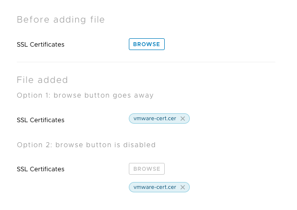
We also have a need for this feature. Our need also ask's for the addition of multiple files. I created a concept below for use to develop and test. Would like to see what the clarity team thinks of this design.

In this design, the browse button allows the user to search for local files and add them. Once added, the file name is displayed in a label with and "x" icon to delete. I also enclosed the labels in a container that scrolls to limit the vertical space but still allows for multiple files to be added and easily accessed.
 bmireles
on 10 May 2017
bmireles
on 10 May 2017
@bmireles thanks for taking a look at this and coming up with a proposal, this helps. So here is the angels I see to this (so we have a clear understanding of this when we start working on it) and please let me know if I missed anything:
- We need a quick styling of
input type="file"itself when we're uploading a single file. - We need a case where we might want to upload multiple files before we actually go ahead and upload them together or post them together.
The above addresses 2 and somewhat addresses 1 styling wise. Keeping the needs-ux-input label to work on this and we'll prioritize it soon. / cc @mathisscott
 jaffoneh
on 10 May 2017
jaffoneh
on 10 May 2017
Thanks, @bmireles . This looks like it would need to be an angular component. I will ask @reddolan to review it in the near future before discussing implementation with the team.
Any information on your circumstances of need will be helpful because we have a lot of competing priorities right now.
 mathisscott
on 10 May 2017
mathisscott
on 10 May 2017
@bmireles This looks good. Do you happen to also have a design for the single file experience?
 reddolan
on 25 May 2017
reddolan
on 25 May 2017
@reddolan Here is what I was thinking for a single file. Would like to get feedback on it though.
bmireles
on 6 Jun 2017
By default, the file upload handles one file at a time. HTML5 has an additional attribute that allows for multiple uploads. Though the files have to come from the same folder and be selected at the same time. If you select one file and then browse and select another file, the first one is replaced with the new selection.
I recommend we go with the Option 2 design but keep the Browse button active at all times. After uploading more than one, than the design would expand like you have spec'd on your previous comment. This gives the user two ways of being able to change the file being uploaded:
- clicking the Browse button and selecting another file
- clicking the X icon on the file name listed to remove it, then clicking Browse to select another file
cc: @bmireles
reddolan
on 8 Jun 2017
TY for the clarification @reddolan.
bmireles
on 19 Jun 2017
Nice workaround I came up with, use the input inside a label. You can style the label with Clarity .btn and .btn-link classes:
<label class="btn btn-link">
    <input type="file"
           (change)="onChange($event)"
           placeholder="Upload file"
           accept="*">
    Attach Files
</label>
 omrico
on 13 Nov 2017
omrico
on 13 Nov 2017
In which version we can expect this to be implemented in Clarity?
 rdvojmoc
on 17 Aug 2018
rdvojmoc
on 17 Aug 2018
The new forms has this styling designed, though we haven't built the Angular component for it yet.
 gnomeontherun
on 17 Aug 2018
gnomeontherun
on 17 Aug 2018
@gnomeontherun how do you get the new styling?
When I do
        <div class="clr-form-control">
          <label for="example" class="clr-control-label">File</label>
          <div class="clr-control-container">
            <div class="clr-input-wrapper">
              <input type="file" id="importFile" class="clr-input">
            </div>
          </div>
        </div>
It doesn't have very nice styling.
 rogerfar
on 3 Oct 2018
rogerfar
on 3 Oct 2018
The workaround described above doesn't seem to be working in the newest version of Clarity, but adding the class described here to the input seems to fix it up again:
<label class="btn btn-link">
    <input type="file"
           (change)="onChange($event)"
           placeholder="Upload file"
           class="button-input"
           accept="*">
    Attach Files
</label>
css:
.button-input {
  width: 0.1px;
  height: 0.1px;
  opacity: 0;
  overflow: hidden;
  position: absolute;
  z-index: -1;
}
 ATMarcks
on 12 Mar 2019
ATMarcks
on 12 Mar 2019
Maybe you can add "Drag & Drop" support to the file input component when you build a Angular component for it.
I created a custom file comonent for our project. When a file is dragged over the document, the component indicates that a file can be dropped with a border and a message:

When the file is dragged inside the border, the border color indicates this:
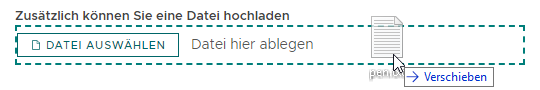
When the drag is cancelled, the border is removed.
Now when I look at it, maybe the button should also be hidden when a drag is in progress.
 furti
on 31 May 2019
furti
on 31 May 2019
it seems a little silent around this component ...
could you guys @mathisscott, @gnomeontherun give us a bit of a heads up here:
- is this design specification ready for implementation?
- are there any planning details predictable?
currently no milestone, no project ...
 d-m-s
on 9 Jul 2019
d-m-s
on 9 Jul 2019
It hasn't been prioritized yet, but there is the CSS version you can use available today (undocumented). https://github.com/vmware/clarity/blob/master/src/dev/src/app/forms/controls/file.html
gnomeontherun
on 9 Jul 2019
Any updates on this?
 nmcbride
on 6 Dec 2019
nmcbride
on 6 Dec 2019
Its not currently prioritized for the core teams workload. Is it a feature you are interested in contributing?
 hippee-lee
on 6 Dec 2019
hippee-lee
on 6 Dec 2019
file-upload seems like a very common component for an ui framework!
any chances this get a little more attention?
d-m-s
on 10 Jun 2020
The status hasn't changed, but the implementation is one that should be pretty similar to the normal input and the styles are already available as linked above. This is a good candidate for a contribution!
gnomeontherun
on 10 Jun 2020
It hasn't been prioritized yet, but there is the CSS version you can use available today (undocumented). https://github.com/vmware/clarity/blob/master/src/dev/src/app/forms/controls/file.html

d-m-s
on 16 Jun 2020
Files have moved https://github.com/vmware/clarity/tree/master/packages/angular/projects/dev/src/app/forms/controls
gnomeontherun
on 16 Jun 2020
This is available through @clr/core now, so I'm going to close this as resolved.
gnomeontherun
on 1 Sep 2020
Hi there 👋, this is an automated message. To help Clarity keep track of discussions, we automatically lock closed issues after 14 days. Please look for another open issue or open a new issue with updated details and reference this one as necessary.
![github-actions[bot] picture](https://avatars.githubusercontent.com/in/15368?v=4&s=40) github-actions[bot]
on 16 Sep 2020
github-actions[bot]
on 16 Sep 2020
Related issues
 clane
·
3Comments
clane
·
3Comments
 srikanthps
·
3Comments
srikanthps
·
3Comments
 ph55
·
3Comments
ph55
·
3Comments
 JohannesRudolph
·
4Comments
JohannesRudolph
·
4Comments
 beaker1977
·
3Comments
beaker1977
·
3Comments
Most helpful comment
Nice workaround I came up with, use the input inside a label. You can style the label with Clarity .btn and .btn-link classes: