Clarity: Vertical Navigation component (new)
Description
A Vertical Navigation is a component used to navigate users between pages of an application or site. Links within the navigation run down the side of a page versus across the top like Header or Subnav. Also known as side navigation or sidenav.
Use cases under consideration
- layout
- icons
- hierarchy
- collapse and expand navigation
- combinations of above
Documentation
- key features are: group links together, icons, hierarchy, and ability to collapse and expand
- we recommend using vertical navigation with a header
- we do not recommend using vertical navigation with a header and subnav
Layout Options
- 3 options: basic, with dividers, with dividers and section headers
- active link has white background
- the touch target is the entire width of the navigation, similar to the space of the active indicator
- touch targets are 36px high, making them easier to interact with on touch screens

Icons
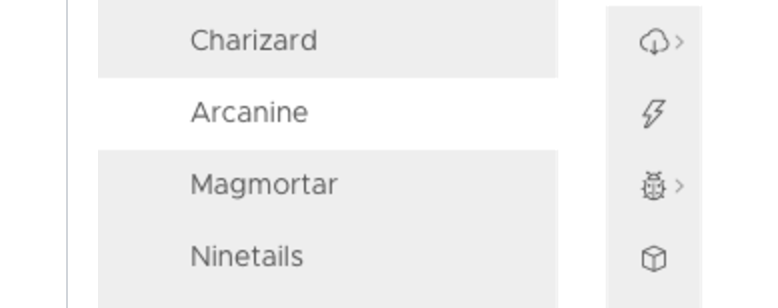
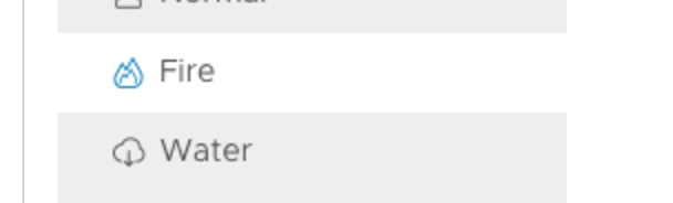
- icons are to the left of navigation labels
- icons are 16x16
- the touch target is the entire width of the navigation, including the icon
- use icons that describe the navigation label, it’s helpful when using collapsable navigation
- we recommend either all links have icons or none have them, it makes it is easier for scanning
- active link will display the icon as blue

Hierarchy - basic
- navigation items that have nested links are indicated with semibold font weight and a caret icon on the right side of the navigation
- clicking on the navigation label, caret or anywhere in between will expand the selection
- if a nested link is active it will display active while the parent is expanded
- if the the parent is collapsed, the active indicator will be shown on the parent instead
- hierarchy supports two levels: parent level and one nested level
- top level items with no nested links, are semibold and are expected to link to a page

Hierarchy - icons
- same rules apply with icons as without them (See Hierarchy - Basic above)
- icons are also clickable targets that will expand and collapse the selection

Collapse/Expand - basic
- clicking the double caret icon in the upper-right corner will collapse and expand the navigation
- if no icons are in the navigation, when collapsed, the bar will only show the double caret
- the whitespace below the double caret can be clicked to expand the navigation
- if icons are in the navigation, when collapsed, the bar will show the double caret and all other icons
- the active navigation item will also show as an active icon when collapsed
- clicking on one of the icons will navigate the user, and the navigation will stay collapsed

Collapse/Expand - hierarchy
- all Hierarchy rules apply from above
- in the collapsed navigation, any icon with hierarchy has a small caret next to it
- clicking the icon will expand the navigation and expand the parent navigation item
- clicking on an icon with no hierarchy will navigate the user to a page

Long labels
- for labels that exceed the width available, the label will be appended with an ellipses
- we recommend that navigation labels remain short and concise to prevent an ellipses from showing

 reddolan
All 31 comments
Can the sidenav support the color schemes like the header (header-1 ... header-6)?
 bjabes
on 1 Jun 2017
bjabes
on 1 Jun 2017
If the nav list does not use icons AND is collapsed, is there reason it needs to take up as much horizontal space as it does? Seems like that would be a case where the width could be cut down to just show the double-caret plus 12px of horiz. padding.
Also, it's unclear what the difference in these two statements under "Collapse/Expand - Hierarchy" are:
- clicking on an icon with no hierarchy will navigate the user to a page
- clicking any icon without a caret (no hierarchy) will navigate a user
 joshjohnsonux
on 1 Jun 2017
joshjohnsonux
on 1 Jun 2017
It's also unclear whether clicking an icon in a collapsed sidenav that has sub-items will expand the nav component in-place causing other page elements to the right to reflow temporarily back and forth, or if it'll expand as a floating nav over the content until an item is clicked or it's dismissed by clicking away from the nav. (I vote for the latter, as it's less visually distracting for the rest of the page)
joshjohnsonux
on 1 Jun 2017
Is there a reason to limit navigation to only one level of nesting?
 pblasco
on 1 Jun 2017
pblasco
on 1 Jun 2017
In expanded mode, does it overlay the rest of contents or takes up the horizontal space?
 ssanghavi
on 1 Jun 2017
ssanghavi
on 1 Jun 2017
i thought that the background color of the content area was FAFAFA. which might not work well with a selected highlight color of white for the navigation.
 lweitzman
on 1 Jun 2017
lweitzman
on 1 Jun 2017
@bjabes by default the background color will be #eee. It will be able to be overridden by CSS depending on product needs.
We had considered this as an option but decided against it as it was a very bold treatment as a default and many folks we talked with were needing subtle side navigation treatments.
reddolan
on 1 Jun 2017
@ssanghavi collapsing and expanding the navigation will move the content area. If the content area is developed in a responsive manner, the content area would expand and collapse with the navigation.
reddolan
on 1 Jun 2017
@pblasco your solution can incorporate 3 levels of navigation when using the header in combination with this vertical navigation.
The idea of having three levels of navigation within this was something we discussed. We believe a 3rd level would significantly decrease the horizontal space available, even more so when icons are present. This would potentially force many links to display with an ellipses making it difficult for users to decipher links. Also with the addition of dividers and section headers we wanted to be conscious of the amount of visual noise potentially being added to the vertical nav. Lastly, in our research we saw most solutions had one or two levels of navigation. Those that have three levels, we wanted to get those teams to rethink and simplify their solution’s information architecture.
reddolan
on 1 Jun 2017
@lweitzman we had considered using #fafafa as the active link background color. However, after seeing it in context with other content, we decided that using the #ffffff background color brought more contrast and visibility to the active link. Whereas using the #fafafa made the active link more muted and less visible.
reddolan
on 1 Jun 2017
Makes sense. Thanks for the thoughtful response.
pblasco
on 1 Jun 2017
@joshjohnson72 in the case of no icons and collapsing the nav, we discussed the option of having the nav just take up enough space to frame the expand icon. Three things came from this discussion. First, we were concerned about the visibility of such an idea in context of other content as well as whether it might cover important content. Second, having the bar visible is a clearer indication of the navigation that is presently collapsed. Third, with no icons, the entire bar is a click target making it easy for user to click anywhere to expand it, versus just that smaller click target where the icon is.
in the case of the different statements, it’s a typo. The are saying the same thing in different ways. It was probably on oversight while writing in things. I will fix this. It should just the first bullet as it reads better.
For the last question, if I understand you correctly, you are asking whether expanding the navigation will shift the content area or whether it will cover the content area. If correct, then the answer is the content area will either push to the right or condense for the space of the navigation depending on whether the content area is developed in a responsive manner. If I misunderstood your question, let me know and I will do better to answer it.
reddolan
on 1 Jun 2017
@reddolan If the purpose of having a user explicitly collapse the nav is to gain more horizontal space for page level info, I would assume maximizing horizontal space would take precedence over concerns about visibility and touch target size. Visibility could instead be addressed by animating the close function to draw the eye. (which I think makes sense regardless) And you already noted the entire bar is a click target, so it's unclear that that's a substantial issue either. But for a few pixels, I'm willing to wait and see.
Where I'm more concerned though is the temporary expansion of a collapsed nav. It seems both visually jarring and conceivably expensive from a performance perspective to redraw all the page content (think charts and dashboard) just in time for the user to navigate to another area where it's not needed. I personally think an overlay would be a much better solution.
joshjohnsonux
on 2 Jun 2017
@joshjohnson72 while I understand your point, I disagree. Usability should trump in this case. If a user collapses the nav and can't find it when they need it, was it really that helpful to remove the bar space? Users gain will likely gain 182px of space by collapsing the nav, that is significant. I would argue that if not having that additional 48px broke the content experience, addressing the AI should be the greater concern. That said, this decision isn't in stone. If we get enough feedback to add it, we will look into it.
To your second point, I have used many designs that have a responsive collapsible sidenav. I have yet to think "that was visually jarring". With well-tuned animations, it will feel natural as it collapses and expands. I could see it be visually jarring if the user were clicking the icon over and over again. But that is addressed by moving the location of the icon from expanded to collapsed states. If a solution's content were to move around jarringly, I would suggest addressing the content AI or responsive patterns.
reddolan
on 2 Jun 2017
Have you considered having the nav slide out from collapsed state on hover and return to collapsed state on hover out or selection of a nav item? If I prefer to have the nav collapsed, I don't really want three clicks to open it, select an item, and close it again every time I navigate. I realize that the icons-only version can allow for quick navigation in collapsed state, but have found icons alone to be unreliable for users to identify the item they want to select.
I've used a similar left nav pattern in the past and on implementation, found that users needed help with the icons - so we implemented a hover on the icons that showed the text as a single slide out for items. We ended up with enabling a sort of pinned open state and the option to hover and select to leave the nav collapsed or explicitly click the arrows to pin it open again.
 kevinmcbride
on 6 Jun 2017
kevinmcbride
on 6 Jun 2017
Another question - in the hierarchy, it sounds like a parent can only be used to expand the children. I can already see places where we have a top level page with children and want both the parent and children to be items in the navigation. One way to do that would be to make the label navigate to the parent page and the caret open and close the children. Is that an option? If not, how would you handle the situation where both parent and children are navigation targets?
kevinmcbride
on 6 Jun 2017
@kevinmcbride in the case of expanding and collapsing the navigation on hover, we are moving away from hover functionality when possible in favor of click. There are a few reasons for this. One, hover doesn’t translate well to touch experiences. Two, hover tends to have usability and dexterity issues associated with it. Even if we perfect the interaction, it requires significant additional coding in some cases which unnecessarily weighs down the code. Lastly, is we want it to be associated with an intentional interaction, not unintentional. By this I mean, if a user happens to be interacting with something next to the collapsed navigation and accidentally moves the cursor over the nav it will expand unintentionally. If the content is responsive along with that, then it will shift as well. The user will then have to move their cursor away from the nav that was expanded to get it to collapse. Then they will have to wait for the content to settle back in place again before they can interact with what they had originally intended to. I understand your concern about the additional click, it is a trade-off for a better overall experience. Your comment about icons is also a valid one. Icons can be a good thing or a bad thing depending on how they are recognized. Something else to consider is that if the user is currently on a nested child link, expanding the navigation will retain the parent-expanded state so a user will only end up clicking twice to select a sibling link.
Regarding help with icons, We will be incorporating a hover tooltip for icons so when the nav is in the collapsed state users will have some way of being able to know what the icons are without having to open the nav. We won’t have a hover-expand nav with a pinned option though for the reasons above.
About your hierarchy parent question, this was something we discussed as well. In my past experience usability testing split buttons like you described, users in most cases failed to recognize that there were two independent controls. Because of this issue we decided to enforce the parent to be a expand/collapse control when children are present. If your solution has a landing page for the parent-level item/link we recommend making it the first link of the children and label it something like “overview” or what might make more sense.
reddolan
on 6 Jun 2017
Relating to #1049 Would there be an option to set a fixed width / padding options for the menu? Currently the menu width seems to have a fixed min width and expands wider on larger (wider) windows. This leaves a lot of white space to the right of the menu which would be used for content.
 mooreaa
on 13 Jun 2017
mooreaa
on 13 Jun 2017
@mooreaa
1049 is one of those things that users could enforce on their own with custom CSS. As for whether it is something Clarity should provide, that's a question best left to the Clarity UX team.
 mathisscott
on 13 Jun 2017
mathisscott
on 13 Jun 2017
I don't see any mention of the hover state of a navigation item in the description, how will that look like?
 clementcur
on 13 Jul 2017
clementcur
on 13 Jul 2017
Thanks for bringing this up, @clementcur .
@adityarb88 , @Shijir , or @reddolan might be able to answer your question on that.
mathisscott
on 13 Jul 2017
@clementcur: I believe the hover state is the same as the active state with the icon color changing to blue:
@reddolan: please correct me if i am wrong.
 adityarb88
on 14 Jul 2017
adityarb88
on 14 Jul 2017
Implemented and merged. PR #1181
adityarb88
on 16 Aug 2017
In "Hierarchy - basic" has this explanation: "clicking on the navigation label, caret or anywhere in between will expand the selection".
But when I click on the parent the childrens are not expanded. Just by clicking the caret the childrens are expanded.
Is there a way, that when clicking on the parent name and/or icon (not just in the caret), the childrens are expanded?
 williangd
on 1 Sep 2017
williangd
on 1 Sep 2017
Hi @williangd
Great request! We are currently investigating this as an option and should have a resolution on that in an upcoming release.
mathisscott
on 1 Sep 2017
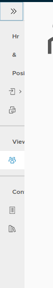
Hi, i am using section headers in side nave, when i collapse this section headers something look like this, is their any way to hide them when collapse. Thank you.
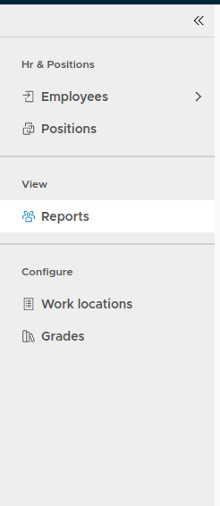
After collapse the header hr & positions looks like .
 rameshyala
on 7 Dec 2017
rameshyala
on 7 Dec 2017
@rameshyala
You should be able to do that with CSS. If you need help, please give us a plunkr and I can show you how.
mathisscott
on 7 Dec 2017
Thank you @mathisscott , Hear is the plunker link
rameshyala
on 8 Dec 2017
Hi @rameshyala
This appears to be a bug in vertical nav. I opened an issue for it already.
I also created a workaround in plunkr. If you look in index.html, you'll see the styles I'm using. Hopefully that will be sufficient until we can fix it.
Thanks.
mathisscott
on 13 Dec 2017
is there any way to override the collapse/expand double-angle svg icon?
 kingua
on 24 Jul 2018
kingua
on 24 Jul 2018
Not at this time. The collapse/expand icon is part of the component.
 hippee-lee
on 24 Jul 2018
hippee-lee
on 24 Jul 2018
Related issues
 aaronfrost
·
3Comments
aaronfrost
·
3Comments
 dennitsa
·
4Comments
dennitsa
·
4Comments
 beaker1977
·
3Comments
beaker1977
·
3Comments
 gperdomor
·
3Comments
gperdomor
·
3Comments
 amellnik
·
3Comments
amellnik
·
3Comments
Most helpful comment
Hi @williangd
Great request! We are currently investigating this as an option and should have a resolution on that in an upcoming release.