Description of the new feature/enhancement (with images if possible)
The @ symbol could easily be confused with the copyright symbol with the current design. Especially at smaller sizes, it looks a bit like a 'c' in an ellipse.

While the copyright symbol is obviously a copyright symbol, the @ symbol is not obviously an @ symbol.
Proposed technical implementation details (optional)
Separating the tail of the 'a' from the outline should eliminate any potential confusion, such as:

 DoubleDeez
All 5 comments
Thanks for the feedback! The core problem is that both the @ and copyright symbol have been designed to have maximum internal space. I think that in context they're fairly straightforward to tell apart, but I'll leave this open so that if other people have issues with this then we can look to address it.
 aaronbell
on 12 Nov 2019
aaronbell
on 12 Nov 2019
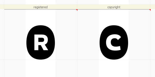
The copyright and registered symbols could be filled circles with a C or R reversed out.
The At symbol, could also terminate it's curved tail to the left side, rather than the bottom
 mdtauk
on 12 Nov 2019
mdtauk
on 12 Nov 2019
Hmm. I'll have to do some experiments. Thanks!
aaronbell
on 12 Nov 2019
Hmm. I'll have to do some experiments. Thanks!
mdtauk
on 12 Nov 2019
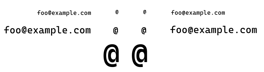
What about connecting the 'a' slightly with the circle at the top, and let the tail stop slightly sooner?
 Qqwy
on 20 Nov 2019
Qqwy
on 20 Nov 2019
Related issues
 dkgreer52
·
4Comments
dkgreer52
·
4Comments
 hansswolfs
·
3Comments
hansswolfs
·
3Comments
 khoshroomahdi
·
4Comments
khoshroomahdi
·
4Comments
 Taomyn
·
3Comments
Taomyn
·
3Comments
 teebeast
·
5Comments
teebeast
·
5Comments
Most helpful comment
What about connecting the 'a' slightly with the circle at the top, and let the tail stop slightly sooner?