Cascadia-code: Suggestion: Better readable Symbols for Greater or Equal and Less or Equal
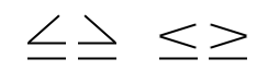
The following image shows that the less or equal operator is smaller than the inequality operator and in comparison difficult to recognize.

Please make both symbols more readable. Here my suggestion for an alternative design.
 teebeast
All 5 comments
Strongly prefer the example on the right.
 Entroper
on 8 Oct 2019
Entroper
on 8 Oct 2019
Strongly prefer the the "lesser than" in the screenshot. Perhaps it's proportions are wrong and it looks pixelated in the screenshot compared to the other characters, but it's a much more stylish ligature.
 alexleduc76
on 10 Oct 2019
alexleduc76
on 10 Oct 2019
The gte and lte version of the operators when used with underline, like in a text that is a link, can be confused with gt and lt. Need to consider that, maybe it is best to not use a horizontal line below the < and > to avoid this situation.
 lmcarreiro
on 16 Oct 2019
lmcarreiro
on 16 Oct 2019
Just be sure the horizontal line is above the underline.
Entroper
on 16 Oct 2019
Thanks for the comments! I'm planning a modification of these forms. For now, I'm closing this as a dup of #144.
 aaronbell
on 12 Nov 2019
aaronbell
on 12 Nov 2019
Related issues
 mdtauk
·
6Comments
mdtauk
·
6Comments
 DoubleDeez
·
5Comments
DoubleDeez
·
5Comments
 xmha97
·
3Comments
mdtauk
·
7Comments
xmha97
·
3Comments
mdtauk
·
7Comments
 khoshroomahdi
·
4Comments
khoshroomahdi
·
4Comments
Most helpful comment
Strongly prefer the example on the right.