Cascadia-code: Suggestion: Removing Serifs from glyphs to solidify Sans Serif character
Not a specific request yet, but ideas to address an issue that has come up from a few people. The mixture of a few distinctly Serifed letters among a general Sans Serif design.
I hope this issue can become a collaborative discussion at how we may be able to alter some of the glyphs which preserve the use of space and the intention of filling the character width, whilst preserving some of the distinctive strokes and shapes.
I am currently away from my usual PC and software, so consider the following image as a crude mock up, rather than a finished submission.
Edit: Adding higher quality mock-ups
lowercase _a_
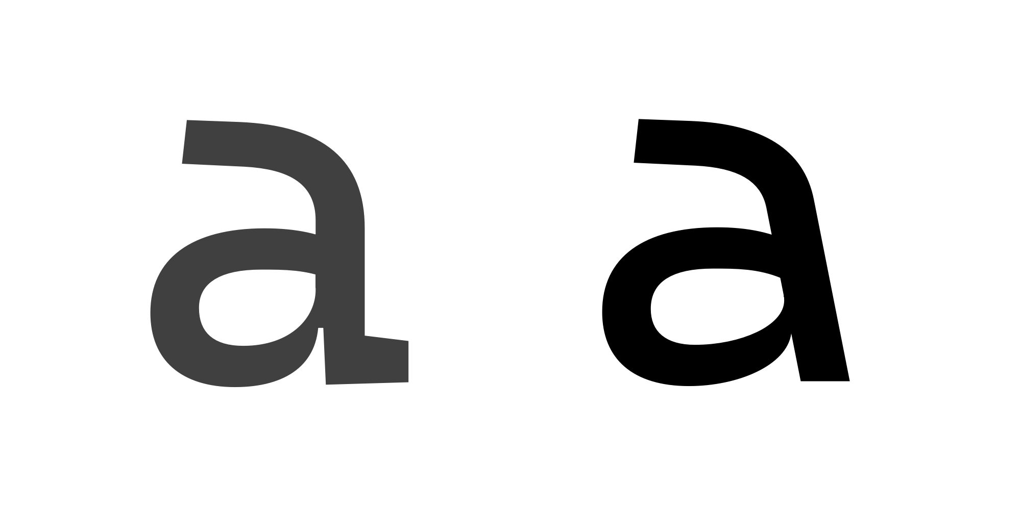
SVG Export from FontLab - Stylistic Alternative - lowercase A
Have the spine of the letter take on a diagonal angle, to fill the space where the serif currently is, as well as reduce the very tight ink trap with the lower story of the a's curve
 mdtauk
All 6 comments
The mixture of a few distinctly Serifed letters among a general Sans Serif design.
How is that an issue? This font is an original design, and many monospace fonts have serifs on some of their glyphs.
 adrientetar
on 21 Sep 2019
adrientetar
on 21 Sep 2019
I agree with @adrientetar. Serifs are often used to fill a void in monospace designs. Play e.g. with the PROP axis on https://www.recursive.design/ to see why.
 madig
on 21 Sep 2019
madig
on 21 Sep 2019
There is one issue asking for a Sans Serif version of the typeface, and characters like the a and the r could be mistaken as belonging to different typefaces. But it is subjective, and not everyone will share the same opinion, which is why I consider it a discussion as opposed to a specific request.
My goal with these ideas are to keep the widths whilst not using such strong serifs.
mdtauk
on 21 Sep 2019
lowercase _l_
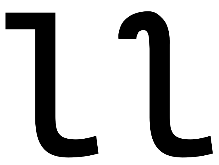
Instead of a straight serif on the top of the l (which could be mistaken for a numeral one, we could have a characteristic flick, which still gives it a distinctive shape.
mdtauk
on 21 Sep 2019
lowercase _r_
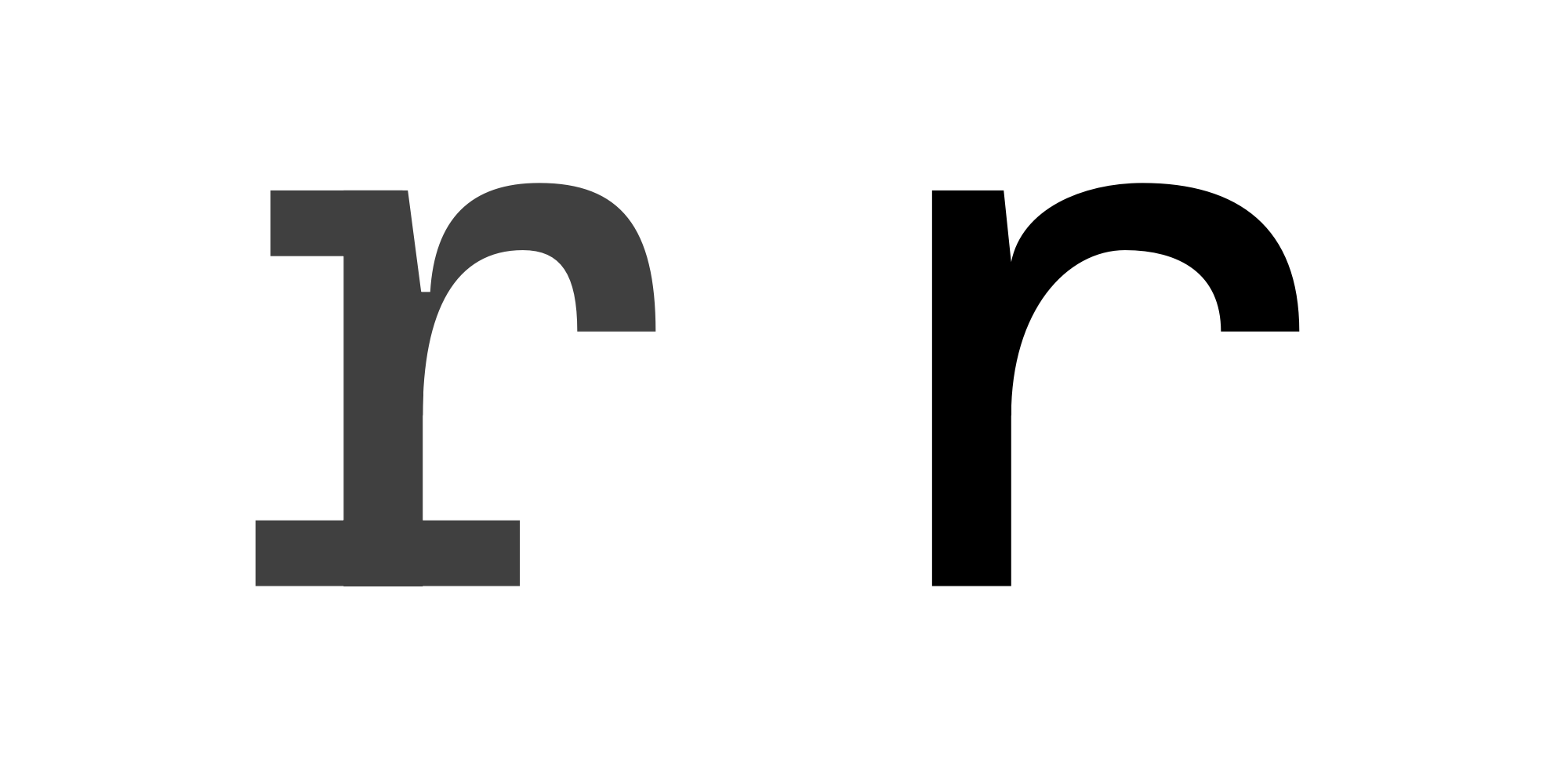
SVG Export from FontLab - Stylistic Alternative - lowercase R
The lowercase r is probably the most Serif like of all the characters in the typeface. Like the lowercase i it uses the full bottom and left serifs but stands out from the other letters.
Here I have removed the serifs, pulled the spine towards the left, and lengthened the arm on the letter.
mdtauk
on 21 Sep 2019
Thanks again for the suggestions! For the sake of streamlining the bug list, I'm duping this against #83.
 aaronbell
on 2 Jul 2020
aaronbell
on 2 Jul 2020
Related issues
 schorrm
·
7Comments
schorrm
·
7Comments
 khoshroomahdi
·
4Comments
khoshroomahdi
·
4Comments
 alanbirtles
·
6Comments
mdtauk
·
7Comments
alanbirtles
·
6Comments
mdtauk
·
7Comments
 pmartin-brierley
·
5Comments
pmartin-brierley
·
5Comments
Most helpful comment
How is that an issue? This font is an original design, and many monospace fonts have serifs on some of their glyphs.