Cascadia-code: TTF version of all fonts not appearing correctly
Environment
Cascadia Code version number:2004.30
Application (with version) used to display text:Notepad++ v7.8.6
OS platform and version:Windows Server 2016
Screen resolution (i.e. 220dpi): Unsure, using RDP

Any other software?
Steps to reproduce
Use font in NotePad++
Expected behavior
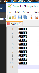
Actual behavior
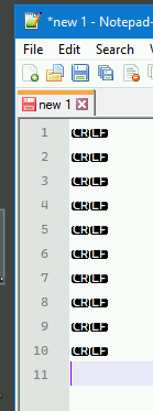
I'm seeing some very strange issues with the latest version, this is just in Notepad++, both on Windows Servers 2016, albeit different machines/dpi, but it was fine before I updated the font - yes I removed the old one first, and have also rebooted.
Happens with all four TTF font versions
_Originally posted by @Taomyn in https://github.com/microsoft/cascadia-code/issues/267#issuecomment-628540635_
 Taomyn
All 3 comments
I wonder if this issue is related to this
 angelog0
on 14 May 2020
angelog0
on 14 May 2020
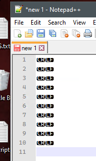
Confirmed same behaviour on Windows 10 1909
Taomyn
on 14 May 2020
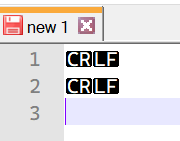
This is actually due to the way that Notepad++ builds those control characters. It uses the letters from inside the font, and then applied a black background. However, what confuses me is how they choose where the black background goes. It appears that, rather than using the font metrics (such as sTypo or hhea values), it measures the UPM (units per EM) distance from the winDescent value and that's the top of the box. For Cascadia Code, this ends up being around 1200 funits (font units), which is far too low to adequately cover the capital C R L F.
However, this approach doesn't take into consideration that winDescent can extend pretty far down in different fonts (especially with box drawing characters) and as such, result in the above weird rendering bug. It would have been much better to use a different mechanism to draw the background. :/
Through my investigations I feel confident about increasing the winDescent value by about 300 funits to align with the sTypo and hhea values, which resolves this issue in Notepad++.
Thanks for the weird bug!
 aaronbell
on 14 May 2020
aaronbell
on 14 May 2020
Related issues
 dreamer
·
4Comments
dreamer
·
4Comments
 flowchartsman
·
6Comments
flowchartsman
·
6Comments
 mdtauk
·
6Comments
mdtauk
·
6Comments
 alanbirtles
·
6Comments
alanbirtles
·
6Comments
 pmartin-brierley
·
5Comments
pmartin-brierley
·
5Comments
Most helpful comment
This is actually due to the way that Notepad++ builds those control characters. It uses the letters from inside the font, and then applied a black background. However, what confuses me is how they choose where the black background goes. It appears that, rather than using the font metrics (such as sTypo or hhea values), it measures the UPM (units per EM) distance from the winDescent value and that's the top of the box. For Cascadia Code, this ends up being around 1200 funits (font units), which is far too low to adequately cover the capital C R L F.
However, this approach doesn't take into consideration that winDescent can extend pretty far down in different fonts (especially with box drawing characters) and as such, result in the above weird rendering bug. It would have been much better to use a different mechanism to draw the background. :/
Through my investigations I feel confident about increasing the winDescent value by about 300 funits to align with the sTypo and hhea values, which resolves this issue in Notepad++.
Thanks for the weird bug!