Altair: Text labeling not matching stacked bar chart
Hello there and thanks for this great framework! I have an issue with the following bar chart:
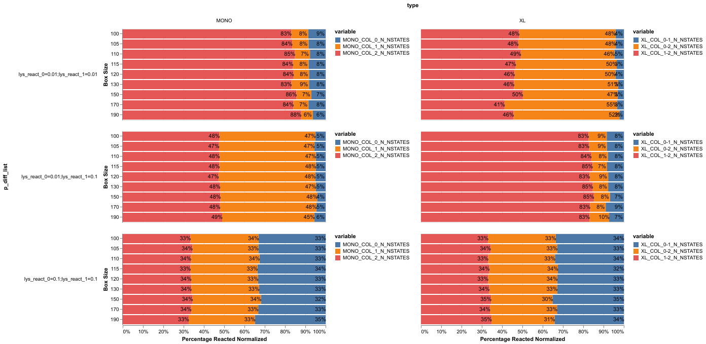
Click
Note that I added the red rectangle to highlight a problem: some text labels do not match the bar below. So in this case the 55% and the 41% should be switched around. When I enable tool tips then I can see that the correct value is actually used by altair for the bar plot but not for the label. Strangely enough this only happens for some values...
It is created by this code:
base = alt.Chart().mark_bar().encode(
    x=alt.X("value:Q", stack='normalize',axis=alt.Axis(format='%', title='Percentage Reacted Normalized')),
    y=alt.Y(md_db.param_boxize+':O', axis=alt.Axis(title='Box Size')),
    tooltip=['value', 'value_norm:Q', 'value_ref_ratio:Q','variable:N', md_db.param_boxize+ ':O'] + [md_db.param_react + str(n) + ':N' for n in range(2)],

)
bars = base.encode(
    color=alt.Color('variable:N'),
)
text = base.mark_text(
    dx=-10,
    angle=0,
    color='black',
).encode(
    text=alt.Text('value_norm:Q',format='.0%'),
)
alt.layer(bars, text).facet(
    column=alt.Column('type:N'),
    row=alt.Row(md_db.param_diff_col+':N', header=alt.Header(labelAngle=0)),
    data=df_merge
)
Unfortunately I cannot attach dummy data right now but will do so if requested.
 stengellab
All 7 comments
If you could provide a sample dataset that reproduces this error, that would be helpful. It's hard to diagnose what's happening without the complete code.
 jakevdp
on 27 Jun 2019
jakevdp
on 27 Jun 2019
I have found that the issue is somehow related to the color argument. I pass the color separately to the bars object while I create the mark_text on top of the base object (which knows nothing of the color...).
If I additionally encode the color for the text object and resolve the colors independently I end up with this:
Here is the code for the plot above:
Added to the encode part of the text object:
color=alt.Color('variable:N', scale=alt.Scale(range=['black']), legend=None)Updated facet code:
alt.layer(bars, text).resolve_scale(color='independent').facet(
As you can see the labeling matches now perfectly but I end up with 6 legends and I now have only three colors instead of six which I preferred.
Here is some code for you to reproduce via a vega dataset:
from vega_datasets import data

df1=data.barley()
df1['yield_norm'] = df1.groupby(['year', 'variety'])['yield'].transform(lambda x: x/x.sum())

base = alt.Chart().mark_bar().encode(
    x=alt.X('yield:Q', stack='normalize'),
    y=alt.Y('variety:N'),
    tooltip=['yield:Q', 'variety:N', 'year:O', 'yield_norm']
)

bars = base.encode(
    color=alt.Color('site:N'),
)

text = base.mark_text(dx=-15, dy=3, color='black').encode(
    text=alt.Text('yield_norm:Q', format='.0%'),
)

alt.layer(bars, text).facet(column=alt.Column('year:O'), data=df1)
Note that I calculate the normalized values via pandas; there probably is some altair way to do this. Unfortunately I am not familiar enough yet with altair to figure this out...
You will see that some labels but not all of them match (positions as well as values)...
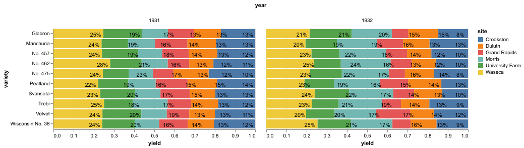
This can be "fixed" by adding the color scale to the mark_text:
from vega_datasets import data

df1=data.barley()
df1['yield_norm'] = df1.groupby(['year', 'variety'])['yield'].transform(lambda x: x/x.sum())

base = alt.Chart().mark_bar().encode(
    x=alt.X('yield:Q', stack='normalize', axis=alt.Axis(format='%', title='Normalized Yield')),
    y=alt.Y('variety:N'),
    tooltip=['yield:Q', 'variety:N', 'year:O', 'yield_norm']
)

bars = base.encode(
    color=alt.Color('site:N'),
)

text = base.mark_text(dx=-15, dy=3, color='black').encode(
    text=alt.Text('yield_norm:Q', format='.0%'),
    color=alt.Color('site:N', scale=alt.Scale(range=['black']), legend=None)
)

alt.layer(bars, text).resolve_scale(color='independent').facet(column=alt.Column('year:O'), data=df1)
The match is now perfect. However, this a) seems like hacky workaround, b) will create superfluous legends and c) will (for my data set) reduce the number of used colors which is not what I want. Really hope this helps
stengellab
on 28 Jun 2019
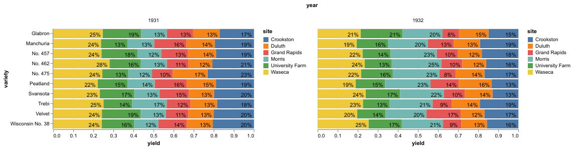
The problem I think is that the stack order of the bars is not consistent between the charts: adding a color encoding changes the default stack order. You can fix this by explicitly setting the order channel in the base chart, so that the labels are stacked in the same order regardless of the encoding:
import altair as alt
from vega_datasets import data

df1=data.barley()
df1['yield_sum'] = df1.groupby(['year', 'variety'])['yield'].transform('sum')
df1['yield_norm'] = df1['yield']/df1['yield_sum']

base = alt.Chart(df1).mark_bar().encode(
    x=alt.X('yield:Q', stack='normalize'),
    y=alt.Y('variety:N'),
    tooltip=['yield:Q', 'variety:N', 'year:O', 'yield_norm'],
    order='site:N'
)

bars = base.encode(
    detail='site:N',
    color='site:N',
)

text = base.mark_text(dx=-15, dy=3).encode(
    text=alt.Text('yield_norm:Q', format='.0%'),
)

alt.layer(bars, text).facet(column=alt.Column('year:O'))
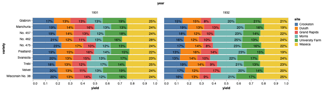
jakevdp
on 28 Jun 2019
For what it's worth, here's how you can push the data manipulations into the chart's transform specification:
df = data.barley()

base = alt.Chart(df).transform_joinaggregate(
    yield_sum='sum(yield)',
    groupby=['year', 'variety']
).transform_calculate(
    yield_norm='datum.yield / datum.yield_sum'
).mark_bar().encode(
    x=alt.X('yield:Q', stack='normalize'),
    y=alt.Y('variety:N'),
    tooltip=['yield:Q', 'variety:N', 'year:O', 'yield_norm:Q'],
    order='site:N'
)

bars = base.encode(
    detail='site:N',
    color='site:N',
)

text = base.mark_text(dx=-15, dy=3).encode(
    text=alt.Text('yield_norm:Q', format='.0%'),
)

alt.layer(bars, text).facet(column=alt.Column('year:O'))

jakevdp
on 28 Jun 2019
Thank you very much! The order parameter was exactly what I was looking for. Unfortunately when trying your code to push the data manipulations directly I get an error:
Click
It goes away though when moving the df as input from the Chart object to the facet object (data=df). Thank you so much for going the extra length of showing me these transformations; I'm not sure I like the syntax more than pandas but it is nice to keep the original dataframe 'clean'.
In the end my problem should have rather been on stackexchange than here I guess but it's tough to know beforehand.
stengellab
on 28 Jun 2019
I think that error indicates that you're using Altair version 3.0. Update to the latest release (3.1), and the code should work.
If you need to stick with Altair version 3.0 for some reason, you can specify the data in the facet method, as you did in your original snippet.
jakevdp
on 28 Jun 2019
Thanks again, conda decided to install 3.0 for some reason. 3.1 is a great update!
stengellab
on 1 Jul 2019
Related issues
jakevdp
·
34Comments
 Hisham-Hussein
·
29Comments
Hisham-Hussein
·
29Comments
 mroswell
·
21Comments
mroswell
·
21Comments
 pagpires
·
21Comments
pagpires
·
21Comments
 Znafon
·
23Comments
Znafon
·
23Comments