Altair: layered charts can't seem to have different color mappings
It looks like layered charts can't have different color scales. Is that true? Intentional?
I'm using a different color scale for the bars as the lines, and then composing the charts. My goal is to have a slightly lighter color scheme for the lines than the bars, to see what that might look like. But, it doesn't seem to be respecting the second colorscale.
To test it, I did something more obvious: using "red" instead of "lightgrey".
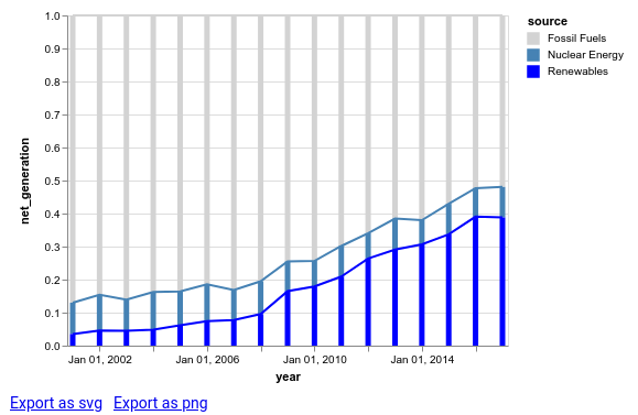
See code and image below.
import altair as alt
from vega_datasets import data

iowa = data.iowa_electricity()

bars = alt.Chart(iowa).mark_bar().encode(
    x="year:T",
    y=alt.Y("net_generation:Q", stack="normalize"),
    color=alt.Color("source:N",
                    scale=alt.Scale(domain=['Fossil Fuels', 'Nuclear Energy', 'Renewables'],
                      range=['lightgrey', 'steelblue', 'blue']))
)

lines = alt.Chart(iowa).mark_line().encode(
    x="year:T",
    y=alt.Y("net_generation:Q", stack="normalize"),
    color=alt.Color("source:N",
                    scale=alt.Scale(domain=['Fossil Fuels', 'Nuclear Energy', 'Renewables'],
                      range=['red', '#94caf7', '#6b6bff']))
)

alt.layer(
    bars,
    lines
)
question
 zanarmstrong
All 4 comments
You can set the scale resolve to be "independent" like here. (From a quick search, I couldn't find Altair syntax page for it, but I'm sure there is one.)
 kanitw
on 17 Jul 2018
kanitw
on 17 Jul 2018
Altair syntax looks like this:
alt.layer(
    bars,
    lines
).resolve_scale(color='independent')
 jakevdp
on 18 Jul 2018
jakevdp
on 18 Jul 2018
👍10
❤5
Our docs are definitely missing discussion of resolve for compound charts.
jakevdp
on 18 Jul 2018
Thank you!
zanarmstrong
on 22 Jul 2018
Was this page helpful?
0 / 5 - 0 ratings
Related issues
 tonylee3399
·
3Comments
tonylee3399
·
3Comments
 dzonimn
·
3Comments
dzonimn
·
3Comments
 firasm
·
3Comments
firasm
·
3Comments
 HalukaMB
·
3Comments
HalukaMB
·
3Comments
 floringogianu
·
3Comments
floringogianu
·
3Comments
Most helpful comment
Altair syntax looks like this: