Altair: Transform Filter on Concatenated Chart appear to be cropped
Hi, i'm trying to concatenate two different charts with linked interactivity. If I click on one of the Choice rectangle, it would only shows the Category that are assigned to that Choice. So, far so good, you can use the following code to reproduce it.
import pandas as pd
import altair as alt
import numpy as np

print(f"Altair version: {alt.__version__}")
print(f"Pandas version: {pd.__version__}")
print(f"Numpy  version: {np.__version__}")

np.random.seed(77)

df = pd.DataFrame({
    'Choice': np.random.choice(['A', 'B', 'C'], 50),
    'Category': range(50)
})

choice_selection = alt.selection_single(fields=['Choice'], name='Choice: ')
category_selection = alt.selection_single(fields=['Category'], name='Category: ')

rect = alt.Chart(df).mark_rect().encode(
    y='Choice:N',
    color=alt.condition(choice_selection, alt.Color('Choice:N', legend=None), alt.value('lightgray'))
).add_selection(
    choice_selection
)

cat_rect = alt.Chart(df).mark_rect().encode(
    y='Category:N',
    color=alt.condition(category_selection, alt.Color('Category:N', legend=None), alt.value('lightgray'))
).add_selection(
    category_selection
).transform_filter(
    choice_selection
)

rect | cat_rect
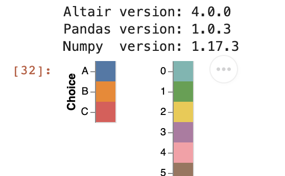
Code above produces this chart:
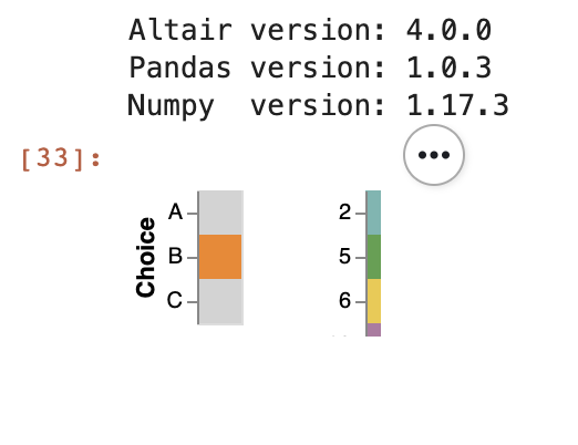
However, if I initialize choice_selection with an empty='none' parameter on the code on Line 16, the concatenated cat_rect chart seems to be cropped. See the following code and screenshot:
choice_selection = alt.selection_single(fields=['Choice'], name='Choice: ', empty='none')
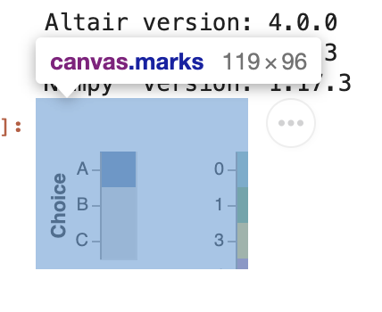
And it seems that it is related to the canvas of the JavaScript instead of the Vega-Lite:
I want to initiate them with an empty='none' parameter because Category field would contain a very long list of unique values. Is there a way to fix this? Thanks in advance.
 tonylee3399
All 3 comments
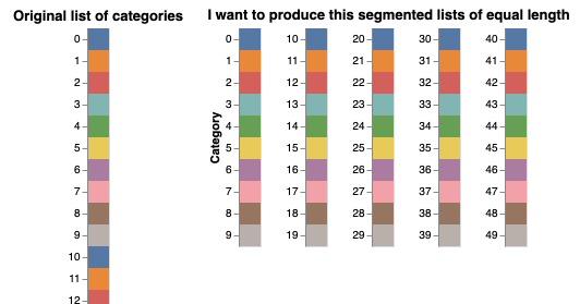
Related to this, I would like to ask an additional question regarding the long list of Category field. Is there a way to automatically divide those long-list into, let's say 5 different columns?
I could achieve this with this code, but it's not elegant:
charts = []

i = 0
for n in range(5):
    charts.append(
        alt.Chart(df.iloc[i:i+10]).mark_rect().encode(
            y=alt.Y('Category:N', title='Category' if i == 0 else None),
            color=alt.Color('Category:N', legend=None)
        )
    )
    i += 10

alt.Chart(df).mark_rect().encode(
    y='Category:N',
    color=alt.Color('Category:N', legend=None)
).properties(title='Original list of categories') | alt.hconcat(*charts).properties(title='I want to produce this segmented lists of equal length')
tonylee3399
on 13 Apr 2020
This appears to be an issue with the renderer: it chooses the size of the chart based on the initial render, and does not dynamically expand that if the chart changes due to interactions. I'd raise the issue with the Vega-Lite project.
 jakevdp
on 13 Apr 2020
jakevdp
on 13 Apr 2020
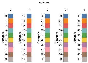
For your second question, you could do something like this:
alt.Chart(df).transform_calculate(
    column="floor(datum.Category / 10)"
).mark_rect().encode(
    y='Category:N',
    color=alt.Color('Category:N', legend=None),
    column='column:N'
).resolve_scale(
    y='independent'
)
jakevdp
on 13 Apr 2020
Related issues
 mroswell
·
4Comments
mroswell
·
4Comments
 morberg
·
3Comments
morberg
·
3Comments
 nielsmde
·
4Comments
nielsmde
·
4Comments
 DentonGentry
·
3Comments
DentonGentry
·
3Comments
 breadbaron
·
4Comments
breadbaron
·
4Comments