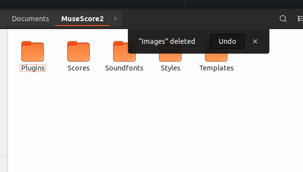
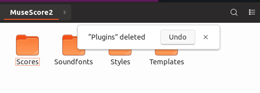
Yaru: Enhance the readability of appNotifications
As discussed here https://github.com/ubuntu/gnome-shell-communitheme/issues/89
Implement white appNotifications or dark notifications with better readability which would affect for example nautilus, which uses appNotifications
@godlyranchdressing could you try that? I've seen you did something similar in united-gnome
https://user-images.githubusercontent.com/3986894/38161675-047ac8d4-34d4-11e8-934a-2aaabf3ed308.gif
All 6 comments
IF we want to keep the dark notifications, I suggest a lower transparency on the background. That would be better because then the contrast between the background and the button would be bigger. Like the Adwaita notifications. Currently the dark button is really hard to see.
@madsrh Yeah, the bottom highlight effect that dark buttons have is much less than it used to be. I think I was lazy with bringing it back, but I don't know if to bother with it anymore with @nana-4's proposed changes in #288 (which I quite like).
Mockups using both ideas:
The notification frame with less transparency (0.05 vs the current 0.1)

Light notifications based on the current popover style:

That ilght one looks really good imho
@godlyranchdressing Which one do you vote for?
I think the transparency needs to be (even) lower in the dark notification. Maybe that will feel weird alongside the system menu, calendar,... but IMO the contrast (button vs. background) is too low.
Again, Adwaita for comparison:

@madsrh The light one, but I was leaning towards the dark one before making the mockups.
I think it looks friendlier, but the dark one _does_ pop against the white background more.
Any less transparency and it might as well be solid IMO. It's been a while since I've seen the Shell theme's SASS but 0.05 is the same transparency that the Shell popover menus (calendar, etc.) used last I remember.
@godlyranchdressing Okay, I'm a bit torn myself, but a solid background with Graphite #666 would look good IMO.
We want it to pop, but I'm not sure if it would feel weird with both light and dark notifications.
Most helpful comment
@madsrh Yeah, the bottom highlight effect that dark buttons have is much less than it used to be. I think I was lazy with bringing it back, but I don't know if to bother with it anymore with @nana-4's proposed changes in #288 (which I quite like).
Mockups using both ideas:
The notification frame with less transparency (0.05 vs the current 0.1)
Light notifications based on the current popover style: