Yaru: Reducing the orange - making orange more elegant
Do not worry. I am not really asking for a different highlight-color. But the orange could be reduced. The theme is taking a very classy, clean and mature direction. But this is how the theme can look too:

I think it is too much of one color.
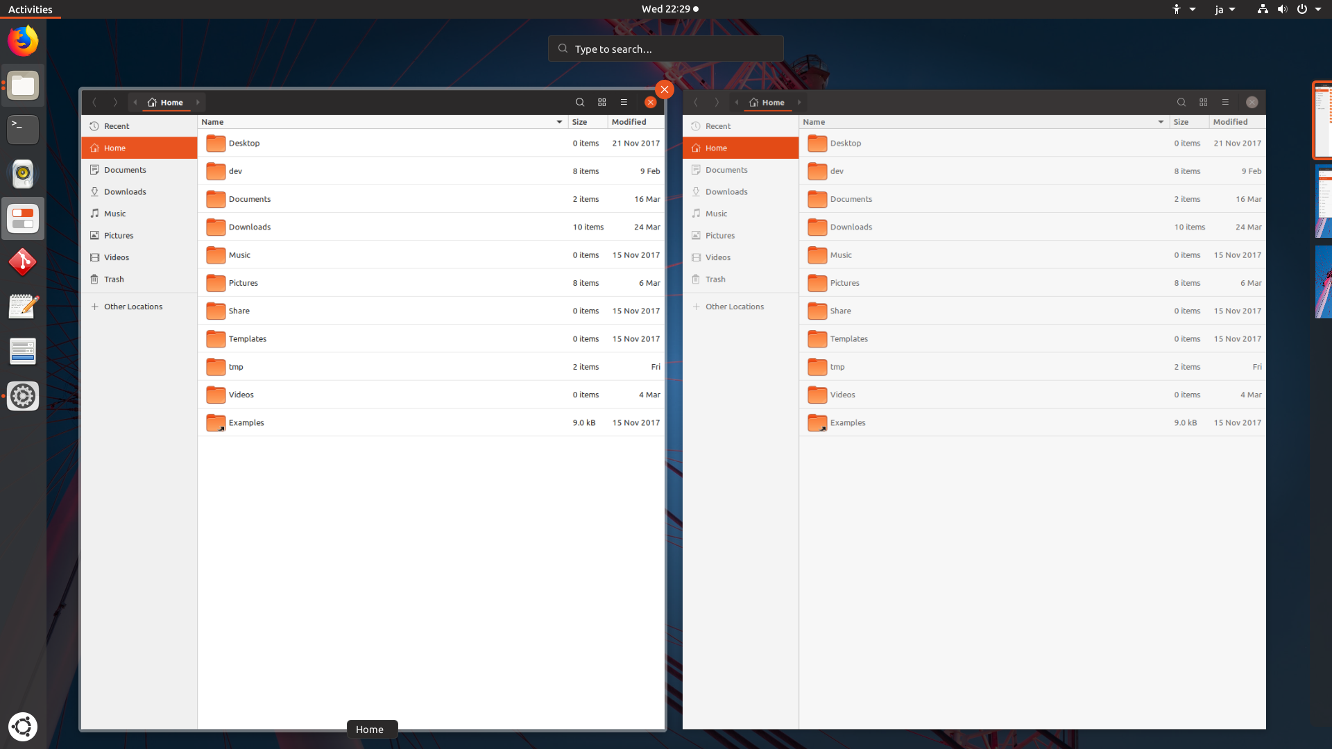
The highlight in the nautilus-sidebar is orange. Could it behave more like a clicked button?

That would mean a stronger grey. It would be more consistent to how buttons behave even when the clickable elements in the sidebar are no buttons.
The menus have a grey highlight too:

The nautilus-sidebar is the only element with this behavior (getting orange when clicked).
 ghost
ghost
All 78 comments
Other sidebars are orange too - Settings, Tweaks, file chooser.
 CDrummond
on 25 Mar 2018
CDrummond
on 25 Mar 2018
Yes, sorry. I meant sidebars but used the example for nautilus-sidebars. You are right. All sidebars use orange highlights. For consistency: Shouldn't they behave more like pressed buttons?
ghost
on 25 Mar 2018
I'm not a designer, but (IMVHO) no they should not look like buttons. To me they're like elements from a list, where one is selected - and selected list items have an orange background.
CDrummond
on 25 Mar 2018
I know that this is the number one criticism when people try the theme. We discussed this earlier and tried a few things but landed on this pure orange.
I'll leave it up to the other guys whether this issue should be closed or needs further discussion. IMHO this is a _won't fix_
 madsrh
on 25 Mar 2018
madsrh
on 25 Mar 2018
Most themes, including adwaita which is the base for this theme, don't theme the sidebar as selected toggle buttons.
I would also encourage everyone to not start an issue for every bit that comes into their mind. There is already a lot of stuff to fix. Let the designers do the design and let us try to fix the issues or report actual issues. This would be just my suggestion since we all want to stay on the road, don't we? Closing this now.
 Feichtmeier
on 25 Mar 2018
Feichtmeier
on 25 Mar 2018
Sidebars when clicked -> get orange
Buttons when clicked -> get grey
When something is clicked there is no need to use different colors.
ghost
on 25 Mar 2018
I never said it should be themed like a button. Only the colours should behave like one.
This reaction is not fair.
ghost
on 25 Mar 2018
At least we should try to understand each other. It is not fair to react like this when people try to help. This is a question of consistency. Similar elements react different.
No need to treat people like this.
ghost
on 25 Mar 2018
@madsrh @clobrano feel free to re-open this
@NusiNusi Keep up the good work and report bugs :+1:
If it's really a stronger urge to change this you can always ask in the old issue for this. :)
Sorry if you felt offended by this! I didn't want you to feel this way :(
This can always be reopened in a sec :) don't worry
Feichtmeier
on 25 Mar 2018
Sidebars when clicked -> get orange
Buttons when clicked -> get grey
@NusiNusi I think there's a little misunderstanding on orange in nautilus' sidebar. The list item in sidebar is not just pressed, like a button, is also selected. You can see that once pressed even buttons get a orange highlight, so I don't see a problem of consistency here.
In the picture you posted of a contextual menu, the label is hovered, not clicked, nor selected.
 clobrano
on 26 Mar 2018
clobrano
on 26 Mar 2018
Can we reopen this?
ghost
on 1 Apr 2018
Reopened because of the recent discussion in
https://github.com/ubuntu/gtk-communitheme/issues/184
Feichtmeier
on 1 Apr 2018
Is it okay, when we discuss all "reducing orange"-stuff here? We could open concrete tickets after a decision?
IMHO we should consider making the orange lines thinner. Reasons for this:
- it looks more elegant
- it looks more mature
- because it is orange it is still very good visible (1920 x 1080 here. But not sure about 4k)
here a little mockup i made with gimp:

And yes... there are places we could still add orange.
EDIT: By the way this is 1px thickness.
ghost
on 1 Apr 2018
@NusiNusi First of all - wrong project :-) that screenshot belongs to https://github.com/ubuntu/gnome-shell-communitheme . Second - Single is too thin, perhaps a 2px thick line? (I _think_ it's something like 3px at the moment) Also, there is not that much orange. I get it you don't like orange, but it is part of the colour scheme.
CDrummond
on 1 Apr 2018
@CDrummond I asked in my post if it is okay to discuss all that stuff here. Or else we would have to open a ticket for every element we want to reduce, rethink or refine orange. @clobrano should we open a new ticket for this? It all belongs to one topic "reducing orange or make it more elegant/mature".
And sorry but this is simply not fair:
I get it you don't like orange
Why are you saying that? So any discussion is not necessary? We should discuss how we make the use of orange more elegant. I do not understand why you make it so personal. I told the reasons in my post and not that i don't like it. Tell me reasons why it should be kept how it is. That is the way we discuss this. With arguments.
ghost
on 1 Apr 2018
I actually thought that the orange highlights are OK, but (too) many orange folder icons _are_ too much orange. 🍊🍊🍊🍊🍊🍊🍊🍊🍊🍊😜
Isn't there a chance to change the folder icon color (instead of reducing orange highlights of the theme)?
 nana-4
on 1 Apr 2018
nana-4
on 1 Apr 2018
I absolutely love the Suru folder icons including the orange.
Not that I have anything to decide, but -1 from me :dancer:
Let's first see how the incoming nautilus selection will feel when seeing it "live" and then move on and see if there is any other orange that reaaally needs to be changed. Personally, I feel that this whole discussion went somehow out of place :)
Feichtmeier
on 1 Apr 2018
I think nearly every clickable element gets grey(er) when hover. Only in gnome-shell the windows get an orange hover. I made a mockup to show another possible solution:

You can see that i used a squircel @madsrh proposed and a much thinner orange line for selected "activities" (1px). What do you think?
EDIT: I think with thinner lines we can make very sexy animations @nana-4 ;)
EDIT 2: I updated the mockup. Maybe the close-button should only get orange when hovered. This way we do not have two orange "blobs" next to each other when we hover over the window in gnome-shell. What do you think?:

ghost
on 1 Apr 2018
@NusiNusi sorry - no offence intended. _Almost_ all styles use the highlight colour in the sidebars, as they highlight an item in a list. So, its consistent for Communitheme to use this. You take things too personally. My opionion is no more, or less, valid than yours. Sorry if I got the wrong impression - but you do seem to be trying to reduce the amount of orange. Hence my (incorrectly it seems) assuming you did not like this colour.
CDrummond
on 1 Apr 2018
@CDrummond I really think we should reduce the amount of orange. But at the same time i accept (now) that it is part of the color-scheme. IMHO orange can be more attractive when we use it more minimalistic. Giving the theme orange accents rather than orange blocks. At the moment the communitheme seems to have at most part the following rules:
- orange is the color for selected
- gray is the color for hover/mouse-over
Should this be followed for the whole theme? That means for gnome-shell too (see my mockup in last post.) What do you think?
At the same time we should add orange to other places. When getting asked for the password the "enter-field" (is this the correct name?) is selected so it should be orange:

The close-button is at least for me a serious problem. Maybe it is because i wear glasses but after a time it looks like the x is moving more to the left side of the orange cirlce. When i turn my head from left to right and back the x is moving inside the circle from left to right too. When working at night the orange dot really bothers me because it takes to much attention in my field of vision. So reducing the orange here is not a matter of taste. It's about usability. What do you think about this?
ghost
on 1 Apr 2018
Some thoughts on reducing orange:
Orange really isn't the an easy color for UI design, but this is part of the palette that we've been dealt.
- The sidebar:
I'm really looking forward to try this in the real (did @nana-4 send a PR?). I've tried this in a few mockups and I really miss the "huge block of orange" :wink: It's hard to tell if it's because I've been looking at this since november or if it's just because (almost) all themes use a solid color in the sidebar. Let's see how it feels 😃
- The orange lines in the top-bar could be thinner. This way it looks more elegant/mature. (Maybe in stackswitcher and everywhere else too?)
Sure, but 1px might be too thin though.
- The hover-color in gnome-shell should be gray and not orange. Because everywhere else the theme uses gray when a clickable element gets hovered (mouse-over).
Yes, the orange is too much here. Wasn't there already an issue regarding this? 🤔
- The close-button could only be orange when hovered (mouse-over). It looks more elegant and mature this way and we would not have two orange blobs next to each other in gnome-shell.
Like the sidebar, we again already spend a lot of time discussing the window controls and landed on the orange close button. I think I personally have a foot in each camp (both for and against).
Regarding the "Activities" view, only the active window will have an orange X, the other windows will be in backdrop.
Anyway, if we change this, we will lose a IMO huge part of the branding and also the link to Ambiance. The arguments in favor of removing the color, would be more consistent window controls, Activities would look more clean and there was no orange X planned for Unity8.
- The close-button in gnome-shell should stay orange because the window is hovered (mouse-over).
Doesn't it already do this???
When getting asked for the password the "enter-field" (is this the correct name?) is selected so it should be orange:
As @clobrano already mentioned this is the plan. @luxamman also had some other changes to the shell design pending, but he is currently busy out in the real world :earth_americas:
One of the few requirements that the theme has to meet, is that it is easily recognisable. By looking at a random screenshot for one second, a linux user should be able to tell that this is Ubuntu!
I have a suggestion for reduced orange myself - the selected text color. @godlyranchdressing already suggested this a few months ago, but I guess I missed that :flushed: Sorry! Taken from Unity8 design here, right?
When selecting a lot of text, the current orange is really overwhelming. Lowering the opacity never looks good with orange, so this light blue might be a good solution (or a weird mix).
Also the dropdown (font, size,...) in Libreoffice is orange but gray in widget-factory. I'm guessing that's a bug?

One final thing, is the Calendar. IMO we should (as mentioned)never use the lower opacity orange, so I would suggest: Solid orange border for selected and gray background for the current day.

@clobrano @godlyranchdressing and others, let us know if you feel that issues should be opened for any of these.
madsrh
on 2 Apr 2018
I feel that is whole topic is getting out of control and I hope that we do not end up having just another generic "elegant" theme. Like @madsrh said this should be the ubuntu theme and everyone should know that it is ubuntu. There are a lot of ideas and I think that is great, but it is quiet hard to filter when the design process is allready finnished long ago.
Also, does commuitheme have really MORE orange than adwaita has blue? I don't think so.
Anyways...
I'll check for reducing the orange selection width in shell and make some screenshots. Is there allready an issue in shell repo for this?
Feichtmeier
on 2 Apr 2018
I still don't want to create an issue for this until the nautilus sidebar change is live. Maybe this whole topic will calm down a bit then.
On the overview:
Let's keep in mind that what the user does in this overview - he wants to SELECT a window - hence he needs to know which window is SELECTED. He does not hang around in this overview for more than 10 secs getting depressed about orange.
Some screenshots of variations of the overview selection to get an impression in which direction we could go, if we really need to....
A) 1px border

B) 4px border

C) Transparent orange border

D) Same thickness as "live" but with $ash border

Feichtmeier
on 2 Apr 2018
@clobrano should we open a new ticket for this? It all belongs to one topic "reducing orange or make it more elegant/mature".
On doubt, please write on the Forum.
In particular, it's a good practice to open one ticket for each very specific problem, so that it is easier to trace back what has been done and why. This is why it's better to discuss open and wide topics on the forum and then open tickets that reflect the decision taken.
I am not interested in reducing orange more than we already did. The only place where I feel too much of it is maybe Nautilus, because of the folders, but Suru Icons are out of our control. What if someone changes just the icon set and keep communitheme?
I actually thought that the orange highlights are OK.
I agree. I'd like to try the new mockup, because it looks nice, not because it reduces the orange.
The close-button is at least for me a serious problem. Maybe it is because I wear glasses but after a time it looks like the x is moving more to the left side of the orange circle
I wear glasses too.
Close button has been black, then an orange circle, then a squircle, then orange only on hover, then current style. Every version has been appreciated and disregarded by someone. This is normal, of course, but I learned that we cannot follow any wind. This style trace back Ambiance, with both gnome2 and unity in the last 11 years at least. Of course, if we are aware that this make feel dizzy a lot of people we surely consider to change it.
At the moment the communitheme seems to have at most part the following rules:
- orange is the color for selected
- gray is the color for hover/mouse-over
...
Yes, the orange is too much here. Wasn't there already an issue regarding this?
There was an action to change from grey to orange and that's what we did :D
@NusiNusi, this is similar as sidebar's items. Selection and hover are not mutually exclusive. In activities you both hover and select at the same time. So, to me it's OK to keep the color, and also agree that the border might be too thick. I like the first mockup by @Feichtmeier, but I should try it on the real thing and double check if it isn't too thin. @Feichtmeier if you like, please open a PR.
As @clobrano already mentioned this is the plan
Correct, this is the ticket. It does not mention directly the entries, but it's the same thing.
I have a suggestion for reduced orange myself - the selected text color. @godlyranchdressing already suggested this a few months ago, but I guess I missed that flushed Sorry! Taken from Unity8 design here, right?
When selecting a lot of text, the current orange is really overwhelming. Lowering the opacity never looks good with orange, so this light blue might be a good solution (or a weird mix).
Totally forgot that, you're right, I think we should make an exception to the rule of selection color here. Do you mind open a bug for this?
Finally, I agree with @madsrh and @Feichtmeier, "reducing orange" is not a topic for me.
clobrano
on 2 Apr 2018
@madsrh
Sure, but 1px might be too thin though.
Yes, another solution would be some kind of glow. This way it would be thicker and at the same time lose the somehow blocky look. I am +1 for making them thinner. 1px or more.
Doesn't it already do this???
Yes, i was saying it in the context of changing the highlight-color to gray. I wanted to avoid a misunderstanding i could mean the close-button too.
@clobrano
In activities you both hover and select at the same time
Hm... I am not sure about this. In activities i hover when mouse-over. When i select it i click on it and then the window gets in focus. When you go to the right the selected desktop has an orange frame. Here it is logic because it is selected. When i select another desktop by clicking on it then it gets the orange frame instead.

In activities we only hover over a "possible" selection of open windows. We still do not select. Am i right?
I wear glasses too.
Close button has been black, then an orange circle, then a squircle, then orange only on hover, then current style. Every version has been appreciated and disregarded by someone. This is normal, of course, but I learned that we cannot follow any wind. This style trace back Ambiance, with both gnome2 and unity in the last 11 years at least. Of course, if we are aware that this make feel dizzy a lot of people we surely consider to change it.
A little google-research showed me that it could be a little optical illusion. When you look a the x in the close-button and move your head to the left and to the right, the x will move too inside the orange circle. You do not have this in Ambiance. I think because the x is black and the orange is darker?
I found an article with this example:

You can read it up here: https://www.washingtonpost.com/news/wonk/wp/2015/02/27/12-fascinating-optical-illusions-show-how-color-can-trick-the-eye/?utm_term=.0279e8279a7f
So yes, at least for me it moves. What about you?
Another reason for removing the orange button (or make it more subtle) is that it seems like a very strong distraction. It "screams" for attention. The reason for this could be the white x which make the close-button somehow "shine" much more. Especially when working late the "shiny" orange dot on the right corner is too big of a distraction.

I recommend to make it only orange on mouse-over/hover. This is the only situation when it need my attention but not when i am writing a text. This way we could keep the look of it and a complete redesign would not be necessary? At the same time we would avoid two orange dots next to each other in gnome-shell:

IMHO this looks much cleaner:

@Feichtmeier Thank you for your mockups. IMHO version D is consistency- and usability-wise the best solution. Version C would be my next choice but IMHO it would be a design-choice because it would break consistency.
ghost
on 2 Apr 2018
Imho grey just does not make sense. Grey means something not so important for me.
Orange means "I am doing something important now - I am going to select a window or even drag it onto another workspace"
It is the workspace overview - this is what you do here:
- have an overview of all opened windows on the current workspace
(the currently selected workspace is indicated on the right in the thumbnail panel) - then SELECT a window and eventually DRAG it onto a different workspace
- CLOSE windows - these might be unsaved files! or even more important stuff
So this is really all more important than hovering above toggle buttons - which are grey when hovered.
I would go for A ) or B )
Feichtmeier
on 2 Apr 2018
@Feichtmeier
I am doing something important now - I am going to select a window
But it is not selected. You selected at the moment you want to DRAG it. In this situation it can be orange.
I understand what you mean but with this logic nearly every clickable element should become orange because i am going to do something important: looking for updates or changing the theme etc.
And as i said:
- in gnome-shell the close-button stays orange because - as you said - i am going to close the window and unsaved data might be lost. With the gray border the close-button looks even for more attention because it would be the only orange element (much stronger contrast). "Watch out... when i click this this window gets closed." At the moment it is more like a lump on an orange frame.
ghost
on 2 Apr 2018
Sorry for my delay of the sidebar change. (I was working on the button rework because I thought it is more important right now :P) I'll work on it as soon as possible.
Incidentally, I do vote my +1 for changing the the overview border color, but to be _translucent white_ (derived from text color like transparentize($fg_color, 0.5)), not grey. ;)
As @clobrano and @Feichtmeier stated, the border has the meaning of _both hover and select at the same time_, and to me, "translucent white" for _hover_ and "orange" close button for _select_ make sense. I also recommend making the orange close button bigger at the same time to emphasize selection.
nana-4
on 2 Apr 2018
@nana-4 Like this?
Can't find the size of the window control :S
Feichtmeier
on 2 Apr 2018
@Feichtmeier This needs to be 32px.
Also it may be better to change the circle size of the source SVGs. (Not testing for now.)
nana-4
on 2 Apr 2018
@Feichtmeier Is the squircle proposed by @madsrh still a thing? Maybe you can put that into the update too if @madsrh still wants it. From me a big +1 for your changes.
ghost
on 2 Apr 2018
Is the squircle proposed by @madsrh still a thing?
Did I propose that? 😳 I don't think so. Is this what you are referring to?
madsrh
on 2 Apr 2018
@madsrh Yes! So it was the idea of @CDrummond . Was not sure about this.
ghost
on 2 Apr 2018
Yes! So it was the idea of @CDrummond . Was not sure about this.
@NusiNusi Ahhhhh, I wasn't actually suggesting it. It was suggested (by Craig) and I just posted a mockup to the discussion because we actually did considered this earlier. Sorry for the misunderstanding.
madsrh
on 2 Apr 2018
@madsrh It was my mistake. No problem. I really liked it.
Have you read my post about the orange close-button and the optical illusion (sources for explanation are there too)? Is this worth rethinking the close-button? I experience it as very distracting.
ghost
on 2 Apr 2018
I am not a fan of this squircle close button.
The effect of having two close buttons in 🍊 is gone when more windows are opened.
Feichtmeier
on 2 Apr 2018
@nana-4 @madsrh I am really not for changing the size of the close button:
- the button is allready quiet big
- the size is the same size as in adwaita
- when you increase the number of opened windows the button stays in the same size so increasing it could look stupid on many windows
Feichtmeier
on 3 Apr 2018
Dragon Ball... Thats why you like the orange ;)
Have i missed that? I did not understand that it was planned to change the size of the button. Only the color of the highlight.
ghost
on 3 Apr 2018
@NusiNusi
Have i missed that? I did not understand that it was planned to change the size of the button.
I suggested that. :) Quote:
I also recommend making the orange close button bigger at the same time to emphasize selection.
@Feichtmeier How about this below? Is the button big yet? However, actual clickable area remains unchanged. (Still 32px) IMHO this doesn't look stupid on many windows :)
nana-4
on 4 Apr 2018
While looking at discussions/issues about Orange, now I'm thinking the saturation of the current Orange (#E95420) might be too strong. How about making the orange a little softer (in other words, reducing the saturation)?
FYI, Ambiance has a quite soft orange:
Reducing the saturation might help #307, ubuntu/gnome-shell-communitheme/issues/93, "white on orange" readability, and other issues related to orange.
nana-4
on 4 Apr 2018
As far as I know this is the officially brand Ubuntu orange. So a big NO for me. Apart from that I really like the current orange. But seriously no offense intended but could we please stop this orange war? :) There is no orange readability problem for me
Feichtmeier
on 4 Apr 2018
We have addressed the text color and the overview in separate issues. I would like to close this now as there are two PRs also pending. The discussion has spreaded a lot. Also I would like to remind everyone that there have been color discussions and decisions back last year (not by me ofc). I think we should not revert and mix up all colors in the middle of the development. This is the official Ubuntu color palette I am a bit confused
Feichtmeier
on 4 Apr 2018
As far as I know this is the officially brand Ubuntu orange.
I know it, but if I'm not wrong Ubuntu allows Tints. Ambiance also uses tint colors.
Sorry for bother you. I just thought it might have a possibility of solving various reported issues.
nana-4
on 4 Apr 2018
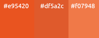
@nana-4 How much tweaking are we talking about? I think the orange in Ambiance (#f07948) looks awful, but something subtle like #df5a2c could work. I don't know if this change is too small?
@Feichtmeier I don't think a small deviation from the official color palette would matter - just look at how from the Ambiance orange is from the official orange.
madsrh
on 4 Apr 2018
This was the official Ubuntu orange back then when ambiance went life. :)
They changed it to the orange now. You are the designer, sorry.
But I think we got lost in this discussion somehow. :(
Feichtmeier
on 4 Apr 2018
@madsrh I'm not saying that let's use Ambiance Orange. :)
I just thought the middle between #E95420 and #EB6536 would look better. I'm not still testing #df5a2c, though.
nana-4
on 4 Apr 2018
As long as orange is not used as background for white text it would not be necessary to change it. And we should not forget that the orange used at the moment matches the orange of the icons. We would risk that it won't fit to the icons anymore. I am maybe the only one here but i think as long as we use the orange as lines and borders it is no problem.
EDIT: and we should not worry that we could have not enough orange... there is plenty of orange...
ghost
on 4 Apr 2018
Should I open an issue for this? It's becoming quiet hard to refer the issues in the PRs xD and we got so many ideas here :)
Feichtmeier
on 4 Apr 2018
I can just change the name of the issue "Rethinking the use of orange".
ghost
on 4 Apr 2018
That was not my intention. This issue here already refers to 2 PRs and we discussed more than three different suggestions (I won't call it issues). Would be a bit easier to follow if we got one issue for each bug or suggestion or enhancement :D
We could also continue the design discussions on the community website? :) We could also start a poll for this. If the amount of orange is really an issue for more than some few then this is really something where the designers could start to rethink color and occurrence of orange. But if this is really something subjective of so few we could agree that we should stop the reducing of orange for now and focus on other issues :).
Feichtmeier
on 4 Apr 2018
I am for keeping current orange color. As said, this one has a clear origin from current Ubuntu design, while any other would be just a matter of taste as we are facing a lot lately. However, since I was the first to propose a change of the black back in the days, I surely don't want you to stop investigating :smile:
clobrano
on 4 Apr 2018
@Feichtmeier AppNotifications - making orange more elegant:
How about using an thin (thinner than in my very bad mockup) circle about the close-button when hover / mouse-over:

And we could make the symbol more visible by making it orange (when hover or even without?):
ghost
on 7 Apr 2018
@NusiNusi these are shell notifications :)
-1 from me this does not look good to me :| atleast not in this mockup
Feichtmeier
on 7 Apr 2018
yes, i know. but thought we talk all orange related stuff here before opening a new ticket for it.
And yes, the mockups are bad. Not good at gimp at all. But you got the idea. IMHO the less orange the better but thought this could be a little compensation because the orange got reduced in other places.
ghost
on 7 Apr 2018
@NusiNusi orange circle does not look consistent to me. Probably it's better to just replicate the same hover effect we have on the other buttons
clobrano
on 7 Apr 2018
@clobrano yes, you are right. Hoped the other close-buttons could get a similar minimalistic use of orange. but again, you are right and first we should look where the other close-button is heading. the beauty about lines (even in form of a ring) is that we could have nice animations: the line would draw itself. @nana-4 already showed some beautiful animations.
making the symbol orange is not liked either. but after some time thinking about it i came to the conclusion it could cause problems when the symbol appears in another place of the theme. Suddenly it would be orange everywhere.
ghost
on 8 Apr 2018

Could the orange not be subtly changed to match the front of the orange folder icons? Helps tie it all together. The orange in the side bar looks closer to red to my eye, especially with night light mode on
 jim3872
on 13 Apr 2018
jim3872
on 13 Apr 2018
Sorry, but What do you mean by "subtly changed"?
this orange comes from official Ubuntu palette
clobrano
on 14 Apr 2018
@jim3872 The folder icons actually consist of two orange shades. One in the back is (almost) excatly the orange of the rest of the UI and the brighter orange makes this folder look a bit more "3D". So no need to change anything, especially since we discussed another change incoming soon -> the orange box will eventually become an orange border, which you can see when you scroll up :)
Edit: oh my fault it's in a different issue :| It's somewhere believe me! Maybe even on the forum
Feichtmeier
on 14 Apr 2018
@clobrano as in a 'fine' shade change. As described in the points raised above the ubuntu orange is monochromatic so choosing a more subtle shade/tint is doable. I don't think the folder icons are in the palette so we can forget that. But how about EB6536 (90%) over E95420 (100%)

Throwing this out there but how about light shades of Aubergine

The theme is looking very good overall so apologies if this comes across as nitpicking/pedantic/irritating
@Feichtmeier Will keep an eye out for for the orange box thanks
jim3872
on 14 Apr 2018
@jim3872 This is what is going to come:
https://user-images.githubusercontent.com/9556384/38165696-6829f764-3552-11e8-9c98-5e9c4c53f35d.gif
When @nana-4 finds some free time he will open a PR for it.
When the community dislikes it and we feel it does not work we would think about another solution and maybe think about changing the colour. But lets try it with the orange line like in @nana-4 s mockup. I am sure you will like it :smiley:
You will find it here #184
ghost
on 14 Apr 2018
OK ill shut up then because that looks excellent :)
jim3872
on 14 Apr 2018
@NusiNusi, I can't find the thread that mockup was posted in. Is that for all sidebars or just Nautilus?
 godlyranchdressing
on 17 Apr 2018
godlyranchdressing
on 17 Apr 2018
@godlyranchdressing #184
madsrh
on 17 Apr 2018
@godlyranchdressing https://github.com/ubuntu/gtk-communitheme/issues/184 for consistency on all sidebars. Thank you
ghost
on 17 Apr 2018
+1 for changing it everywhere if we change it
Feichtmeier
on 17 Apr 2018
The state so far
So lots of refinements have landed in the theme and i want to give you a little summary of the use of orange in the communitheme.
As already stated orange is a very attention-graby color. Now the theme uses orange most times to underline something "selected" or "active" (am i using the right term?):
- The stackswitcher

The topbar

The "categories" in shell

"Active" apps in shell (at least very short underlines)

"Selected" menus (libreoffice for example)

The sidebar will use vertical orange lines because it is a vertical list (_still waiting for the snap-update_).

All (selected) fields (entryfields) where the user can enter something are using orange border (please note: without glow!):
- Passwordfield on gnome-shell

Search on gnome-shell

Search on gtk

_The glow is already been removed by @godlyranchdressing (thank you) but the update still did not land on my snap. I will update this picture when it lands._
4.(Re)naming Files on gtk (_imagine without glow - going to update the screenshots_)


The shell uses orange for a "selected" desktop too:

So these are the places / items that use orange lines / underlines / or borders (without glow) to show the user something is selected or active.
Reasons to keep this:
By using lines and borders the orange is more subtle and at the same time functional. It asks for enough attention to get noticed by the user. It does not ask for too much attention to distract or annoy the user from his work.
When a different color would be used (lets say gray), lines could be not enough to be noticed at first sight by the user.
So by using lines and borders the attention-hungry characteristic of orange is used in an appropriate dose.
Another way the theme uses orange is by using it as some kind of little warning:
The close-button on hover

The selection of elements in nautilus uses a different kind of orange selection. Instead of lines/underlines/borders an orange background is used. This is at least a striking use of orange:

Selected text was already changed to blue because the orange was just too strong and i would recommend to think about doing the same here.
As a office-user the system looks like this at the moment:

I can completely focus on the content of my work and the systems asks for my attention only when i interact with it by using subtle and at the same time noticeable orange elements. I recommend to continue this kind of use for the color orange.
EDIT: I have still some ideas where to add orange. I can share my ideas later if you wish.
ghost
on 18 Apr 2018
@NusiNusi Nicely summed up.
If we really keep the nautilus sidebar, we should adapt to this also in the treeviewer selection used for example in geary's left sidebar or in gthumb's left sidebar
Feichtmeier
on 18 Apr 2018
@NusiNusi Nicely summed up.
+1 👍
I've thought about the underline in #4 before and forgot about it again, but IMO this isn't perfect. Why not use a dot like the dock or if it has to be a line, why is it so short? There's also the app-in-a-box design that uses a semi-transparent background behind the running application, but that might not fit with the rest of our design.
BTW I also think the ALT+TAB (app-switching) should be added to the todo list.
I was pretty confident that we made a good decision with the new close button in the window controls - at least using the OS feels very Ubuntu to me - but looking at @NusiNusi's _office-user_ screenshot above, has got me a bit concerned about the lack/feeling of branding (again) 🤔I don't want to sidetrack the conversation here, just sharing my thoughts ;)
madsrh
on 18 Apr 2018
@madsrh well, I would call LO look almost "a mess" at the moment. I believe you can only fix it by heavily app-theming, which we don't want to do. Also, since ubuntu switched to GNOME LO uses that GNOME icons, previously they used the libreoffice-style-human.
(you can reduce this aweful look by 1) installing https://extensions.gnome.org/extension/1267/no-title-bar/ and 2) by switching to the experimental ribbon tabs:

But that's offtopic. :)
I tried some stuff with the alt tab switcher. A 2 px border with medium_radius, but the problem is that the text labels beneath the icons get cuted by the border :| I can try some more versions later after "Feierabend"
Feichtmeier
on 18 Apr 2018
@madsrh about ALT-Tab switching: should i open a ticket?
I can understand that you worry about the branding but the orange is still very noticeable in the theme. When you do nothing you have a lot of orange in the wallpaper and when you interact with the UI orange dots and lines appear everywhere. Orange is just too intrusive.
Nr. 4 (the underline in gnome-shell): do you want to open a ticket? Already an idea for it? I am open for both ideas: making it a dot like in the dock or making the underline longer. Even an 2px border like @Feichtmeier proposed could look ok. From me always +1 when orange gets used in lines and dots :+1:
After @Feichtmeier had some "Feierabend"-beer he will be in the perfect mood of showing us how this could look like ;)
The close-button: i love it that we changed it and i fear you want to change it back. What do you think about an orange x (on hover)?

EDIT: this way we would keep the style of using thin sharp lines and dots. And now an X.
EDIT 2: please keep in mind i made the X on each end 1px "longer".
ghost
on 18 Apr 2018
@NusiNusi I don't want to change the close button again - I think it's good as it currently is 😃I don't think the colored X looks good even if it "keeps the style".
I would like to try some mockups for #4, but sure you can open the issues.
madsrh
on 18 Apr 2018


Or just a stripe

Feichtmeier
on 18 Apr 2018
The notifications have an icon which is difficult to recognize on first sight because of the bad contrast. The color gray is used for the icons. I am going to open a ticket for it to ask increase the visibility.
The notifications appear only for a short period of time. The icon helps showing what part of the system is asking for attention (Is it the printer, a new connected device or the cloud?). Of course we read the text but the icon can be the first signal. Some users (like me) would like to see easier if a file on dropbox was updated. We already use orange for the close-button to ask the user for more attention. I recommend doing the same for the icons in notifications.
This is how it looks at the moment:

On screens with high resolutions the icon is already tiny and very difficult to recognize.
Making it orange increases visibility strongly:

_(my mockups are really bad and maybe someone could make a better one)_
The use of orange would be functional, logic and fit to the style of the theme. IMHO it even looks very cool.
I already suggested this and you did not like it but it seemed you only gave attention to my first mockup with the orange circle.
If this is a complete no-go for you i will at least open a ticket to suggest making the icon much darker (black) to increase the visibility.
EDIT: ticket for increasing visibility + mockup (without asking for orange): https://github.com/ubuntu/gnome-shell-communitheme/issues/121
ghost
on 21 Apr 2018
I believe we reduced the orange enough now =P
If you agree @NusiNusi we should close this. But I have to thank you to be so penetrative with this, because you were right in most cases =)
Feichtmeier
on 23 Apr 2018
Yeah we reduced enough. And it looks beautiful.
Before:

And now:

I hoped we could talk about where we could make tiny orange refinements: see my last post about the icons in notifications. If this is for you and the other a no-go-zone we can close this here and reopen if necessary.
ghost
on 23 Apr 2018
Nono, just for organisation purpose. And my comment was actually a late commit/compliment on the truth of your complaints. Hope you didn't understand this wrong!
I think it would be better to open a different ticket for orange refinements because this issue here had so many PR's referring to it it gets confusing =)
Feichtmeier
on 23 Apr 2018
Sorry for being so penetrative :smile: I think this "ticket" is a very good example of how much thought is put into this theme. Every tiny element of the theme is being discussed and put thought on. The theme is not just a product of combined tastes but a theme that looks good and can be used for productive working without annoying the user. Not sure if this was ever done for a linux-theme.
Yes, let's close it. Thank you for your patience and for the discussions.
ghost
on 23 Apr 2018
Related issues
 pojntfx
·
3Comments
pojntfx
·
3Comments
 snydox
·
3Comments
Feichtmeier
·
3Comments
snydox
·
3Comments
Feichtmeier
·
3Comments
 chrisjbillington
·
3Comments
chrisjbillington
·
3Comments
 sicklylife-jp
·
3Comments
sicklylife-jp
·
3Comments
Most helpful comment
Sorry for being so penetrative :smile: I think this "ticket" is a very good example of how much thought is put into this theme. Every tiny element of the theme is being discussed and put thought on. The theme is not just a product of combined tastes but a theme that looks good and can be used for productive working without annoying the user. Not sure if this was ever done for a linux-theme.
Yes, let's close it. Thank you for your patience and for the discussions.