Yaru: Update Yaru with non-uniform icons and remove third-party app icons
This issue is for organization only and communication between contributors!
Any off-topic comments will be REMOVED
_App Name | icon name | list | of | symlink-names | ..._
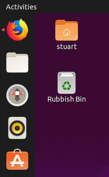
Remove Yaru icons for these preinstalled third-party apps:
- [x] Firefox | firefox
- [x] Thunderbird | thunderbird
- [x] Libreoffice Writer
- [x] Libreoffice Base
- [x] Libreoffice Calc
- [x] Libreoffice Draw
- [x] Libreoffice Impress
Remove system icons that have other issues
- [x] welcome-app
Remove Yaru icons for these non-preinstalled third-party apps:
- [x] Polari | polari | org.gnome.Polari
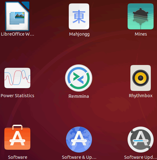
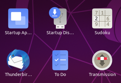
Update these Yaru icons with non-uniform baseplates for gnome "coreapps" which are pre-installed in the default Ubuntu installation:
- [x] AisleRiot Solitare
- [x] Alerts <-- doesn't show up in app grid but appears on launcher and currently has a Suru squircle
- [x] Amazon
- [x] Calculator
- [x] Calendar
- [x] Cheese
- [x] Document Viewer
- [x] e-Book Reader <-- has an upstream Suru icon
- [x] Files
- [x] Input Method <-- I think this one's already non-uniform, it's the keyboard?
- [x] Language Support
- [x] Mahjongg
- [x] Mines
- [x] Power Statistics
- [x] Remmina
- [x] Rhythmbox
- [x] Settings
- [x] Shotwell
- [x] Simple Scan
- [x] Software & Updates
- [x] Software Updater
- [x] Startup Applications
- [x] Startup Disk Creator
- [x] Sudoku
- [x] System Monitor
- [x] Text Editor
- [x] To Do
- [x] Transmission <-- do we want our own icon for this, I think it was one of the controversial ones?
- [x] Ubuntu Software Center
- [x] Videos
- [x] Archive Manager
- [x] Backups
- [x] Characters
- [x] Disk Usage Analyzer
- [x] Disks
- [x] Fonts
- [x] Help
- [x] Image Viewer
- [x] Logs
- [x] Passwords and Keys
- [x] Screenshot
- [x] Terminal
- [x] Live-Patch
- [x] Apport
- [x] photps-app + symlinks
- [x] messaging-app + symlinks
- [x] ubiquity
- [x] notes-app + symlinks
- [x] clocks
 Feichtmeier
All 49 comments
I've ticked some of the boxes. Do we want a "stretch goal" section to include Gnome's own apps that aren't shipped with Ubuntu by default? E.g., Ubuntu only includes three games, but there's about a dozen in that family. Also I've done some that aren't in Ubuntu by default just because there was a Suru icon for it already (e.g. I had to install address-book-app to test it).
 ubuntujaggers
on 13 Feb 2019
ubuntujaggers
on 13 Feb 2019
IMVHO we want the "stretched goal". The issue, as we all know, is snaps. Are core Gnome apps likely to get snapped? We will _always_ have, and cannot avoid, a mix of icons - but where do we draw the line?
I guess it would be an odd experience to have beautiful icons for all installed Gnome apps, but if the user installs Dconf, Tweaks , 2048 or Chess those apps would use the upstream icons.
When I realized that because of the snap/flatpack icon issue we could never have a 100% suru desktop even if we spend everyday crafting 3rd party icons, I was slowly coming to terms with us shipping upstream icons and having NO maintenance at all. BUT seeing this work by @ubuntujaggers and at the same time, some of the upstream icons landing in 19.04, I'm now convinced that this is the right direction and that the Ubuntu desktop would have been a sad place without this.
 madsrh
on 14 Feb 2019
madsrh
on 14 Feb 2019
the Ubuntu desktop would have been a sad place without this.
Thanks you @madsrh :)
ubuntujaggers
on 14 Feb 2019
Some snaps have a hard path in their desktop file some don't.
Feichtmeier
on 14 Feb 2019
As long as we keep track of what gnome calls core apps and what not we could be golden and independent from preinstalled or not can someone link that gnome list in here?
Feichtmeier
on 14 Feb 2019
+1 @Feichtmeier see my comment above ;)
madsrh
on 14 Feb 2019
Podcasts is official GNOME app. Why you want to remove it?
 eaglersdeveloper
on 14 Feb 2019
eaglersdeveloper
on 14 Feb 2019
It's a core app? I guess then we can keep it
Feichtmeier
on 14 Feb 2019
Yes, since 3.30
eaglersdeveloper
on 14 Feb 2019
Icons to have a more radical redesign:
- Software centre
- E-book reader (another docs-looking app with no clue about how it's different to other docs-looking apps - can we make an icon of a physical e-book reader)
Any others?
ubuntujaggers
on 15 Feb 2019
Icons to have a more radical redesign: Software centre
+1 As far as I know upstream is still using the bag metaphor, which Humanity also had,. Also discussed in https://github.com/ubuntu/yaru/issues/1051
madsrh
on 15 Feb 2019
Sad to read you’re planning to remove LibreOffice icons (which I, as a member of @LibreOfficeDesign liked very much) — I was about to report that Yaru was missing icons for LibreOffice Math…
 fitojb
on 17 Feb 2019
fitojb
on 17 Feb 2019
Thanks for the vote of confidence @fitojb :) Great to hear that you liked the design.
Maybe we could keep the LibreOffice icons on the new square backplate (looks hopefully at @Feichtmeier, @madsrh and @clobrano)? Heck, I'd even throw in a Maths ;)
ubuntujaggers
on 17 Feb 2019
It's more of a political drama dodge than anything else since we all liked your LO icons. If we theme LO we may think of theming Mozilla and so on. We already made that journey once and i would prefer to not make it again :D
Feichtmeier
on 17 Feb 2019
The political drama came from our enthusiasm in making the icons by our own, without interacting with the maintainers first. Considering this, I think that we can still keep the door open for new icons if a proposal or blessing come from them in the first place.
 clobrano
on 17 Feb 2019
clobrano
on 17 Feb 2019
True. How about: we this route until this or its successor branch is done and we made it through the checklist, then see what we do with LO?
But if we don't have the desire to squircle every icon anymore with this 5-baseshape-approach, why should we modify the LO icons in the first place?
Feichtmeier
on 18 Feb 2019
If LO likes the new approach we or them can make the new icon
clobrano
on 18 Feb 2019
Are you going to keep at least the symbolic icons for the top bar?
fitojb
on 18 Feb 2019
Are you going to keep at least the symbolic icons for the top bar?
One weird thing: it doesn't seem to like it if your theme includes a symbolic without a full colour. If there's any icon in the theme for an app, even if it's only the symbolic one, it tries to use it instead of the default one. So when I deleted Thunderbird but tried to keep the symbolic, it was using the symbolic in the app grid.
One workaround would be to make a copy of the upstream icon and include it in Yaru, but with our symbolic icon.
Alternatively, I don't know whether upstream LO already has 16px symbolic icons of its own?
ubuntujaggers
on 19 Feb 2019
Oh boy, this is the neverending discussion. It almost makes selecting a text color seem easy 😆
It's more of a political drama dodge than anything else since we all liked your LO icons. If we theme LO we may think of theming Mozilla and so on. We already made that journey once and i would prefer to not make it again :D
Although @Feichtmeier is the voice of reason and logic here, I have to admit that this solution really doesn't feel right.
But if we don't have the desire to squircle every icon anymore with this 5-baseshape-approach...
We still have that desire 😃 Especially with @ubuntujaggers burning thought the list above in no time :tada:
...why should we modify the LO icons in the first place?
- Because it's a preinstalled application
- Because we want a beautiful desktop
- Because LibreOfficeDesign wants us to
How about: we _follow_ this route until this or its successor branch is done and we made it through the checklist, then see what we do with LO?
+1
If you ask me (_you didn't, but I'll post my comment anyway_) we will always end up with mixed icons, so why not ship as many beautiful icons - that upstream app maintainers have approved/requested - as possible? And with this new approach, it's not all or nothing at all; we can ship Suru LO and e.g. Thunderbird, but leave Firefox untouched. With the "old" squircle approach this would have looked out of place.
madsrh
on 19 Feb 2019
One weird thing: it doesn't seem to like it if your theme includes a symbolic without a full colour. If there's any icon in the theme for an app, even if it's only the symbolic one, it tries to use it instead of the default one. So when I deleted Thunderbird but tried to keep the symbolic, it was using the symbolic in the app grid.
weird indeed, we need to investigate more on this
clobrano
on 19 Feb 2019
If you ask me ( you didn't, but I'll post my comment anyway ) we will always end up with mixed icons, so why not ship as many beautiful icons - that upstream app maintainers have approved/requested - as possible?
Then what's the point of reducing Suru shape?
eaglersdeveloper
on 20 Feb 2019
Then what's the point of reducing Suru shape?
To reduce/avoid shape conflicts
clobrano
on 20 Feb 2019
@antenore would you green-light a Yaru-styled icon for the default Ubuntu installation? Currently there is no modified version of your upstream icon but since Remmina is pre-installed in Ubuntu, it would be nice if we could draw an icon for Ubuntu.
Same question to @ckerr
Transmission is pre-installed with Ubuntu, would it be okay for you if ubuntu comes with a modified version of your app icon?
The current progress can be seen here: https://github.com/ubuntu/yaru/pull/1209
Feichtmeier
on 25 Feb 2019
No issues on my side but let's see what @giox069 think about it as well.
 antenore
on 25 Feb 2019
antenore
on 25 Feb 2019
Thanks for the reply @antenore! - if it is green-lighted let's see when @ubuntujaggers finds time for it, but if you like the outcome we could alternatively contribute it upstream instead/additionally
Feichtmeier
on 25 Feb 2019
@Feichtmeier That means that you will create a yaru folder with your icons (plus the CMakke files update)?
antenore
on 25 Feb 2019
I didn't really understand you :(
We ship an icon set additionally to the gtk, shell and sound theme in the Yaru package which is pre installed in Ubuntu now.
In that icon theme we now mostly include gnome core app icons. But if you and @giox069 would agree we could also include a yaru-styled remmina icon alongside the other icons. But alternatively we could make a merge request at your git lab repo and don't include the new icon in Yaru (or do both in a transition phase)
Feichtmeier
on 25 Feb 2019
@Feichtmeier sorry :-P later I'll expand/explain it better.
antenore
on 25 Feb 2019
@Feichtmeier The Remmina desktop icons are under https://gitlab.com/Remmina/Remmina/blob/master/data/desktop/scalable/apps , do you want to replace those icons or do you want to add new ones, in a dedicated folders tree?
Our icons are installed as it should, under the hicolor folders, what I understand is that you want to create new icons to be placed under /usr/share/icons/yaru.
So maybe we have to reorganize a bit our folder tree, like .../data/desktop/hicolor/scalable/apps, and than we will have to adapt the build scripts.
Well, I hope it's a bit more clear, in any case we have nothing against storing the icons, let's find the solution that better suite everybody. The above mentioned Remmina icon is quite loved by our community ;-)
cc: @giox069
antenore
on 25 Feb 2019
@antenore
do you want to replace those icons or do you want to add new ones, in a dedicated folders tree?
Well, there is still no icon drawn so I can't ask you if you like it :D but if you would, I would tend to replace your upstream icon.
But! if your community loves the current icon, which is understandable since it is not a bad or dated icon (it just does not fit to the current paper-approach we are using in yar) let's wait for @giox069 green-light, and if that is happening, we will add it to yaru/ubuntu.
So your upstream icon stays untouched and our icon will probably be the same but with one of the round baseplates you can see here https://github.com/ubuntu/yaru/pull/1209 but 95% your logo/pictogram ( at least that's my idea of it, but sadly I miss the drawing skills and am dependent on @ubuntujaggers :) )
Feichtmeier
on 26 Feb 2019
There's a difference between a good logo and a good icon. The Remmina logo is fantastic. As an icon it doesn't fit with the Suru icons and it "drowns" in the app grid. Maybe ubuntujaggers has a great idea, but if not, I would suggest keeping the logo as it is but simply adding a background.
To illustrate what I mean (but not a suggestion):
madsrh
on 26 Feb 2019
Yes, I see.
As I said we are open to discussion, and by the way, THANKS SO MUCH FOR WHAT YOU ARE DOING!! :-) (shouting with pleasure and kindness)
cc: @madsrh @Feichtmeier
antenore
on 26 Feb 2019
@antenore thanks for your kind words! :)
@ubuntujaggers updated the list with some icons to add/change and 1 to remove (welcome-app, since it is already a circle in vanilla ubuntu, and there were some problems to let the welcome app suck up the yaru icon, let's just remove it from yaru)
(and please check the hub mails ;D )
Feichtmeier
on 26 Feb 2019
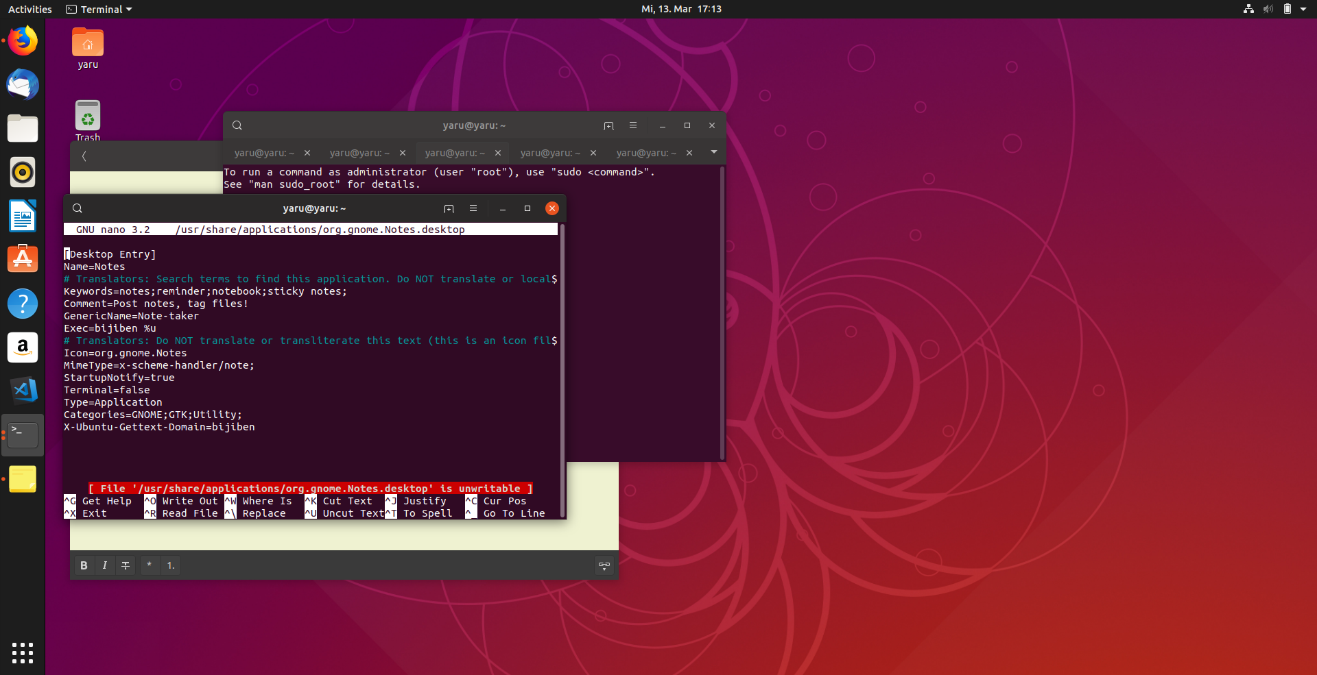
@ubuntujaggers the symbolic icon A needs an update :dancer:
Posting this here instead of creating a new issue
Feichtmeier
on 27 Feb 2019
Guys, is everyone 100% happy with the general appearance of the icons on the app grid? I wonder if they're definitely as sharp as the squircle versions?
ubuntujaggers
on 1 Mar 2019
I am very happy with it!
Only some symbolic app icon sync is needed then "we" are done :) Thank you @ubuntujaggers !
Also, had finally a chance to see the new error/alert icon ;) in action!
Feichtmeier
on 6 Mar 2019
We missed 1 symlink
@ubuntujaggers
Just to keep track, I post it in this issue here. Let's see if this is worth a SRU
Feichtmeier
on 13 Mar 2019
@ubuntujaggers about live patch: in this case launchpad and canonical are upstream so we could decide to change the icon there instead of in yaru
Feichtmeier
on 20 Mar 2019
Last icon left on the list (I really can hardly believe you burned through the whole list @ubuntujaggers /bow ) is transmission - transmission devs didnt respond to github tagging, other ideas to contact them?
Feichtmeier
on 30 Apr 2019
@mikedld would it be okay for you if Ubuntu would include a version of your logo that fits into our new icon style?
Feichtmeier
on 1 May 2019
@Feichtmeier, is it the icon in #1209 that you're asking us about (per your https://github.com/ubuntu/yaru/issues/1180#issuecomment-466942768)? If it's the one, I can hardly see the difference so I don't mind; otherwise please clarify.
 mikedld
on 1 May 2019
mikedld
on 1 May 2019
@mikedld ah thanks for replying!
There is currently no icon drawn because we made ourselves the "rule" to ask third party apps first if they are generally okay with us making an icon.
@ubuntujaggers do you have any icon ideas for a Yaru transmission icon?
Feichtmeier
on 1 May 2019
What about gnome-font-viewer?

 tsymbalenkovlad
on 14 Jul 2019
tsymbalenkovlad
on 14 Jul 2019
It's there, it's just the snap that doesn't suck the right icon. But canonical is working on this
Feichtmeier
on 14 Jul 2019
But i have no snaps installed ( :
No snaps are installed yet. Try 'snap install hello-world'.
(It's not installed as flatpak too, it's certainly .deb)
tsymbalenkovlad
on 15 Jul 2019
Oh! Maybe it's a missing symlink
I'll check, thanks for reporting
Feichtmeier
on 15 Jul 2019
@Feichtmeier, is it the icon in #1209 that you're asking us about (per your #1180 (comment))? If it's the one, I can hardly see the difference so I don't mind; otherwise please clarify.
Hi @mikedld (and @Feichtmeier, @madsrh, @clobrano),
Sorry this took forever. Here's a concept for a Transmission icon to use in the Yaru theme, using the same style as the other pre-installed apps:
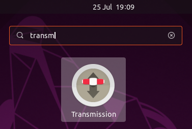
I'm also going to try a square version of the icon this week for comparison. But, in general, would upstream be happy for us to use an icon like this in the Yaru theme? If so, I have maybe half an hour more work to do on the smallest sizes. If not, I'll save myself half an hour :)
ubuntujaggers
on 25 Jul 2019
Yay we can finally close it :clinking_glasses:
Thank you Stuart!!!
Feichtmeier
on 29 Jul 2019
Related issues
Feichtmeier
·
3Comments
 matthewpaulthomas
·
3Comments
Feichtmeier
·
3Comments
matthewpaulthomas
·
3Comments
Feichtmeier
·
3Comments
 CDrummond
·
3Comments
CDrummond
·
3Comments
 chrisjbillington
·
3Comments
chrisjbillington
·
3Comments
Most helpful comment
Hi @mikedld (and @Feichtmeier, @madsrh, @clobrano),
Sorry this took forever. Here's a concept for a Transmission icon to use in the Yaru theme, using the same style as the other pre-installed apps:
I'm also going to try a square version of the icon this week for comparison. But, in general, would upstream be happy for us to use an icon like this in the Yaru theme? If so, I have maybe half an hour more work to do on the smallest sizes. If not, I'll save myself half an hour :)