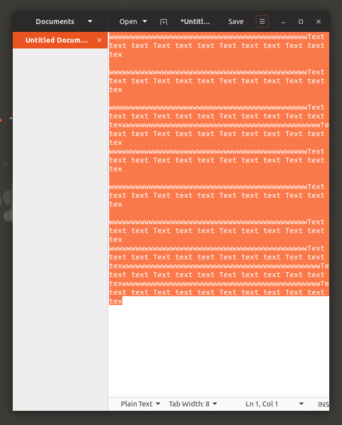
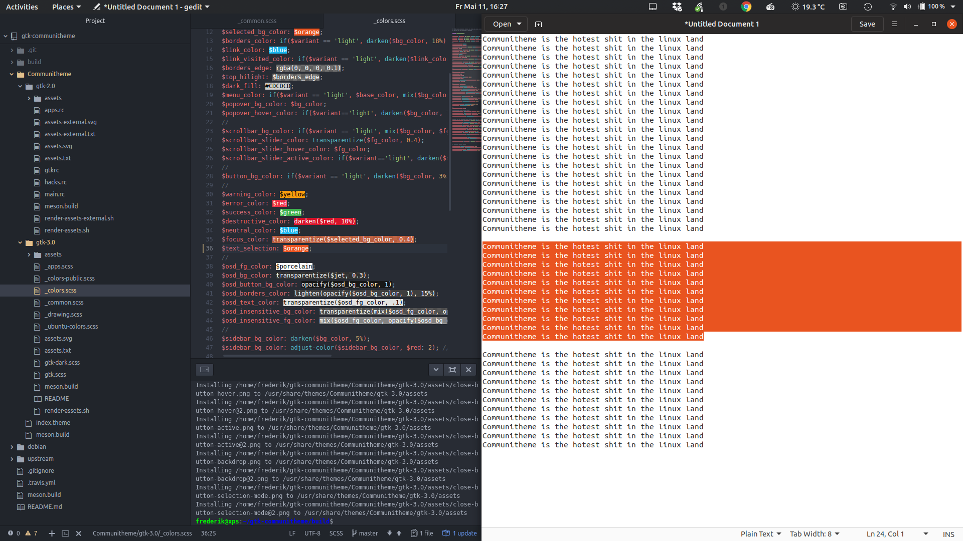
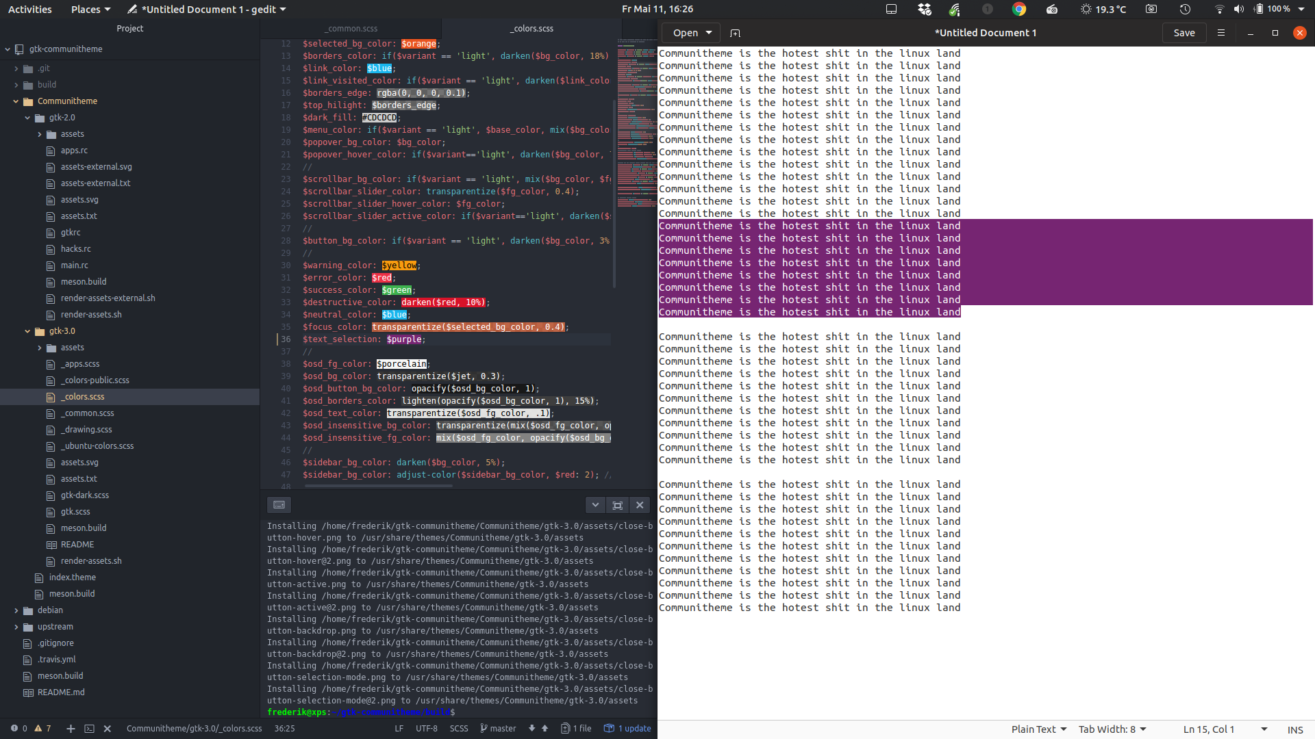
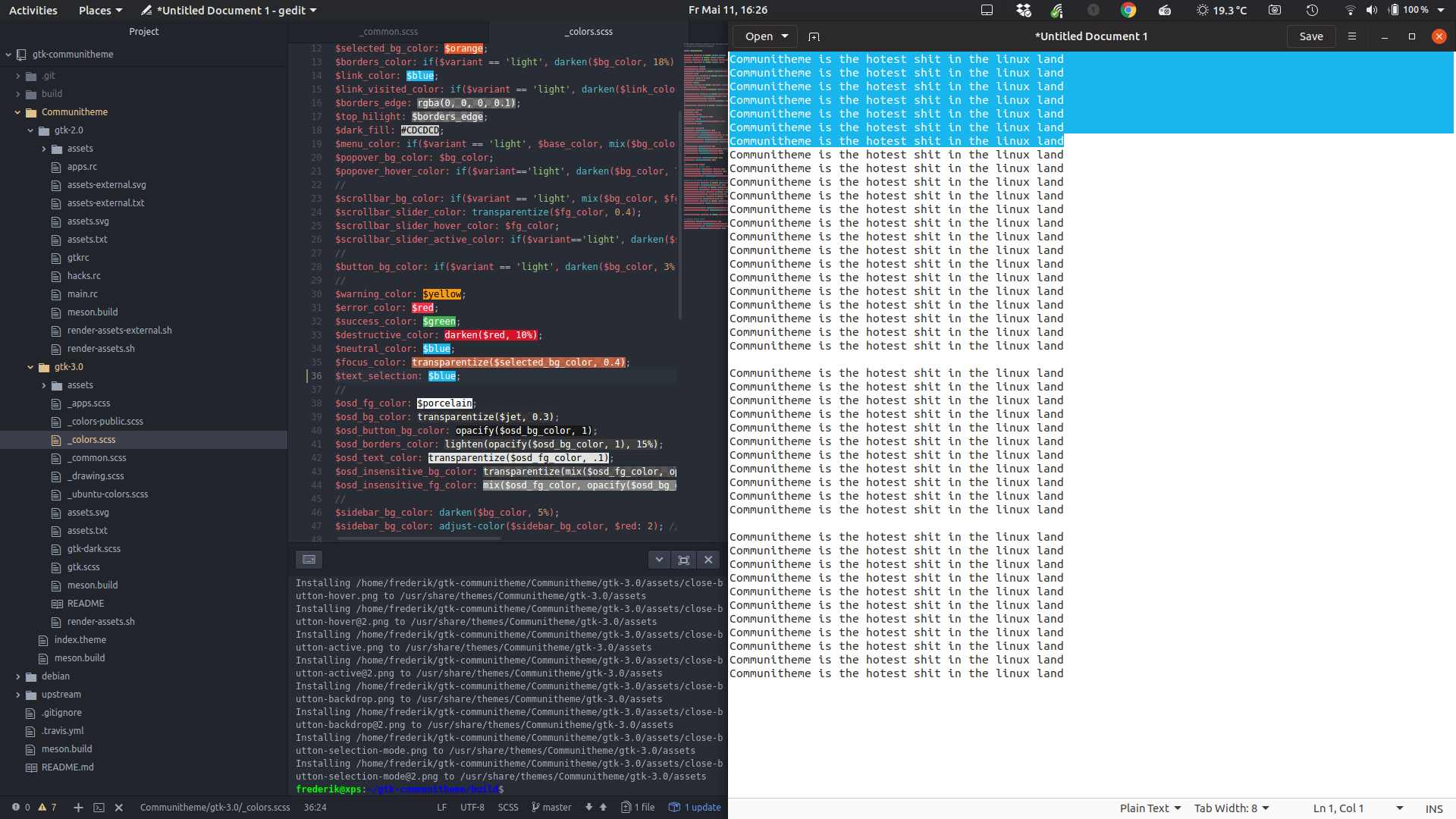
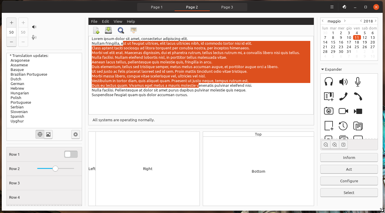
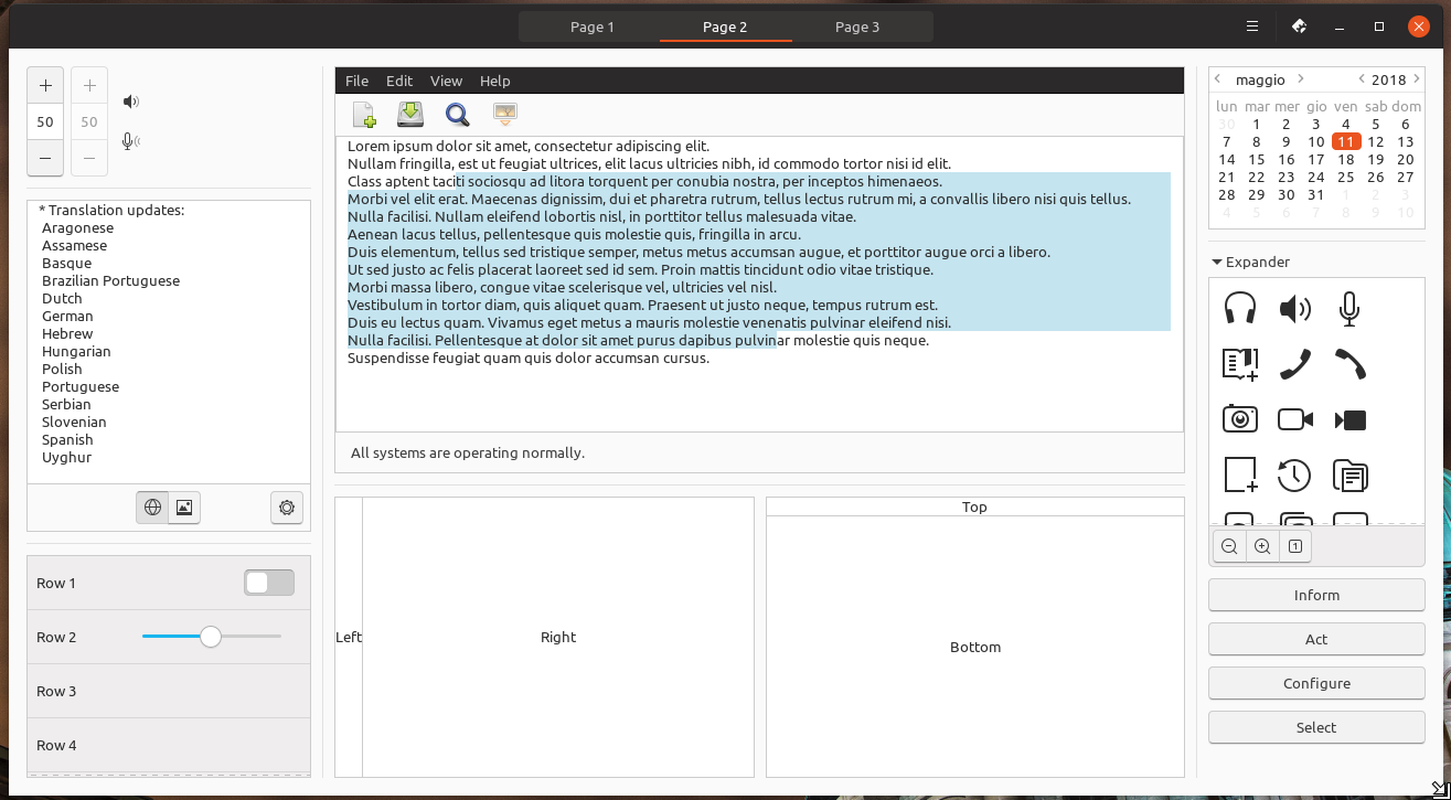
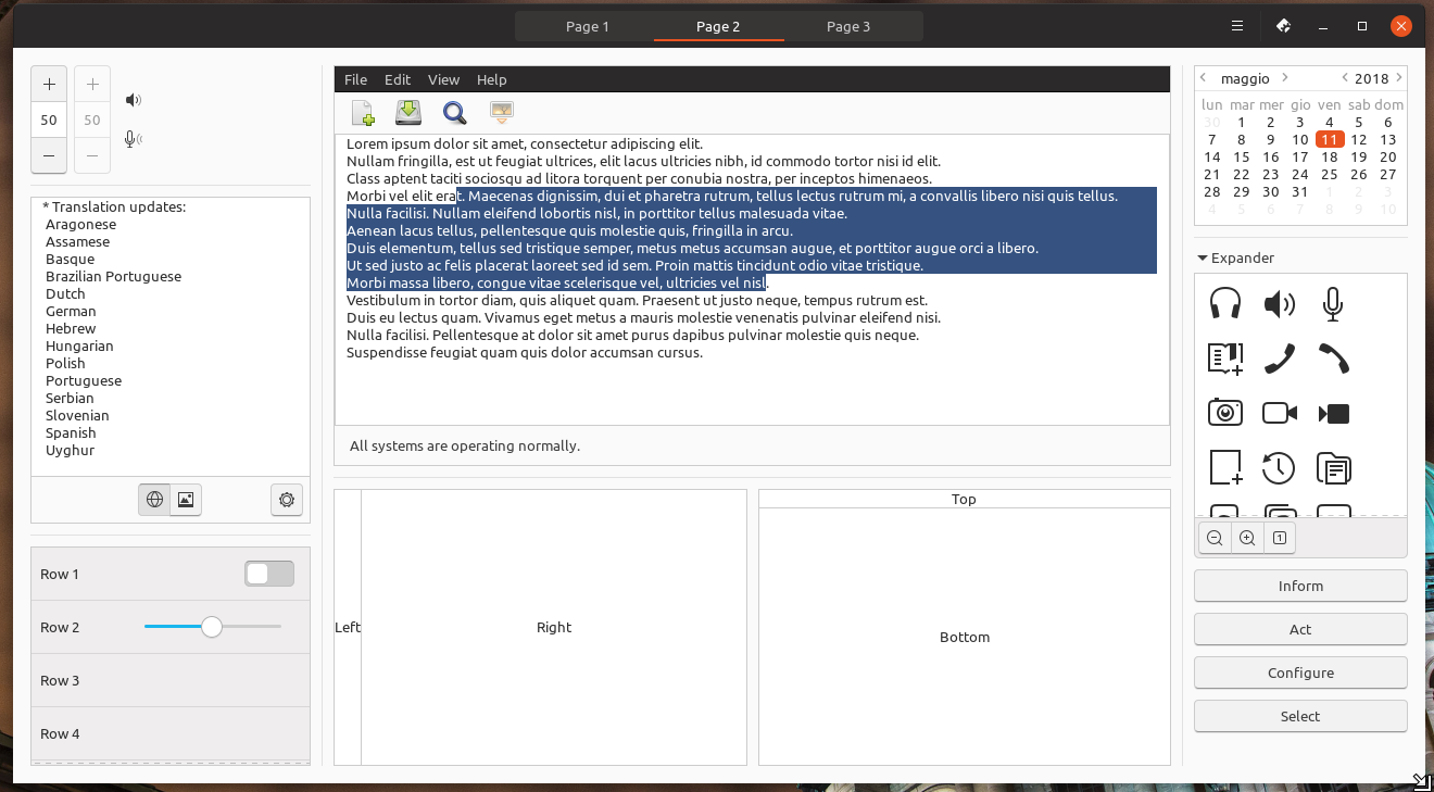
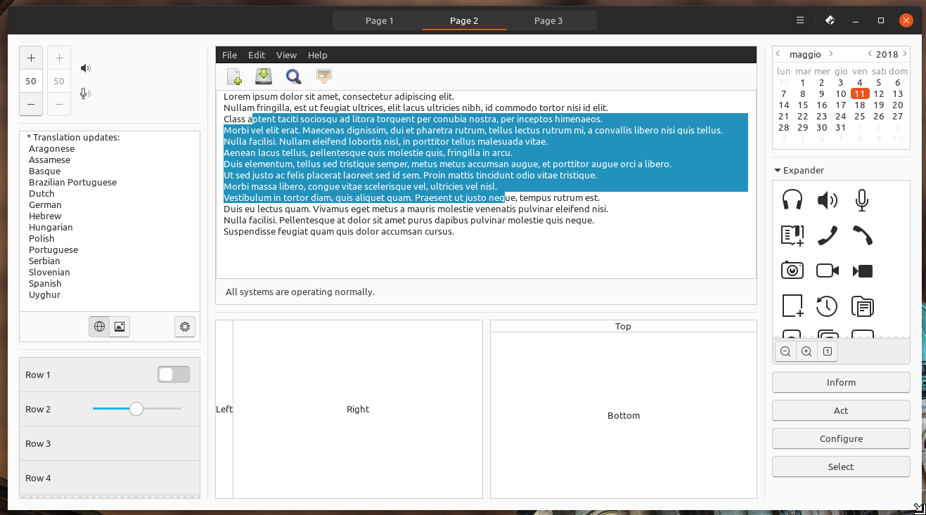
The selected text color is current orange. When selecting a lot of text, the current orange is really overwhelming. Lowering the opacity never looks good with orange, so this light blue from Unity8 might be a good solution. I can't find it in the documentation, but here it looks like #d2effd
TODO
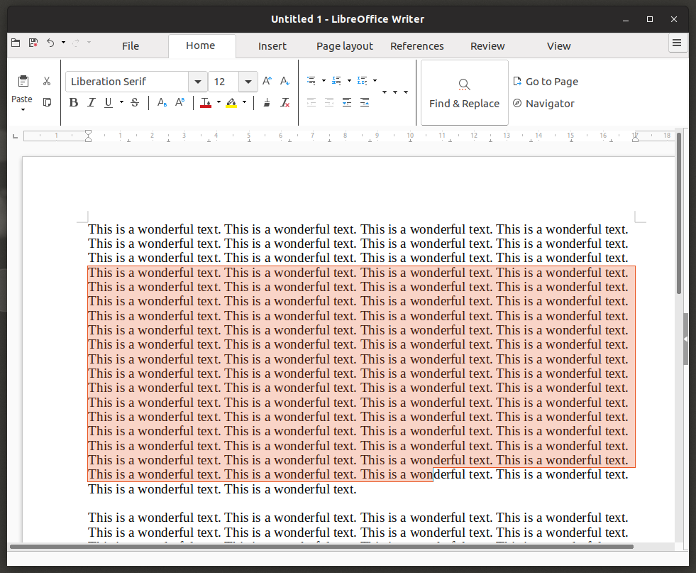
- [ ] Adapt LibreOffice text selection to madsblue -> actually open a ticket on Libreoffice about this
- [x] Adapt Firefox text selection to madsblue (in progress)
 madsrh
All 70 comments
This could be a solution to GtkTextView but I feel that this is not the right implementation! Also firefox is not affected by this but chrome is :)
```.view,
textview {
text {
@extend %view;
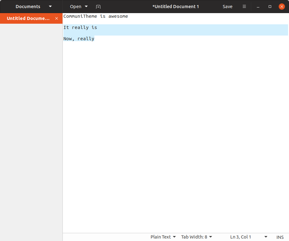
selection { background-color: #d2effd;
  /*&:focus, & { @extend %selected_items; }*/}
}
}´´´
 Feichtmeier
on 3 Apr 2018
Feichtmeier
on 3 Apr 2018
My only concern is that this might feel out of place in the theme (if you know what I mean), but that is hard to tell from a screenshot. This looks good to me 👍Can't wait to try it in the real.
@godlyranchdressing or @nana-4 will know how to fix this in Firefox
madsrh
on 3 Apr 2018
I guess it would be better to not "hardcode" the color code into this class and rather add some color in the colors file.
Adtionally, I commented the annotation to extend from selected items.
Feichtmeier
on 3 Apr 2018
Agree, we can create a text_selection variable in colors.scss.
 clobrano
on 3 Apr 2018
clobrano
on 3 Apr 2018
Instead of using a hardcoded color I just transparentized the blue in this example:
$selection_color: transparentize($blue, 0.75);

I think instead of putting the usual background-color: $selection_color; &:backdrop etc, we could follow the %selected_items placeholder and make a %selected_text placeholder with the appropriate changes, then just use that wherever we need to. That way we won't have to go about changing multiple lines if we need to make a change.
 godlyranchdressing
on 4 Apr 2018
godlyranchdressing
on 4 Apr 2018
@godlyranchdressing Using transparentized color looks good idea. However, as shown in the screenshot, for some reason some selected text color (in the screenshot, top and bottom lines) gets darker than others. Maybe mix($blue, $base_color, 25%) is better to avoid the bug.
 nana-4
on 5 Apr 2018
nana-4
on 5 Apr 2018
Can we merge the branch about this? If there's something left to be checked, we can open a new ticket later
clobrano
on 9 Apr 2018
Okay :) Done
Feichtmeier
on 9 Apr 2018
Selected text is on libreoffice still orange.
 ghost
on 11 Apr 2018
ghost
on 11 Apr 2018
I can do that but i am wrong here? This ticket is already for selected text color.
ghost
on 11 Apr 2018
Never mind, thought this is a PR -.-
too much emails
Feichtmeier
on 11 Apr 2018
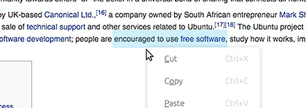
Should we use a different shade of orange as discussed in #289 or stick to the blue? Right now selected text if it isn't in an entry field (which has an orange highlight):

Entry with lighter orange:
godlyranchdressing
on 12 Apr 2018
@godlyranchdressing The lighter orange looks more like salmon. At least on my display. Or a soft pink. I do not recognize orange at all. Pretty sure this depends on the display used. Had the same problem before it was changed to blue. Only on libreoffice it looks orange.
EDIT: you mentioned the orange highlight of the entry field: how about deactivating the glow? This way the orange would not be so offensive and could be more acceptable with the blue.
ghost
on 12 Apr 2018
@godlyranchdressing Orange and blue isn't the perfect solution, but I really like the blue inside Gedit, Firefox,... just not inside a selected textfield ;)
A less "clashing" color might be gray. We're already using gray for hovering.
madsrh
on 13 Apr 2018
I like the gray but couldn't it be too much gray?
ghost
on 14 Apr 2018
Grey text looks inactive to me.
I would totally go with the current blue
Looks fresh and does but draw too much attention
Feichtmeier
on 14 Apr 2018
I don't think it's too much gray but the gray does look a little strange. We could just remove the orange glow altogether and change the caret color to blue when the entry field is active.
@Feichtmeier @clobrano @madsrh :eyes:
godlyranchdressing
on 17 Apr 2018
The state so far:
selection-color in PDFs:

selection-color in gedit:

selection-color in nautilus:
selection-color in libreoffice:
selection-color in firefox:
I am pretty sure you will agree when i say: at the moment there is no consistency.
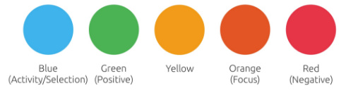
How about giving the use of the selection-color a system, some kind of logic:
Unity8-blue for selected content (all kind of texts in office or the browser, files in nautilus etc.)
Orange for selected parts/elements of the system (nautilus-sidebar, stackswitcher, shell-topbar etc.)
Is this even possible?
ghost
on 22 Apr 2018
I don't think that you can compare selecting files in Nautilus with selecting text in a texteditor @NusiNusi - they are two different things IMO.
The other inconsistencies I'll let @clobrano and @godlyranchdressing comment on, but isn't issue here that #95420 is the fallback selection color?
madsrh
on 22 Apr 2018
I agree that we should talk about "text" selection here, that is not labels.
So, only pdf and libreoffice are a problem of consistency to me
clobrano
on 22 Apr 2018
yes, they are two different things but have one thing in common: they are content. But try it with text only.
ghost
on 23 Apr 2018
How do you define content?
clobrano
on 23 Apr 2018
Hmmm, not only because of a consistency (because consistency is only applicable to things which fit together) problem but because the orange under orange is indeed quiet glowy I like @madsrh idea of light blue text selection everywhere it could be applied. Even on the selected labels under the folders. But maybe we should increase the blue in to be more intense then. Comparable to @NusiNusi 's issue with glowing orange I need to "abuse" my father again as an example of people who have rather problems with very light colors. I think some people might consider the light blue as too light for the folder selection.
Feichtmeier
on 23 Apr 2018
@clobrano Maybe i am not right, but i think content means everything that is not the system itself. Imagine your apartment is the system. That means the walls, the windows, the doors. Your furniture would be the content. You can change it, remove it and it is inside of your apartment. Not sure if i could make myself clear. For me it seems logic but i lack the right vocabulary to explain what i mean.
This is a technical question: isn't it more difficult to make only the text-selection blue? If so wouldn't it be a good reason to make all selection of content blue? I know this ticket is only for text-selection but this option should be thought about. If it is not complicated at all to change the text-selection-color we can talk about this another time.
I think @Feichtmeier idea making the blue more intense + using it even for files selection would be great. Maybe he can show us some screenshots after his "test" with his father ;)
ghost
on 23 Apr 2018
I know this ticket is only for text-selection but this option should be thought about
We are thinking about it. I agree with @madsrh, orange and this light blue do not fit together, even making the blue more intense. It just make everything too heavy to me. Not even considering that at some point, a dark blue would require the selected text to be white, or it becomes invisible
clobrano
on 23 Apr 2018
Unity8-blue for selected content (all kind of texts in office or the browser, files in nautilus etc.)
Orange for selected parts/elements of the system (nautilus-sidebar, stackswitcher, shell-topbar etc.)
Is this even possible?
@NusiNusi yeah that's possible. I actually came here to post about testing the theme with those changes for a bit.

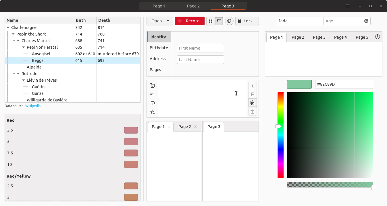

I'm not sure about using blue for selected treeview elements (Begga in the second screenshot) but I decided to put it there just for feedback. I think with so much orange removed we should be okay bringing back the orange bar and orange close button :wink:
godlyranchdressing
on 23 Apr 2018
Great work @godlyranchdressing
I'm on my phone at the moment, but I had something else in mind for the folders/nautilus - I'll post something later 😀
madsrh
on 23 Apr 2018
Uhh, this is how nautilus selection looks on my machine after latest merge:
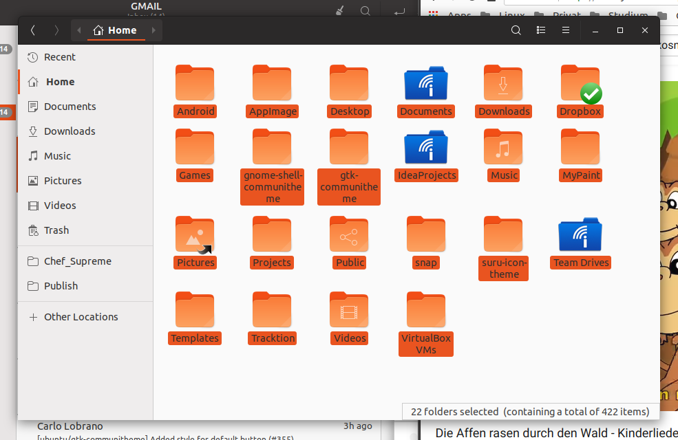
(my daughter loves this song)
Feichtmeier
on 23 Apr 2018
Same problem here.
ghost
on 23 Apr 2018
@godlyranchdressing there are several problems now
- nautilus label selection has the wrong text and background color
- several elements are now affected which we didn't discuss, like the gtkiconview in the setting app
background selection dialog or eye of gnome
@madsrh to what extend do you want the blue selection? There are many things you can select in gtk
Feichtmeier
on 24 Apr 2018
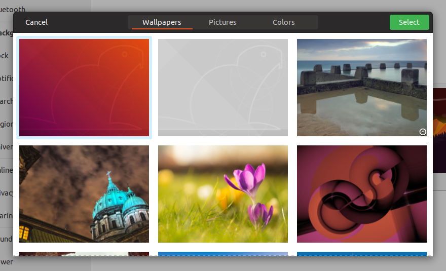
Yes it is very mixed up at the moment, I also like the light blue, but it seems to be too light/transparent (hardly visible in the wallpaper selection window).
Overall I think this is also something that we are used to (the orange selection) but again it would be nicer to have on color for everything. But even Win10 uses different shades of blue for files / text selection, maybe also because the color is not working everywhere.
Like posted before, a (theoretical, complimentary) good start point for a blue should be #1C6595 and lighter steps in #37759D and #5A92B6. This should harmonize with the orange, but maybe is not working in every circumstance either.
I could imagine (shades of) blue for every selection or blue for text and orange for files only. Definitely, it should look a little different (lighter?) than the blue we use for volume and so on, which is again not easy...
 Luxamman
on 24 Apr 2018
Luxamman
on 24 Apr 2018
There is also the treeview as used in geary
What about those @Luxamman ?
Feichtmeier
on 24 Apr 2018
@Feichtmeier - that looks aggressive^^
If it is possible, maybe the same selection like in Files (Bookmarked folders on the left), a orange border on the left and maybe a light grey background?
Or is this just adapting the selection color on the whole selected element?
Luxamman
on 24 Apr 2018
Copytext from 363:
If we like to go for the blue selection, we should go for the blue selection.
Also like said before, I would still like the blue to be more saturated because the contrast to white is sometimes not big enough (will make problems on cheaper displays, sunlight and so on).
Luxamman
on 27 Apr 2018
So @Luxamman we changed it to light orange for now:

The contrast is missing a bit if we keep this.
Just tagging you again into this correct issue here (since we talked about this in the weirdest places):
@madsrh @godlyranchdressing
Feichtmeier
on 1 May 2018
As discussed in #363:
I really have to say that text selection was the one area where I always thought orange was too much. The lighter tone works better now but I still miss the blue. I honestly don't want to start that debate all over again but could you please state or point me to the mayor conflicts with using orange for selected elements as discussed here but keeping blue for text selection only?
I'm under the impression that almost everybody of you would like to keep blue for text selection. It also made for a nice, friendly and distinctive combination of colors (see save dialog for example) and made the sliders/progress bars feel more at home within the theme too. It is almost universally used for text selection everywhere. But it creates situations where we have two or even three different colors right next to each other, especially for text fields.
Current edge-channel:
Current stable-channel:
_There are issues with contrast against dark background and a mix of colors especially for text fields._

 ya-d
on 3 May 2018
ya-d
on 3 May 2018
This back and forth has been going on for too long though. It's Ubuntu, it's orange. At this point I say we rollback using blue for selected text as it's only since then that the use of blue has started to seem incoherent
One week later: Do you still feel this way @godlyranchdressing ? Returning to orange, I actually don't have that "coming home" feeling I was expecting.
What do you (everyone) think about the suggestion to return to blue (slightly dark) for editable text (as @clobrano calls it) only? No sidebars, treeviews, icons, selections, etc...
This means we would keep blue for:
- sliders
- spinners
- text links
- selection text (like Gedit, Firefox, ...)
madsrh
on 6 May 2018
What do you (everyone) think about the suggestion to return to blue (slightly dark) for editable text (as @clobrano calls it) only?
+1
clobrano
on 6 May 2018
@madsrh we can try again, but use more blue. My two main issues are that the distinction between where the blue is used and where it isn't, won't be immediately obvious to an everyday user, especially with widgets like the treeview (one of the places I think we should try using blue). Then there's the entry fields using orange instead of something more "color agnostic" to show focus while highlighted text inside the entry field uses blue.
But then when we use more blue, won't the orange start to seem as it's being overridden? We DO have enough time to fine-tune the colors though, so we can just make a PR and work through the issues as we are with the light Shell dialogs.
Maybe we can take a look at Pop and see how and where they use their two highlight colors before we try anything?
godlyranchdressing
on 7 May 2018
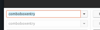
@godlyranchdressing I believe the text field's have just been forgotten and should also be blue. I think I've posted this before but I've forgotten where but this is my idea:
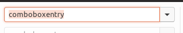
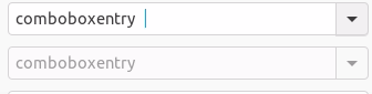
- blue (darker than this) for _text_ selection in editable text (GtkEntry, GtkSearchEntry, GtkComboBoxText, GtkTextView) and for non-editable text as in the browser or the GNOME evince PDF
- orange for _all other_ selection, like rows in sidebars, rows in treeview (remember: treeview is used in the strangest places), images, icons, anything else basically
Feichtmeier
on 7 May 2018
Maybe we can take a look at Pop and see how and where they use their two highlight colors before we try anything?
They originally laid out use of color in "Making Ubuntu Pop", but the theme has gone through several revisions since than.
ya-d
on 7 May 2018
Okay! Here we go again 😃
_Short version_: Can we try #dd501e? 🎨
I'm not satisfied with the current color. I would almost prefer the full orange (#95420), but it's really hard on the eyes 👀 because it's so bright. Here's a description for my suggestion/testing list:
- #d74d1d is the full orange darkened 8% - it appears slightly brown which looks weird when there's a orange next to it.
- I would like to suggest #dd501e! This is the full orange darkened 5%, it's not as hard on the eyes, but still hard to tell apart from the full orange
- E95420 full orange - well...
- #2ab7eb is the slider color
- #c4e4f0 is (close to) the old highlight
- #355280 is another one that feel good on the eyes, but again looks like we've had an accident with the color palette 🙄 This is from the NEW Unity8 color palette (the Google docs).
- #2292bc 🤷♂️
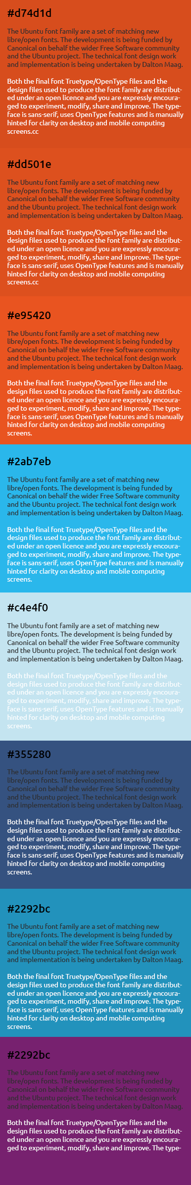
EDIT: I've checked the contrast ratio and not many of these pass the test 😞
madsrh
on 10 May 2018
@madsrh thanks for this nice color overview. The darker orange could work.
2ab7eb looks also very nice with a white text-color but yes the backlash for "blue" could be yet great again :|
Feichtmeier
on 10 May 2018
@madsrh since no-one else answered yet, what about purple, regular blue or inkstone? ;D I could rather live with any of those than the orange text-selection. The orange is kind of annoying when you are coding and select code in IDEs
Feichtmeier
on 11 May 2018
EDIT: I've checked the contrast ratio and not many of these pass the test disappointed
which ones pass it?
clobrano
on 11 May 2018
d74d1d
dd501e (it doesn't seem to change much, IMHO)
c4e4f0 (this looks good to me. Also I like the fact that the text color does not change)
355280
2292bc
clobrano
on 11 May 2018
That light blue looks great
And blue was/is a progress/activity AND selection color =)
Feichtmeier
on 11 May 2018
+1 for blue from me
 mivoligo
on 11 May 2018
mivoligo
on 11 May 2018
dd501e (it doesn't seem to change much, IMHO)
No, it's very subtle, but it's not as shiny/bright as e95420 and it's not as brown looking as d74d1d
which ones pass it?
@clobrano Actually, the light blue you liked c4e4f0 but we're going in circles because it's the one we had earlier 😆
The light blue is good, but do we agree that it's only for text? @godlyranchdressing do you still want blue for treeview too, because IMHO I think we can have both - orange for treeview and blue for text.
But we will still have this:
madsrh
on 11 May 2018
Yes we would run in circles but imho this would be the best solution: light blue for text selection, orange for row selection! And then don't get sidetracked because there is no consistency needed between a selection of a control element and the selection/highlight of text! :peace_symbol:
Feichtmeier
on 11 May 2018
I've totally fogot this, sorry. ~I'll try to have a PR for this week~ nevermind, I didn't see it was already assigned
clobrano
on 29 May 2018
@clobrano I don't know if I find time for this today so if you want you can do it. And don't panic about firefox we can ignorethat because I opened a firefox bug for this
Feichtmeier
on 29 May 2018
Nothing to be sorry about this is really confusing
Feichtmeier
on 29 May 2018
@clobrano @Feichtmeier @godlyranchdressing
I know that Firefox is still work in progress, but this still feels a bit odd to me, so I was just wondering if we could change the selection for GtkEntry to orange again and then keep blue for large selections (chrome, firefox, gedit,...)???

madsrh
on 5 Jun 2018
The combination of the orange selection and the blue text looks indeed somehow out of place.
This topic is really one of the hardest part of the whole theming so far xD No really, it's just a hard decision. But I am not so much for mixing text selection. I would prefer a solution for all text. Editable or not and big or not
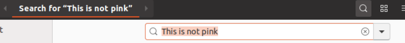
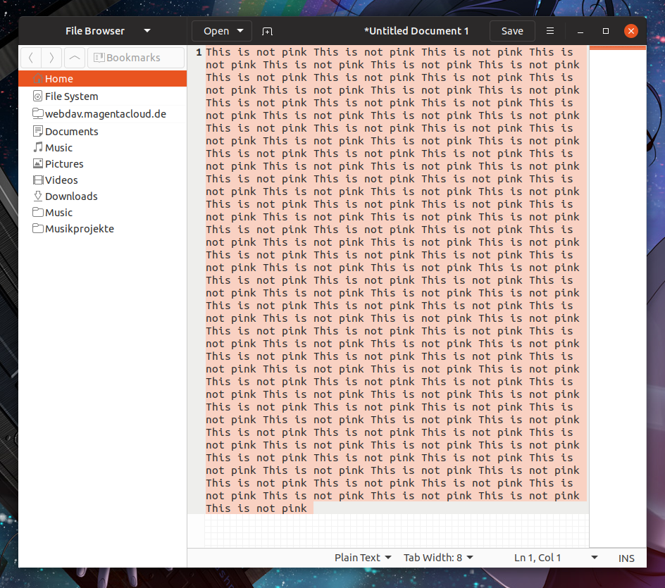
Maybe we should check different shades of light orange again. Like the one libreoffice is hardcoding:

Feichtmeier
on 5 Jun 2018
Feichtmeier
on 5 Jun 2018
@Feichtmeier We already have a mix atm, so I don't think bringing salmon back would help.
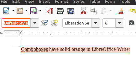
Besides the comboboxes in Libre is using a solid orange.
You don't think this would makes more sense than the current use of blue❓
IMHO solid orange is better than pink.
Would there actually be places where something like this mockup would happen?
Any change you @Feichtmeier could make a PR for me and others to test this idea?
madsrh
on 5 Jun 2018
Sure I can!
So orange for GtkEntries and light blue for larger selections like in chrome ((( sorry firefox! ))) or GtkTextView ?
Feichtmeier
on 5 Jun 2018
closed by #517
clobrano
on 11 Jun 2018
There's a bug with some text being bold like Nana4 commented in the top of this issue (can't post a link from my phone)
madsrh
on 11 Jun 2018
- [ ] Adapt LibreOffice text selection to madsblue
- [x] Adapt Firefox text selection to madsblue (in progress)
Feichtmeier
on 21 Jun 2018
hey @Feichtmeier, do you know whether "adapt LibreOffice" is doable? Or we might try to reach them and ask?
clobrano
on 14 Jul 2018
I think the only way to do it is to style view blue and then unstyle it for every application where view should have an orange selection. Maybe it's better to reach out. I believe some dude here was from libre office. Can't remember his name but his avatar was a small man with a hat and sunglasses :D
Feichtmeier
on 15 Jul 2018
Could that be you @fitojb ? 😁
madsrh
on 15 Jul 2018
I’m I the only one that thinks blue feels a little bit alien to Ubuntu? If I understand that correctly it was choosen because a lighter orange looks like salmon. Yes it does, if you just change the brightness and ignore the relationship of red and yellow. To get a lighter shade of orange you have to change the hue, too. Because the yellow gets to much lighter compared to the red if you boost the brightness or lower saturation, you have to give back some yellow and take away some red (the same is true for lowering opacity, which on white backgrounds basically is boosting brightness and lowering saturation).
I’ve made an example scale. You see that not only the brightness changes but also saturation and hue. Not the mathematical way to make the orange brighter is correct but the percepted one.
This is only an example, but maybe keeping orange as a selection colour would be considered again?
 charakterziffer
on 10 Aug 2018
charakterziffer
on 10 Aug 2018
@charakterziffer thanks for the idea!
Yes this was/is a hot topic. Imho the light blue text selection looks way better for large text selections like in your browser or in an IDE. But me and prbly @madsrh also agrees that it looks strange when it is combined with the orange, for example in entries, where you have an orange selection ring and the blue text. It is a tradeoff either way. We often discussed this and already reduced the presence of the new, heavy ubuntu-orange a lot in the shell and the gtk theme.
Imho blue in general looks really great for this theme. It also didn't came out of nowhere it comes from the unity8 theme, where there were even less orange.
Check out our design wiki for some of your decisions: https://github.com/ubuntu/yaru/wiki
Edit: concrete this is here -> https://github.com/ubuntu/yaru/wiki/%233-GTK-Theme-Design#gtktextview
Feichtmeier
on 10 Aug 2018
Thank you for the link, Fechtmeier! I see that in this GTK Theme there’s also a lot of blue (in my opinion way too much for Ubuntu, if it was violet at least). But of course colours are a very opinionated topic.
I just wanted to show that lowering opacity without compensating the hue gives you a different colour, especially when the original colour is mixed from two components which differ in brightness (here: red and yellow). It’s the same with violet which becomes pinker, less with petrol which gets slightly bluer when brightening it.
charakterziffer
on 10 Aug 2018
Thanks @charakterziffer, it would be good to actually try this orange with entries? What do you think?
clobrano
on 11 Aug 2018
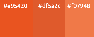
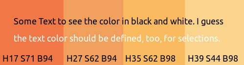
I have to confess that I don’t know how to install and modify the Yaru theme on my Ubuntu 16.04 Unity system. So I only can do graphical mock-ups. I identified the active text colour as #3d3d3d. Here are three proposals for selection orange.

The first one should match the orange frame best but may be a little to red (salmon). The second is paler, better matching the perceived lightness of the current blue. The third one is more intensive, giving a blazer orange. On the right sight there’s the HEX code of each colour as well as the contrast to the text color. The now used blue #d2effd has a contrast of 9.05, but all orange variants pass the AAA level for all text sizes. I hope the proposed colours are not too similar to come to an agreement.
Important: The chosen colour has to be tested with a with bigger selection as in https://github.com/ubuntu/yaru/issues/307#issuecomment-383410949 above – colours tend to look lighter on big areas. There are so much perception effects with colour, see also as the orange line around a focussed field looks very red (fine lines tend to look darker, in this case more red).
charakterziffer
on 11 Aug 2018
At the end we decided to keep current text highlight colors. Thanks anyway for the info!
clobrano
on 24 Aug 2018
Related issues
 CDrummond
·
3Comments
CDrummond
·
3Comments
 YamiYukiSenpai
·
3Comments
Feichtmeier
·
3Comments
YamiYukiSenpai
·
3Comments
Feichtmeier
·
3Comments
 matthewpaulthomas
·
3Comments
matthewpaulthomas
·
3Comments
matthewpaulthomas
·
3Comments
matthewpaulthomas
·
3Comments
Most helpful comment
Okay! Here we go again 😃
_Short version_: Can we try #dd501e? 🎨
I'm not satisfied with the current color. I would almost prefer the full orange (#95420), but it's really hard on the eyes 👀 because it's so bright. Here's a description for my suggestion/testing list:
EDIT: I've checked the contrast ratio and not many of these pass the test 😞