Web-bugs: www.boredpanda.com - design is broken
URL: https://www.boredpanda.com/
Browser / Version: Firefox Mobile 57.0
Operating System: Android 7.0
Tested Another Browser: Yes
Problem type: Design is broken
Description: The text is not properly aligned.
Steps to Reproduce:
_From webcompat.com with ❤️_
 webcompat-bot
All 9 comments
I was able to produce this issue in Nightly but I have tried it chrome and focus and everything was fine there.
 birajkarmakar
on 23 Dec 2017
birajkarmakar
on 23 Dec 2017
With a bit outline.
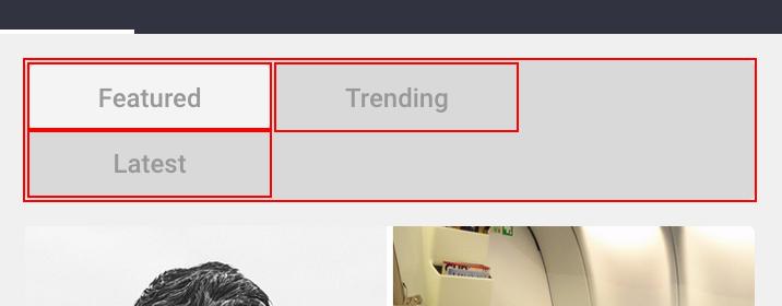
This is the markup as-is…
<nav class="mobile-category-list"> <ul> <li class="popular active"> <a href="https://www.boredpanda.com">Featured</a> </li> <li> <a href="https://www.boredpanda.com?show=trending">Trending</a> </li> <li> <a href="https://www.boredpanda.com?show=recent">Latest</a> </li> </ul></nav>
.mobile-category-list ul {
    background-color: #d9d9d9;
    display: table;
    list-style: none;
    width: 100%;
    border-radius: 3px;
    padding: 2px;
    box-sizing: border-box;
}
.mobile-category-list ul li {
    height: 30px;
    display: inline-block;
    width: 33.3333333%;
    text-align: center;
}

.mobile-category-list ul li a {
    color: #989898;
    font-size: 12px;
    display: block;
    line-height: 30px;
    font-family: Roboto;
    font-weight: 500;
    border-radius: 3px;
}
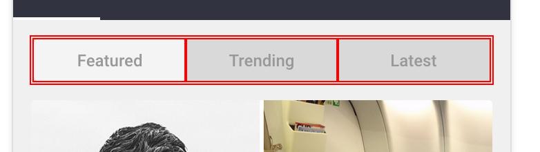
Ah! There are spaces in between the li and a elements. Let's remove those. Let's try to remove these…
<nav class="mobile-category-list"> <ul> <li class="popular active"><a href="https://www.boredpanda.com">Featured</a></li> <li><a href="https://www.boredpanda.com?show=trending">Trending</a></li> <li><a href="https://www.boredpanda.com?show=recent">Latest</a></li> </ul></nav>
not changing anything.
ok let's try to remove the spaces in between the </li> <li>
<nav class="mobile-category-list"> <ul><li class="popular active"><a href="https://www.boredpanda.com">Featured</a></li><li><a href="https://www.boredpanda.com?show=trending">Trending</a></li><li><a href="https://www.boredpanda.com?show=recent">Latest</a></li></ul></nav>
Ah this! fixed it.
but there's simpler way for fixing this design. Just changing the display: table with display: flex.
.mobile-category-list ul {
    background-color: #d9d9d9;
    display: flex;
    list-style: none;
    width: 100%;
    border-radius: 3px;
    padding: 2px;
    box-sizing: border-box;
}
 karlcow
on 10 Apr 2018
karlcow
on 10 Apr 2018
I have also filed https://bugzilla.mozilla.org/show_bug.cgi?id=1452870
I have the feeling there's an already existing issue for this.
karlcow
on 10 Apr 2018
The page to contact them
https://www.boredpanda.com/contact-us/?your-recipient=General%20Inquiry
karlcow
on 10 Apr 2018
Founder of Bored Panda
https://twitter.com/banisauskas?lang=en
https://linkedin.com/in/tomas-bani%C5%A1auskas-05a32724
karlcow
on 10 Apr 2018
Reaching out to Justina Palinaviciute, Head of Ad-Ops and Monetization at BoredPanda, via LinkedIn.
https://www.linkedin.com/in/justinapalinaviciute/
 adamopenweb
on 11 Apr 2018
adamopenweb
on 11 Apr 2018
Will look into this guys ;) thanks.
 boredJustina
on 11 Apr 2018
boredJustina
on 11 Apr 2018
Thank you guys, I've fixed it :)
 deividasjank
on 11 Apr 2018
deividasjank
on 11 Apr 2018
Very very cool. Thanks a lot.
karlcow
on 11 Apr 2018
Related issues
 GeorgeWL
·
5Comments
karlcow
·
5Comments
GeorgeWL
·
5Comments
karlcow
·
5Comments
 tGstep
·
3Comments
tGstep
·
3Comments
 Ezio916
·
4Comments
Ezio916
·
4Comments
 bull500
·
5Comments
bull500
·
5Comments
Most helpful comment
Thank you guys, I've fixed it :)