Thegreatsuspender: Hotkeys
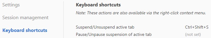
I would suggest to update this inscription
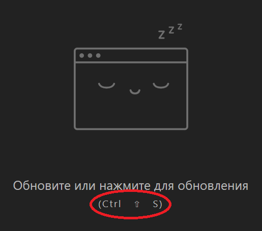
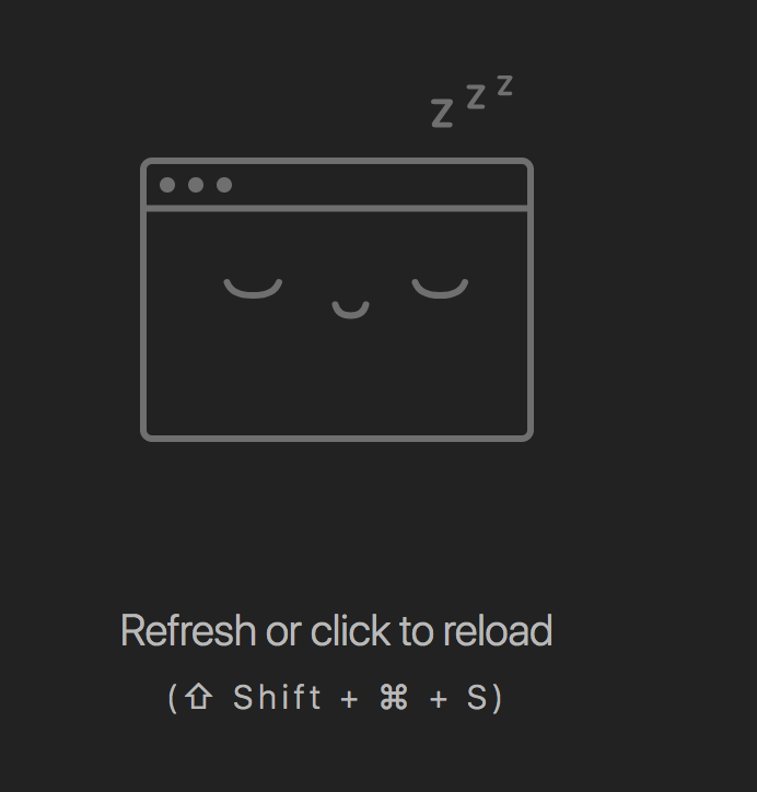
for example on "Ctrl + Shift + S", as it is written in the settings
or add some gloss to them and do something like this
and yes, I understand how petty this change 😅
- Extension version: 7.0.165
- Browser name & version: 72.0.3626.96
- Operating system & version: win10 x64 1703
 MonsterNya
All 15 comments
I agree that screenshot is not ideal. FWIW it looks much nicer on a mac :P
Here is your suggested alternative on OSX:
Not sure about the second one, although perhaps with the css styling changes it could be more acceptable.
@liamjohnston What do you think?
 deanoemcke
on 12 Feb 2019
deanoemcke
on 12 Feb 2019
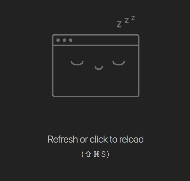
That spacing in your screenshot @MonsterNya is in deed weird and bad.
Mine looks like this (I'm on a mac too):
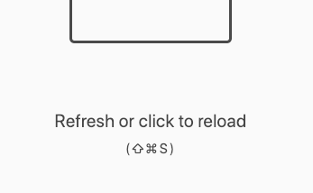
(i.e. it looks as it's supposed to)
Personally, I sort of feel like adding a + between each character would make it look a bit busy without any usability gain. I don't hate it with the +, but I don't think it's _quite_ as good.
Definitely need to get to the bottom of your spacing bug though! I gotta find a windows machine to test on...
 liamjohnston
on 12 Feb 2019
liamjohnston
on 12 Feb 2019
on mac definitely looks better. On windows, the arrow does not look like the classic arrow Shift. more reminds me "up" key.
I don't know why I have such a gap, but he was always there.
MonsterNya
on 13 Feb 2019
Not sure if I've had the shift-arrow icon on the shift button on the previous several keyboards. First time I saw a suspended tab for TGS I had to think a bit about what it meant. Guess it's been a while.
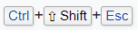
Is it possible to put a rectangle or button around each of them for Windows? [ctrl][shift][s]
 ressikanflute
on 17 Feb 2019
ressikanflute
on 17 Feb 2019
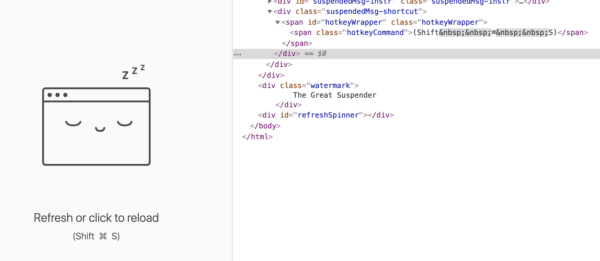
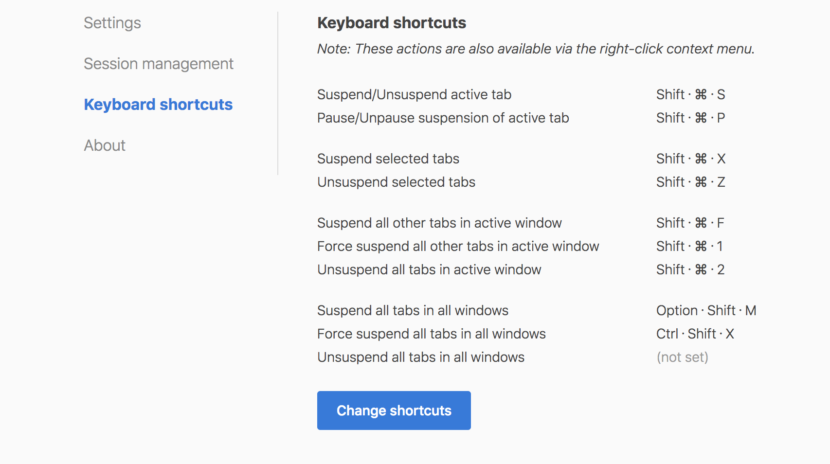
I've discovered the cause of the bad spacing (css issue where we assumed that all shortcut combos were single characters - which is true on a mac).
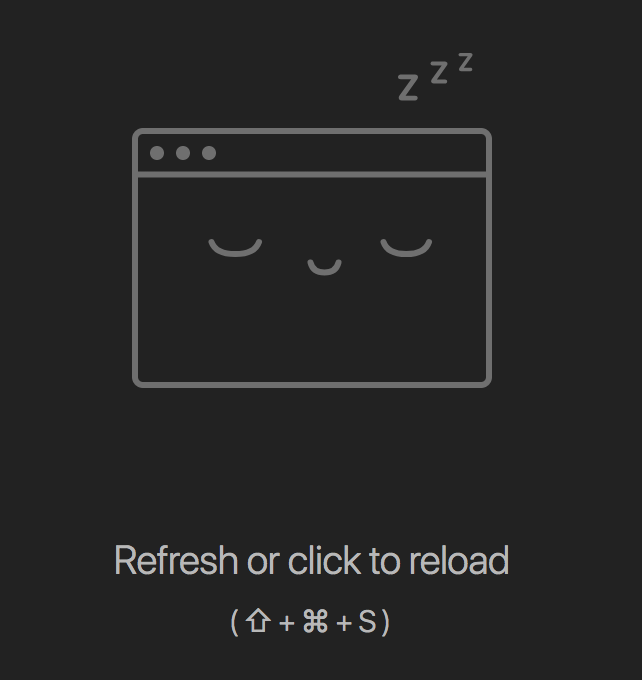
I've made some changes to help with readability across both mac and windows.
Here's some screenshots (dark theme are on mac, light theme are on windows):


deanoemcke
on 21 Feb 2019
Oh man, it's so obvious now 🤦♂️ I guess I'd have figured that out pretty quickly if I'd inspected it on windows.
So what's your fix, @deanoemcke? Remove pletter spacing and wrap each 'key' in a s with left/right margins? Want a hand?
liamjohnston
on 21 Feb 2019
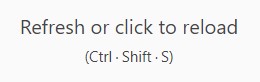
@liamjohnston nah, i'm just going to use space characters and the special 'middle dot' (U+00B7) character as a separator.
Here's a demo:


I'm pretty happy with it. What you think?
Note also I removed the special ⇧ (shift) ⌃ (control) and ⌥ (option) characters as I don't think these are well known - even to mac users. I'm leaving the ⌘ one as this is actually written on the keyboard and i think everyone is fairly familiar with it.
deanoemcke
on 21 Feb 2019
On first impression I don't _love_ the middle dot 😬 But maybe I could learn to.
I have a (only slight) preference for spacing, e.g. (two spaces). Like-a this:
But no biggie either way :)
liamjohnston
on 21 Feb 2019
Hmmm. I found that the space version doesn't look so good without the ⌘ character.
ie:

Here's an alternative with the dot (but no spacing):


deanoemcke
on 21 Feb 2019
How about a single space, then a word-spacing on the parent, e.g. word-spacing: 2px;?
liamjohnston
on 21 Feb 2019
FWIW I thought that first screenshot in your last comment looks fine 🤷♂️ But if you don't think so, go with spaced dots. No biggie from my perspective :)
liamjohnston
on 21 Feb 2019
looks nice. If you do not use "+", then "dot" is the best option.
MonsterNya
on 21 Feb 2019
I like how new dot version looks, using latest commit c245df543f615a018d1e2fb15d00a83fb84ee8fc
And I would suggest to make it look the same in settings, with dot also (and no need to touch font size here below):
 Jollfye
on 21 Feb 2019
Jollfye
on 21 Feb 2019
OK, the dots (with space) have it. Good call @Jollfye on updating the settings page.
liamjohnston
on 21 Feb 2019
deanoemcke
on 28 Feb 2019
Related issues
 spmedia
·
4Comments
spmedia
·
4Comments
 TheMageKing
·
3Comments
TheMageKing
·
3Comments
 lookfirst
·
3Comments
lookfirst
·
3Comments
 yuanstanley
·
4Comments
yuanstanley
·
4Comments
 philoupd
·
3Comments
philoupd
·
3Comments