Sequel-ace: Tabs colors are very similar when inactive [Dark theme]
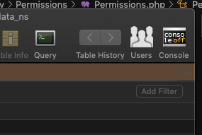
When the dark mode is enabled all disabled tabs colors look very similar. It is difficult to recognize that I am in the production DB :)
It would be nice to have more bright colors or pick color from the color palette.
 ashatrov-realforce
All 4 comments
Copying it here just to make it easier to see the picture. Also I'd like to point out that the close tab button (x) is hard to see

 stebogit
on 3 Aug 2020
stebogit
on 3 Aug 2020
When the GUI is in dark mode the close tab button (x) and the new tab button (+) should be in white colour (or the active default color fot dark mode)
 aledexter
on 16 Aug 2020
aledexter
on 16 Aug 2020
Same here: brighter colors would be very appreciated!
Even in light mode I find them too grey / similar.
 MaximeLaurenty
on 3 Nov 2020
MaximeLaurenty
on 3 Nov 2020
Same here. I was about to add a feature request to show the new tab button (+) when only one tab was open, but then I realized it was already there, I just couldn't see it, lol.
 origamifreak2
on 2 Dec 2020
origamifreak2
on 2 Dec 2020
Related issues
 categoryshell
·
5Comments
categoryshell
·
5Comments
 stychos
·
9Comments
stychos
·
9Comments
 vuon9
·
4Comments
vuon9
·
4Comments
 netojose
·
4Comments
netojose
·
4Comments
 nilbus
·
7Comments
nilbus
·
7Comments
Most helpful comment
Copying it here just to make it easier to see the picture. Also I'd like to point out that the close tab button (
x) is hard to see