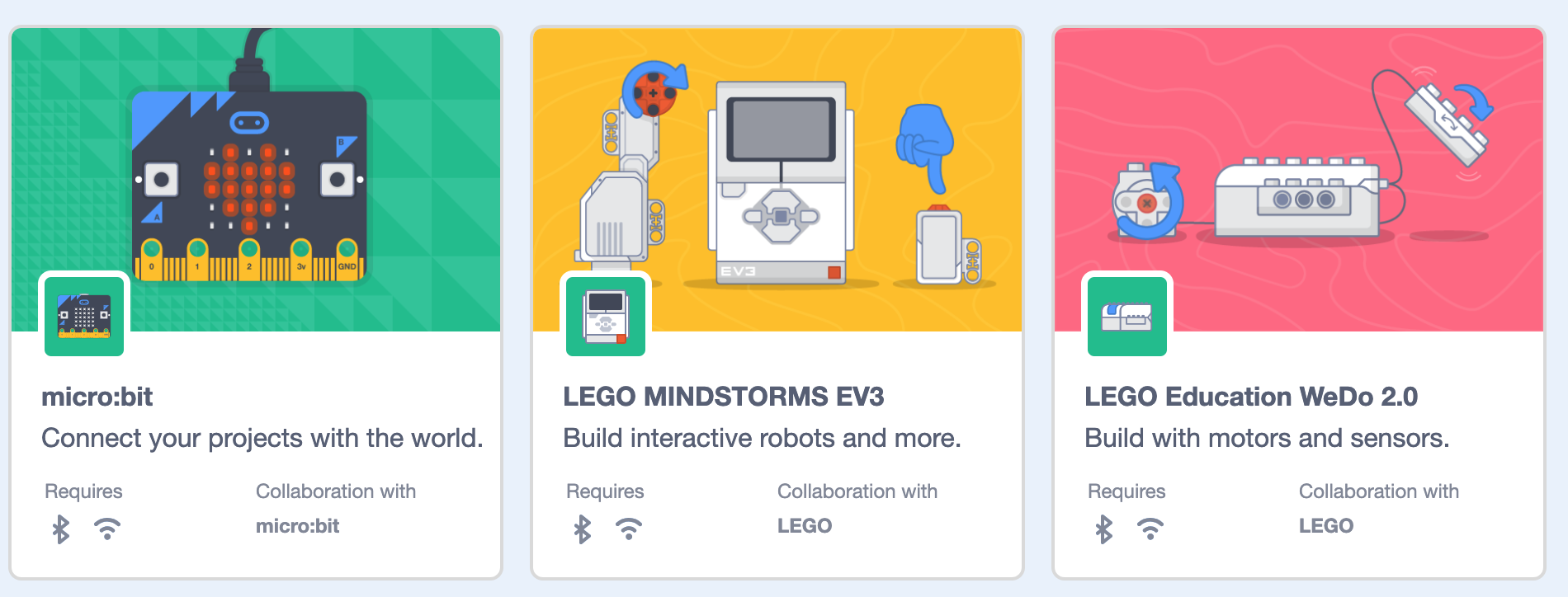
Scratch-gui: Allow extension tiles to display both internet and bluetooth requirement icons
This is necessary because currently the connection to Scratch Link requires a working internet connection for the initial DNS lookup.
Probably we can just put the icons next to each other with a little padding, wifi first then bluetooth (curious if @carljbowman has thoughts on this)
 ericrosenbaum
All 5 comments
@ericrosenbaum @carljbowman
The current bluetooth and wifi SVGs have different inherent padding in the SVG files themselves:
The bluetooth SVG has good padding already without needing to add extra CSS, whereas the wifi SVGs would need some CSS. I suggest making them match so that the CSS can be uniform for all these icons. Any thoughts?
 evhan55
on 5 Mar 2019
evhan55
on 5 Mar 2019
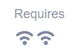
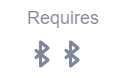
Without making any changes to CSS or the SVG files, actually, this is how things look:
@carljbowman does that look ok to you?
evhan55
on 12 Mar 2019
Sorry to the delay on responding to this. We use a standard icon square ratio for all our icons, this helps with consistency and gives us a little space to work with to optically align icons.
Before we make updates to the icon files, I'd suggest adding some margins with CSS. Might be nice to get .25rem (4px) or .5rem (8px) between the icons. The icons do feel a little tight right now.
 carljbowman
on 12 Mar 2019
carljbowman
on 12 Mar 2019
@carljbowman sounds good!
Do you have a preference here?
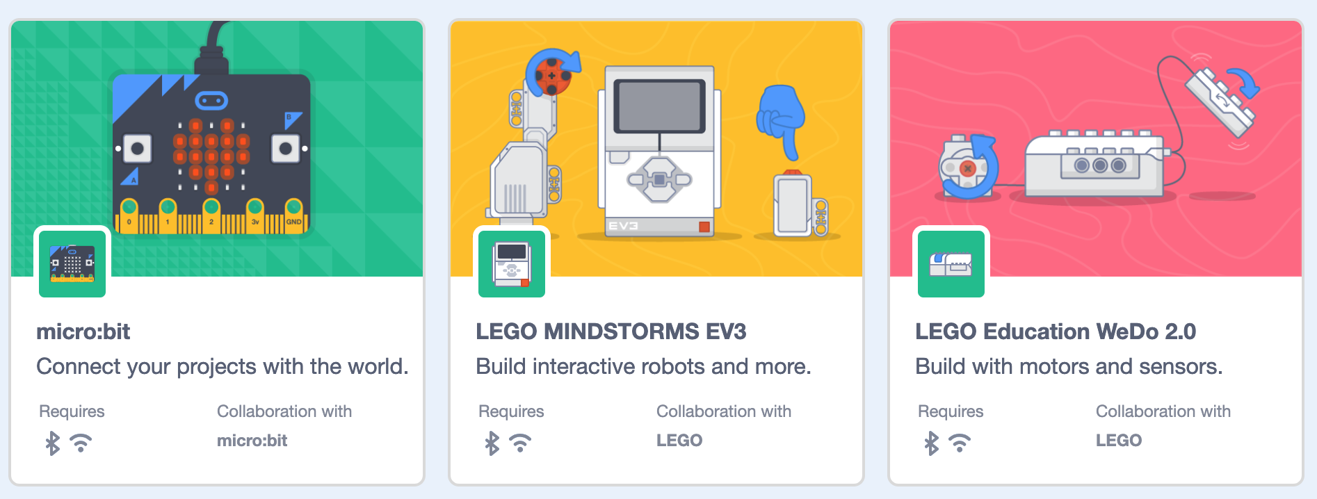
0.25rem:
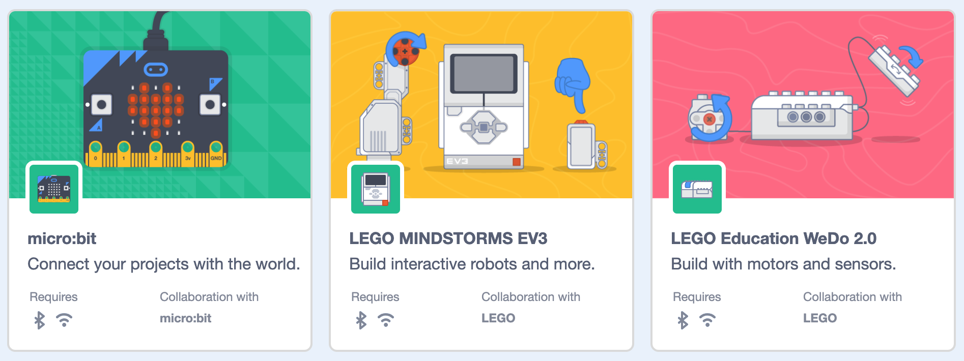
0.5rem:
evhan55
on 12 Mar 2019
Thanks @evhan55 - My leaning would be towards .25rem.
carljbowman
on 12 Mar 2019
Related issues
 davidaylaian
·
4Comments
davidaylaian
·
4Comments
 rschamp
·
3Comments
rschamp
·
3Comments
 chrisgarrity
·
4Comments
chrisgarrity
·
4Comments
chrisgarrity
·
4Comments
chrisgarrity
·
4Comments
 kyleplo
·
4Comments
kyleplo
·
4Comments
Most helpful comment
Thanks @evhan55 - My leaning would be towards .25rem.