Refined-github: Highlight issues or PRs that belong to the user
I am adding this as an issue to get feedback on it if people find it useful before i head over to implement it.
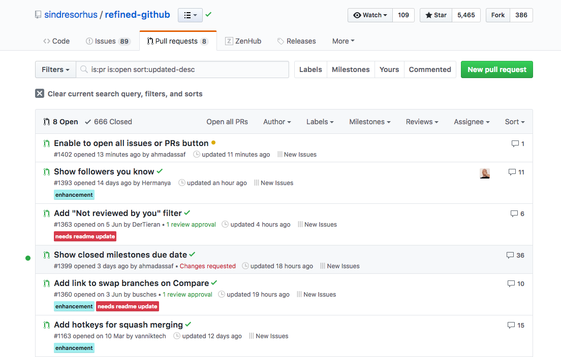
The problem is quickly spotting my PRs or issues assigned to me in a long backlog. You can see a PoC below where a green dot is next to the PR that belongs to me.
Looking forward to hear your thoughts.
 ahmadassaf
All 11 comments
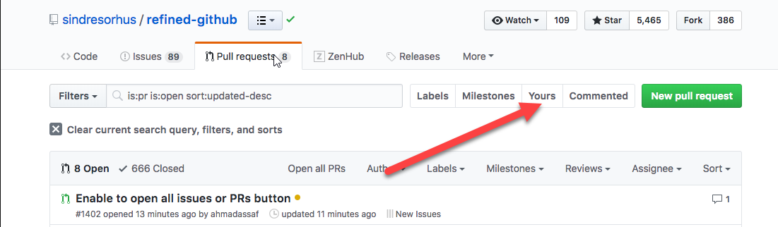
Why not click the Yours label?
 busches
on 11 Jul 2018
busches
on 11 Jul 2018
I did not know about the Yours label .. I assume this is a feature of this extension? Anyhow, when i went now to try it out I am getting very weird behaviour. It is not working in PRs and sometimes it tries to globally search all of my issues. Digging more 👀
ahmadassaf
on 11 Jul 2018
One more note as well .. I am currently on a built version from master branch and the Yours label does not show. Which is something that I have fixed in https://github.com/sindresorhus/refined-github/pull/1402/
ahmadassaf
on 11 Jul 2018
@ahmadassaf not sure how you're not seeing it, it's literally in your screenshot
busches
on 11 Jul 2018
@busches I didn’t say that I can’t see it .. I said I didn’t know about it .. it being there doesn’t necessarily mean I know it’s usage. However also check the other remarks I have about it.
The screenshot is from an extension version built from the branch i attached with the fix
ahmadassaf
on 11 Jul 2018
The yours seem to be a global filter and not specific to the repo you are on. Is that an expected behaviour ?
ahmadassaf
on 16 Jul 2018
I no longer see the "Your" and "Commented" buttons on the issue/PR view. Either we removed it or something broke. Probably the latter.
 sindresorhus
on 7 Nov 2018
sindresorhus
on 7 Nov 2018
@ahmadassaf How about highlighting your username instead with a slight dim color?
sindresorhus
on 7 Nov 2018
How about highlighting your username instead with a slight dim color?
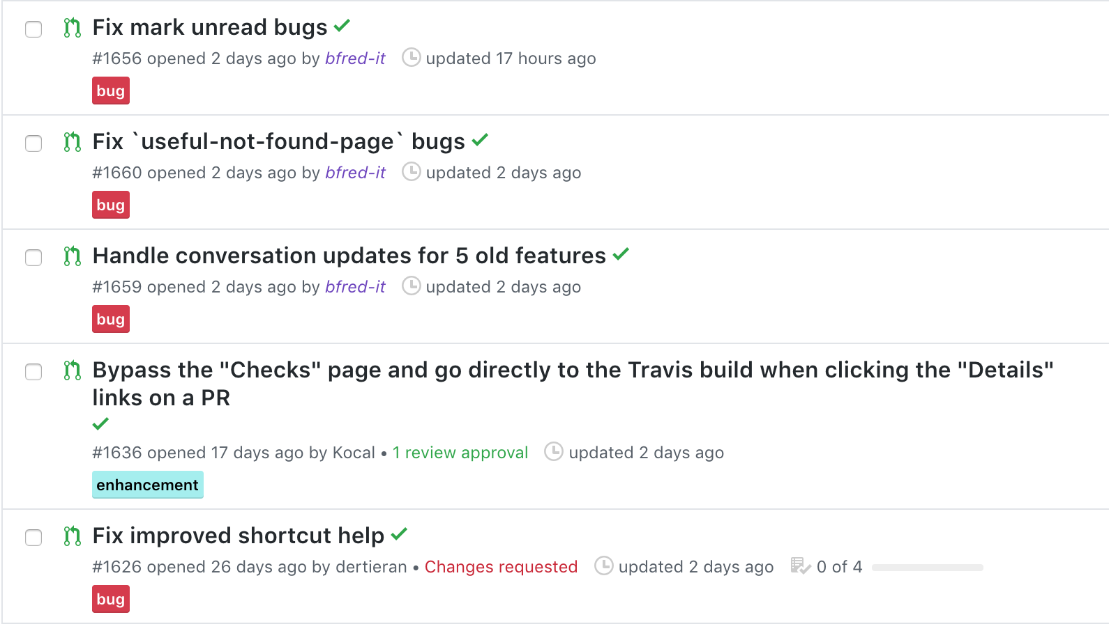
Here's what it looks like with .text-purple and italic. The username is pretty thin and small so it's very slightly visible
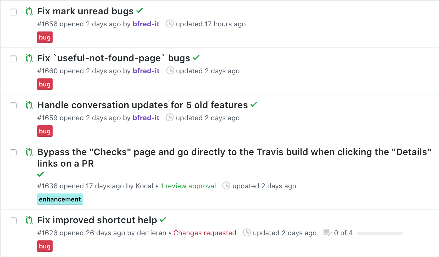
With bold it's a bit more visible:
 fregante
on 11 Dec 2018
fregante
on 11 Dec 2018
@bfred-it what about an orange color? (purple looks like an opened link)
 yakov116
on 11 Dec 2018
yakov116
on 11 Dec 2018
Purple to me symbolizes a merged PR. How about bold only without a color?
sindresorhus
on 11 Dec 2018
Related issues
 supremebeing7
·
3Comments
supremebeing7
·
3Comments
 shivapoudel
·
3Comments
shivapoudel
·
3Comments
 alexanderadam
·
3Comments
alexanderadam
·
3Comments
 hkdobrev
·
3Comments
hkdobrev
·
3Comments
hkdobrev
·
3Comments
hkdobrev
·
3Comments
Most helpful comment
Purple to me symbolizes a merged PR. How about bold only without a color?