Refined-github: Show status of linked-to PR/Issue
If there is a link to another issue/PR, I should somehow be able to identify it's status (green/red/purple color coding, or inline a badge).
 jamestalmage
All 8 comments
👍 That would indeed be useful.
 sindresorhus
on 8 May 2016
sindresorhus
on 8 May 2016
@jamestalmage I've discovered (but not tried or inspected source so cannot yet recommend) https://justineo.github.io/github-hovercard/.
 AndersDJohnson
on 2 May 2017
AndersDJohnson
on 2 May 2017
Duplicate issue with some useful discussion: #373
 hkdobrev
on 9 May 2017
hkdobrev
on 9 May 2017
I'd love to see this. Relevant comments from that repo:
Would be useful indeed, but we would have to use the GitHub API for this, which has limits on how many requests we can do, so it gets complicated fast. We would also need to have an options page for the user to save their token. We could fetch the whole page instead and have no limits, but that's wasteful.
Regarding the actual UI, I'd go with an icon of open/closed issue/PR. This way you'll also know what's this number is referring to.
What's the preferred course of action? I think we should start using the API without a token and add a token field in the options to enable private repos support and increase the limits.
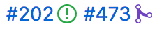
This would be nice:
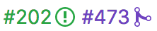
or even
 fregante
on 22 Jun 2017
fregante
on 22 Jun 2017
There's one issue with the icons though: change of layout. We already change links on load in #473 and that causes text to move around, but it happens once, right after the page load. This would happen many times as the fetches finish loading and it could get annoying fast.
Either we skip the icon (and keep the color) or we replace the # with it, making sure it's the same exact width.
Edit: but the latter can't be done for external issues like user/repo#111 because # is in the middle.
Maybe the jump is not _that_ annoying. Or maybe PR can be added in minuscule font above # instead, absolutely positioned.
fregante
on 22 Jun 2017
We could add a padding via CSS and make the icon absolutely positioned
 jgierer12
on 22 Jun 2017
jgierer12
on 22 Jun 2017
Hey, that's an easy way out. 👍 It'll also need a temporary icon then otherwise the extra padding will look bad until the icons are in.
fregante
on 22 Jun 2017
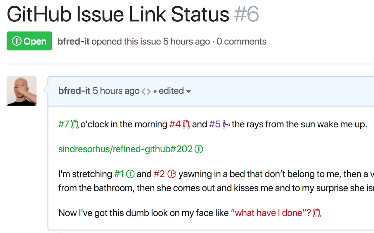
Here you go! I implemented this as a separate extension since it's _marketable on its own_ and can be useful even if people aren't interested in Refined GitHub.
https://github.com/bfred-it/github-issue-link-status
https://chrome.google.com/webstore/detail/github-issue-link-status/nbiddhncecgemgccalnoanpnenalmkic
fregante
on 19 Dec 2017
Related issues
 mischah
·
3Comments
mischah
·
3Comments
 yakov116
·
3Comments
yakov116
·
3Comments
 supremebeing7
·
3Comments
supremebeing7
·
3Comments
 durka
·
3Comments
durka
·
3Comments
 Celthi
·
3Comments
Celthi
·
3Comments
Most helpful comment
Here you go! I implemented this as a separate extension since it's _marketable on its own_ and can be useful even if people aren't interested in Refined GitHub.
https://github.com/bfred-it/github-issue-link-status
https://chrome.google.com/webstore/detail/github-issue-link-status/nbiddhncecgemgccalnoanpnenalmkic