React-vis: xAxis labels render on each other
When the graph is small and there are many ticks, some labels are rendered over each other
I see tickTotal is hard coded according to the width of the graph. I can set the tickTotal manually, but ideally I want it to be set automatically with any given data. Is there a recommended way to handle that case?
https://codesandbox.io/s/0owow0zpkp
(first graph has xType="time")

UPDATE:
Just found out I can use tickLabelAngle and increase bottom margin. Is this the best approach?
 elado
elado
All 12 comments
+1 Same issue
 krabbypattified
on 3 Dec 2017
krabbypattified
on 3 Dec 2017
Just found out I can use tickLabelAngle and increase bottom margin. Is this the best approach?
that is 100% what i would recommend. did that end up working out for you?
 mcnuttandrew
on 13 Dec 2017
mcnuttandrew
on 13 Dec 2017
Yes, that worked for me.
In another scenario I used a combination of tickFormat and tickTotal (aside: I don't like that tickTotal only functions as a "suggestion").
However, I feel that the default setting should try harder to not cause overlap.
krabbypattified
on 14 Dec 2017
ok so the possible way out of this is to make getTicksTotalFromSize smarter.
I agree that today it errs on the size of many ticks. It's not trivial to find a good heuristics though.
 jckr
on 19 Mar 2018
jckr
on 19 Mar 2018
Just found out I can use tickLabelAngle and increase bottom margin. Is this the best approach?
tickLabelAngle worked for me.. but.. the margin bottom isnt working.. half of x axis value is being cut off,
should i give margin bottom to <XYPlot/> ? or <XAxis/> ?
i tried both, didnt work,
can anyone please help me out. thank you :)
 s8sachin
on 27 Jun 2018
s8sachin
on 27 Jun 2018
^ Margin bottom also is not working for me. I tried applying it to both the Plot and the Axis, and it doesn't actually increase the amount of the label that's visible. It just adds an empty margin to the bottom. I also tried playing with height and padding, but I wasn't able to get it to not cut off the label once I had turned it sideways.
 maxgardner
on 23 Jul 2018
maxgardner
on 23 Jul 2018
Can you post some of the code you are using?
mcnuttandrew
on 23 Jul 2018
Ah yes, sorry about that. Here's what I have currently:
<FlexibleWidthXYPlot
height={size}
xType={'ordinal'}
yDomain={[0, data.outstanding]}
style={{marginBottom: '50px'}}
>
<XAxis
tickFormat={(t, i) => {
if ((i + 1) % 5 === 0) {
return t.split(',')[0];
} else {
return;
}
}}
tickLabelAngle={-90}
style={{marginBottom: '50px'}}
/>
<YAxis
tickFormat={intOnlyTicks}
/>
<AreaSeries
color='#EEE'
colorType='literal'
curve='curveBasis'
data={data.burndown}
animation
/>
<LineSeries
color='#A2A2A2'
colorType='literal'
curve='curveBasis'
data={data.burndown}
animation
/>
</FlexibleWidthXYPlot>
And here's what it ends up looking like:

I've tried applying height through the style as well. When I tried applying marginBottom as a prop, it didn't seem to have any affect. If you can see anywhere I'm going wrong, I will take any guidance I can get!
maxgardner
on 23 Jul 2018
I think there might another margin you don't know about! Adding margin in style can be helpful, although it just adds margin around the inner svg. If you want to add internal margin, ie within the svg, you need to use the margin prop on the plot itself. (See https://uber.github.io/react-vis/documentation/api-reference/xy-plot for more). So your component might become something like
 <FlexibleWidthXYPlot
        height={size}
        xType={'ordinal'}
        yDomain={[0, data.outstanding]}
        margin={{bottom: 50}}
      >
    ....
   </FlexibleWidthXYPlot>
@mcnuttandrew Thank you, that did it!
maxgardner
on 24 Jul 2018
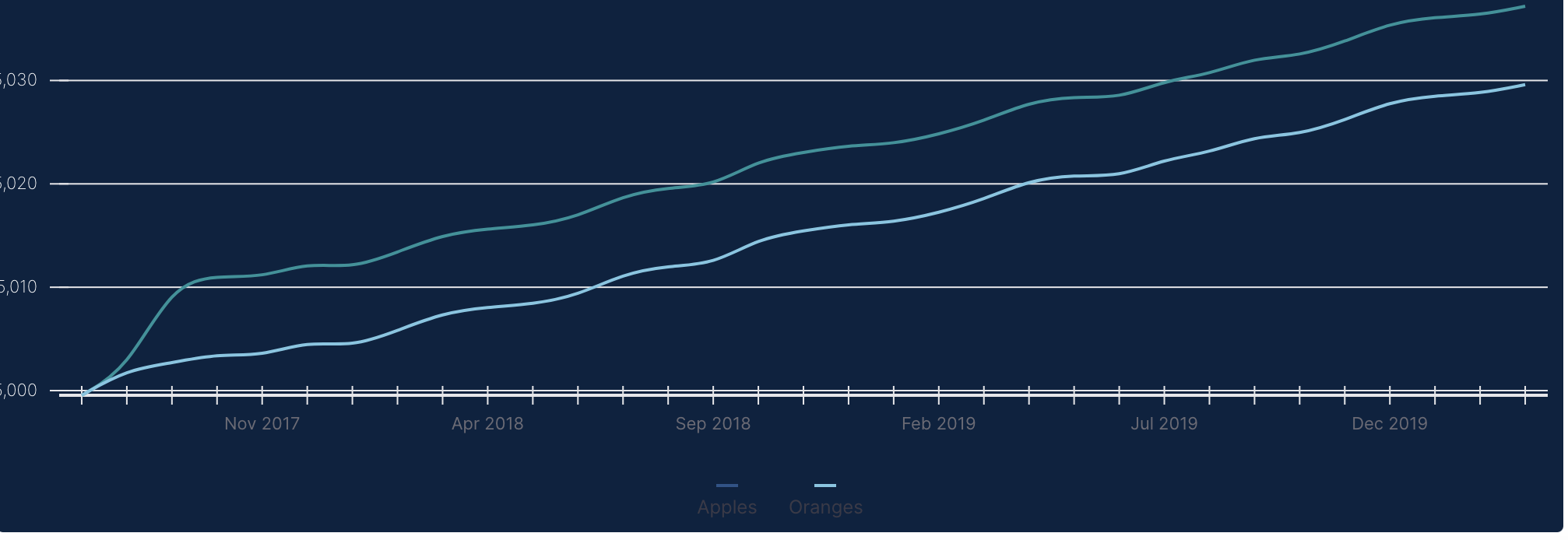
I have an almost same example like this one, but I can't set the text vertically (product design, I can't change it), I tried it, made it with tickLabelAngle but when I presented it they said it can't be vertically.
The actual values are perfectly fine in the page, but when the window get resized the values in the horizontal get illegible (like the ones in the picture). There is any property I can apply on it to make it responsive when the window get resized?
 RonanFelipe
on 27 May 2019
RonanFelipe
on 27 May 2019
<XAxis
          tickFormat={(t, i) => {
            if ((i + 1) % 5 === 0) {
              return t.split(',')[0];
            } else {
              return;
            }
          }}
          style={{marginBottom: '50px'}}
        />
 prancky
on 2 Jun 2020
prancky
on 2 Jun 2020
Related issues
 cang-afero
·
4Comments
cang-afero
·
4Comments
 yennycheung
·
4Comments
yennycheung
·
4Comments
 basilaiman
·
3Comments
basilaiman
·
3Comments
 gespispace
·
3Comments
gespispace
·
3Comments
 kbouaazzi-ds
·
3Comments
kbouaazzi-ds
·
3Comments
Most helpful comment
I think there might another margin you don't know about! Adding margin in style can be helpful, although it just adds margin around the inner svg. If you want to add internal margin, ie within the svg, you need to use the margin prop on the plot itself. (See https://uber.github.io/react-vis/documentation/api-reference/xy-plot for more). So your component might become something like