React-vis: Big numbers get cropped on both x and y axis
Please see this codepen. The numbers are cropped on both the x and y axis when they are too big.
 yennycheung
All 4 comments
Hey @yennycheung, you can address this issue by specifying a margin on your XYPlot, like so
const Chart = () => (
  <XYPlot
    margin={{left: 100, right: 100}}
    width={window.innerWidth - 50}
    height={window.innerHeight - 50}>
    <XAxis/>
    <YAxis/>
    <HorizontalGridLines />
    <LineMarkSeries data={[
      {x: 100000, y: 100000},
      {x: 200000, y: 500000},
      {x: 300000, y: 150000}
    ]}/>
  </XYPlot>
)
 mcnuttandrew
on 28 Sep 2017
mcnuttandrew
on 28 Sep 2017
I'm gonna mark this as closed, but feel free to re-open if you like
mcnuttandrew
on 5 Oct 2017
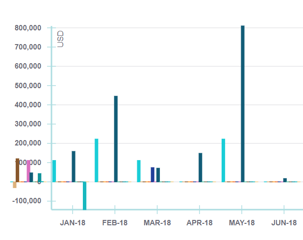
with VerticalBarSeriesCanvas margin={{left:100}} could not solve this problem, only Y axis was pushed right every other content remained in the same position.
<XYPlot
        onMouseLeave={this._onMouseLeave}
        xType="ordinal"
        width={800}
        height={300}
        margin={{left:100}}
        // stackBy="y"
        >
        <HorizontalGridLines />
        <XAxis  title="Month" style={{
          line: {stroke: '#ADDDE1'},
          ticks: {stroke: '#ADDDE1'},
          text: {stroke: 'none', fill: '#6b6b76', fontWeight: 600, fontSize: 10}
        }} />
        <YAxis  title="USD"
          tickTotal={7}
          style={{
          line: {stroke: '#ADDDE1'},
          ticks: {stroke: '#ADDDE1'},
          text: {stroke: 'none', fill: '#6b6b76', fontWeight: 600, fontSize: 10}
        }}/>
        { this.props.data.map((e, i) => <VerticalBarSeriesCanvas key = {i} data = {e} color={colorPalette[i]}/> )}
        <LabelSeries
        onNearestX={this._onNearestX}
        data={this.props.data[0]}
        />
        <Crosshair
          values={this.state.crosshairValues}
          titleFormat={(d) => ({title: 'Term', value: d[0].x})}
          itemsFormat={(d) => d.map(d =>{
            return {title: d.name, value: Math.round(d.y.toFixed(2) * 100) / 100}
          })}
        >
        </Crosshair>
        </XYPlot>
 bbosze
on 31 Aug 2018
bbosze
on 31 Aug 2018
@bbosze this is kinda a shot in the dark but have you definitely imported the style sheet? (see readme for additional details). If that doesn't fix it, would you mind putting together a code pen with your example? I want to make sure that i understand your problem/data
mcnuttandrew
on 4 Sep 2018
Related issues
 wroughtec
·
4Comments
wroughtec
·
4Comments
 basilaiman
·
3Comments
mcnuttandrew
·
3Comments
mcnuttandrew
·
5Comments
basilaiman
·
3Comments
mcnuttandrew
·
3Comments
mcnuttandrew
·
5Comments
 markov00
·
5Comments
markov00
·
5Comments
Most helpful comment
Hey @yennycheung, you can address this issue by specifying a margin on your XYPlot, like so