Osu-web: Add score date to the beatmap leaderboard
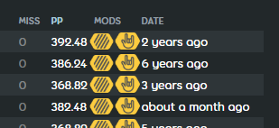
Just like osuplus does it
 stanriders
All 6 comments
In my opinion, I think it should be provided in a different way, like maybe on hover. The current implementation takes up the most space on the map rankings and makes everything considerably more squished.
 AqilCont
on 21 Jun 2020
AqilCont
on 21 Jun 2020
@arflyte has this been considered in the newer design? definitely something we want to show somehow.
 peppy
on 22 Jun 2020
peppy
on 22 Jun 2020
Oh. I don't think I have this. I'll add it.
 arflyte
on 22 Jun 2020
arflyte
on 22 Jun 2020

Condensed 300/100/50/Miss to make space for the Time column. Relative dates are shown in short form, actual dates shown on hover. Anything lower than 1 hour shown as "<1h".
arflyte
on 23 Jun 2020
Condensed 300/100/50/Miss to make space for the Time column. Relative dates are shown in short form, actual dates shown on hover. Anything lower than 1 hour shown as "<1h".
I think we would benefit from just removing the smaller time signatures completely, and making the remaining ones more definite. An example would be to just have 2yrs instead of 2y 4m.
Also, I don't think we need to shorten anything below an hour if we just follow the rules above, like maybe 38min or 28sec. This is definitely more readable to the average user(especially me, since I always think "minutes" when I see "m"), and hovering on the text shows the full date anyways, so I don't see this as a large compromise.
AqilCont
on 23 Jun 2020
Yeah, that works too.
arflyte
on 24 Jun 2020
Related issues
 Xinnoh
·
5Comments
peppy
·
4Comments
Xinnoh
·
5Comments
peppy
·
4Comments
 smileyhead
·
4Comments
smileyhead
·
4Comments
 TicClick
·
5Comments
TicClick
·
5Comments
 downpour-osu
·
4Comments
downpour-osu
·
4Comments
Most helpful comment
Condensed 300/100/50/Miss to make space for the Time column. Relative dates are shown in short form, actual dates shown on hover. Anything lower than 1 hour shown as "<1h".