Nodejs.dev: Top menu strategy for mobile?
Hi Team,
We have a horizontal scroll on mobile currently due to wide menu items:
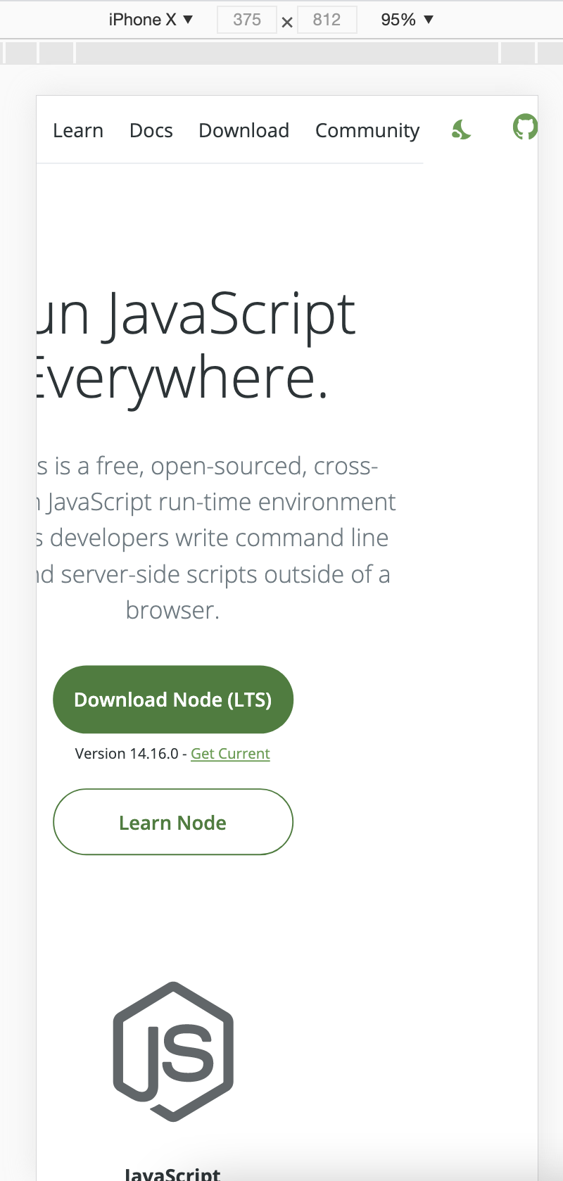
I'd like to know do we have a design decision regarding top menu on mobile?
Maybe I just missed it in Figma? :)
 rodion-arr
All 10 comments
How does a classic Hamburger menu sound like? The items in the menu are gonna increase over time actually, and we something that can contain them.
 manishprivet
on 6 Apr 2021
manishprivet
on 6 Apr 2021
Deleted previous comment as the original post had an accurate image. The site "appears" fine on mobile but the day/night icon and github icon were off to the side as shown above. :(
 joesepi
on 5 May 2021
joesepi
on 5 May 2021
Another possible solution can be to fix the Nodejs logo on the left, dark mode button, and GitHub icon on right, and making the links horizontally scrollable? I wanted to work on this, but unsure which one to follow. @benhalverson @designMoreWeb
manishprivet
on 5 May 2021
let's go with the hamburger menu.
 benhalverson
on 12 May 2021
benhalverson
on 12 May 2021
@manishprivet Are you actively working on this? If not id like to work on it
 lancemccluskey
on 15 May 2021
lancemccluskey
on 15 May 2021
Linking #1322 for visibility.
lancemccluskey
on 15 May 2021
@lancemccluskey I'm actually working this 😅
manishprivet
on 15 May 2021
We were talking about this issue today in the website redesign meeting. We agreed that a design that looks more like should be implemented.
https://excalidraw.com/#json=4916647710162944,cT5qOWo5Y5KeoM0V2bBAZQ
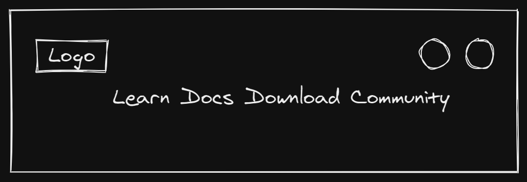
Is this how you did the quick sketch @obensource
benhalverson
on 19 May 2021
@benhalverson you got it! 👍
The nav links should probably use a space-between with flexbox (so they create a 'nav border' at the top, if you will 😄), otherwise it might end up looking like a bunch of floating links if they're centered or whatever. Anyways, thanks a million for your work @benhalverson! 😎
 obensource
on 19 May 2021
obensource
on 19 May 2021
If we're sure that no more links will be added to navigation in near future, then I'll implement this instead of hamburger 😅
manishprivet
on 20 May 2021
Related issues
 jemjam
·
3Comments
jemjam
·
3Comments
 marcustisater
·
4Comments
marcustisater
·
4Comments
 lidoravitan
·
4Comments
benhalverson
·
4Comments
lidoravitan
·
4Comments
benhalverson
·
4Comments
 ollelauribostrom
·
3Comments
ollelauribostrom
·
3Comments
Most helpful comment
How does a classic Hamburger menu sound like? The items in the menu are gonna increase over time actually, and we something that can contain them.