Nodejs.dev: Remove dotted border from download cards and download icon
Description
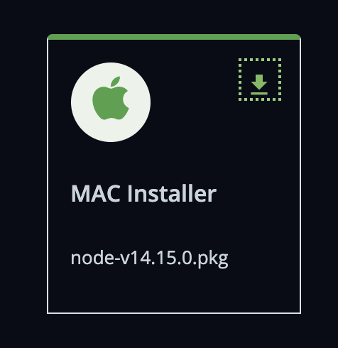
We should remove the dashed border around the buttons LTS/Current, Download cards section and download icon


 benhalverson
All 4 comments
i'd like to work on it :)
 talarviv
on 16 Nov 2020
talarviv
on 16 Nov 2020
This css rule seems to be causing this to happen
https://github.com/nodejs/nodejs.dev/blob/ca46400b2b63180f447201f213f01923e5b146cd/src/styles/layout.scss#L247-L249
Do we want to specifically remove this dotted-border from the component mentioned above or remove it at all?
talarviv
on 16 Nov 2020
@talarviv the outline is there to improve accessibility but they are not correct for this component.
Screenshot 1: The outline should only be shown for each button when tabbed through, not the entire group.
Screenshot 2: The first focus (the whole group) is wrong, that should be removed. The outline should only be kept for the individual download options.
Screenshot 3: The padding and outline are not the same.
Try to adjust HTML before CSS.
And thanks for picking this up, I am very picky when it comes to accessibility 😆👍
 marcustisater
on 16 Nov 2020
marcustisater
on 16 Nov 2020
I decided to split the change into two parts. so #1063 is about download cards.
I will open a new pull request for download button (LTS/Current screenshot 1).
talarviv
on 27 Nov 2020
Related issues
talarviv
·
4Comments
 mhdawson
·
4Comments
benhalverson
·
4Comments
mhdawson
·
4Comments
benhalverson
·
4Comments
 mmarchini
·
4Comments
mmarchini
·
4Comments
 antsmartian
·
3Comments
antsmartian
·
3Comments
Most helpful comment
i'd like to work on it :)