Nodejs.dev: Read documentation button alignment
Description
Read docs button is moved from left to right. 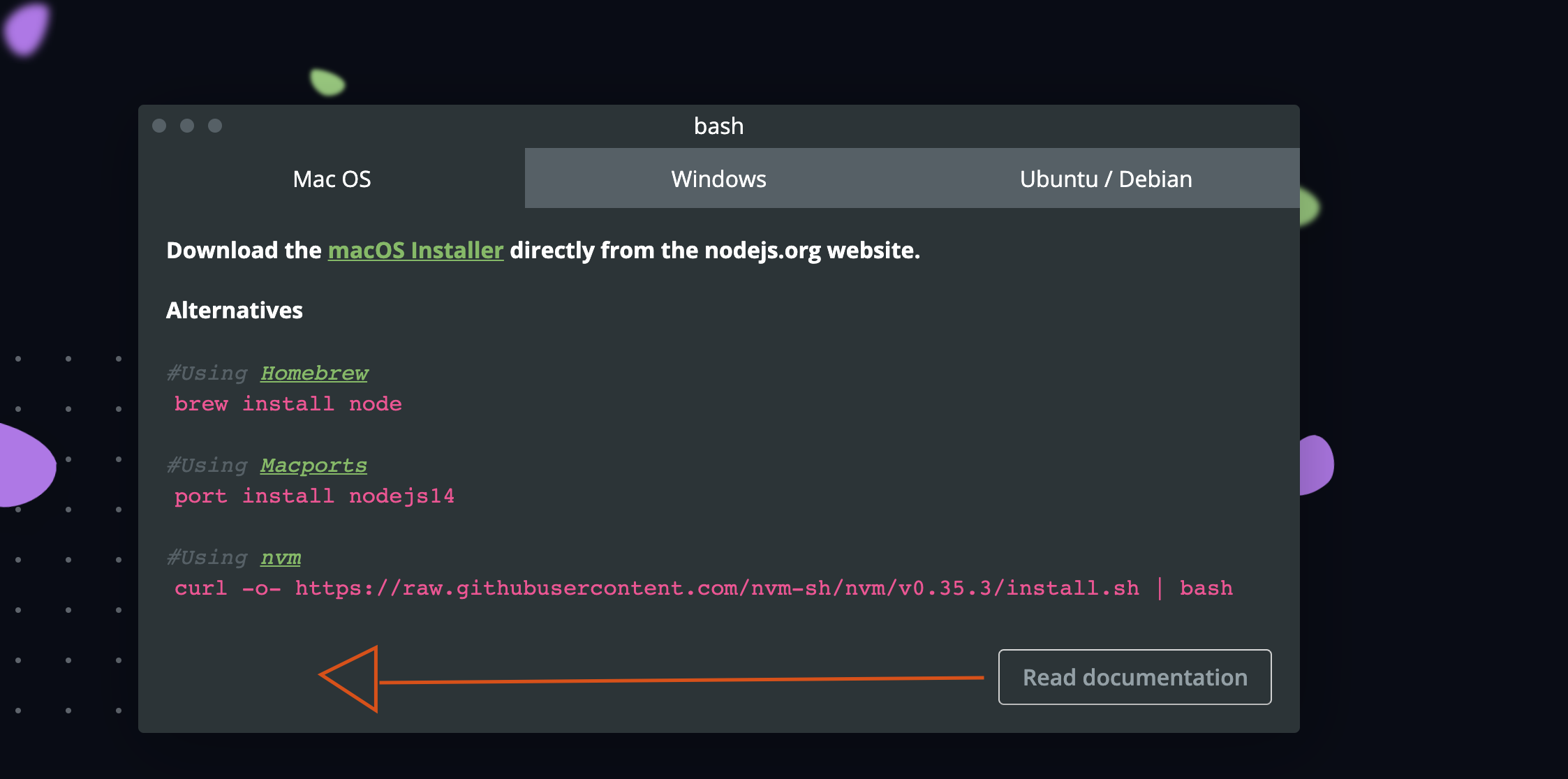
I am fixing it this issue is just for tracking purposes
 designMoreWeb
All 3 comments
As discussed in #747
designMoreWeb
on 20 May 2020
The design has the button in the bottom right
I think it looks better in the bottom left
¯\_(ツ)_/¯
 benhalverson
on 20 May 2020
benhalverson
on 20 May 2020
👍3
Fixed via #747.
 ahmadawais
on 20 May 2020
ahmadawais
on 20 May 2020
Was this page helpful?
0 / 5 - 0 ratings
Related issues
 antsmartian
·
3Comments
antsmartian
·
3Comments
 marcustisater
·
3Comments
marcustisater
·
3Comments
 BeniCheni
·
4Comments
BeniCheni
·
4Comments
 ollelauribostrom
·
3Comments
ollelauribostrom
·
3Comments
 tstreamDOTh
·
3Comments
tstreamDOTh
·
3Comments
Most helpful comment
The design has the button in the bottom right
I think it looks better in the bottom left
¯\_(ツ)_/¯