Nextcloud-vue: Actions: "active" style doesn't work
I would like to use the actions component with some action components. For some of them, the entry should reflect an enabled state (e.g. fullscreen mode is enabled/disabled). Therefore, I tried to pass the active class to the respective action component, e.g. ActionButton.
However, that class is directly removed, when opening the popover-menu from the actions component or when moving the mouse over some items (this can be observed using the browser's web developer tools).
Hence, currently it is not possible to set an active state for an actions item. It would be nice, if it would.
 korelstar
All 29 comments
The active is just to force a hover/focus state.
You want a disable/enable state instead of the active, right?
 skjnldsv
on 3 Jun 2019
skjnldsv
on 3 Jun 2019
Okay, I think I got the meaning of active wrong. In the App-Navigation, the CSS class active determines also the currently selected element (not just hover and focus). I thought this is the same, here.
However, I think "disabled" is also not the correct term, since the action should still be triggerable. Hence, this is different to #356.
As an alternative, I could use different labels for the same ActionButton, e.g. "Launch fullscreen mode" and "Close fullscreen mode" (these labels are quite long 😟) and/or colorize the icon in order to let the design emphasize the state. This doesn't require any changes in nextcloud-vue, but maybe we should have a common design speak for this.
/cc @jancborchardt
korelstar
on 3 Jun 2019
At least in current implementation (like Talk app notification level in 3-dot menu, and personal settings federation privacy settings) we use the active class for, well, the active element.
If there is not a specific reason otherwise, .active and hover/focus could be the same. That is, blue bar on the left and full opacity.
 jancborchardt
on 3 Jun 2019
jancborchardt
on 3 Jun 2019
I'm not sure I really get the topic here :see_no_evil:
could you maybe illustrate it? Why not just change the icon for the full screen toggle? You know what state it is since it's a toggle, right?
skjnldsv
on 3 Jun 2019
Okay, here we go:
App Navigation
In the app navigation, the currently selected item is shown with a blue bar at the left and full opacity. For this, the CSS class active is used. In the following screenshot, the item "Neueste" is active.
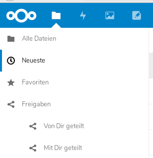
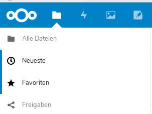
The same design is used when hovering an item from the app navigation. In the following screenshot, the item "Neueste" is active and I'm hovering the item "Favoriten":
Actions
When using the actions component, hovering works in the same way like in the app navigation. In the following screenshot, I'm hovering the item "Fullscreen":
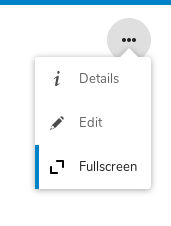
However, in contrast to the app navigation, the actions component doesn't allow to use the active CSS class for marking the currently active item.
Conclusion
Yes, I could use another icon for indicating the active state. But that's not the same design speak like in the app navigation. I'm not sure, if this is intended. It would be good to have a clear guideline which is documented somewhere.
korelstar
on 7 Jun 2019
Thank you for the detailed explanation @korelstar – this is how I understood it, and I agree with you that the actions component should allow to use the active CSS class for marking the currently active item just like the app-navigation does.
jancborchardt
on 7 Jun 2019
I really don't get it.
An active state in the appnavigatio make sense as we can have definitive 'active' state there: the current url.
But in an action menu I don't see the point. When you open one, the first item is always the first active one, and mouse/keyboard will change the active directly.
What would an active state add there?
You want to be able to set a specific entry as active by default on a menu opening?
skjnldsv
on 7 Jun 2019
@skjnldsv look in the 3-dot menu of a conversation in Talk. One of the 3 notification options is active, always.
jancborchardt
on 9 Jun 2019
Ah, yes it make sense then! Thanks fro the help, I was a bit confused :see_no_evil:
But how should the hover active differs from the selected active then? Because it would be confusing to have the same :)
skjnldsv
on 9 Jun 2019
But how should the hover active differs from the selected active then? Because it would be confusing to have the same :)
It’s fine to have the same, this is what we have in the header app list too. :)
jancborchardt
on 20 Jun 2019
@jancborchardt how about a slightly less wide blue bar on the left if active only?
Or none at all? :)
skjnldsv
on 20 Jun 2019
I like the suggestion to differ between "active" and "hover/focus". It could be transferred to the app-navigation, too.
My suggestion is to use the current style for "active" and a style with less opacity/brighter blue/or something else for "hover/focus".
korelstar
on 20 Jun 2019
So @jenniferpiperek actually had a nice mockup for a possible different "Active" state, where it used a lighter blue (lighter primary color) as background of the row. This makes it much more visible. And it also didn’t need the blue bar on the left then, and we could also make the text more opaque and readable. And the background for hover/focus could still be grey to be a bit different if we like.
@jenniferpiperek do you want to post the mockup that you did? We can also chat about it at the Contributor Week. :)
jancborchardt
on 20 Jun 2019
Awesome! Thanks @jenniferpiperek !
skjnldsv
on 20 Jun 2019
Ping @jenniferpiperek :)
skjnldsv
on 11 Jul 2019
Hello,
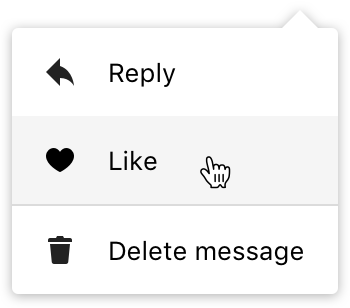
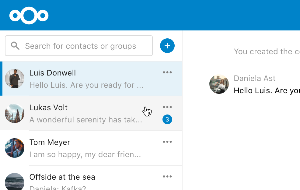
I was thinking about possible different styles for each state a list component could have. Here's my proposal:
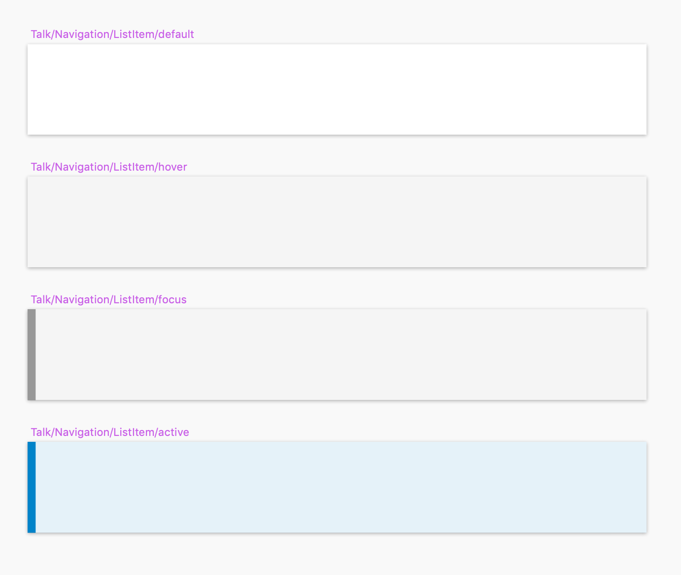
- Default
Background: White - Hover
Background: Darker Grey 10% Opacity - Focus
Background: Darker Grey 10% Opacity
Line: Darker Grey 100% - Active
Background: Primary Color 10% Opacity
Line: Primary Color 100%
Here are some examples how the styles would look like in action:
 jenniferpiperek
on 4 Sep 2019
jenniferpiperek
on 4 Sep 2019
Wow!! That looks realllyyyy good!!!
I also love the counter position!!!
Lots of things to do there :)
Let's wait for #486 to be merged so we can change the design to fit your mockups @jenniferpiperek !
skjnldsv
on 4 Sep 2019
Looks very good :)
I also love the counter position!!!
About this one: I agree about this 'one character' case but I think that with something like '99+' it may lose it's grace
 ma12-co
on 4 Sep 2019
ma12-co
on 4 Sep 2019
Suuuper nice @jenniferpiperek! :tada: :)
I also think the counter bubble will work well with more characters in it – can’t be worse than it is now. :) If it looks strange going off to the left, we could also center it below the 3-dot menu?
jancborchardt
on 4 Sep 2019
So @ma12-co and I talked about the details of the normal/hover/focus/active states and we would only change 1 thing, and that is to use the same effect for focus as we do on hover – that is only the grey background (without the bar).
Reasoning for that is:
- Is there any specific reason why hover and focus are different here?
- When you navigate via keyboard and have issues seeing color, then focus and active would clash.
We also came up with a reason _why_ hover and focus would be different, and that is:
- When the focus effect would be too intense for hover
- And when the hover effect would be too little for focus
What do you think @jenniferpiperek @skjnldsv? :)
jancborchardt
on 20 Sep 2019
I think this is to differenciate the .active and focus.
Because otherwise you could end up with this:
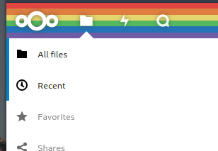
(first one is the current opened section, second is my mouse focusing it)
So for me we need both :)
skjnldsv
on 20 Sep 2019
Focus would be same as hover = grey background. So it _is_ differentiated from the active style. :)
jancborchardt
on 20 Sep 2019
Ah sorry, I misunderstood! Yes, let's merge focus and hover! :)
ALso we never use a differentiation of the two anywhere else on nc! :rocket:
skjnldsv
on 20 Sep 2019
So @skjnldsv you're going to do this when you do the keyboard navigation like in actions right?
ma12-co
on 20 Sep 2019
@ma12-co, you're learning too fast. Already sneakily hiding requests in others pull request 😂😂
Yes, I can do that, no problem! 🤗
skjnldsv
on 20 Sep 2019
Lol
I kinda remember u telling me that you were doing that it :)
ma12-co
on 21 Sep 2019
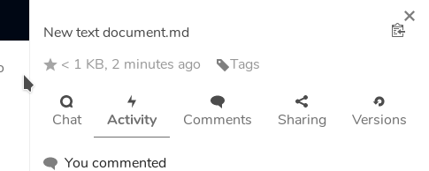
Btw I think that the tabbed navigation in the sidebar should behave in the exact same way, what do you think?
ma12-co
on 21 Sep 2019
Just opened an issue: #603
ma12-co
on 21 Sep 2019
In the call we discussed that in the case of "single choice" settings in the menu, like:
- Notification level in Talk
- Sharing permissions
- Privacy level in personal settings details
- Post visibility in Social app
We could use the radio button element and add a prop for icons. That’s better for accessibility than just list elements with one of them being marked active.
jancborchardt
on 15 Oct 2019
Related issues
ma12-co
·
7Comments
 ChristophWurst
·
6Comments
korelstar
·
7Comments
ChristophWurst
·
6Comments
korelstar
·
7Comments
 georgehrke
·
9Comments
georgehrke
·
9Comments
 janis91
·
5Comments
janis91
·
5Comments
Most helpful comment
Hello,
I was thinking about possible different styles for each state a list component could have. Here's my proposal:
Background: White
Background: Darker Grey 10% Opacity
Background: Darker Grey 10% Opacity
Line: Darker Grey 100%
Background: Primary Color 10% Opacity
Line: Primary Color 100%
Here are some examples how the styles would look like in action: