Nextcloud-vue: Add ability to tweak the modal backdrop color
Right now the modal casts this very dark backdrop on the whole page. I think that is good for photo viewing but very aggressive for anything else, as it almost completely hides the UI underneath.
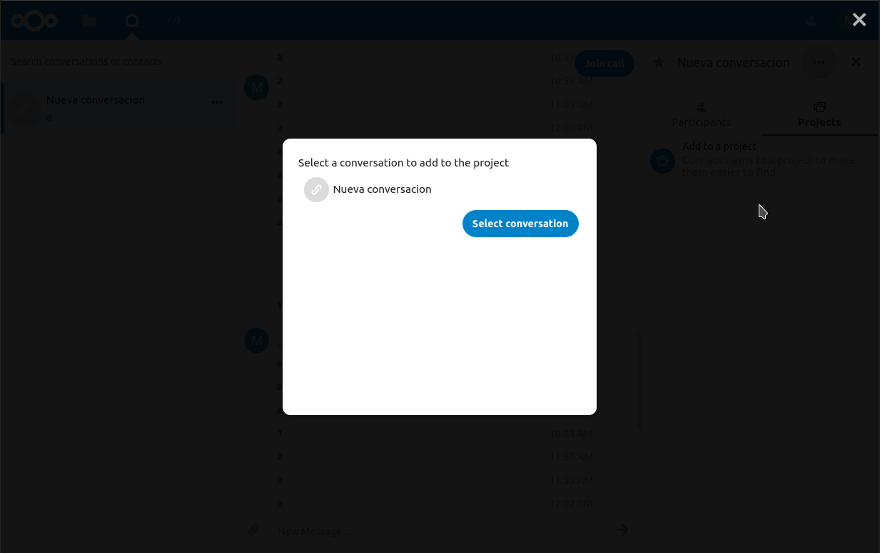
I think it would make sense to have at least 2 options: this very dark one, and a more clear one, as per material design specs: https://material.io/components/dialogs/#anatomy
What do you think @nextcloud/designers?
 ma12-co
All 7 comments
do it in css? ^^
 skjnldsv
on 26 Nov 2019
skjnldsv
on 26 Nov 2019
at least 2 options: this very dark one, and a more clear one
ah right, that would be cleaner indeed :)
please do! :rocket: :heart:
skjnldsv
on 26 Nov 2019
Actually IMO we should make the dark option completely black, as the UI behind the current one is so dark that it's kinda useless and it seems almost an error/unwanted.
ma12-co
on 26 Nov 2019
Yes, I thought we agreed on only using this very dark one only for picture viewing? e.g. the First run wizard and all the normal modals should use a rather light backdrop.
This does not need to be configurable. Basically the default is a light backdrop, and Viewer simply uses a very dark backdrop.
 jancborchardt
on 26 Nov 2019
jancborchardt
on 26 Nov 2019
@jancborchardt so a toggle between the viewer mode and the first run wizard?
skjnldsv
on 26 Nov 2019
@jancborchardt so a toggle between the viewer mode and the first run wizard?
No, as said above:
This does not need to be configurable. Basically the default is a light backdrop, and Viewer simply uses a very dark backdrop.
So everyone uses the default, which is a lighter backdrop. Viewer force overrides it. If we see that any other app needs it, we can make the Viewer backdrop style available to others as well.
jancborchardt
on 2 Dec 2019
Nevermind, https://github.com/nextcloud/nextcloud-vue/pull/750 seems good :)
jancborchardt
on 2 Dec 2019
Related issues
 juliushaertl
·
10Comments
juliushaertl
·
10Comments
 roadrunnerjb
·
5Comments
roadrunnerjb
·
5Comments
 korelstar
·
7Comments
skjnldsv
·
9Comments
korelstar
·
7Comments
skjnldsv
·
9Comments
 raimund-schluessler
·
9Comments
raimund-schluessler
·
9Comments
Most helpful comment
Yes, I thought we agreed on only using this very dark one only for picture viewing? e.g. the First run wizard and all the normal modals should use a rather light backdrop.
This does not need to be configurable. Basically the default is a light backdrop, and Viewer simply uses a very dark backdrop.