Mplfinance: One to many relationship for market bars -> trade markers
Investigating further into the trade marker topic. It would be trivial and no new functionality required if there was at most 1 buy and 1 sell per bar, and one could simply generate 2 series, buys and sells with prices at the appropriate timestamps (rest nan) and add them as scatter plot via addplot.
As always it turned out to be not that simple. When you have multiple buys or sells in a bar I think the challenge comes in. I tried passing in a series/df with duplicate date times,.ie. multiple trades at one bar, ( and no nans for the data in between) and I got the error :ValueError: x and y must be the same size
Happy to add all the details but I assume this (multiple trades/data points per bar) is just not possible at the moment?
Any thoughts on how one could work around this? Adding a number of add plots without knowing how many in advance seems cumbersome, also from a data preparation perspective. I am envisioning some sort of outer join allowed to pass in trades ...(?) List? I read most of the pertinent discussions and issues and this didn't come up to my knowledge.
 DiSchi123
All 12 comments
It is true that, at present, a single mpf.make_addplot() call does not support having multiple values at a single point in time.
Also, I understand that Adding a number of add plots without knowing how many in advance seems cumbersome but one could in theory abstract the work into a single function that would take a list of buys with dates (some dates possibly duplicates) and sells with dates (some dates possibly duplicates) and would generate from those lists an list of an arbitrary number addplot objects to be passed into mpf.plot(). This addplot generating function would also need, at least, the DatetimeIndex from the original dataframe so that it can appropriately structure the addplot data (x and y must be the same size).
Aside from this, here are a few "workarounds" you can try:
The simplest way to handle multiple buys or sells at a single point in time (but perhaps at various prices) would be, I believe, to use mplfinance's
alinesfeature, to plot your buy and sell lines as short horizontal lines at each trade price, using one color and/or line-type for buys and another color and/or line-type for sell (perhaps something like this picture here). If you follow the the discussion from this comment and on through the next few comments below it, you will see how this can be done.Perhaps Markus (@fxhuhn) would be willing to share the code used to make this picture so that we can see how that excellent plot was accomplished (although it is possible it is a matter of an arbitrary number of addplots; still I think it would be very worthwhile to see that code; the plot is great!).
Another possiblity is to use
returnfig=Trueto gain access to the Axes object(s) created by mplfinance. You can then callAxes.scatter()directly and you will not be limited to having the same number of x-values as your original dataframe DatetimeIndex, and you will also be able to have the same x-value multiple times (for multiple buys or sells at the same point in time). In this way you could plot all buys with a singleAxes.scatter()call (even with multiple buys on the same date) and all sells in a secondAxes.scatter()call. One caveat here: Ifshow_nontrading=False(which is the default value if you do not specifyshow_nontrading) then the x-values you pass in must correspond to the row number of your dataframe where the trade occured (not the datetime).
(I've posted an example of doing this, which you can view either here, or hereWe could add a kwarg to
make_addplot()that would allow you to pass in your own x-values (as datetimes). This would be similar to the previous suggestion (callAxes.scatter()directly) except that mplfinance would automatically do the translation for you from datetime to row number. In this way you could plot all buys with a singlemake_addplot()call (even with multiple buys on the same date) and all sells in a secondmake_addplot()call.We could also add a feature very similar to
alines(perhaps calleramarkersfor arbitrary markers, that would have an interface similar toalinesbut which would also accept arbitry marker styles, sizes, and colors.
 DanielGoldfarb
on 24 Sep 2020
DanielGoldfarb
on 24 Sep 2020
Thanks! My first approach will be your first suggestion, i.e. programmatically finagle the trade data into the needed dataframe columns. I opened a S.O. issue to get some help on that. Any results will be shared here.
The second option I would then investigate are these alines. They are actually also interesting by themselves. Good to know, for e.g. showing the SL level for each trade or other S/R lines on the chart. Will get back.
DiSchi123
on 24 Sep 2020
@DiSchi123 Dirk, Thanks. I've upvoted your S.O. question (well written) as well as Cameron Riddell's answer (very elegant; I would not have thought of that).
After applying Cameron's answer, you will have to merge/ensure that all datetimes from the original mpf.plot() dataframe index also exist in the addplot dataframe, filling the missing points with nans.
After that you have two choices: You can then make each column a separate addplot (if you want them to have separate attributes) or you can make a single addplot passing in the dataframe and all columns will be plotted.
If you don't mind, please post the result when you get this working. I think it will be interesting to see. Perhaps we can also make an example notebook for it in the examples folder of this repository. Thanks. --Daniel
DanielGoldfarb
on 24 Sep 2020
So the answer from Cameron makes it relatively straightforward to implement multiple buy or sell trade markers on a single bar, and for that matter, have a trade marker functionality.
Here is my implementation:
Ingredients:
Create 2 dataframes from your trades, "buys" and "sells" (steps vary based one's trade data). Note that if you have other attributes that make your trades unique, filter your buys and sells accordingly.
E.g. if you have asset id in your trades make sure you only have buys and sells for that asset id which matches your other chart data (see below) as the chart will be for one asset only.
buys
DateTime  [ Price
2018-10-15 03:00:00 | 1.156435
2018-10-24 03:00:00 | 1.143300
2018-10-29 03:00:00 | 1.140150
2018-10-29 06:00:00 | 1.141300
2018-11-05 10:00:00 | 1.139880
2018-11-08 11:00:00 | 1.142580
2018-11-14 04:00:00 | 1.127400
2018-11-15 05:00:00 | 1.127400
2018-11-16 08:00:00 | 1.136800
2018-11-21 00:00:00 | 1.137775
For this test we add more trades to a single date time
buys.loc[9] = ['2018-10-29 06:00:00', 1.1405]
buys.loc[10] = ['2018-10-29 06:00:00', 1.1400]
buys['DateTime']= pd.to_datetime(buys['DateTime'])
buys=buys.sort_values(by=['DateTime'])   ## data frame must be sorted by date time for the next step!
"De-normalize" (Cameron's answer)
buys["TradeDate_count"] = buys.groupby("DateTime").cumcount() + 1
sells["TradeDate_count"] = sells.groupby("DateTime").cumcount() + 1
newbuys = (buys.pivot(index='DateTime', columns='TradeDate_count', values="Price")
           .rename(columns="price{}".format)
           .rename_axis(columns=None))
newsells = (sells.pivot(index="DateTime", columns="TradeDate_count", values="Price")
           .rename(columns="price{}".format)
           .rename_axis(columns=None))
newbuys.head(10)
    price1  price2  price3
DateTime
2018-10-15 03:00:00 1.156435    NaN NaN
2018-10-24 03:00:00 1.143300    NaN NaN
2018-10-29 03:00:00 1.140150    NaN NaN
2018-10-29 06:00:00 1.141300    1.14    1.1405
2018-11-05 10:00:00 1.139880    NaN NaN
2018-11-14 04:00:00 1.127400    NaN NaN
2018-11-15 05:00:00 1.127400    NaN NaN
2018-11-16 08:00:00 1.136800    NaN NaN
2018-11-21 00:00:00 1.137775    NaN NaN
2018-11-21 19:00:00 1.138885    NaN NaN


md5-d944f27b5cf89889dbc12dad0db0c62a


buyseries = mainindidf.merge(newbuys, how='left', left_index=True, right_index=True)[newbuys.columns]
sellseries =  mainindidf.merge(newsells, how='left', left_index=True, right_index=True)[newsells.columns]

apds = [mpf.make_addplot(mainindidf),
        mpf.make_addplot(subindidf,panel=1,type=subshow_as),
        mpf.make_addplot(buyseries,type='scatter',markersize=200,marker='^',color='g'),
        mpf.make_addplot(sellseries,type='scatter',markersize=200,marker='v',color='r')
        ]


`mpf.plot(mainchartdf,addplot=apds,type='candle', volume=False) `
Result: voila! Note the multiple buys at 06:00
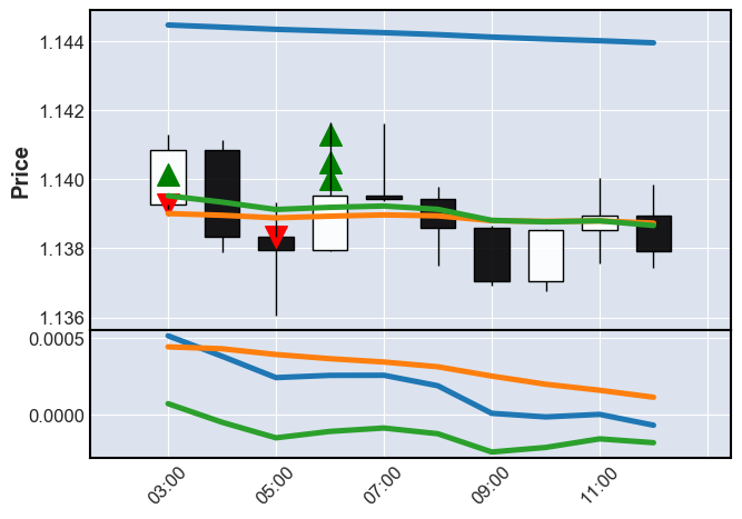
Hope that helps, sorry I dont know how to better paste a notebook into GitHub
DiSchi123
on 24 Sep 2020
(interim) solution above
DiSchi123
on 24 Sep 2020
Thanks! Looks great!
DanielGoldfarb
on 25 Sep 2020
I would like to add a postscript to this: It appears when you pass a series or df that consists only of "nan" it will cause an error message. I looked up a solution, didn't fully test it but should work (do the same for the buy series obviously)
                if sellseries.isnull().values.all(axis=0)[0]:  ## test if all cols have null only
                    pass
                else:
                    apds.append(mpf.make_addplot(sellseries,type='scatter',markersize=200,marker='v',color='r'))
Btw I like how you can gradually append to the "apds", useful if you have many of them and not sure if they all will be added
DiSchi123
on 25 Sep 2020
Now that I think of it, this may have to be done column by column? Thoughts?
DiSchi123
on 25 Sep 2020
Error message (before the fix, when I sent an empty buy or sell series):
~/miniconda3/lib/python3.7/site-packages/mplfinance/plotting.py in plot(data, **kwargs)
550 for column in apdata:
551 ydata = apdata.loc[:,column] if havedf else column
--> 552 ax = _addplot_columns(panid,panels,ydata,apdict,xdates,config)
553 _addplot_apply_supplements(ax,apdict)
554
~/miniconda3/lib/python3.7/site-packages/mplfinance/plotting.py in _addplot_columns(panid, panels, ydata, apdict, xdates, config)
755 if apdict['secondary_y'] == 'auto':
756 yd = [y for y in ydata if not math.isnan(y)]
--> 757 ymhi = math.log(max(math.fabs(np.nanmax(yd)),1e-7),10)
758 ymlo = math.log(max(math.fabs(np.nanmin(yd)),1e-7),10)
759 secondary_y = _auto_secondary_y( panels, panid, ymlo, ymhi )
<__array_function__ internals> in nanmax(args, *kwargs)
~/miniconda3/lib/python3.7/site-packages/numpy/lib/nanfunctions.py in nanmax(a, axis, out, keepdims)
441 # Slow, but safe for subclasses of ndarray
442 a, mask = _replace_nan(a, -np.inf)
--> 443 res = np.amax(a, axis=axis, out=out, **kwargs)
444 if mask is None:
445 return res
<__array_function__ internals> in amax(args, *kwargs)
~/miniconda3/lib/python3.7/site-packages/numpy/core/fromnumeric.py in amax(a, axis, out, keepdims, initial, where)
2666 """
2667 return _wrapreduction(a, np.maximum, 'max', axis, None, out,
-> 2668 keepdims=keepdims, initial=initial, where=where)
2669
2670
~/miniconda3/lib/python3.7/site-packages/numpy/core/fromnumeric.py in _wrapreduction(obj, ufunc, method, axis, dtype, out, *kwargs)
88 return reduction(axis=axis, out=out, *passkwargs)
89
---> 90 return ufunc.reduce(obj, axis, dtype, out, **passkwargs)
91
92
ValueError: zero-size array to reduction operation maximum which has no identity
DiSchi123
on 25 Sep 2020
                if sellseries.isnull().values.all(axis=0)[0]:  ## test if all cols have null only
                    pass
                else:
                    apds.append(mpf.make_addplot(sellseries,type='scatter',markersize=200,marker='v',color='r'))
I think this is definitely the way to go!
( but I don't understand why you have [0] at the end, instead of just sellseries.isnull().values.all(axis=0)).
At any rate, there was an earlier request for mplfinance to accept "all nan" series and/or dataframes (instead of the ValueError exception you see). I am philosophically opposed to this. If a method exists to do something (plot data) then your code should be smart enough to not call the method if there is nothing to do ... which is exactly what you are doing above with your if .isnull().values.all() and pass, and that's why I think that is the way to go. You can see my complete response here.
Thanks for the update.
DanielGoldfarb
on 26 Sep 2020
I agree. And my filtering should handle my data after I thought about it more.
DiSchi123
on 26 Sep 2020
Sorry, yet again a small tweak. The main solution is unchanged but to avoid the df having any nans, I found it more reliable to first delete all columns that are all nan form the buys and sells, then, if the remaining buys/sells df still has columns left (which must have at least one trade in them), add to the apds.
buyseries.dropna(axis=1, how='all',inplace=True)
                if len(buyseries.columns) ==0:  # after deletion of nan cols none left?
                    pass  # only add to chart if any trade, otherwise error
                else:
                    apds.append(mpf.make_addplot(buyseries,type='scatter',markersize=200,marker='^',color='g'))
The reason I found this better is that I feel its a bit difficult to know if the solution laid out above will have an additional columns in the buys or sells dfs. It is a bit difficult to apply the time window at that stage. After the application of the time window you may have a second price column in the buys/sells of all nan.
DiSchi123
on 5 Oct 2020
Related issues
 viorell91
·
3Comments
viorell91
·
3Comments
 jainraje
·
4Comments
jainraje
·
4Comments
 toksis
·
5Comments
toksis
·
5Comments
 obahat
·
3Comments
obahat
·
3Comments
 tessanix
·
5Comments
tessanix
·
5Comments
Most helpful comment
So the answer from Cameron makes it relatively straightforward to implement multiple buy or sell trade markers on a single bar, and for that matter, have a trade marker functionality.
Here is my implementation:
Ingredients:
Create 2 dataframes from your trades, "buys" and "sells" (steps vary based one's trade data). Note that if you have other attributes that make your trades unique, filter your buys and sells accordingly.
E.g. if you have asset id in your trades make sure you only have buys and sells for that asset id which matches your other chart data (see below) as the chart will be for one asset only.
For this test we add more trades to a single date time
"De-normalize" (Cameron's answer)
Result: voila! Note the multiple buys at 06:00
Hope that helps, sorry I dont know how to better paste a notebook into GitHub