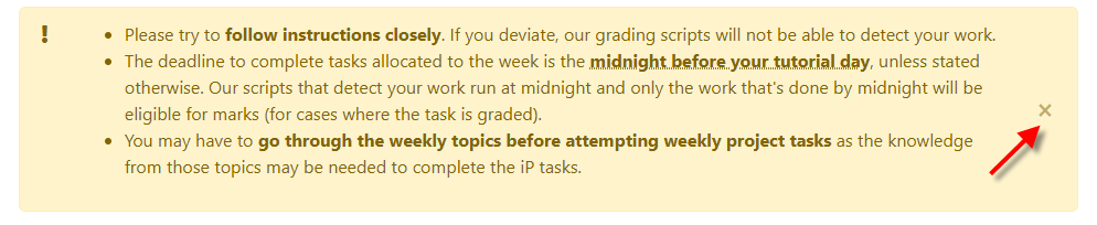
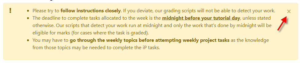
Markbind: x of the dismissible boxes it not at the top-right corner
v2.8.0
Current:
Previous:
 damithc
All 13 comments
Hmm, it was actually an intentional decision I made when adding headings to boxes in https://github.com/MarkBind/vue-strap/pull/116.
It looked a little ~strange~ packed when the heading is squashed with the close button in the top right to me, so I also applied the change to boxes without headings to maintain consistency.

Granted, its a subjective change. Should it be reverted?
 ang-zeyu
on 25 Dec 2019
ang-zeyu
on 25 Dec 2019
How about if we keep it as high as possible? i.e., if there is no heading, it will be at the top. If there is a heading, it will be just below it (as shown in the screenshot).
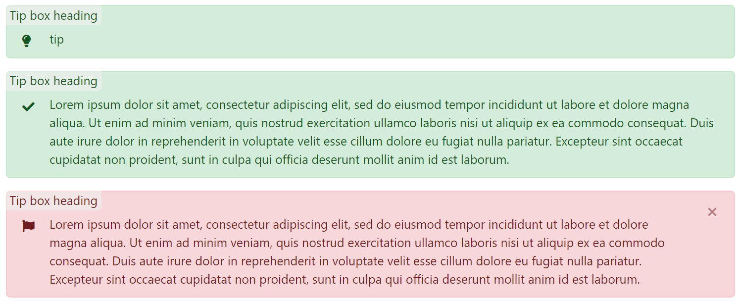
Also, we can consider moving the heading to the left corner.
damithc
on 26 Dec 2019
Also, we can consider moving the heading to the left corner.
Here's how it looks on the left:
And if the x is aligned with the flag instead of at the top right.
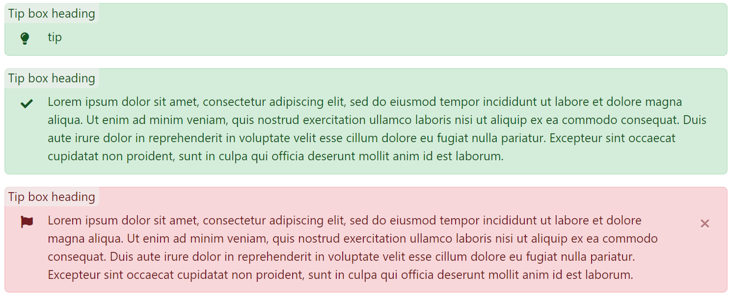
I think having the heading on the left gives a cleaner feel overall, and having the type-specific icon appear under the header is a welcome change ( since the header is likely tied to what the icon implies ).
But it would also mean no text wrapping around the header (since starting the content with a massive indent probably wouldnt be ideal), and a taller box overall.
How about if we keep it as high as possible? i.e., if there is no heading, it will be at the top. If there is a heading, it will be just below it (as shown in the screenshot).
On second look, this dosen't look too packed as well.
Any input? 😮
I prefer heading-left, and x aligned with flag personally
ang-zeyu
on 26 Dec 2019
I prefer heading-left, and
xaligned with flag personally
I prefer the heading-left, x on top as it is traditional to have window controls at the top-right corner.
On a separate matter, should we remove the background behind the heading? Or make he background span the entire box?
What happens if I use more formatting for the header e.g.,
<box>
<div slot="header">

### See here!
</div>
Coming soon...
</box>
I prefer the heading-left,
xon top as it is traditional to have window controls at the top-right corner.
👍
On a separate matter, should we remove the background behind the heading? Or make he background span the entire box?
'Barebones' but looks unexpectedly good.

I think spanning the background across the entire width of the box ( if I didn't misinterpret ) would make it very similar in functionality and design to an expanded but unexpandable panel
Could also try a background that blends more inconspicuously with the original background

What happens if I use more formatting for the header e.g.,
<box>
<div slot="header">

### See here!
</div>
Coming soon...
</box>
I didn't implement md parsing for the box headings. 🤦♂ Will add it in as well.
But once it is there, I would suppose the background stays? ( if there's one )
ang-zeyu
on 26 Dec 2019
Shall we go with this one then?

damithc
on 26 Dec 2019
Shall we go with this one then?
👍
ang-zeyu
on 26 Dec 2019
By the way, this the 'box with header' in MkDocs. I like it.

It's quite close to a panel, but a lot more convenient for authors, compared to configuring a panel to match this style exactly. Perhaps we can support a similar style if a header is supplied? Just a thought.
damithc
on 27 Dec 2019
Looks nice 👍
Isn't too hard to morph from what I have either
On another note,
Heading indexing for boxes should be allowed for boxes right? ( the feature where if you use a custom h1 h2... h6 header or always-index class )
Or would that be out-of-scope? Since boxes are typically used for presenting bite-sized information
ang-zeyu
on 27 Dec 2019
Heading indexing for boxes should be allowed for boxes right? ( the feature where if you use a custom
h1 h2... h6header oralways-indexclass )
Or would that be out-of-scope? Since boxes are typically used for presenting bite-sized information
Depends on the cost. Ideally, should be allowed if not a lot of extra work. Our search relies on heading and we might want readers to be able to locate a box using search. But if the cost too high, we can disallow it.
damithc
on 27 Dec 2019
Depends on the cost. Ideally, should be allowed if not a lot of extra work.
Hmm, should be rather cost-free when building since collectHeadingsAndKeywords already does it for <box> contents.
Just need to render each heading='...' with markdown-it, which is also being done for panels.
Search performance could be an issue either depending on the total number of headings in the site, but one could always use no-index to trim it down.
The search bar could also be optimized to do lazy searching in the future if it isn't already doing so, or have 'search categories' to limit the amount of data processed at every key press.
I'll try it out first eitherway. Thanks!
ang-zeyu
on 27 Dec 2019
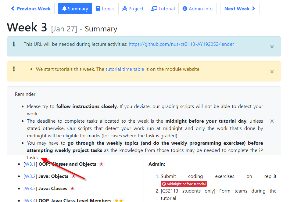
@ang-zeyu Is this problem (i.e., content overflow) related? https://nus-cs2113-ay1920s2.github.io/website/schedule/week3/index.html
damithc
on 25 Jan 2020
@ang-zeyu Is this problem (i.e., content overflow) related? https://nus-cs2113-ay1920s2.github.io/website/schedule/week3/index.html
Yes, seems to be an issue with floating the dismiss button. It should be fixed when we switch to the new design though.
Will try to get the new design out asap!
ang-zeyu
on 25 Jan 2020
Related issues
ang-zeyu
·
6Comments
 yamgent
·
5Comments
damithc
·
6Comments
yamgent
·
5Comments
damithc
·
5Comments
yamgent
·
5Comments
damithc
·
6Comments
yamgent
·
5Comments
damithc
·
5Comments
Most helpful comment
Hmm, should be rather cost-free when building since
collectHeadingsAndKeywordsalready does it for<box>contents.Just need to render each heading='
...' with markdown-it, which is also being done forpanels.Search performance could be an issue either depending on the total number of headings in the site, but one could always use
no-indexto trim it down.The search bar could also be optimized to do lazy searching in the future if it isn't already doing so, or have 'search categories' to limit the amount of data processed at every key press.
I'll try it out first eitherway. Thanks!