Manageiq-ui-classic: Layout simplification/unification
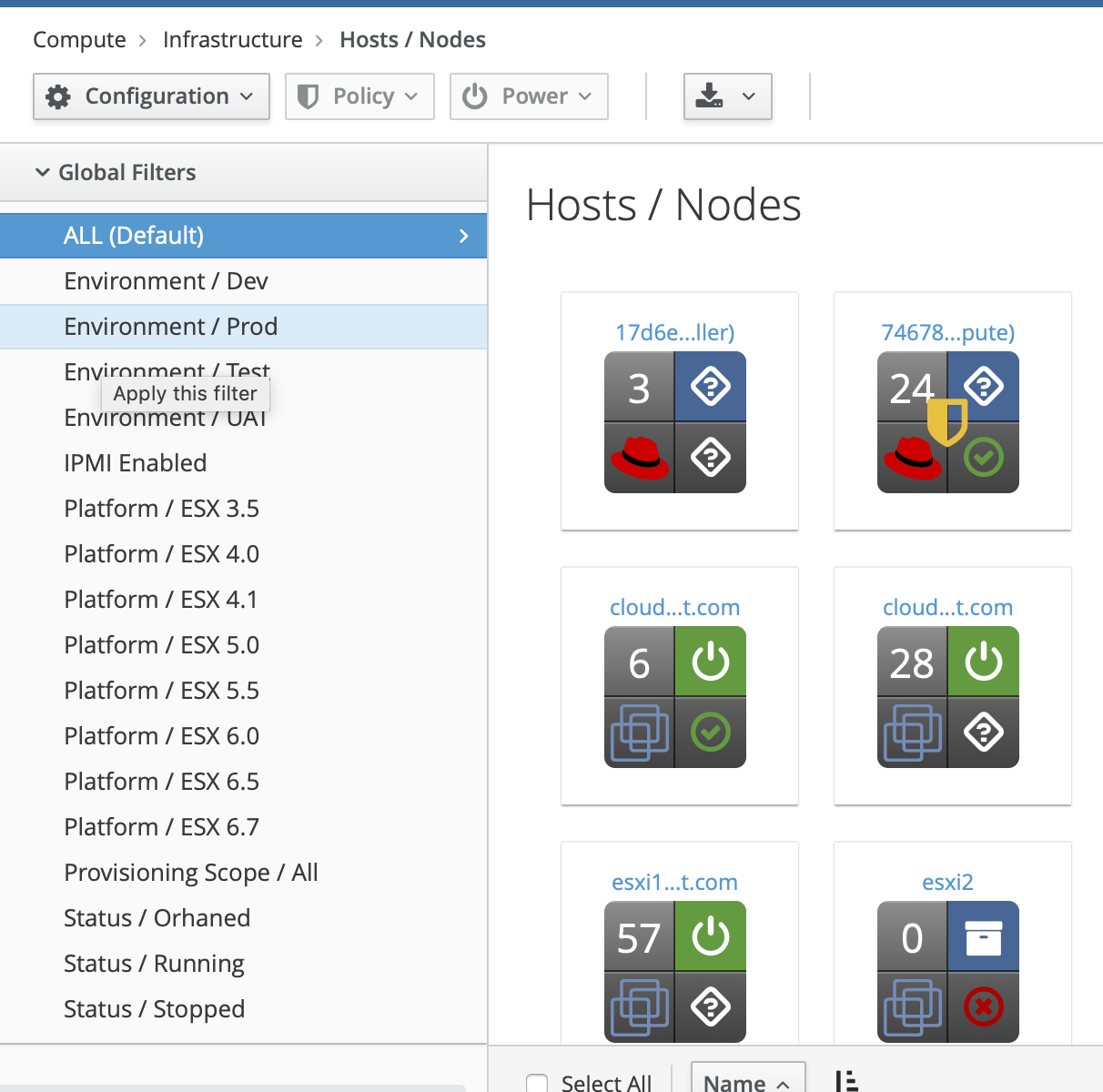
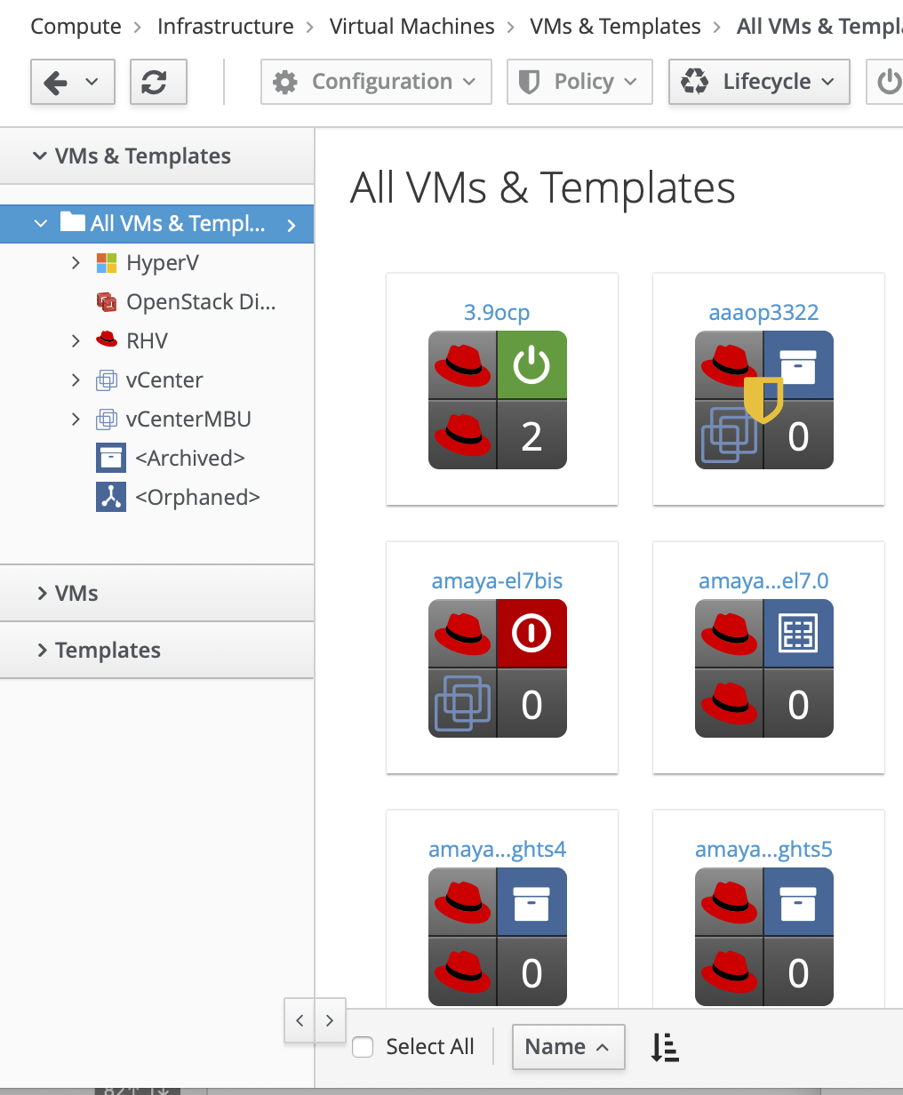
We currently have two main types of 2-column layouts in the UI: One operates using the Bootstrap grid. The other is adjustable with our custom "resizer" (this layout is used in our "explorer" screens.) The resizer was inspired by the old DHTMLX slider bar we used before Patternfly. We never fully implemented either the slider or the resizer across the UI, leaving us with a strange mix of layouts (Hosts vs VMs, for example.)
I think we must resolve this to move forward. I suggest, we remove the resizer and work toward unifying the layouts, as we prepare for mobile/tablet support, and greater consistency with the rest of the projects using PF. Thoughts?
Hosts (w/o resizer)
VMs (w/ resizer)
cc / @martinpovolny @skateman @terezanovotna @h-kataria @Loicavenel
 epwinchell
All 2 comments
I am for a consistent behavior, meaning I don't care if the resizer is there or not, but it should be the same on every page with a sidebar.
 skateman
on 13 Aug 2019
skateman
on 13 Aug 2019
@miq-bot remove_label ux/review
@miq-bot add_label ux/approved
 terezanovotna
on 23 Aug 2019
terezanovotna
on 23 Aug 2019
Related issues
 romanblanco
·
8Comments
romanblanco
·
8Comments
 miha-plesko
·
6Comments
miha-plesko
·
6Comments
 hstastna
·
5Comments
hstastna
·
7Comments
hstastna
·
5Comments
hstastna
·
7Comments
 agrare
·
5Comments
agrare
·
5Comments
Most helpful comment
I am for a consistent behavior, meaning I don't care if the resizer is there or not, but it should be the same on every page with a sidebar.