Light-client: Context aware info or help button and page on every screen
Description
There should be a button which leads to a pop-up/screen which explains the current screen.
@taleldayekh Could you please paste the screen, which you have showed us?
Acceptance criteria
- There is an information icon on the top
- It is an overlay for the whole screen
- Per screen
- One illustration
- One paragraph
- There is one route
- It recognizes on which page it is
- The text is defined in the translation file
- It is individually formatted per screen
- The content for all the screen defined in https://github.com/raiden-network/light-client/issues/698#issuecomment-725418451 is written and implemented
Tasks
- [ ] Explain limitations to Sahsh @taleldayekh
- [ ] Design @sashseurat
- [ ] Illustrations
- [ ] Implement
 christianbrb
All 10 comments
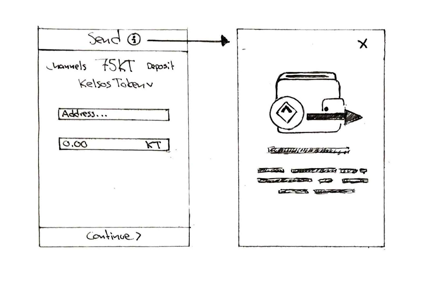
The idea is to provide the user easy access to additional information whenever she is unsure about a certain step in any of the dApp flows.
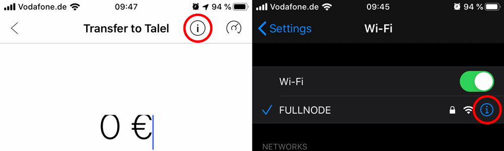
By clicking the "i" (information) symbol on a screen the user is shown an ovelay with additional information, perhaps together with an illustration. This can be used both to clearify what the user should do on a given screen but also for explaining blockchain/ethereum/dApp concepts that might be unclear for a new user.
Examples of implementations in other apps:
 taleldayekh
on 9 Dec 2019
taleldayekh
on 9 Dec 2019
Maybe should do this instead of #1487
@sashseurat @MariaNono Do you have got ideas regarding that issue?
christianbrb
on 4 Aug 2020
@christianbrb Here is where I think it makes sense to provide the users with some sort of "documentation" inside the dApp in the info overlay. Have a look and gimme your thoughts.
Select Hub
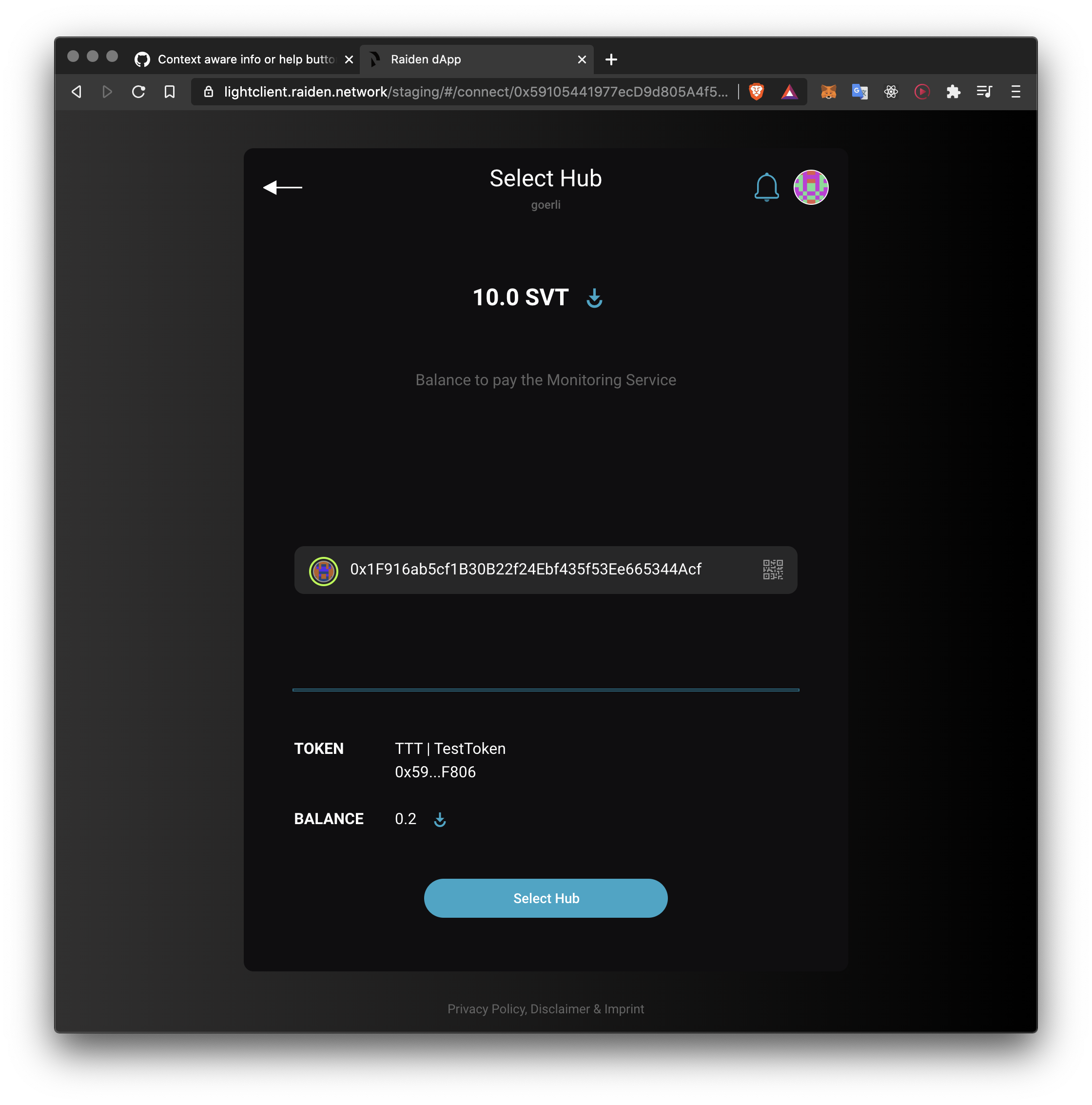
Not necessarily clear what a hub is.
Open Channel
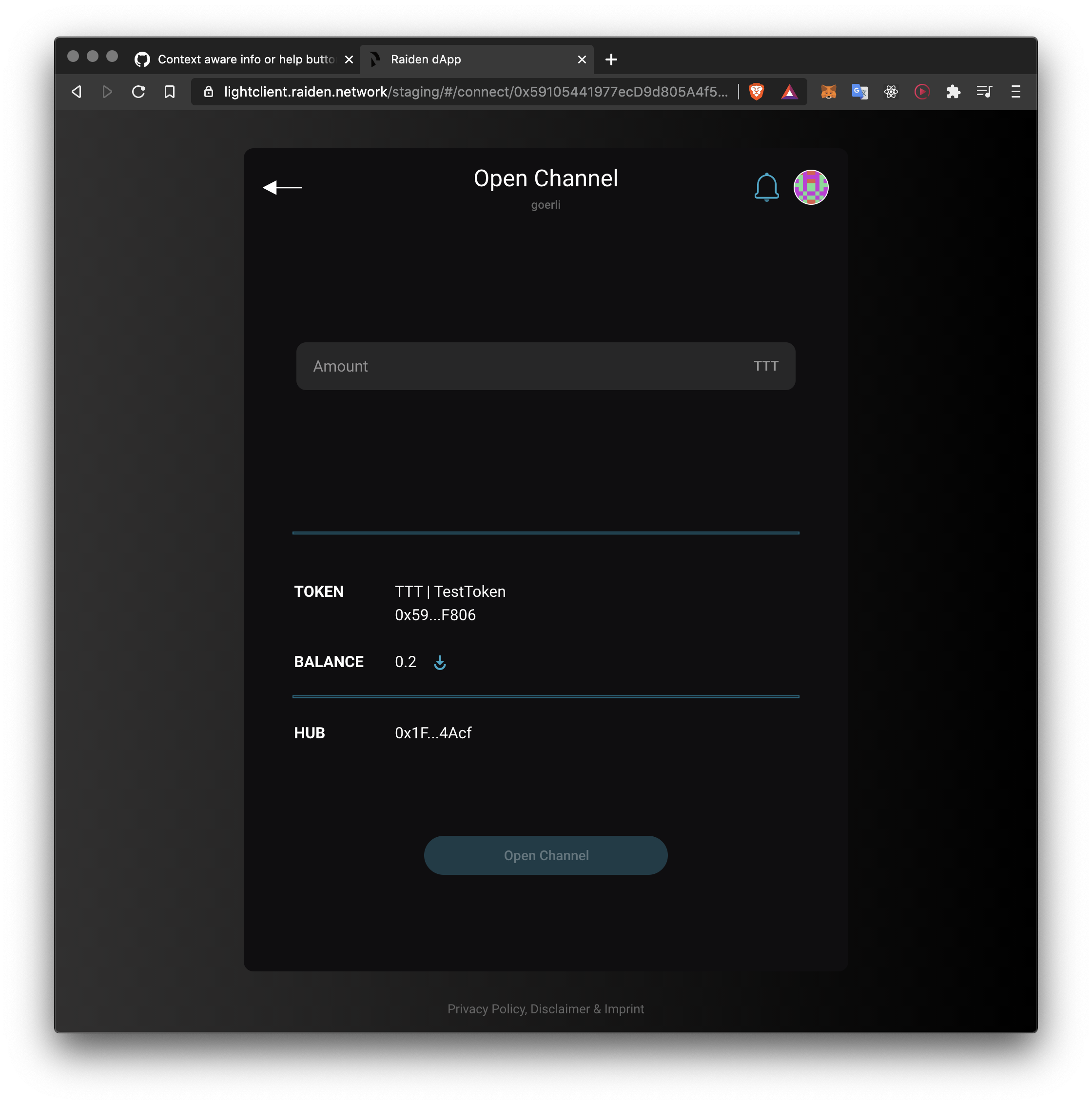
Short description of the concept of channels.
Transfer (for mediated transfers)
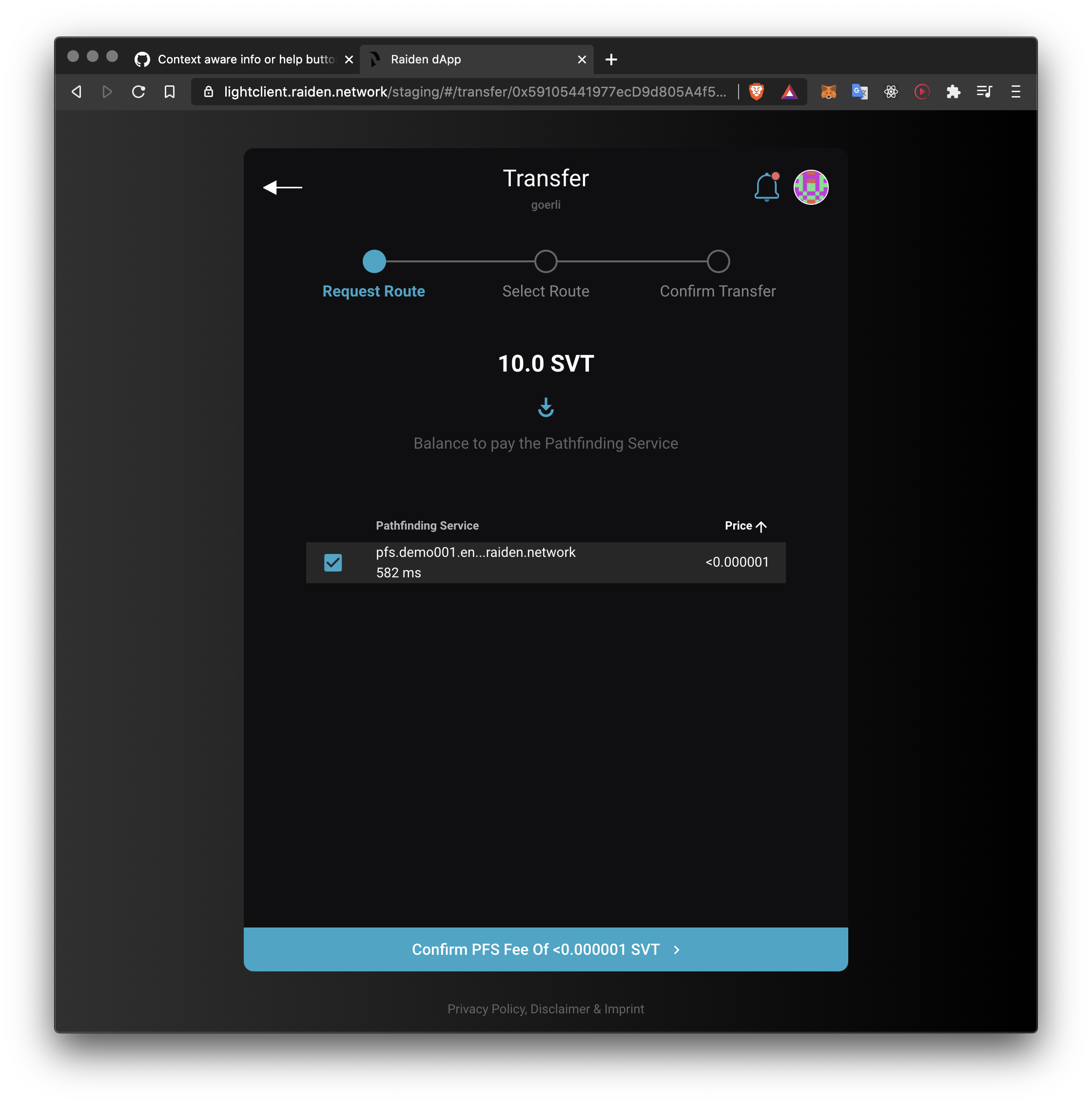
Short descriptions about the PFS concept and the purpose of selecting routes (hops).
Channels
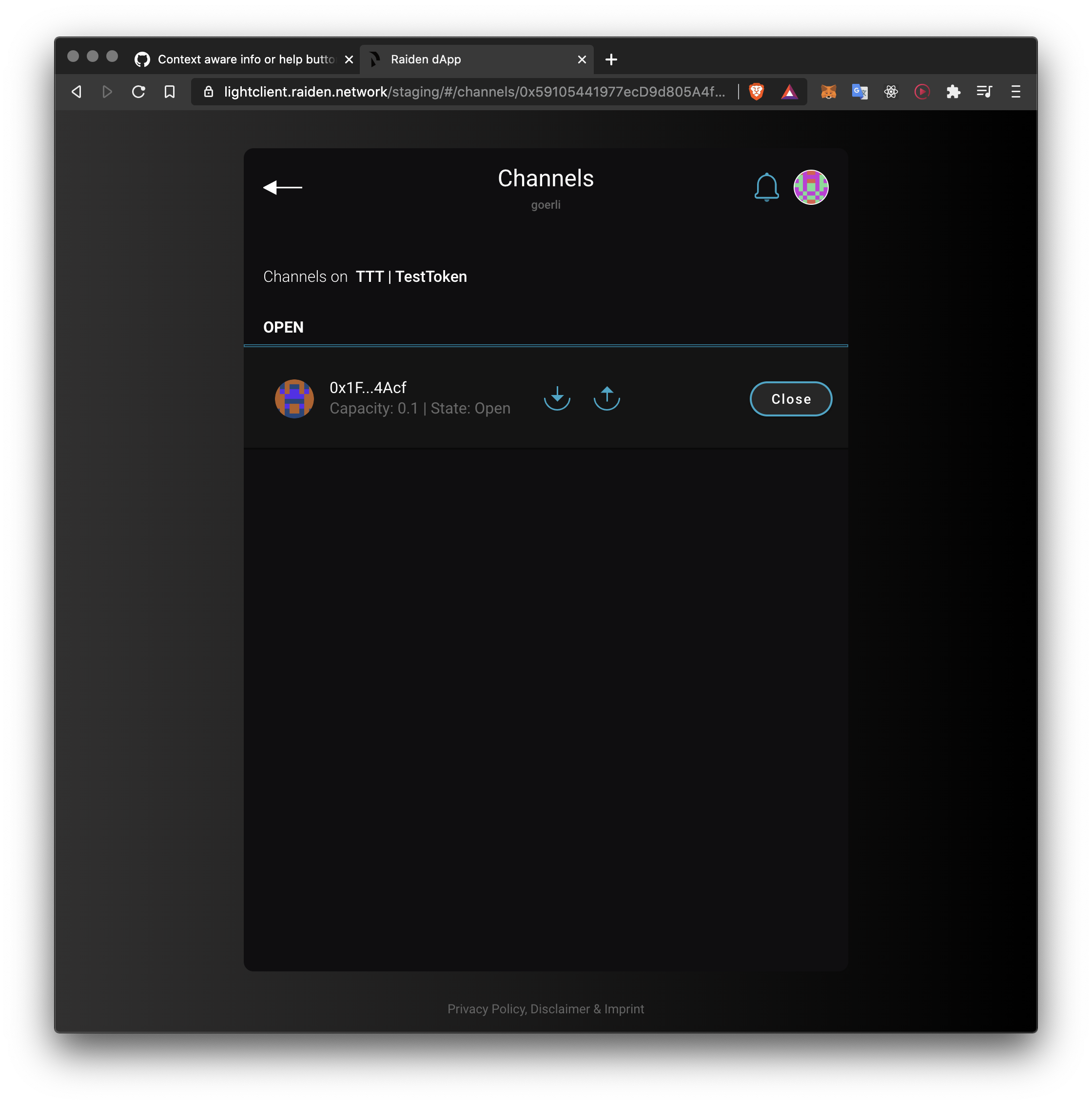
Describe that the user channels open with the currently selected token and if they cannot see a specific channel it might mean that they have the wrong token selected.
Also describe the close and settle functionality.
Transfer ETH
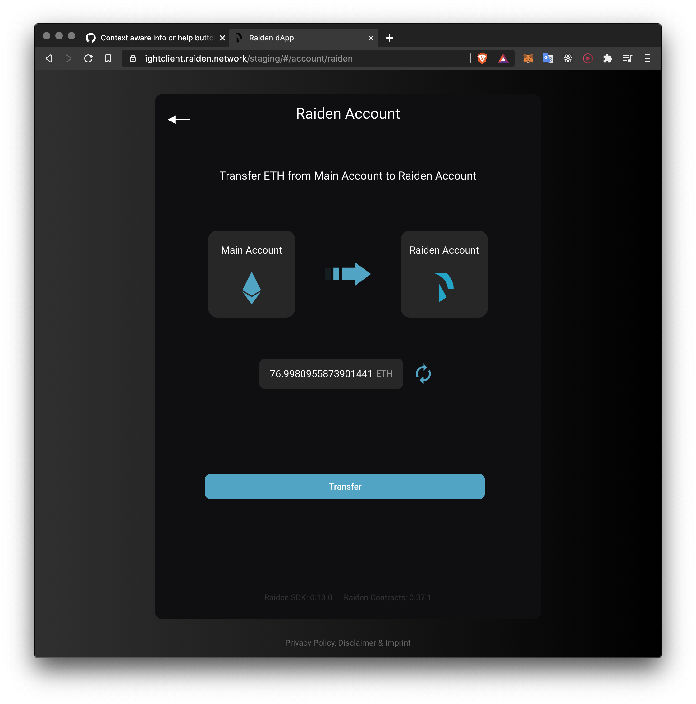
Short description about the main account and Raiden account ETH.
Withdraw Tokens
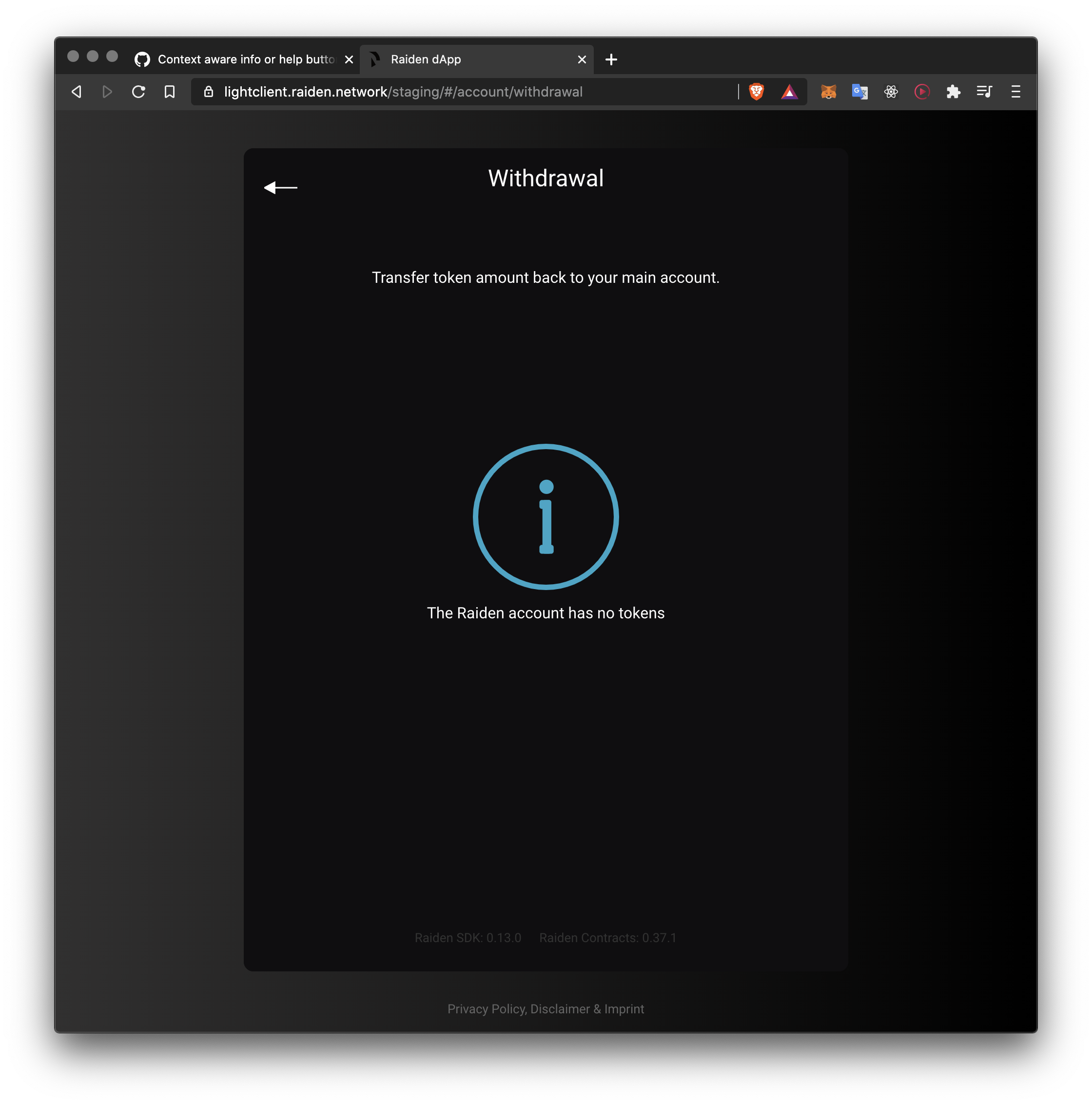
Describe how the user would get tokens here, i.e. by closing channel.
UDC
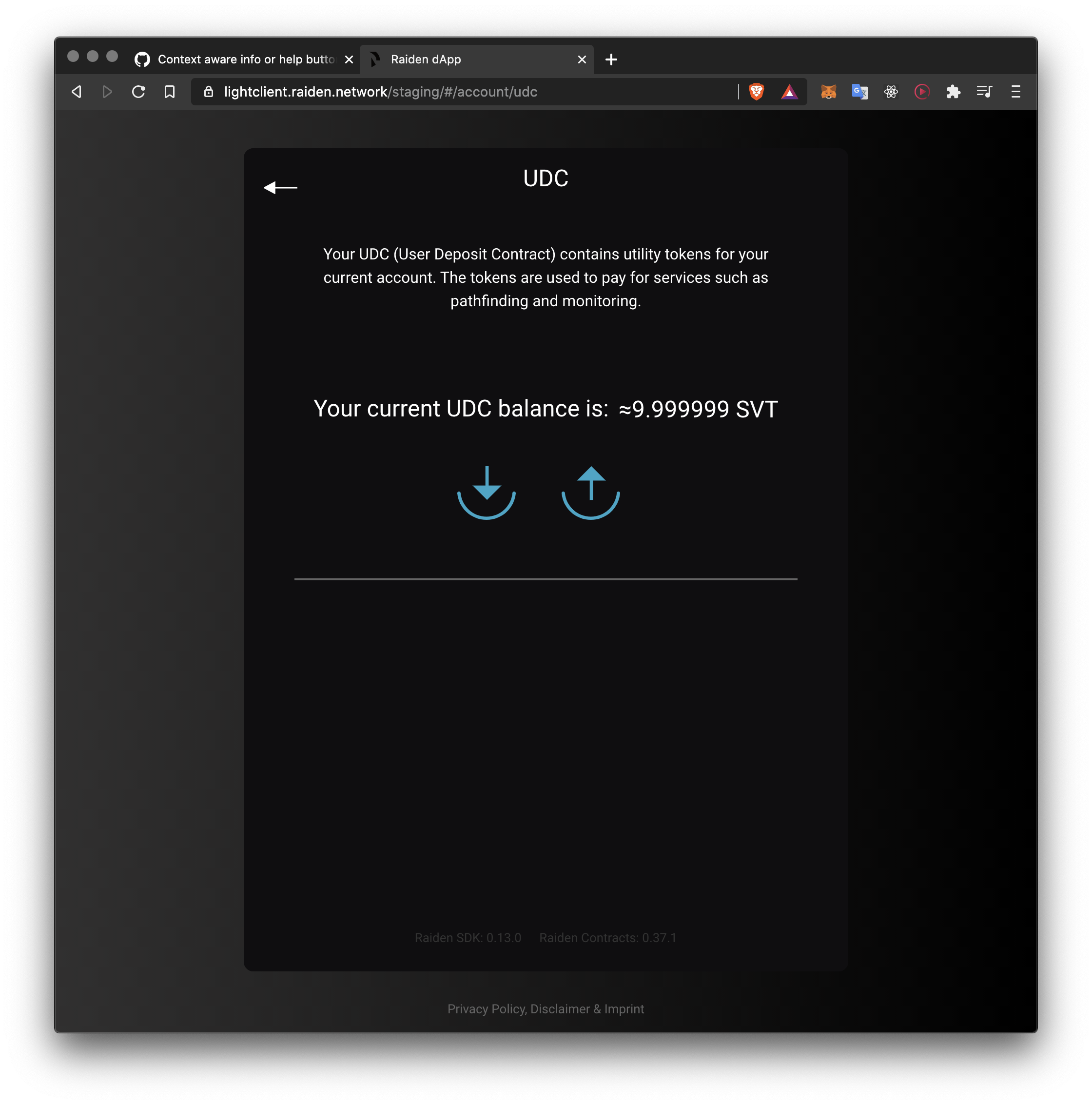
Move current description of the UDC to info overlay.
Backup State
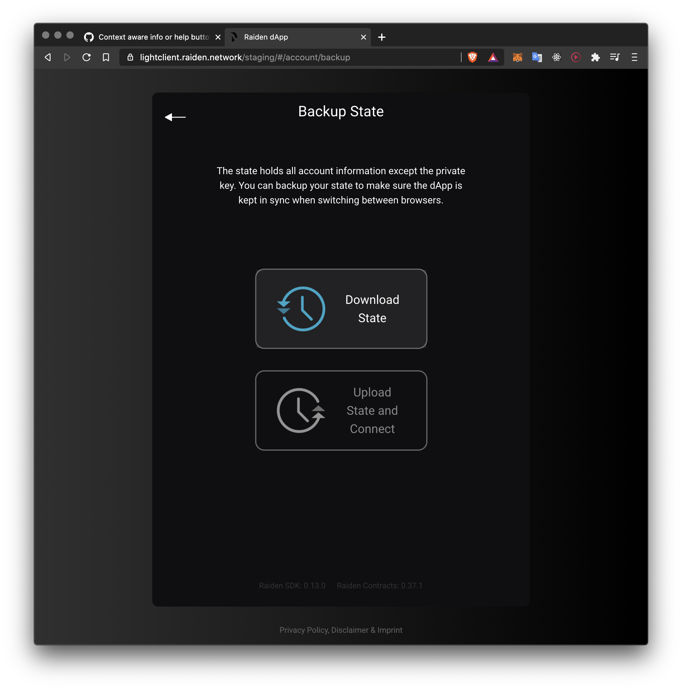
Explain to user why backing up state is crucial.
taleldayekh
on 11 Nov 2020
@taleldayekh & @christianbrb
Here is a draft of my suggestion for the Select a Hub screen overlay:
https://www.figma.com/proto/KVi3wU2n28KlozER6tmg4m/LC-Info-Overlays?node-id=1%3A14&viewport=-95%2C292%2C0.5&scaling=min-zoom
It will be really nice if the illustration can be done by @MariaNono!
The approach is:
Giving user an overlay in the appearance of a screen, with a bit of a highlighted background to draw user's attention, and provide better contrast for easier reading of a big paragraph.
Simple text (minimizing use of technical terms) in large font for a clear and accessible explanation.
Two exit points (X + Done) for user's hightened sense of control
Placeholder for illustration depicting a hub - a node which is connected to several other nodes (abstract concept: connectivity [of nodes])
 sashseurat
on 12 Nov 2020
sashseurat
on 12 Nov 2020
Here is draft for Open Channel screen overlay (in same Figma file, under different page):
https://www.figma.com/file/KVi3wU2n28KlozER6tmg4m/LC-Info-Overlays?node-id=10%3A20
Same approach, with illustration of "connectivity", or similar to the open channel icon (as seen in placeholder)
sashseurat
on 13 Nov 2020
@sashseurat Very nice! @taleldayekh It is improving the dApp a lot, thanks for pushing it :)
Just a workflow and implementation proposal. Is it always the same screen and just the text and icon need to be "configured".
christianbrb
on 13 Nov 2020
Just a workflow and implementation proposal. Is it always the same screen and just the text and icon need to be "configured".
Yes exactly like that :)
taleldayekh
on 13 Nov 2020
Hi, @sashseurat I have just finished some first sketches and discussed them with @taleldayekh
Have a look and let's discuss them soon.
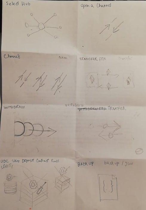
 MariaNono
on 16 Nov 2020
MariaNono
on 16 Nov 2020
Second sketch iteration!
@christianbrb , @taleldayekh , @sashseurat , I would proceed with these ideas unless you any changes to suggest.
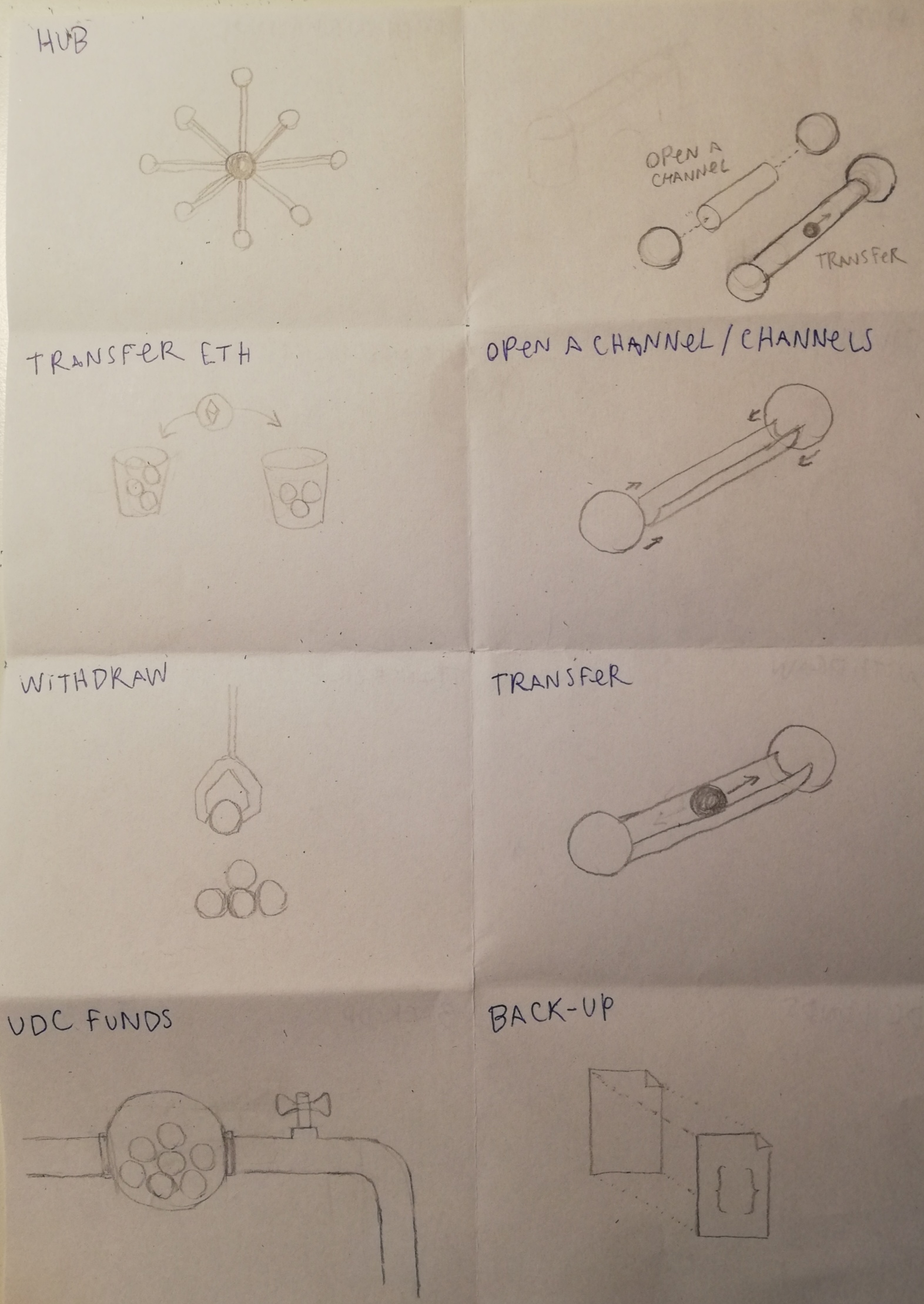
MariaNono
on 19 Nov 2020
@MariaNono Looks very nice :)
Open channel:
- Please also add dots (tokens) on the left side of the channel (it is the deposit)
- Just make the arrows into one direction (from left to right) as the the user can just pay somebody if the partner hasn't done a counterdeposit.
UDC Funds:
This one is really hard. It should be shown, that it is used to pay a service.
User/Wallet -> Token -> Service (RSB Provider)
christianbrb
on 20 Nov 2020
Related issues
 kelsos
·
4Comments
kelsos
·
6Comments
kelsos
·
4Comments
kelsos
·
6Comments
 MrCleanerPickerUpper
·
6Comments
christianbrb
·
5Comments
christianbrb
·
6Comments
MrCleanerPickerUpper
·
6Comments
christianbrb
·
5Comments
christianbrb
·
6Comments
Most helpful comment
Hi, @sashseurat I have just finished some first sketches and discussed them with @taleldayekh

Have a look and let's discuss them soon.