Light-client: Formatting of channel settlement notification and message
Description
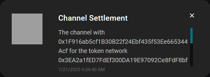
The channel notification and message text need to get formatted nicely. We should also check, if the text is understandable. There are a lot of addresses within the notification.
Acceptance criteria
- Addresses are truncated
- Icon is shown
Tasks
- [ ]
 christianbrb
All 5 comments
Meeting with @sashseurat @MariaNono and @taleldayekh
- Design of the notification panel
a) Text for Sash
b) It is for slow blockchain interactions
c) We currently have Settle Channel Notifications
d) Next one is going to be open channel
e) Icons: In progress, Done, Failed
f) Take the bin instead of the x to get rid of notifications
g) The blocks are incrementing (just numbers) - Design of the notification overlay
a) Taking the same design as the notifications in the panel mockup - Visual progress bar
a) Making a separate issue to split this
christianbrb
on 11 Aug 2020
@christianbrb + @taleldayekh Here is the click-dummy for the notifications panel ready for your review:
https://www.figma.com/proto/nCvDyCfu5ZXnNETzepPLwg/LC-Notifications-Panel?node-id=179%3A11&viewport=923%2C270%2C0.884325385093689&scaling=contain
I've added the open channel icon, channel settled icon, and failed icon and would like your feedback on them as well.
 sashseurat
on 19 Aug 2020
sashseurat
on 19 Aug 2020
@sashseurat Crazy stuff, looks super nice 👍 :)
 taleldayekh
on 19 Aug 2020
taleldayekh
on 19 Aug 2020
@taleldayekh Please also take a look at https://github.com/raiden-network/light-client/issues/1902#issuecomment-677557195 when implementing this issue.
I would be in favor using the clickable snack bar at footer instead of the notification overlay on the top.
christianbrb
on 24 Aug 2020
I would be in favor using the clickable snack bar at footer instead of the notification overlay on the top.
Understood and I agree. 👍
taleldayekh
on 24 Aug 2020
Related issues
 nephix
·
3Comments
christianbrb
·
5Comments
nephix
·
3Comments
christianbrb
·
5Comments
 MrCleanerPickerUpper
·
6Comments
MrCleanerPickerUpper
·
6Comments
 kelsos
·
4Comments
christianbrb
·
3Comments
kelsos
·
4Comments
christianbrb
·
3Comments