Jupyterlab: Improve user experience in Launcher
The labels of the python kernels in the launcher are hard to read, especially when you have a large number of kernels. I had to hover over them to read the full name.
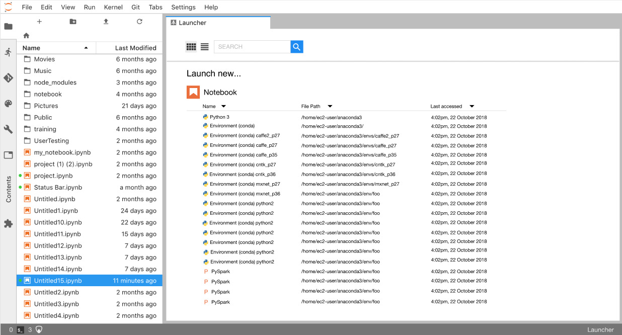
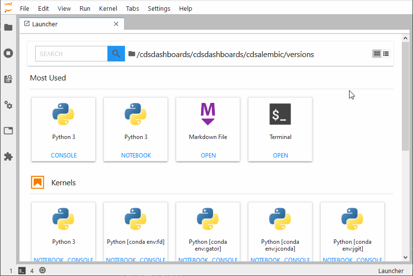
Below is an example of running a Jupyter lab launcher using the Amazon Deep Learning AMI. The Conda environments are already labeled in the AMI and all start with "Environment .. ", making it hard to get an overview. It would be great to allow a list view or search.

And a list of the environments in conda

 rutgerhofste
All 45 comments
cc @tgeorgeux
 blink1073
on 5 Feb 2018
blink1073
on 5 Feb 2018
Thanks for bringing this up @rutgerhofste, and especially for providing a screenshot that makes the problem crystal-clear. @blink1073 has CCd our designer, @tgeorgeux, for discussion.
 jasongrout
on 5 Feb 2018
jasongrout
on 5 Feb 2018
What we really need is kernels to provide us with a length limited
"display" version of the kernel name. As long as kernel authors give us
these long names, it is going to be really tough to build a good UX around
them.
On Mon, Feb 5, 2018 at 10:05 AM, Jason Grout notifications@github.com
wrote:
Thanks for bringing this up @rutgerhofste
https://github.com/rutgerhofste, and especially for providing a
screenshot that makes the problem crystal-clear. @blink1073
https://github.com/blink1073 has CCd our designer, @tgeorgeux
https://github.com/tgeorgeux, for discussion.—
You are receiving this because you are subscribed to this thread.
Reply to this email directly, view it on GitHub
https://github.com/jupyterlab/jupyterlab/issues/3795#issuecomment-363168927,
or mute the thread
https://github.com/notifications/unsubscribe-auth/AABr0LhmHXUbH_RpgnTPBxdVcJbRchWRks5tR0LygaJpZM4R261G
.
--
Brian E. Granger
Associate Professor of Physics and Data Science
Cal Poly State University, San Luis Obispo
@ellisonbg on Twitter and GitHub
[email protected] and [email protected]
 ellisonbg
on 6 Feb 2018
ellisonbg
on 6 Feb 2018
I've run into this issue too. Maybe a simpler list-style design (or an option to change the view to list-style, similar to file browsers) would work better.
My general feeling is also that the design currently doesn't sufficiently convey the fact that the icons will launch an environment (personally for a minute I thought they were previews of the notebook files rather than the kernels). I think a wider list or card style design with a 'launch' label/icon would help.
 mangecoeur
on 8 Feb 2018
mangecoeur
on 8 Feb 2018
I'm hitting this problem as well - I think a button to toggle between a List and Card view is an excellent idea.
Additionally, I find the duplication of each kernel under both the Notebook and Console headers in Launcher is visually aggressive. We could take this a step further and make the Notebook, Console , and Other sections collapsible.
 aeksco
on 22 Mar 2018
aeksco
on 22 Mar 2018
Or, to build on @aeksco 's idea, how about swapping the hierarchy from type{notebook,console} ->kernel to kernel ->type, with a card for each kernel with launcher icons for the notebook and the console associated with that kernel. At the moment you get a lot of duplication since every kernel can have a notebook and a console.
mangecoeur
on 22 Mar 2018
@mangecoeur I like that idea a lot - we can integrate the same {notebook,console} UI elements in both the Card and List layouts for consistency.
I'd be happy to take this on as a first contribution to the Jupyterlab - perhaps a maintainer could validate the scope of this Enhancement before I start working?
aeksco
on 22 Mar 2018
A few points:
- I agree that a list based view would be helpful, but its default view
should follow the existing hierarchy. One nice aspect of a list view is
that it could be sorted by different fields (kernels, notebook/console,
etc.). - There is an underlying problem in the information kernels are providing
to the UI. In my view, all kernels should have a short name that is unique.
Having kernel names that are as long as sentences, with the unique portion
coming last is not going to be solved well, even by a list view. That
probably would have to be fixed in the underlying Jupyter kernel spec. Can
someone follow up on the other relevant repos (not actually sure which are
the right repos)?
I am finishing finals this week and probably won't have time to describe in
great detail the various things we tried to get to the current point. A lot
of UI/UX design, user testing and design exploration, and implementation
iteration went into the current launcher design. Most things about the
design we have now were very deliberate choices we made based on many
months of work. Dramatic changes to the launcher's current card based view
would need to be backed by substantial UI/UX design work with user testing.
However, if someone wants to dive into a list base view, that would be
great. I would prefer if the work begins with visual design mockups to
prevent wasted coding time.
On Thu, Mar 22, 2018 at 9:53 AM, Alexander Schwartzberg <
[email protected]> wrote:
@mangecoeur https://github.com/mangecoeur I like that idea a lot - we
can integrate the same {notebook,console} UI elements in both the Card
and List layouts for consistency.I'd be happy to take this on as a first contribution to the Jupyterlab -
perhaps a maintainer could validate the scope of this Enhancement before I
start working?—
You are receiving this because you were mentioned.
Reply to this email directly, view it on GitHub
https://github.com/jupyterlab/jupyterlab/issues/3795#issuecomment-375378504,
or mute the thread
https://github.com/notifications/unsubscribe-auth/AABr0PXGhnyxw8F7ozUDX3Xky-Q_b8kvks5tg9cLgaJpZM4R261G
.
--
Brian E. Granger
Associate Professor of Physics and Data Science
Cal Poly State University, San Luis Obispo
@ellisonbg on Twitter and GitHub
[email protected] and [email protected]
ellisonbg
on 22 Mar 2018
@ellisonbg Thank you for the response! I understand the process required for these types of changes requires oversight, and I'd also like to apologize if my above comment in any way undermined the effort and caliber of work that went into the Launcher's current design.
I'd be thrilled to work on a visual design mockup for a Launcher list view - I'll begin pouring over the Juptyerlab design documentation so I have a grasp on the existing UI standards and I'll post an update when I've got something to show :)
aeksco
on 25 Mar 2018
@aeksco Feel free to reach out to me if you have any questions. I'm happy to help where I can.
 tgeorgeux
on 26 Mar 2018
tgeorgeux
on 26 Mar 2018
Just making a comment here that even fairly short (but qualified) names can't read. For example, we have some branded kernel names like "Calysto Scheme", "Calysto Processing", and "Metakernel Python" but those also can't be identified. Perhaps 2 lines in the box would suffice?

 dsblank
on 19 May 2018
dsblank
on 19 May 2018
It would also be really cool if the notebook spec included a longer "description" metadata field that could be used in tooltips or shown by clicking an (i) button. We end up with a lot of customized environments that are configured differently, and a little description of those environments to display for users would be extremely helpful.
 jdavidheiser
on 26 Jun 2018
jdavidheiser
on 26 Jun 2018
What about a flexible view such as in a file browser where you can switch between list view and icon view?
 hadim
on 4 Jul 2018
hadim
on 4 Jul 2018
I like the idea of a flexible view!
On Wed, Jul 4, 2018 at 6:59 AM Hadrien Mary notifications@github.com
wrote:
What about a flexible view such as in a file browser where you can switch
between list view and icon view?—
You are receiving this because you were mentioned.
Reply to this email directly, view it on GitHub
https://github.com/jupyterlab/jupyterlab/issues/3795#issuecomment-402487521,
or mute the thread
https://github.com/notifications/unsubscribe-auth/AABr0K5IUNrX-h4N9hP4BVqMtH6k7pwFks5uDMpHgaJpZM4R261G
.
--
Brian E. Granger
Associate Professor of Physics and Data Science
Cal Poly State University, San Luis Obispo
@ellisonbg on Twitter and GitHub
[email protected] and [email protected]
ellisonbg
on 5 Jul 2018
I like the idea of a list view. A way to improve this with the current layout would be to have a large description appear immediately on hovering instead of having to wait for the alt text to show up.
 mivade
on 14 Aug 2018
mivade
on 14 Aug 2018
Just a heads up I won't have the time to take a crack at this - sorry for dropping the ball!
aeksco
on 15 Aug 2018
Changing to 1.0 for the discussion tomorrow.
jasongrout
on 12 Sep 2018
Another quick observation if this is going to be discussed further: currently when hovering over one of the icons' there is just a 'shade' effect which IMHO doesn't really convey that clicking will create a new notebook. Perhaps in addition the icon should be overlayed on hover with a 'plus' icon or similar, or a hover or tooltip text saying 'create' or 'launch' or similar.
mangecoeur
on 12 Sep 2018
@saulshanabrook @ian-r-rose To help combat repetitive names, @NoahStapp was thinking of using the end of the environment path name as a display name. Is this actually possible?
 i-am-am
on 17 Oct 2018
i-am-am
on 17 Oct 2018
@mangecoeur , was there an outcome of the Sept 12 meeting on this topic? This is definitely an issue for customers that use a lot of conda environments, such as DL AMI and SageMaker customers. We can certainly get creative with shortening names, to an extent, but I wonder if that's a viable long-term solution.
One thought would be do go for a more tile-like view, where the tiles are a bit wider, and the icons a bit smaller. This might better accommodate longer-named kernels.
 kevinmmccormick
on 23 Oct 2018
kevinmmccormick
on 23 Oct 2018
We have some interns working on a list view this quarter and should have
some progress to show soon.
On Tue, Oct 23, 2018 at 11:40 AM kevinmmccormick notifications@github.com
wrote:
@mangecoeur https://github.com/mangecoeur , was there an outcome of the
Sept 12 meeting on this topic? This is definitely an issue for customers
that use a lot of conda environments, such as DL AMI and SageMaker
customers. We can certainly get creative with shortening names, to an
extent, but I wonder if that's a viable long-term solution.One thought would be do go for a more tile-like view, where the tiles are
a bit wider, and the icons a bit smaller. This might better accommodate
longer-named kernels.—
You are receiving this because you were mentioned.
Reply to this email directly, view it on GitHub
https://github.com/jupyterlab/jupyterlab/issues/3795#issuecomment-432369542,
or mute the thread
https://github.com/notifications/unsubscribe-auth/AABr0E3fSYtkFUXAjvOJmJhIb_Ybmcedks5un2K3gaJpZM4R261G
.
--
Brian E. Granger
Associate Professor of Physics and Data Science
Cal Poly State University, San Luis Obispo
@ellisonbg on Twitter and GitHub
[email protected] and [email protected]
ellisonbg
on 23 Oct 2018
Here's a prototype of list view as we've been thinking about it
i-am-am
on 23 Oct 2018
The redundant duplication does grate a bit so I like @mangecoeur's suggestion:
how about swapping the hierarchy from
type{notebook,console} ->kerneltokernel ->type
...which is similar to what I suggested a while ago.
instead of duplicating everything for notebook/console there is instead just a listing of available kernels. Above the kernels is an Activities section with Notebook/Console/Editor.
The kernel selection is "sticky" so that there is always one kernel selected. Initially that would be the default kernel but would change to being whatever was the last used kernel. Upon double-clicking an Activity it would open whatever is appropriate for the currently selected kernel.
 dhirschfeld
on 24 Oct 2018
dhirschfeld
on 24 Oct 2018
Great to see first progress!
+1000 on search box, if it actually searches, which will (rightfully)
demand a server component. Indeed, an initially focused, keyboard
accessible, browser-style omnibox (jupybar?) which could either locate a
recent activity (by name or content or type or kernel), create an activity
(by kernel or type), or execute any command, or reveal help would be an
enormous win: Ctrl+l, start typing, do anything without touching the mouse.
The path of the search or activity-to-be is also important. While it
constantly messes me up, the GitHub chiclet in the search bar for scope
could work, though might have to be more of a Windows explorer
breadcrumb/drop-down because we have more than "the GitHub", "this org",
"this repo", especially when other IDrives get to play in here.
Otherwise, the area at the top reserves a lot of real estate, unless there
is a plan for that to be an extension-extensible area, or if good/optional
branding appears here. A Help/tour button for sure!
The per-activity headers also take up a lot of vertical space. Perhaps each
header could also include 24-32px buttons of the possible new kernel/mime,
which also updated the header label, e.g "Python notebook", "markdown file"
on Hover/focus.
As for the list view... i assume that's recent files? Already a lot of
visual repitition. Perhaps a column per activity (though nobody likes to
scroll horizontally) where each row got a double-height icon, name of file
and mod time, grouped by path. Selecting a path reveals in the file browser.
Excited to see more!
 bollwyvl
on 24 Oct 2018
bollwyvl
on 24 Oct 2018
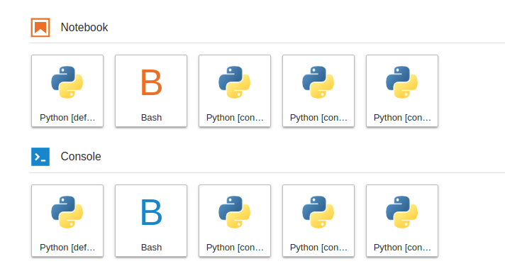
Not sure what the current status is. Even with 5 kernels I need to hover right now to figure out which one to click:
 amueller
on 26 Oct 2018
amueller
on 26 Oct 2018
With influence from @dhirschfeld and @mangecoeur and Anaconda Navigator, here's the direction @takashimokobe and I been heading:
A bigger card view with a different hierarchy,
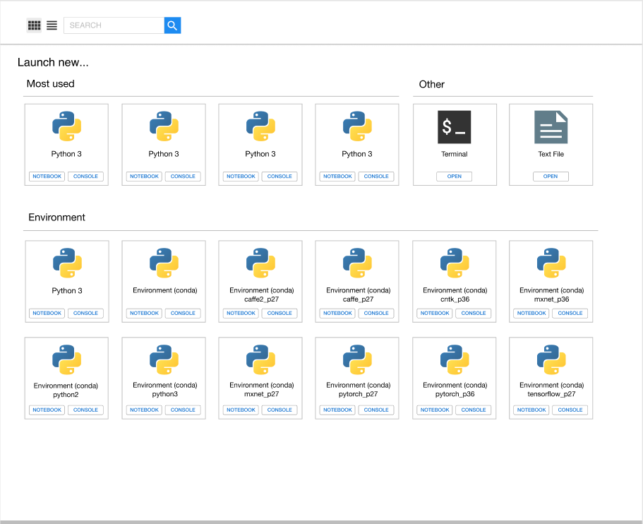
and a matching list view to see more info and more at once.
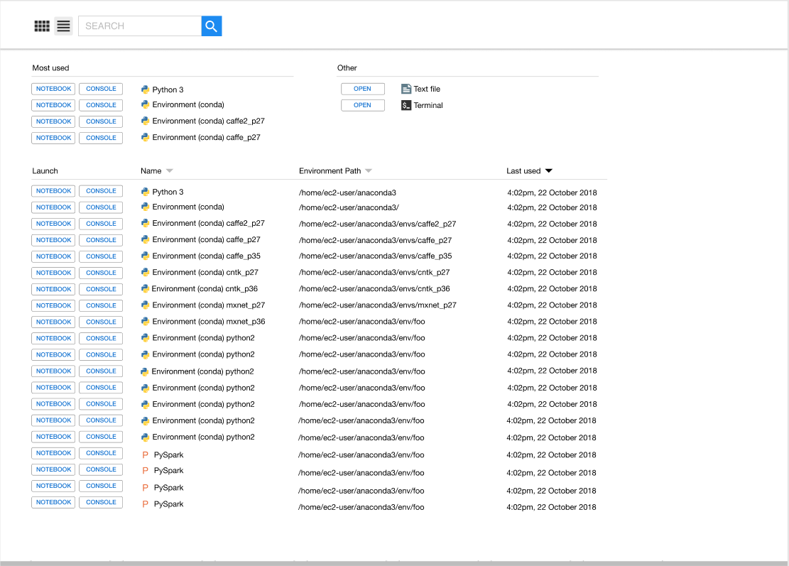
You can see the design process here: https://www.figma.com/file/SBQKZNYlMwqs7I0C9ZPx6Fxr/Launcher?node-id=44%3A110
i-am-am
on 6 Nov 2018
Looks great. Why is the "most used" Python3 three times, though? Are these all the same environment?
amueller
on 6 Nov 2018
Oh, we have some sections that are just filler text right now. In reality there would be different environments there; we just didn't take the time to edit each name. In the same way, we don't imagine anyone having 4 versions of PySpark :)
i-am-am
on 6 Nov 2018
@i-am-am that seems pretty realistic though ;)
amueller
on 6 Nov 2018
It would be lovely to see the icons you'll eventually see in the tabs/file
browser activities in the button labels. Perhaps in the default button
style (blue), with the icons in white... though I'm not sure if it's easy
to remove the icon colors.
By going down to the smaller buttons, Fitt's law does suggest they would be
harder to click: perhaps if the filled the whole bar, trading whitespace
for clickable area.
A third activity for each of these (conda) environments would be opening a
terminal with that environment activated. Unfortunately, there's no way to
register _how_ that would actually happen on the server side, and faking it
on the client side seems a bit awkward.
As for the "Environments" label: it just happens to be that
nb_conda_kernels creates lots of them, so they are most likely to be seen
at present. They could also be remote kernels, or docker kernels, or...
it's hard to anticipate. I don't have a good suggestion, though "Runtime"
is used by Colaboratory and nteract.
On Mon, Nov 5, 2018 at 8:59 PM Andreas Mueller notifications@github.com
wrote:
@i-am-am https://github.com/i-am-am that seems pretty realistic though
;)—
You are receiving this because you commented.Reply to this email directly, view it on GitHub
https://github.com/jupyterlab/jupyterlab/issues/3795#issuecomment-436104583,
or mute the thread
https://github.com/notifications/unsubscribe-auth/AACxREnSy-arg-o7RLdPvs7EdUCEO61gks5usOzogaJpZM4R261G
.
bollwyvl
on 6 Nov 2018
Great work!
A third activity
Thanks Nick. I can imagine other extensions that want to open kernels. For example, you might want to open a text file with an associated kernel (for our cool new autocomplete) with one click. You might want to open a app-building environment connected to a kernel. If there is a way to not limit ourselves to two kernel-based activities, that would be great.
jasongrout
on 6 Nov 2018
Looks nice!
My only concern is what happens if I click the big icon (e.g. for the python3 kernel) and not the notebook/console buttons? Does it launch a notebook? If not, then suddenly there is a lot of screen real-estate that looks like a button but is not clickable. It will also be quite a bit more cumbersome to launch a notebook since the clickable target is much smaller. IMO the biggest attraction of the old layout was its Big Friendly Buttons (BFBs).
 vidartf
on 6 Nov 2018
vidartf
on 6 Nov 2018
Updates on solutions for now and the future:
There is currently a way to rename kernels. That can help in many cases. This Stack Overflow page is one place with good instructions
If many kernels are poorly named, look at what program is auto generating those names and see if there is a way to change from within that program, or talk to developers of that program. JupyterLab itself does not auto generate kernel names.
We've been iterating on your and @ellisonbg's suggestions and we're hoping to have something shippable soon. At the very least, cards with extra room for reasonably long names.
One back end fix we'd like to make is adding a character limit to display names of kernels, with appropriate warnings. If people do find this makes it hard to fit needed information, we can add a metadata attribute (maybe "tags" or "notes"?) for handling that information, and expose it in list view.
i-am-am
on 10 Jan 2019
@i-am-am I tried the SO post, but "kernelspec list" doesn't list the conda kernels, it seems. It only shows 2 of my 5 kernels.
amueller
on 10 Jan 2019
@amueller are you using nb_conda_kernels to dynamically create kernels from conda environments? If so, you can shorten the name by configuring how nb_conda_kernels autogenerates kernel names.
In short, nb_conda_kernels replaces the default kernelspec manager with a custom class (CondaKernelSpecManager) in your config file. This new class is configurable from your jupyter_notebook_config file.
To configure the naming scheme, use the name_format trait. nb_conda_kernel passes two arguments to the string formatter, 0=language and 1=kernel name. If your jupyter_notebook_config is a JSON file, it will look something like this:
 {
   "NotebookApp": {
     "kernel_spec_manager_class": "nb_conda_kernels.CondaKernelSpecManager"
   },
   "CondaKernelSpecManager":{
       "name_format": "{1}"
   }
 }
If it's a python file, it will look something like this:
c.NotebookApp.kernel_spec_manager_class = "nb_conda_kernels.CondaKernelSpecManager"
c.CondaKernelSpecManager.name_format = "{1}"
I hope this helps! 😃
 Zsailer
on 18 Jan 2019
Zsailer
on 18 Jan 2019
@Zsailer thanks, this is great! (though required updating to the latest version of nb_conda_kernel)
amueller
on 18 Jan 2019
In short, nb_conda_kernels replaces the default kernelspec manager with a custom class (
CondaKernelSpecManager) in your config file. This new class is configurable from yourjupyter_notebook_configfile.
@Zsailer wow nice !!!
Found that file in .conda/envs/jupyter/etc/jupyter/jupyter_notebook_config.json I replaced by {1} (conda) and it works like a charm !
Any way to not use that file and make an "override" config ? If yes, woooow !
PS: if we could change the icon, that will be absolutely fine !
 metal3d
on 3 Feb 2019
metal3d
on 3 Feb 2019
Of course we can copy the file anywhere and use it with --config option, I just wonder if an override system exists
metal3d
on 3 Feb 2019
@metal3d You should be able to override directly from the command line by running:
jupyter lab --CondaKernelSpecManager.name_format="'{1}'"
Is that what you're looking for?
Zsailer
on 14 Feb 2019
This will be closed by https://github.com/jupyterlab/jupyterlab/pull/5953
 saulshanabrook
on 22 May 2019
saulshanabrook
on 22 May 2019
I did a deeper API review on #5953 and am recommending we don't merge that for 1.0. Instead I am going to work on a much simpler UX fix to render long kernel names better. Will work on that tonight and get it into 1.0.
ellisonbg
on 10 Jun 2019
@ellisonbg Did you need or want any input on the simple fix for the launcher?
tgeorgeux
on 10 Jun 2019
The changes I am making are pretty simple (just wrapping text to 2 lines). I will have a PR open soon and would love it if you can have a look though.
ellisonbg
on 10 Jun 2019
Opened #6529 to address the launcher issues for 1.0. Once that is merged, let's retarget this issue to Future.
ellisonbg
on 11 Jun 2019
For those still interested, I published an extension for JLab 2.2.x enhancing the launcher: https://github.com/fcollonval/jlab-enhanced-launcher
 fcollonval
on 21 Nov 2020
fcollonval
on 21 Nov 2020
Related issues
blink1073
·
147Comments
ellisonbg
·
64Comments
 selimrbd
·
79Comments
selimrbd
·
79Comments
 nickeubank
·
160Comments
nickeubank
·
160Comments
 stephenholtz
·
48Comments
stephenholtz
·
48Comments
Most helpful comment
With influence from @dhirschfeld and @mangecoeur and Anaconda Navigator, here's the direction @takashimokobe and I been heading:
A bigger card view with a different hierarchy,

and a matching list view to see more info and more at once.

You can see the design process here: https://www.figma.com/file/SBQKZNYlMwqs7I0C9ZPx6Fxr/Launcher?node-id=44%3A110