Jellyfin-web: Search results are hard to discern
Hi
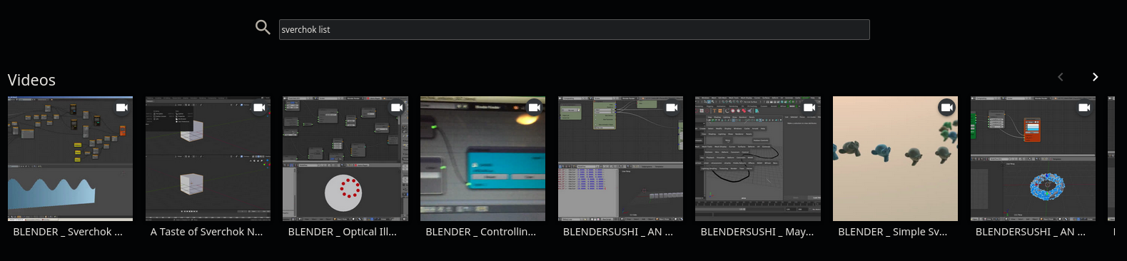
The resulting listing of the search results are really hard to understand because the listings have truncated video names, and there are no other helpers to figure out what the user is looking at.
Please see the image below. As you see all I can see is that they are "Blender related" but the rest is not much clear. There should be a way to increase the text length and the way the search results are displayed, maybe a list based search listing is better.
 gerroon
All 10 comments
This is a web UI issue, so I moved it.
 JustAMan
on 26 Feb 2020
JustAMan
on 26 Feb 2020
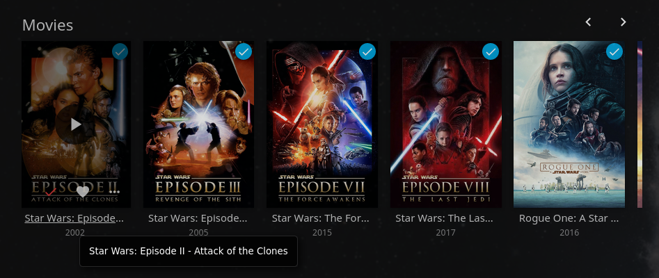
In the latest repo version, if you hover the names with your cursor it displays the entire name. Is it sufficient?
 ThibaultNocchi
on 27 Feb 2020
ThibaultNocchi
on 27 Feb 2020
@ThibaultNocchi
Well, this solution assumes one has a mouse to hover around. Try this on a mobile or some kind of smart tv.
gerroon
on 27 Feb 2020
For mobile, we could use a tap and hold on the truncated elements to show the full text (It's the recommended Material Design solution, which we sort of try to adhere to where it makes sense for us).
For TV, a solution could be to have scrolling text if the text is too big to fit.
This would likely require quite a bit of work on the affected elements, though.
 MrTimscampi
on 28 Feb 2020
MrTimscampi
on 28 Feb 2020
Wy not make the listing vertical and show the text properly?
gerroon
on 28 Feb 2020
Maybe a listing as when you open the search bar without typing anything?
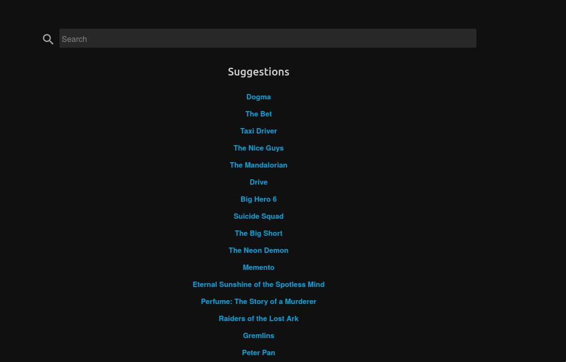
We could maybe add a client setting to choose between listing mode or "poster" mode?
ThibaultNocchi
on 29 Feb 2020
https://github.com/jellyfin/jellyfin/pull/2478
This will fix the search engine. It still needs work on proper sorting for non-movies.
This doesn't really help the UI situation, just wanted to link it :)
 Artiume
on 7 Mar 2020
Artiume
on 7 Mar 2020
@Artiume I think this issue is about showing the results, not about the results themselves :)
JustAMan
on 12 Mar 2020
That's why I put This doesn't really help the UI situation, just wanted to link it :) ;)
Artiume
on 12 Mar 2020
Please redirect feature requests and suggestions to https://features.jellyfin.org/
MrTimscampi
on 30 Jul 2020
Related issues
 hamburglar2160
·
5Comments
hamburglar2160
·
5Comments
 97carmine
·
5Comments
97carmine
·
5Comments
 Anan5a
·
3Comments
Anan5a
·
3Comments
 chnaski
·
3Comments
chnaski
·
3Comments
 tamburra
·
6Comments
tamburra
·
6Comments