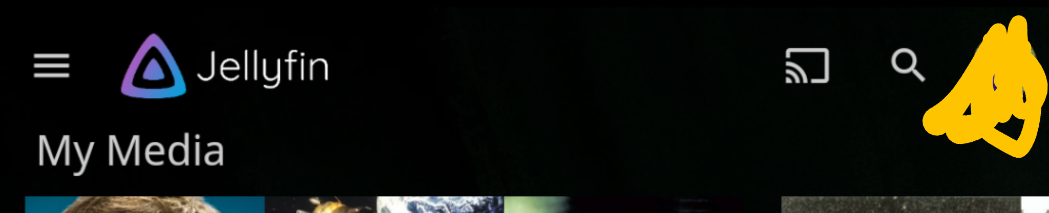
Jellyfin is (in part) about showing off all of your media in one place. When you first open the app having "favorites" there eating that screen space detracts from that. There are a few redundancies and perhaps unnecessary buttons that take up more space than necessary on the home screen, especially on mobile.
edit:
Revised and more concise after discussions here and on matrix:
- On mobile: Show hamburger menu on align-left (#932). Next to that show the Jellyfin logo without the "jellyfin" text in the interest of space. Chromecast button and search button remain.
- All Favorites (just named Favorites) placed in hamburger menu under "Media"
- Add specific "favorites" to the header for TV Shows (currently missing)
- Remove "home" and "favorites" and the header that contain them and reduce librarypage padding (pictured is 3.5em).
 hamburglar2160
All 5 comments
We should keep UI consistent between screens, so I'm against having the tabs moved up on home (Besides, it could get messy on smaller screens).
The headerbar hides itself on mobile anyway, so it's a non issue.
The hamburger menu should be shown though, for sure.
 MrTimscampi
on 11 Mar 2020
MrTimscampi
on 11 Mar 2020
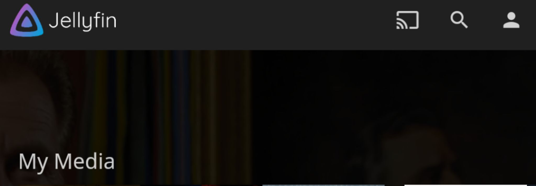
the tabs already move up on non-mobile displays. i'm not advocating moving them up on mobile. i am advocating moving "favorites" up in the form of a "heart" button to free up valuable space.
the headerbar does not hide itself automatically on mobile but DOES on the non-mobile display.
CSS code provided by thornbill will bandage this but still leaves a massive gap.
"
@media all and (max-width: 62.5em) {
.noHomeButtonHeader .headerTabs {
display: none;
}
}
"
hamburglar2160
on 11 Mar 2020
the tabs already move up on non-mobile displays. i'm not advocating moving them up on mobile. i am advocating moving "favorites" up in the form of a "heart" button to free up valuable space.
_This is just quick CSS test._

In this case we need to extract favorite in its own page.
the headerbar does not hide itself automatically on mobile but DOES on the non-mobile display.
it should hide on scroll down
 dmitrylyzo
on 11 Mar 2020
dmitrylyzo
on 11 Mar 2020
_This is just quick CSS test._
This isn't good usability wise, though. It suggests you can favorite this page, since that's what that icon does on every other screen.
MrTimscampi
on 11 Mar 2020
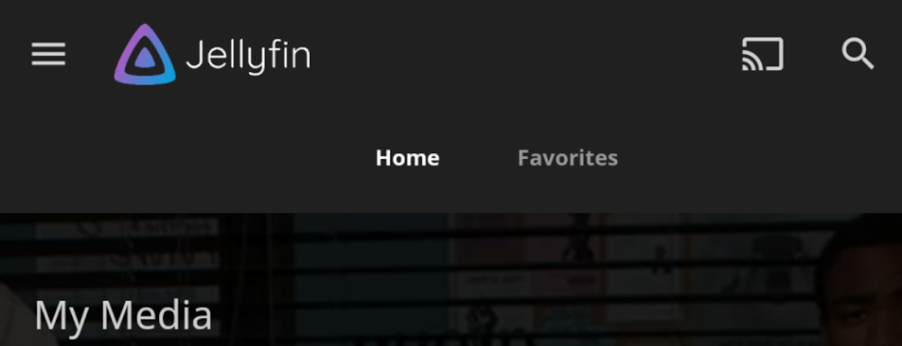
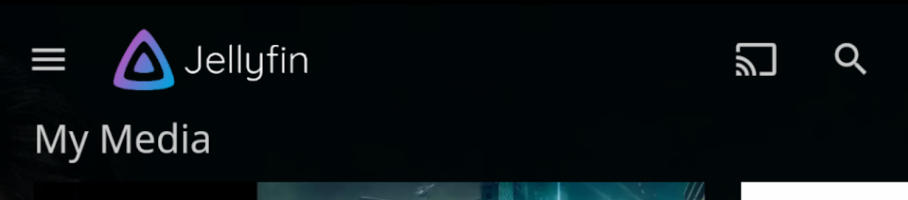
If we move Favorites into the hamburger menu from the home screen, here's the space that will be reallocated to displaying media items (taken from Android 1.0.0:
Before:
After:
hamburglar2160
on 28 Apr 2020
Related issues
 peioe
·
4Comments
peioe
·
4Comments
 mooninite
·
7Comments
mooninite
·
7Comments
 mitchelljfranklin
·
4Comments
mitchelljfranklin
·
4Comments
 nyanloutre
·
7Comments
nyanloutre
·
7Comments
 tamburra
·
6Comments
tamburra
·
6Comments
Most helpful comment
This isn't good usability wise, though. It suggests you can favorite this page, since that's what that icon does on every other screen.