Handbrake: GUI consistency for HandBrake 1.1.0.
Issue to track consistency issues between the graphical interfaces. Marking as enhancement but many of these could be considered bugs.
Let's discuss any concerns and work toward consistent layout, descriptions, and behavior for the benefit of usability (and so documentation isn't a pain).
Issues:
- [x] Ordering and capitalization of Web Optimized, Align A/V Start, iPod 5G Support controls
- [x] Ordering of main tabs (Video, Picture, etc.)
- [x] Add/revise Summary tab
- [x] Source resolution text display (Mac lists anamorphic dimensions, Windows does not, etc.)
- [x] Naming of Selection Behavior and Reload Behavior controls (formerly Configure Defaults)
- postponed
~Naming of Audio, Subtitles, and Chapters column headers~ - postponed
~Preferences descriptions (minor inconsistencies throughout)~ - postponed
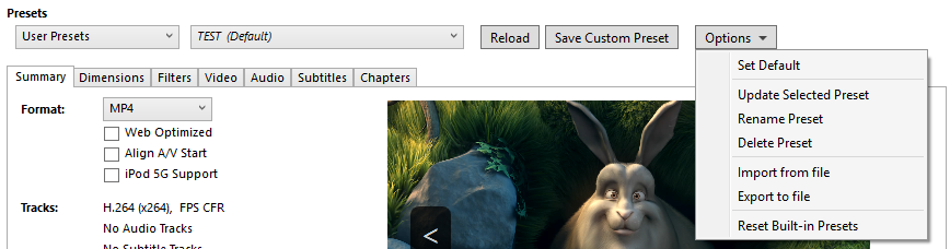
~Tooltips (Mac already revised for 1.0.0, see #280)~ - [x] Final details https://github.com/HandBrake/HandBrake/issues/833#issuecomment-350584426
Feel free to edit this list.
 bradleysepos
All 209 comments
I'd note, I've split Picture / filters onto two tabs on windows as I don't have the real-estate as the UI is smaller. I think the Linux GUI is the same there.
It possibly makes sense. As we get more filters, it's probably going to need a re-design to be list based.
I don't think we can get entirely away from OS Specific features but if we concentrate on the main UI, it should be good enough.
 sr55
on 23 Jul 2017
sr55
on 23 Jul 2017
Indeed, any more filters and Mac HandBrake will explode.
@galad87 Will you have time to consider moving the filters to their own tab for 1.1.0?
bradleysepos
on 23 Jul 2017
I should add, moving filters also makes room for the resolution UI overhaul (update Nov 2019: see #2437). Obviously padding is implemented as a filter under the hood, but it belongs with the future the resolution UI, thus taking up some additional space there.
bradleysepos
on 23 Jul 2017
Fair enough. I wasn't planning on doing much overhaul on the picture settings until we implement the UI overhaul.
Mostly been concentrating on Queue and Post workflows which I'll put up a PR for at some point but that's 1.2 or later
sr55
on 23 Jul 2017
Ordering and capitalization of Web optimized, Align A/V Start, iPod 5G support controls
This layout order seems sane to me. At least on MacGUI, most controls are capitalized throughout, so perhaps we can capitalize the words optimized and support.
bradleysepos
on 26 Jul 2017
First item resolved on Mac/Windows by 712b5e726c60397f354933285368f83fe3a21b4b, a0e28aa2a32e41029e7373ef98d9a24fea8e8ce9, and 710b8c864556a5324683ea8bdf9d7fd4ef9dd7c5. Waiting on John's approval for the Linux changes.
bradleysepos
on 27 Jul 2017
First item resolved on Linux by f3d3844bb and 4386c73d4.
bradleysepos
on 4 Aug 2017
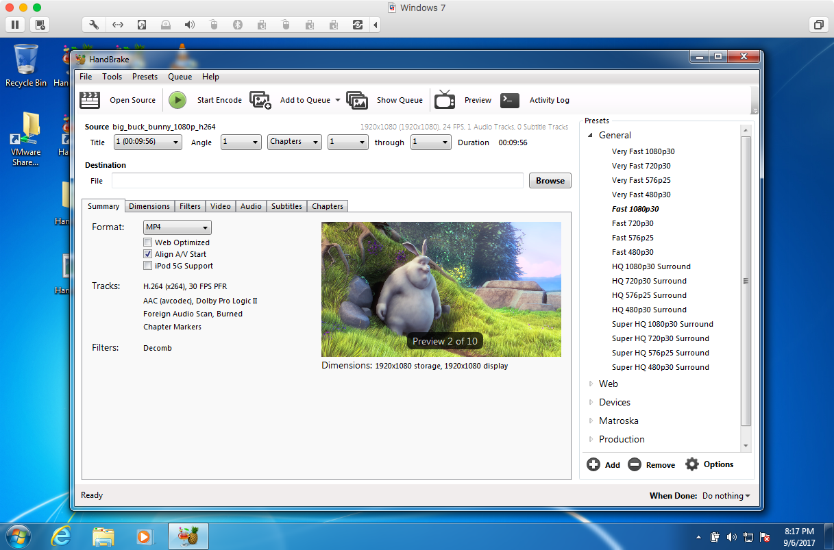
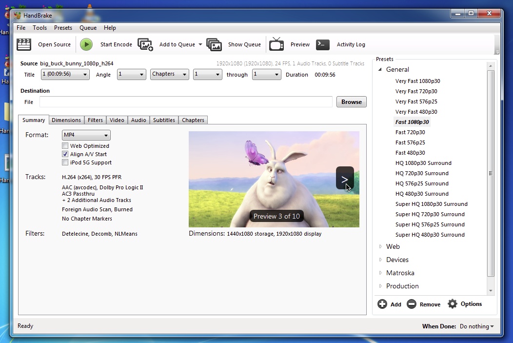
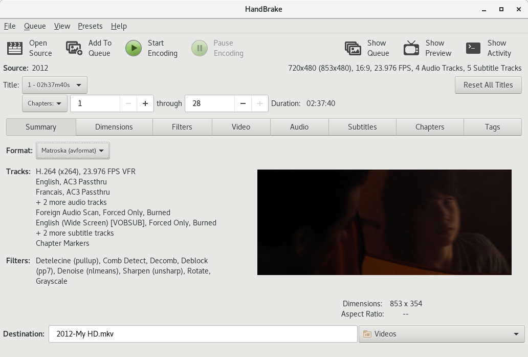
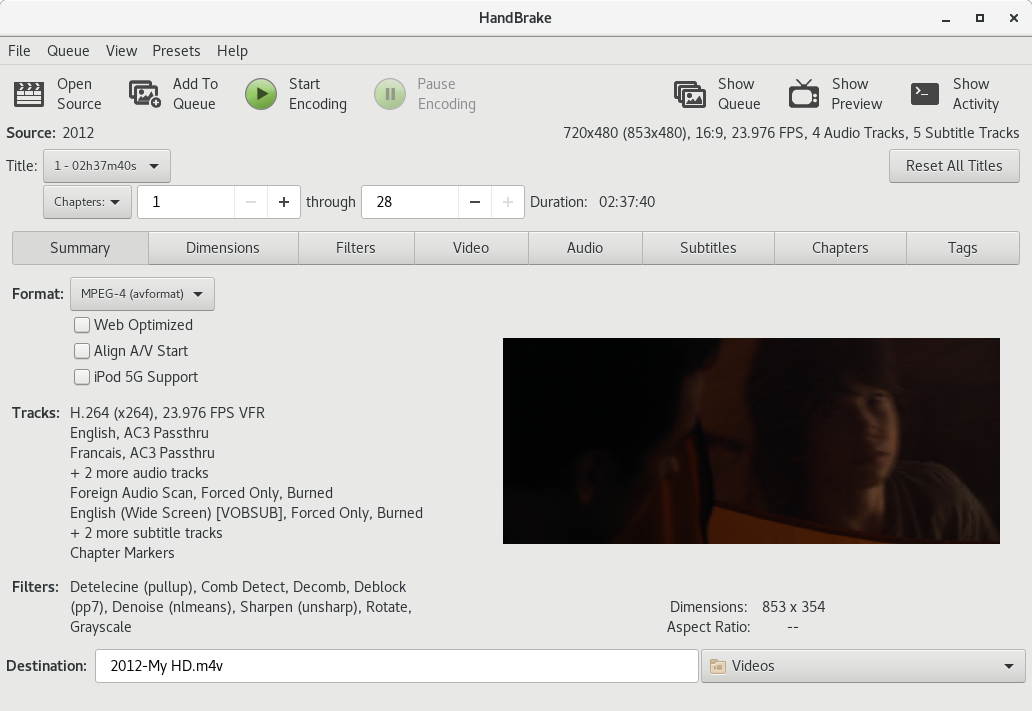
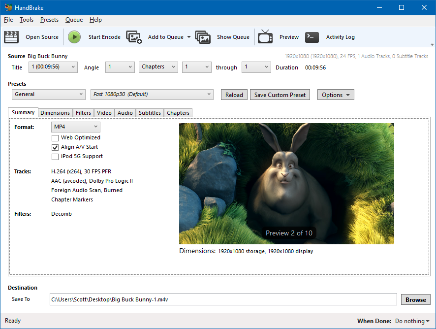
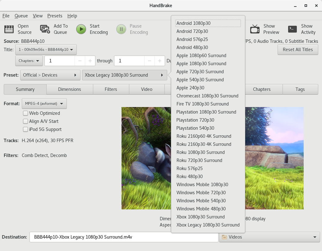
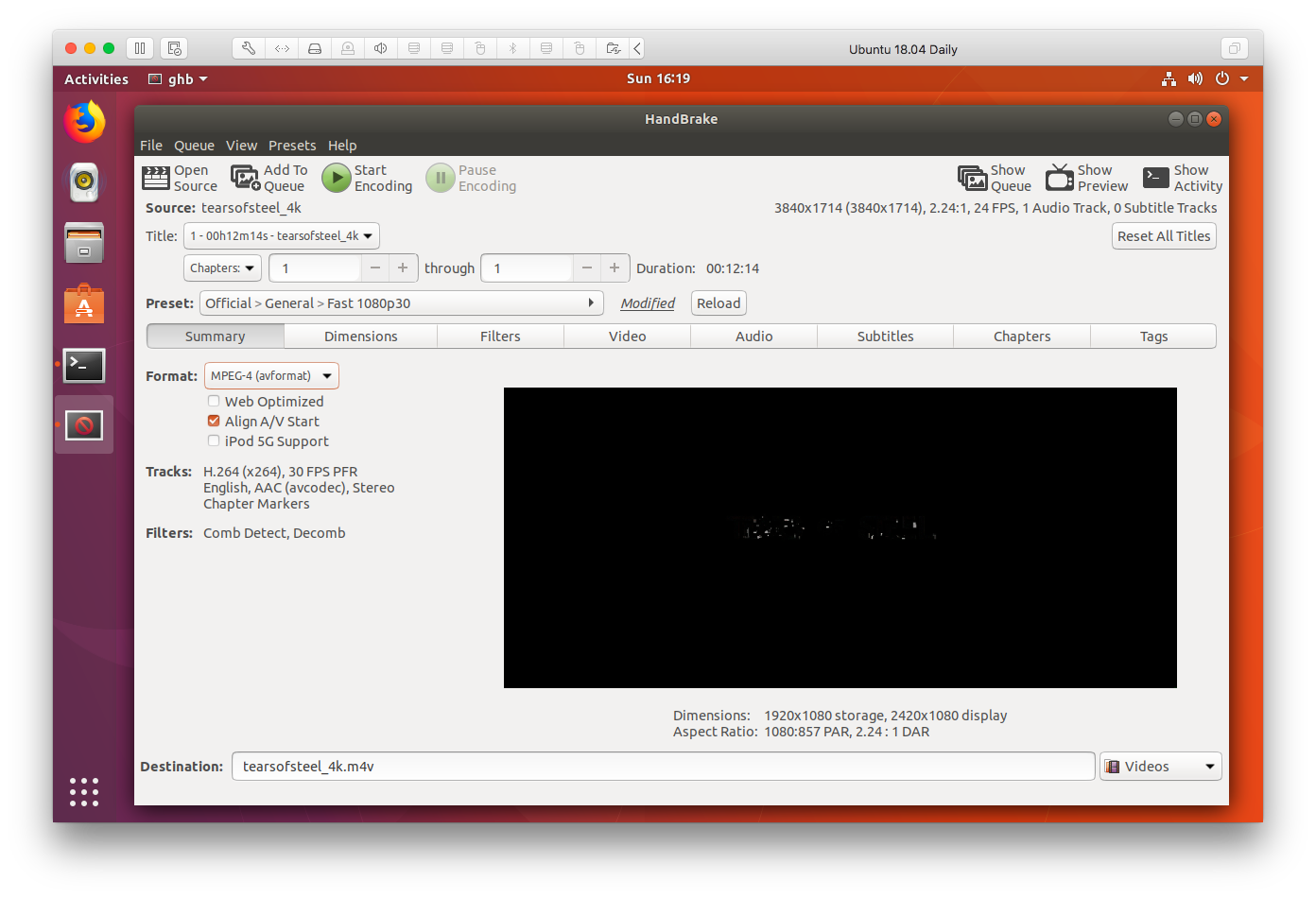
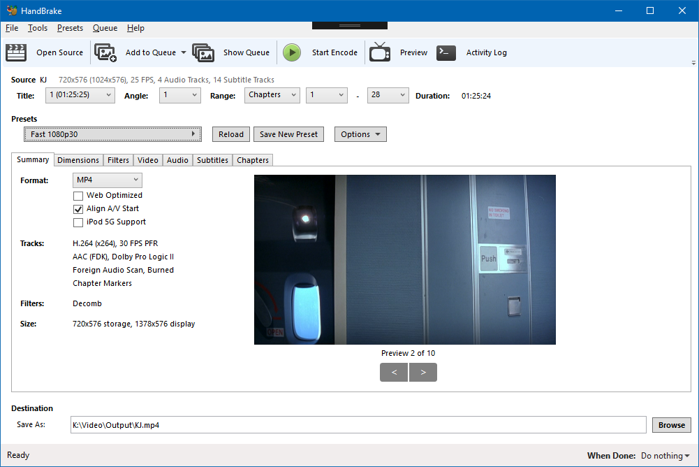
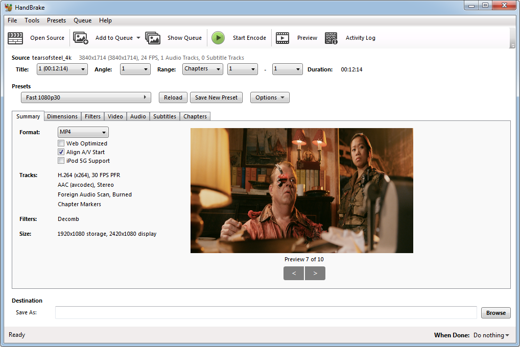
Here are the main tabs for each GUI, aligned on the Video tab.
| Linux | Mac | Windows |
|---------------------|-----------|-----------|
| Summary | | |
| Dimensions | | Picture |
| Filters | | Filters |
| Video | Video | Video |
| | Picture | |
| Audio Selection | Audio | Audio |
| Audio List | | |
| Subtitles Selection | Subtitles | Subtitles |
| Subtitles List | | |
| Chapters | Chapters | Chapters |
| Tags | | |
Here are my proposed changes for better parity.
| Linux | Mac | Windows |
|---------------------|------------------|------------------|
| Summary | | |
| Dimensions | Dimensions | Dimensions |
| Filters | Filters | Filters |
| Video | Video | Video |
| Audio Selection | Audio | Audio |
| Audio List | | |
| Subtitles Selection | Subtitles | Subtitles |
| Subtitles List | | |
| Chapters | Chapters | Chapters |
| Tags | | |
Mac changes:
- Move Picture before Video
- Move Filters to their own tab
- Rename Picture to Dimensions
Windows changes:
- Rename Picture to Dimensions
bradleysepos
on 4 Aug 2017
Another important thing to be considered: it is beneficial to see settings change when one selects a preset. This will not always be the case with the first and default tab being Dimensions (Picture), as opposed to say, the Video tab, especially in the case of an SD source. It's a bit confusing to click a preset and see essentially nothing change in the rest of the GUI.
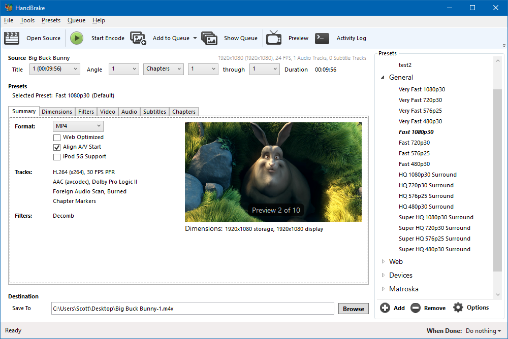
The Summary tab (Linux) is a good start toward what could completely resolve this issue. If I did some work to turn Summary into a true overview of the preset settings (within reason), would we be interested in implementing it across all GUIs for 1.1.0 or 1.2.0?
bradleysepos
on 4 Aug 2017
Regarding summary tab, I'm in favour of your suggestion. I personally like the mini-preview image I have on my summary tab currently since it lets me do an instant sanity check of cropping, but I would not be opposed to dropping it if space is needed for more info.
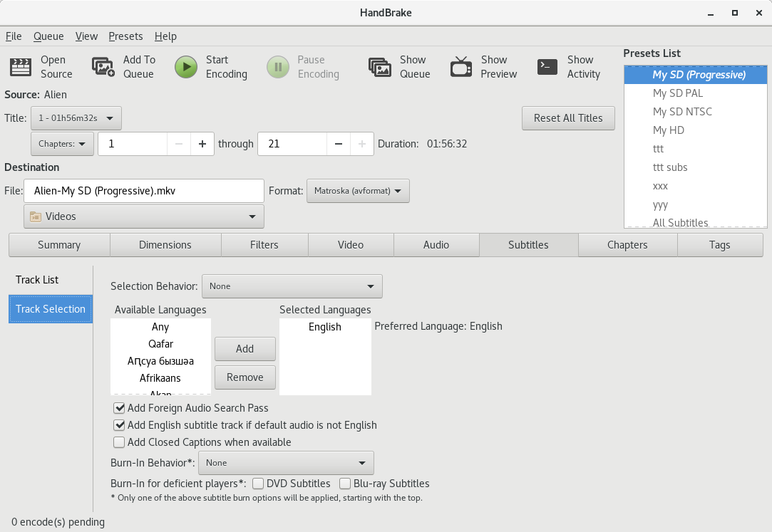
I'm thinking I should also align with the other GUIs with regards to audio and subtitle selection panes. I.e. use "Audio" and "Subtitles" tabs and put a "Selection Behaviour" button/toggle to switch between the list and selection controls. That would reduce the width of my stack widget which has been the source of some window size constraint problems and simplify documentation of GUI differences.
 jstebbins
on 4 Aug 2017
jstebbins
on 4 Aug 2017
Sounds good.
bradleysepos
on 4 Aug 2017
I will split out the Filters to its own tab this weekend.
 galad87
on 8 Aug 2017
galad87
on 8 Aug 2017
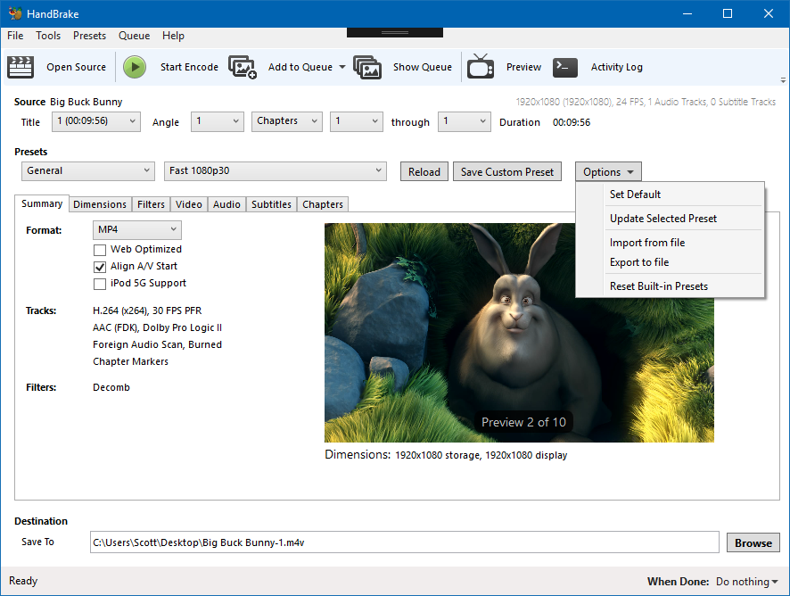
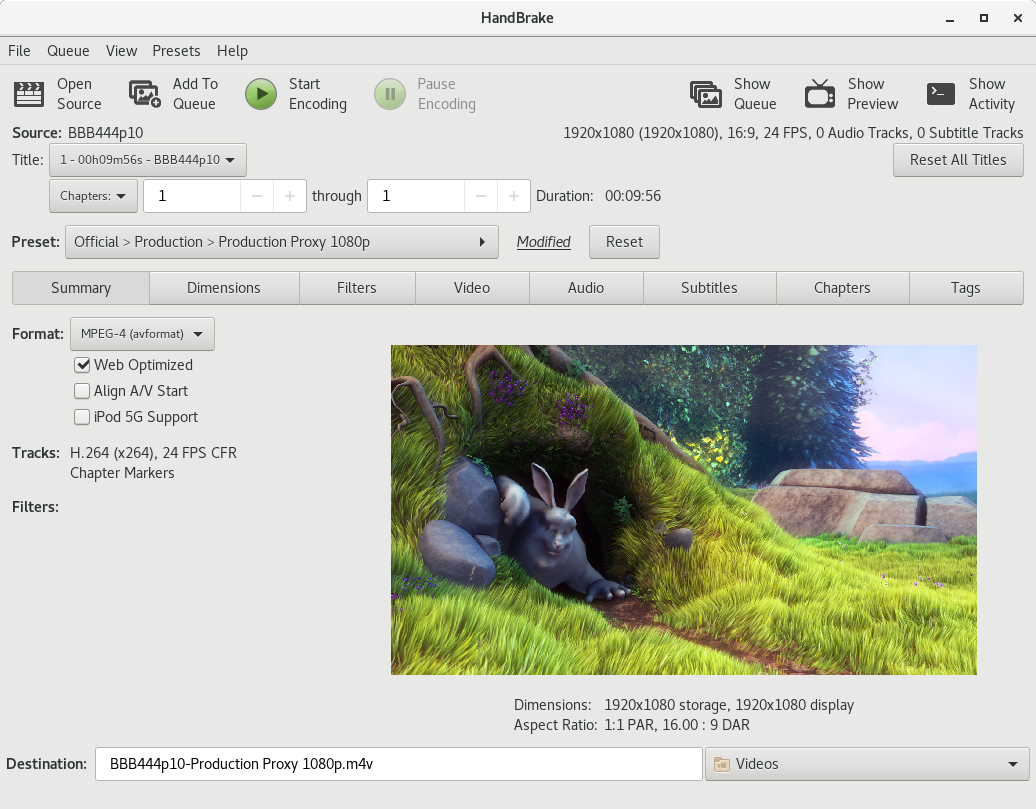
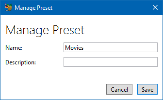
Basic revised UI comp:

This adds the Summary tab to the Mac UI, renames Picture tab to Dimensions, places Filters on their own tab, and uses the aforementioned tab order.
Benefits:
- Reads top to bottom, left to right (like the actual workflow)
- Settings at a glance thanks to Summary tab
- No more Presets drawer (NSDrawer is deprecated and going away)
- More explicit reloading of saved Preset, saving new Preset
bradleysepos
on 10 Aug 2017
Think this is a good start. Here are some thoughts:
Dimensions:
"Original" -> "Source"
Drop Scaling. Don't think it's really that important here.
Ordering: Source, Output (Storage, Display), Croping
Video
I don't have source VFR/CFR into so we'll need to add that to the API.
Does the user care about the encoder? Is H264 (10bit) sufficient?
The preset dropdowns seem awkward but I'm not 100% sure what to do about them. A single categorised dropdown is going to be a bit unpleasent. I also worry that users will think they have a preset selected when infact the moment they make a change, it's no longer on the preset.
"Save As". Maybe "Export To" We've had users in the past confused why the file isn't instantly saved.
Feels awkward being down the bottom. My eyes almost missed it on my first glance because the main content area is quite "busy".
sr55
on 11 Aug 2017
I Wonder if it's also an idea to change the ordering around a bit more.
Most applications I've seen keep source and output into separate. So for example above, the first column would be all the source info and a preview. The 2nd and 3rd columns would be summary of key output settings.
sr55
on 11 Aug 2017
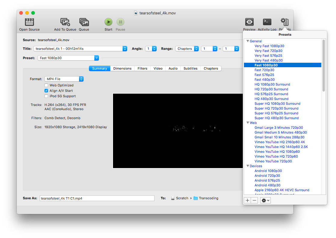
I had some time to flesh out my other idea for the Summary tab, incorporating observations and suggestions here and on IRC. This is somewhat where I originally started, based on LinGUI. The info provides a snapshot of the output settings while still being concise.
Here's another with simplified preview controls:

And no preview controls at all:

Some notes:
There's a bit of extra horizontal white space in this layout; could probably squeeze everything horizontally by 20 pixels or so.
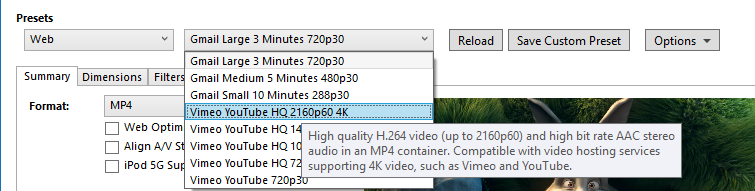
Presets are now two tier: Official/Custom, and Preset name. This assumes it's possible to have categories as non-selectable items in the name field, e.g.:
  Fast 1080p30
✓ HQ 1080p30 Surround
Web
  Gmail Large 3 Minutes 720p30
...
I apparently forgot to re-position Format in the last comp (oops), so it makes a return here. Despite the fact that the container format is perceived as top level for the output data, encapsulating all else, from a UI perspective the format is still part of the preset. Moving it to the Summary tab reflects this a bit better and avoids competing with the Preset controls in the visual hierarchy.
Last but not least, some wording tweaks as suggested to better fit the paradigms we've already set forth, e.g. Destination and Custom Preset are common terms we use in conversation and documentation, so use them in the UI.
Comments welcome as always.
bradleysepos
on 12 Aug 2017
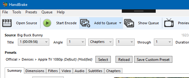
Initial tab outline for the WinGui starting to come together.
Some More Thoughts:
Audio Track Format:
( )
Up to 3 tracks maybe? before it starts counting.
Maybe the same with subtitles.Filters can just word-wrap.
Is it maybe worth putting a border around the preview image?
sr55
on 13 Aug 2017
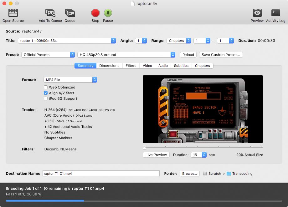
I think showing some more info about the video dimensions would be helpful. I like to see the actual cropped amount, output dimensions, and output DAR. These things are very useful in determining if cropping was done correctly. I don't think "20% Actual Size" contributes much useful information.
jstebbins
on 14 Aug 2017
Sharp minds think alike. I was working on this earlier. More to come (nothing drastic).

bradleysepos
on 14 Aug 2017
Would be useful to have a libhb function that converts display aspects with some fuzz to standard aspects. I notice LinGUI sometimes lists 15.99999:1.
Probably 0.5% or 1% variance would be good. For video, the interesting ones are probably 1:1, 4:3, 16:9, 2.35:1, 2.4:1 and the same in tallscreen.
bradleysepos
on 14 Aug 2017
@sr55 Thoughts on some of your questions:
Up to 3 tracks maybe? before it starts counting.
I'm generally interested in whether I have Stereo+Surround or just Stereo, and Subs/No Subs. Where is everyone else with this?
Filters can just word-wrap.
Yep. Otherwise it gets tricky, especially if we add more.
Is it maybe worth putting a border around the preview image?
My main concern is someone will think it's part of the output.
bradleysepos
on 14 Aug 2017
My primary use case is 1 or 2 audio tracks output, depending on the primary source audio language and 0 or 1 subtitles.
I.e. if the primary source audio language is not English, and there is a secondary English audio track, my preset should output the primary non-English track first plus the secondary English audio track and an English subtitle track. If the primary source audio language is English, my preset should output only the English audio track and enable foreign audio search for subtitles. I always use auto-passthru for all output audio tracks with ac-3 fallback.
So seeing 2 output audio tracks and 1 subtitle track is plenty for my needs. But someone who does something similar to me, but also wants AAC may need to see 4 audio tracks.
jstebbins
on 14 Aug 2017
One way to work in more source info without getting too cluttered.
bradleysepos
on 14 Aug 2017
hmm, I'm not sure Iike that source info like that.
The preview bit looks better though.
IMO, there is space for Source / output below the preview.
You probably don't care about source audio/video tracks very much.
sr55
on 14 Aug 2017
This was what I had first, but then went with "Tracks" to mirror the Summary tab. Either would work fine.

bradleysepos
on 14 Aug 2017
Some more concept art
sr55
on 14 Aug 2017
Per IRC I do like the idea of controls on mouse over to flip between the preview images. It's more elegant than a slider. Of course, with 60 preview images the slider would be faster, but that's what we have the main preview window for.
Initially I liked the Source info under the preview image, but I think I've changed my mind after sleeping on it. The Summary tab is all about output, and I think it should stay that way. Here's another example that may work better:

Yet another case where I rejected my first idea (info above title controls) and it turns out to work better than what I published. Seems like a curse at this point.
bradleysepos
on 15 Aug 2017
Yeh, that's less annoying to look at and the fact it's grey'd out reduces it's important.
sr55
on 15 Aug 2017
I would like to see a certain amount of source info. Remember how I said telecine is one of the things that has tripped me up and caused a re-encode? One thing I look for is whether the source framerate is 29.97 when I know it should be 23.976. When I see this, I know I need to add the detelecine filter.
jstebbins
on 16 Aug 2017
The source frame rate is present in my last... is there something else you would like to see?
bradleysepos
on 16 Aug 2017
The source frame rate is present in my last...
"Last"? I don't see it. Am I missing something, or does "last" mean something you haven't posted yet ;)
jstebbins
on 16 Aug 2017
Image in comment https://github.com/HandBrake/HandBrake/issues/833#issuecomment-322450242
bradleysepos
on 16 Aug 2017
Oh, nevermind. It's not in the summary pane. It's in the "source" area where it belongs. Cool, thanks.
jstebbins
on 16 Aug 2017
No problem. 😸
bradleysepos
on 16 Aug 2017
They are incorporated as you mention, in the nightly build. Compile from source or use the git-snapshots PPA.
Thanks for the kind words.
bradleysepos
on 18 Aug 2017
As a Handbrake and Debian user for a long time I like the layout in https://github.com/HandBrake/HandBrake/issues/833#issuecomment-322450242 .
The only thing I am missing are the Audio/Subtitle Defaults and Audio/Subtitle List tabs.
I take it they will be incorporated under the Audio/Subtitle tabs?
For the rest keep up the good work ppl.
 DeeDeeRanged
on 18 Aug 2017
DeeDeeRanged
on 18 Aug 2017
See my response above. Thanks. ;)
bradleysepos
on 18 Aug 2017
@bradleysepos
Crikey that was a fast reply. I was still editing the comment. :)
DeeDeeRanged
on 18 Aug 2017
Linux Subtitle tab now looks like this:
Track List
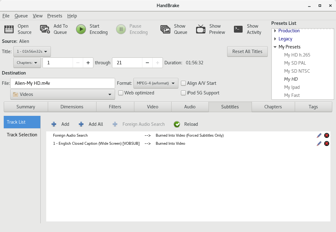
Track Selection Options
jstebbins
on 18 Aug 2017
Initial work done for Windows. I still have some tidy-up to do and also implement preview back/fwd. Will do that tomorrow. But it's mostly functional now.
sr55
on 23 Aug 2017
@sr55 when you have something you are mostly happy with, can you please post a snapshot? Then I'll work on syncing up.
jstebbins
on 7 Sep 2017
@jstebbins Here you go.
Nits: Section names should be bold, Aspect Ratio missing under preview image.
Oh, and of course Destination should move below the settings eventually.
bradleysepos
on 7 Sep 2017
What do you think about making the panels vertical instead of horizontal? Something like this
galad87
on 7 Sep 2017
It's an interesting concept, but I don't care for it. Feels more cluttered and messes with the top-to-bottom, left-to-right flow. The new resolution/dimensions UI proposed awhile back wouldn't work at all, would turn into a scrolling wall of text and controls with not much visual hierarchy.
bradleysepos
on 7 Sep 2017
The audio tab in particular really needs the horizontal spacing.
While I like the tab design from an aesthetics point of view. It's not very descriptive for non savy users.
sr55
on 7 Sep 2017
Presets Design above couple of thoughts: (Bradleys design)
- Sharing presets is less convenient as import/export is hidden in a menu users might not look at.
- Delete is trickier to, since there is no obvious way to delete.
Also, I'm going to try switching the Audio/Subtitle defaults (which are popup windows to side tabs like the linux gui.) see how that looks.
sr55
on 7 Sep 2017
Perhaps next to the Save Custom Preset button we can have a "More" dropdown with Import, Export, and Delete.
bradleysepos
on 7 Sep 2017
Work in progress ...
Audio Tabs (Side Tabs)
New Preset Block
Destination moved to the bottom
sr55
on 7 Sep 2017
I'm not 100% sure about the in-line audio behaviours. It's more "discover able" now I think, but the UI looks busy
sr55
on 7 Sep 2017
Some minor improvements:
Still a bit busy looking :(
sr55
on 7 Sep 2017
Tabs in tabs. Hmm. Yeah it's pretty dense.
Maybe change Summary to Tracks so there's no confusion there.
bradleysepos
on 7 Sep 2017
I thought I'd try it since John did.
It really doesn't feel right.
By Constract: Subtitles feels lighter
sr55
on 7 Sep 2017
I'll sleep on it and continue atleast with the presets / destination.
Which in itself doesn't feel 100% yet either :/
sr55
on 7 Sep 2017
Yes that feels much lighter.
bradleysepos
on 7 Sep 2017
Hmm, I've had a "Show Queue In-line" preference for a while. (off by default so it's a popup like the macgui by default)
I just turned it on to verify I didn't regress it:
That actually works quite well. I still prefer my new design overall for queue management. But for users that prefer a summary view in-line, that works.
sr55
on 8 Sep 2017
Also just a note on the non-bold text on the summary tab. It was just something I was trying out. If you note my new queue design, I deliberately got rid of the old school toolbar in place of a typography design.
Using the "Light" version of Segeo UI for headers. It looks nice but it doesn't work well for smaller headers so I'll convert to bold for now.
sr55
on 8 Sep 2017
OK, Committed: e17f33293848a5f3a783f09377adc94ffedb0f44
We can give this a shot and adapt to feedback.
sr55
on 8 Sep 2017
How are you showing that the user has modified settings and is no longer using the selected preset in this new paradigm? We used to just de-select the preset in the list. I think now we need a special "Custom" option in the preset dropdown to indicate that they have modified the preset.
I'm still not a big fan of the dual dropdown for presets. But since I don't have any better ideas to offer yet, meh.
jstebbins
on 9 Sep 2017
Can place a Modified indicator on or next to the selected preset.
bradleysepos
on 9 Sep 2017
The WinGUI never tracked settings changes before. So it was always a bit confusing.
sr55
on 9 Sep 2017
p.s I do agree on the preset dropdowns. The sheer volume of presets poses a challenge for good UX though.
sr55
on 9 Sep 2017
I mentioned further up having the first dropdown read:
Official Presets
Custom Presets
And the second dropdown read:
  Very Fast 1080p30
✓ Fast 1080p30
  HQ 1080p30 Surround
  SuperHQ 1080p30 Surround
Web
  Gmail Large 3 Minutes 720p30
...
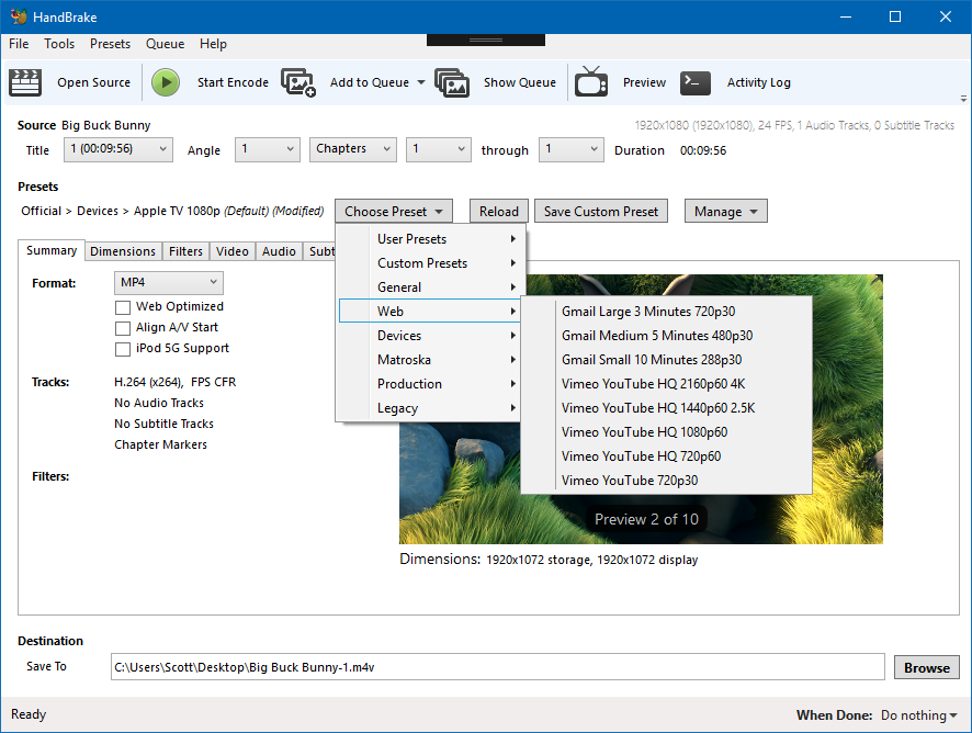
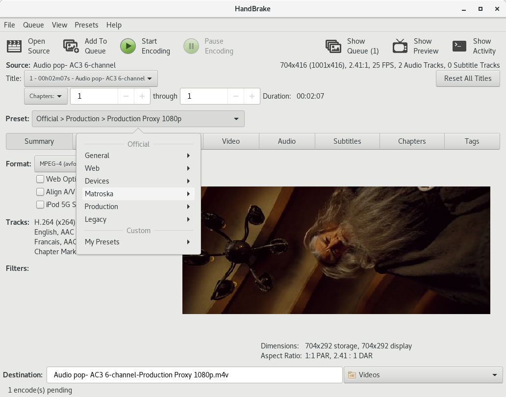
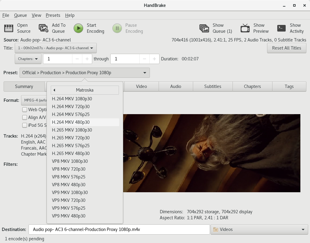
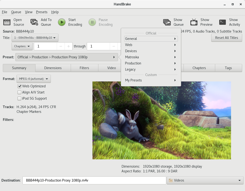
@sr55 I think you have the preset category in the first dropdown instead. We could try that too, and have:
Official Presets
✓ General
  Web
  Devices
  Matroska
  Legacy
Custom Presets
  General
  Foobar
  Bazinga
  Very Fast 1080p30
✓ Fast 1080p30
  HQ 1080p30 Surround
  SuperHQ 1080p30 Surround
  Et cetera
This actually may be better, as the second dropdown will have far fewer items, making both dropdowns more balanced.
One thing I would like to see is Official/Custom shown, so selecting Official Presets > General would actually display Official Presets — General. This way, we can allow the user to sort their custom presets into categories with similar naming; the idea being we create Custom Presets > General for them and place any existing presets there on upgrade. Likewise, when saving a custom preset, we provide a single dropdown to select a category under Custom Presets, or create a new one.
It's late, so if I'm not making much sense, I can clarify another time.
bradleysepos
on 10 Sep 2017
IMHO this is making it more difficult for no clear advantages. There is no way to easily organise presets with the two dropdown buttons. Or collapse a folder you don't one, or reorder them, or rename one. And it takes more clicks to select one.
galad87
on 10 Sep 2017
The WinGui always had a popup for renaming via right click.
That said, your right. Management of presets is a lot more clunky. If you don't want Built-in presets now, it's very time consuming to remove/hide them.
It does work a bit better for finding presets though imo. (Maybe not if you only have a small amount but if you have a larger set it does work better)
I'm not sure what to do here. It's quite a bit of effort making a full preset management window.
sr55
on 10 Sep 2017
Default Preset:
and I guess you could have "(modified)" as well.
Options:
Don't have a clue what to do about ordering.
@galad87 are you thinking maybe we should keep the preset pane but without NSDrawer?
BTW. I'm totally OK with going through numerous iterations of the design, or going back. I'm only pushing this code to allow folks to run it and get a feel for i.
sr55
on 10 Sep 2017
Thanks everyone for the feedback. Some thoughts...
In practice, the proposed controls do a few things:
- Place the feature logically in the vertical flow
- Establish a sane convention for categorization (instead of anything goes and infinite depth)
- Eliminate deprecated controls (NSDrawer)
While it is correct that this also creates more clicks, that can be said for virtually anything that isn't a simple list. Many websites have sitemaps, but most people use and prefer structured navigation except in extreme cases.
Anyway, not to argue, but I do think the proposed controls achieve the goals I wanted to achieve. I'm certainly open to other ideas.
If you don't want Built-in presets now, it's very time consuming to remove/hide them.
I believe somewhere in this or another thread I mentioned having an option in preferences, "Show Official Presets", checked by default. This may be less necessary in the new layout, though.
Related, we're doing a pretty good job calling them Official these days; should continue transitioning naming of User Presets to Custom Presets everywhere possible.
It's quite a bit of effort making a full preset management window.
This seems unnecessary to me. Copying/moving a preset should be as easy as loading one and saving a new custom preset, deleting the original if desired. Delete Category and Rename Category may be useful options.
I do think we should require presets to have a category, so existing/new custom presets will be at Custom Presets > General (the user can create categories other than General).
bradleysepos
on 10 Sep 2017
Another thing I forgot to do. Descriptions:
I've just added a tooltip to the dropdown menu items.
sr55
on 10 Sep 2017
Preset descriptions will be a problem for me with this design. GTK doesn't have any way to add tooltips to individual combobox entries. I could change the tooltip for the combobox after a preset is chosen, but that's a bit clunky since the user can't see the description until after they have selected it.
Let me run this idea by you. What if we had a single preset selection button "Select Preset" where you've put the combo boxes and pressing it pops up a window that basically contains the current preset selection list. Behaviour of the list would be pretty much the same as it is now allowing reordering and all that we currently do with the list. But we constrain the number of levels in the list and force the choice of a category when creating custom presets, so the hierarchy is always Official/Custom > Category > Preset. The hierarchy would be enforced by adding a category selection combobox to the save preset dialog that forces selection of a category.
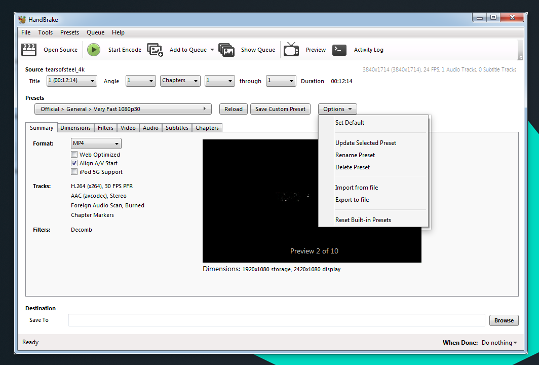
Next to the "Select Preset" button would be a label showing the current preset, e.g. "Custom > General > Blah". In that label we can also indicate if they have modified settings after selecting the preset. I'm a bit unclear what the "Reload" button does in your design. Does it reset all settings to the currently selected preset? If so, I think we still would need this button in my suggestion here since resetting would require pulling up the preset list popup again. I think the "Save Custom Preset" and "Options" buttons are unnecessary since those things can be found under the "Presets" menu at the top of the main window.
jstebbins
on 11 Sep 2017
Yes, Reload reloads the preset. (I need to implement modification detection to add "(modified)" to it so it's clear when it's necessary.
So, to mock your idea out and extending it a little bit:
Fast preset switching is a bit of a pain in that model, but you could improve that by adding a context menu to the area as follows. (It's not very discover-able though)
I guess "Select" as a dropdown button with a categorised menu, and a "Manage" button to bing up the popup with the old style list might work to?
And a quick management window mock up:
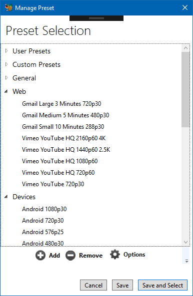
- Drag/Drop re-order
- 1 Level deep categories. (and maybe official / custom although I'm not a total fan of going 2 deep myself)
- Some kind of actions panel at the bottom as before.
- options to cancel, save and select, and select only. (or maybe just Select and Cancel.
sr55
on 11 Sep 2017
Description could be placed below the controls or on the summary tab instead of tooltip.
bradleysepos
on 11 Sep 2017
Improved second screenshot concept:
sr55
on 11 Sep 2017
With the menu, I would still have the same problem with preset description tooltips in GTK. Menu items can't have tooltips either. But I'm OK with that since they are still available in the "quick management" dialog and can be shown for the currently selected preset.
Users that like to use many different presets in one HandBrake session can just leave the quick management dialog open. Users that stick to one preset never have to see the dialog. All the current functionality of the current preset list is available in the "quick management" dialog.
The advantage of your menu idea is that you don't have to look at or scroll through the entire preset list to choose a preset. But it does mean navigating a menu system with 3 levels if we want to go to the 3 level hierarchy Official/Custom > Category > Preset. That might be a bit awkward.
jstebbins
on 11 Sep 2017
Does GTK Support Groups within menus? Or headers of any kind?
sr55
on 11 Sep 2017
i.e Something like https://stackoverflow.com/questions/19393297/drop-down-combo-box-with-multiple-headers but in context menu form.
And is it supported in combo boxes?
sr55
on 11 Sep 2017
I can do that for menus, but I can't find a way to do that for comb boxes.
jstebbins
on 11 Sep 2017
FYI, here's an example of the reworked Summary tab in the LinGui. Still some details to finish, but just wanted to share and get feedback.
jstebbins
on 12 Sep 2017
And with MP4 widgets showing...
jstebbins
on 12 Sep 2017
:smile_cat:
bradleysepos
on 12 Sep 2017
Hi, my thoughts on the new preset management if I may.
Initial reaction after living with it for a few days and reading through this thread is I don't see a reason or need to remove it. A drop down would complement it nicely but it falls well short as a replacement IMO.
I think the drop down could be a good addition but not a replacement for the preset pane. Sub menus I don't like, it's better to have the category and presets in seperate dropdowns to speed up preset switching within the same category. Although if the preset pane is kept then a single dropdown may be better.
Ideally we have both the preset pane and the drop downs, they don't take up much extra space and give the user another way to select presets which I don't think is a bad thing.
The preset pane should remain part of the main window and be collapsable. Vidcoder has a preset pane/settings window seperate from the main window and it's a pain to manage while also taking up valuble screen space. Have it part of the main window and the width of the window increases/decreases when opening/closing the pane.
A seperate preset pane is preferable to no preset pane at all.
It should be possible to hide built in presets, they are useful to have there but personally day to day I don't use them because I tweak each preset for the job, plus all of my source material/encodes are 25/50fps so even if I use one as a base I still have to tweak it and save it to a custom one.
User defined custom preset categorys Would make management, navigation and usability a breeze. Drag and drop presets/preset categorys also useful.
In summary IMO a GUI is to present everything in an easy to access and use manner, removing the preset pane and burying them in a drop down menu is a big step away from that. A drop down to complement the preset pane on the other hand adds usability and doesn't take anything away.
Appologies that ended up being a bit long but hopefully helpful.
 Daz2017
on 13 Sep 2017
Daz2017
on 13 Sep 2017
FYI, example of what a multi level preset menu looks like on gtk
jstebbins
on 16 Sep 2017
If anyone wants to see this in action, I pushed it to the "presets-menu" branch on my github fork.
https://github.com/jstebbins/HandBrake/tree/presets-menu
jstebbins
on 16 Sep 2017
Updated Pics
"Modified" indicator and "Reset" button. Reset button is only sensitive when preset has been modified.
Open menus to right of presets menu button.
jstebbins
on 18 Sep 2017
Reset and Reload mean similar but slightly different things in this context. We certainly mean Reload.
That multi-level menu isn't horrible. That said, I still worry it might not work well for beginners. I'll play with it later this week if I have time.
bradleysepos
on 18 Sep 2017
So currently, I've made the preset list a separate window that can be left open along side the main window. The advantage of this is that it keeps the minimum possible main window size down to something that is usable on a 1024x768 display even when the presets list is visible.
I'm debating whether it would be a good idea to keep the list as part of the main window, but disabled by default. When disabled, the main window still fits a 1024x768 screen, but when enabled the minimum width is going to balloon out to the 1280 range. So main window plus presets list would be pretty much unusable on a 1024x768 display.
Any opinions?
If I move the list back into the main window, I'm thinking a better place for it would be on the left next to the tabbed panes. So source and preset menu would be above presets list and tabbed panes. I think this maintains the flow that @bradleysepos was shooting for better.
Thoughts on this?
jstebbins
on 18 Sep 2017
I'm not a huge fan of a preference materially changing the main window layout. Having an external window is fine, as long as changing presets there is reflected by the control in the main window flow.
bradleysepos
on 18 Sep 2017
Reset and Reload mean similar but slightly different things in this context. We certainly mean Reload.
Can you elaborate what you think the difference is? I chose reset because when I was trying to think of good tooltip text, what I came up with was:
Reset the current title to default Preset values
Can you suggest an alternate tooltip that incorporates "reload" and is as clear or clearer about what it is doing?
jstebbins
on 18 Sep 2017
I'm not a huge fan of a preference materially changing the main window layout
So you've never liked the preset list implementation 😉
jstebbins
on 18 Sep 2017
I was never a fan of the old design either but it has it's advantages over the menu system (which actually looks not too bad on linux)
- It takes up a lot of space. I just fit into 1024x768. Account for window borders and start menu. I'd prefer to have a bit more space for the audio/subtitle tabs with struggle.
- It's not as convienent now that we have soo many presets. Scrolling to find somethings a bit clumsy unless you clean out anything you don't use.
That said, I'm willing to bet a lot of users are going to struggle with this change.
I was experimenting last night with switchable. So Default:
Then
and
So, keep the old toggle behaviour but still have a textual display showing default/modified when it's visible.
sr55
on 18 Sep 2017
Reset could mean either revert to previous or wipe out. Could be interpreted as blanking the preset itself instead of the modifications. Reload always implies doing something again.
"Reload the encoding settings for the currently selected preset. Modifications will be discarded."
bradleysepos
on 18 Sep 2017
Reload the encoding settings for the currently selected preset. Modifications will be discarded.
That works, thanks.
jstebbins
on 18 Sep 2017
I created an alternative implementation that uses 2 menu buttons. One for preset folder selection, and the other for preset selection. The advantage to this implementation is that if you are using multiple presets from the same folder, you don't have to navigate a 2 level menu.
Pushed to presets-menu2 branch in my fork.
https://github.com/jstebbins/HandBrake/tree/presets-menu2
Looks like:
jstebbins
on 19 Sep 2017
After using both these alternatives (single button mulit-level, and dual button single level), I think the single button multi-level menu is more intuitive. Picking a preset is a matter of clicking the button. The menus guide you through the rest. The dual button option leaves you in an intermediate state after selecting a different preset folder with the first button where current settings haven't been changed yet and you have to select something from the second menu button to complete your preset selection. It just feels awkward to me.
Another idea occurred to me when looking at this. It would be helpful for beginners to have a "Preset Help" window where they can conveniently see all the presets with their descriptions all in one place. I'm thinking we could add a "PresetLongDescription" key with a more in-depth explanation. Something like, "You would use this preset when..." type of explanation.
jstebbins
on 19 Sep 2017
Yeh. I suspect the Single categorised menu (rather than traditional dropdown list) is quicker from a navigation and search POV.
BTW, it also occurred to me that in-line queue becomes awkward with this flow, so I've just disabled it for now and standard queue window is the only option. Which makes more sense when you look at my queue redesign concept that we can think about down the road (not before this release!)
Destination being below the queue seems wrong.
sr55
on 20 Sep 2017
I’m still happier with two preset menus instead of one triple-level menu. In any case, the most important thing is to align before release. I would rather have multi-level than a variances between the GUIs.
If I have some time this weekend, I may play with one other idea...
bradleysepos
on 21 Sep 2017
It's not a triple-level menu. It's double where the first menu has sections separated by headers. Maybe that doesn't make a big difference to you, but if it were truly triple level, I think I would be pushing harder to just keep the preset list.
I've been making myself use the menu for preset selection for some encodes I've been doing lately and I am finding it a bit awkward. But half of that is just breaking old habits I think.
jstebbins
on 21 Sep 2017
It's not a triple-level menu. It's double where the first menu has sections separated by headers. Maybe that doesn't make a big difference to you...
Oh! I totally missed that detail. Huge difference.
Seems like a winner. Will try to make some time to play with it soon.
bradleysepos
on 21 Sep 2017
I've implemented Johns 2 layer menu with single dropdown approach. looks quite nice. IT's quite quick to navigate it.
I still need to make a few tweaks but it's in tomorrows nightly.
sr55
on 22 Sep 2017
Go Team
bradleysepos
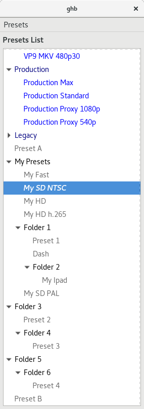
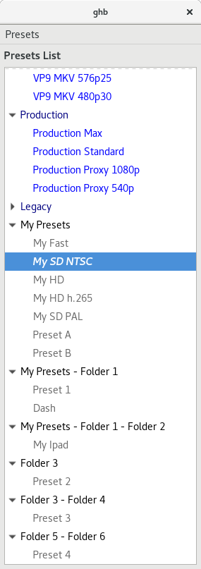
on 22 Sep 2017
So, since we have what is essentially a 3 layer preset system (type/folder/preset), should we allow the reuse of folder and preset names? E.g. should we allow creating a custom folder with the same name as an official folder? To me, it seems reasonable to allow this since the user may want to mirror official presets with their own custom tweaks. But it muddies the waters a little since this would allow duplicate names in the list.
jstebbins
on 27 Sep 2017
I think that would be fine. My initial idea was to have Custom Presets > My Presets as the default user folder, and any older/imported presets not having their own folder be shoved there on import.
bradleysepos
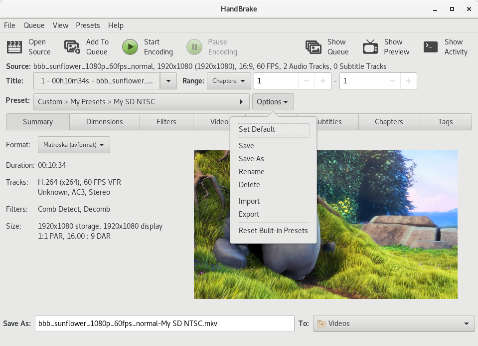
on 27 Sep 2017
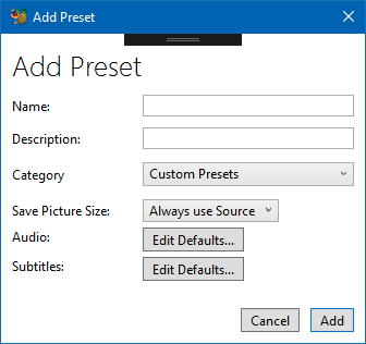
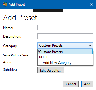
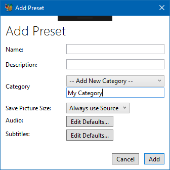
I've just been thinking through how the UI design should enforce the hierarchy. My thought is that the "New Folder" menu option should just go away. Instead, add a "Category" dropdown to the preset "Save" dialog above the entry box for the preset name. The Category dropdown would be populated with the current folders and then have one extra entry "Add New Category". When "Add New Category" is selected, another entry box appears below the dropdown to allow entry of a new category name.
My thought was that we could populate the Category dropdown with existing official folder names plus any custom folder names (removing duplicates). If the user saves a new custom preset using one of the existing official folder name categories, the new preset gets saved to a custom folder of the same name.
I don't know, maybe I'm overcomplicating things. But this just seems like an easy way to help users keep things organized.
jstebbins
on 27 Sep 2017
Looks something like this:
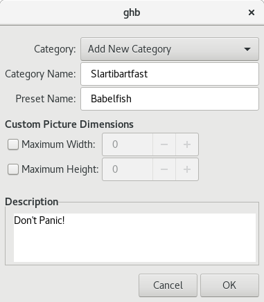
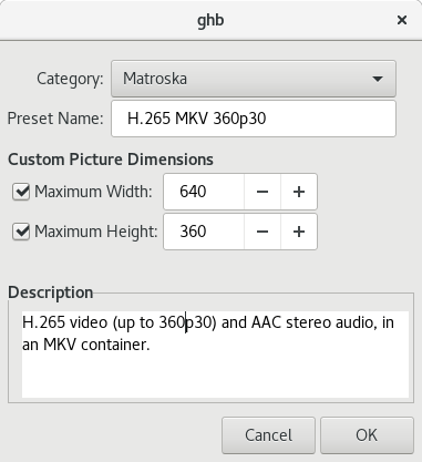
jstebbins
on 28 Sep 2017
My thoughts exactly. Looks good and works well. Nice work.
bradleysepos
on 28 Sep 2017
Branch updated with these changes if anyone wants to see it in action
https://github.com/jstebbins/HandBrake/tree/presets-menu
I had a little hiccough when implementing this. Turns out GTK menus don't allow duplicate menu labels for 2 items even if they are in separate menu sections. I.e. showing an official and custom folder with the same name in the top level menu caused an error. My work-around was to prepend the name with "My" if I see that a custom folder has the same name as an official folder. shrug
jstebbins
on 28 Sep 2017
GTK, sigh.
bradleysepos
on 28 Sep 2017
How do we want to force the new hierarchy on presets when importing? We need to do something with custom presets that aren't in a folder and folders aren't at the top level of the hierarchy.
For presets that aren't in a folder, we can probably just create a folder with a name like "My Presets" and drop them in there. If "My Presets" folder already exists, we just drop them in it.
For folders below the top level, we can just move all presets within those folders to the top level ancestor of the folder. But we have to do something about potential name collisions. A partial solution would be to prepend the old folder name to the preset name. But that could result in unreasonably long names and don't guarantee there will be no name collision. So I'm thinking just keep it simple. If a collision occurs, append an incrementing number to the name until there is no collision.
Does that sound reasonable? If so, I'll add it to the preset import code.
jstebbins
on 29 Sep 2017
I just had another thought about folders that aren't at the top level of the hierarchy that's easier and better I think. Just move the folder to the top level. There could still be name collisions that I would solve the same way, but it maintains more of the organization the user had already created.
jstebbins
on 29 Sep 2017
That’s pretty much what I suggested above. So:
- Foo
- Bar
- Baz
- Bazinga
- Fubar
- Kilgore
- Deadbeef
Becomes:
- My Presets
- Foo
- Bar
- Baz
- Bazinga
- Fubar - Kilgore
- Deadbeef
bradleysepos
on 29 Sep 2017
(Collapse nested folders into a dash-separated name, with spaces for pretty.)
bradleysepos
on 29 Sep 2017
Are you suggesting that this:
- Fubar (folder)
- Kilgore (folder)
- Deadbeef (preset)
- Splat (preset)
would become this:
- Fubar-Kilgore (folder)
- Deadbeef (preset)
- Fubar (folder)
- Splat (preset)
That works.. I'm a bit concerned about names getting too long. And there's still the possibility of name collisions, so still have to have a hack for that. But this is probably mostly a non-issue. I doubt there are all that many people with more than one level of folders.
jstebbins
on 29 Sep 2017
The WinGui doesn't and never has supported Nested User presets. All imports just go under a user presets category today.
So since we are only supporting 1 level of categories, I can only match on it or create a new one from the top level.
sr55
on 29 Sep 2017
That’s what I’m suggesting, though I went with “ - “ over “-“. I guess it doesn’t matter as long as we’re consistent.
+1 for appending incrementing integer on collision.
bradleysepos
on 29 Sep 2017
Part of enforcing the “all presets must have one and only one parent category folder” paradigm will be handling the situation where no folders exist, for instance where the user has deleted the last folder. I suggest we allow deletion of all folders, and automatically create an empty My Presets folder when none are found.
bradleysepos
on 29 Sep 2017
Added preset hierarchy enforcement to preset import
https://github.com/jstebbins/HandBrake/tree/presets-menu
This:
Becomes this:
jstebbins
on 30 Sep 2017
Cool.
bradleysepos
on 30 Sep 2017
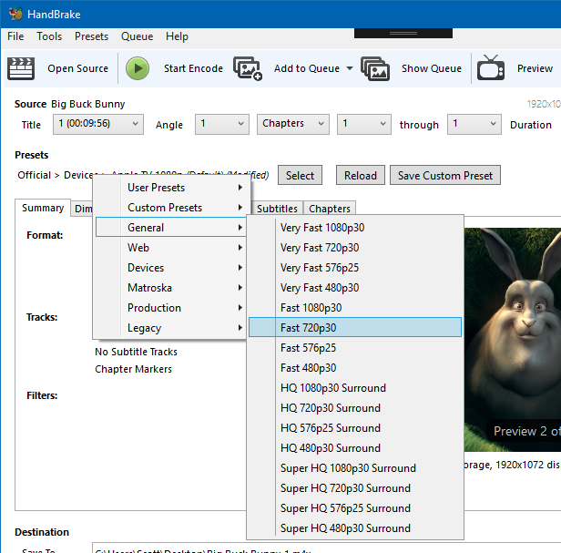
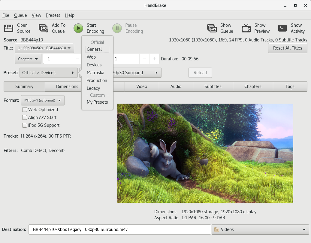
Remaining on the WinGui:
- Category Handling. (Going to follow Johns example above with the dropdown and optional new textbox). Will be single layer and I'll add support for importing categories.
- I've left the legacy list view (as preset menu to switch over to it). If feedback is positive in 1.1 I'll remove that
Otherwise unless there is any other feedback I'm going to call it done.
@jstebbins @galad87 might be work pushing your changes into master and getting some soak time.
p.s we should totally have a Hitchhikers guide preset :)
sr55
on 15 Oct 2017
If we are completeing this, maybe do #560 at the same time and close it out. Hopefully small change.
sr55
on 21 Oct 2017
Single level categories implemented in .NET now.
So I think I'm mostly done and checked into master.
I think I'll leave the optional legacy view mode in for 1.1 and see how things pan out with users. If all is OK I'll remove for 1.2
sr55
on 2 Nov 2017
May want to add a colon after Category for consistency, otherwise looks good! :smile_cat:
bradleysepos
on 2 Nov 2017
that was the second commit ;)
Just didn't update the screenshot
sr55
on 2 Nov 2017
Added a rough PR to finish aligning MacGUI: #1041
bradleysepos
on 3 Dec 2017
@jstebbins @sr55 See https://github.com/HandBrake/HandBrake/pull/1041#issuecomment-348977297 for some items of note.
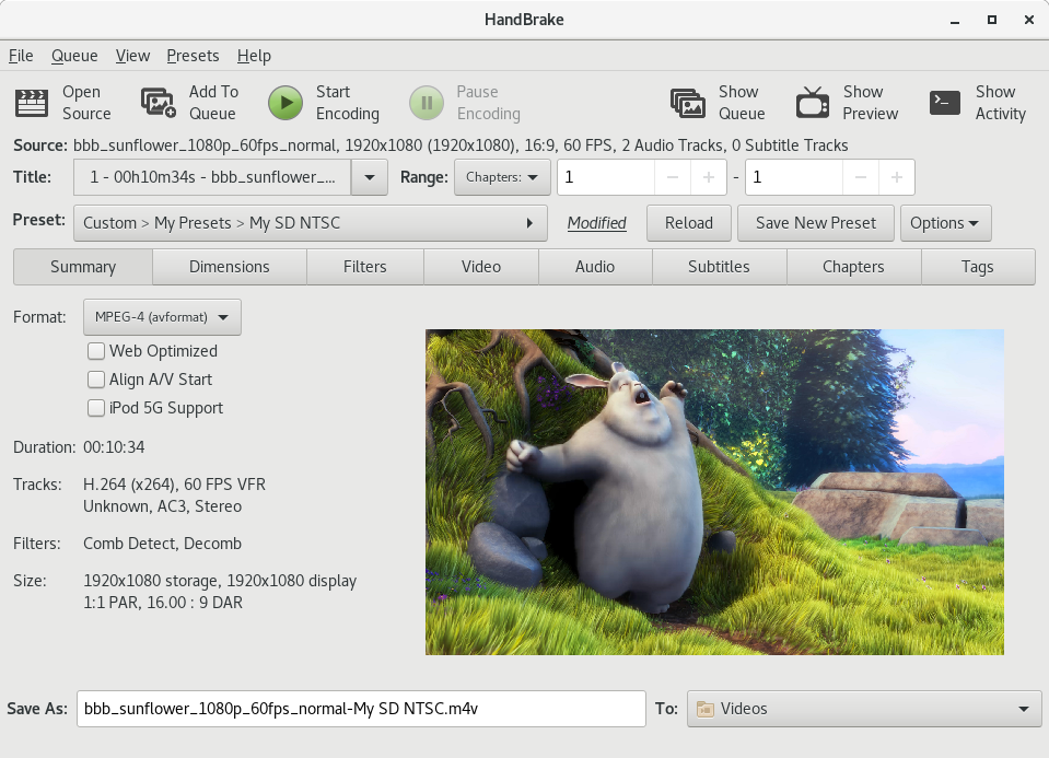
- MacGUI is putting Size below Filters on the Summary tab. Suggest the other GUIs do this instead of placing below the preview image.
- Save As: and To: instead of Destination (Name); we can still call this the destination
- Inside the tabs, all headings like Format:, Tracks: are not bold; I initially spec'd bold but this is uncommon on macOS, so use what is common on your platform or consider aligning with macOS non-bold
bradleysepos
on 4 Dec 2017
Okay, trying to nail down the last of the UI consistency. Be patient with me. 😸
Screenshots of current nightly on Linux, Mac, and Windows:
Windows nightly appears most complete. Linux and Mac are close! Great work, everyone.
Changes needed to fully align the initial display:
_List moved to https://github.com/HandBrake/HandBrake/issues/833#issuecomment-353435994_
As soon as we're solid on these, I'll start updating the documentation with new screenshots. Thanks, everybody, and feel free to discuss any items of concern. 😺
bradleysepos
on 10 Dec 2017
" Rename Destination:/Save To: to Save As: and add To: between fields, same as Mac" I don't actually have a control like Mac to do this. It'd have to be totally custom which I'd rather avoid doing.
sr55
on 10 Dec 2017
Yes, don’t feel the need to circumvent standard controls. Maybe just “Save As:”?
bradleysepos
on 10 Dec 2017
The MacGUi has a different Preview icon. Worth changing?
Also, I use bold for Heading and Section Headings. I was treading the summary tab items as Section headings.
sr55
on 10 Dec 2017
The MacGUi has a different Preview icon. Worth changing?
I think the MacGUI is the newer one, but it really doesn't matter. I'll play around with a new idea.
Also, I use bold for Heading and Section Headings. I was treading the summary tab items as Section headings.
Works for me, as long as it's consistent on/for the platform.
bradleysepos
on 10 Dec 2017
Show selected preset name only (remove Official > General >) same as Mac
This could be very confusing. You can have presets of the same name in different categories. For example, when a user saves a copy of an official preset, the default name is the same.
Add inline Save Custom Preset button same as Windows
Add inline preset Options control same as Windows
I never added these because I have always questioned the need for them. There is already a perfectly good menu bar in the window.
jstebbins
on 11 Dec 2017
You can have presets of the same name in different categories. For example, when a user saves a copy of an official preset, the default name is the same.
I thought we were ensuring no duplicate names? How does the CLI handle --preset=Foo where there are multiple Foo?
I never added these because I have always questioned the need for them.
I can appreciate that. There's value in getting the GUIs on the same page regarding this, too, and it's the item of least parity. We should probably pick a direction to go with this.
Perhaps a good compromise will be for Windows to move the Options control to the Presets menu, and Linux/Mac to adopt the modified indicator, Reload and Save Custom Preset buttons?
bradleysepos
on 11 Dec 2017
I'm thinking we may also want to change Save Custom Preset to Save New Preset so it's obvious a new preset will be created, as opposed to updating/replacing an existing custom preset.
bradleysepos
on 11 Dec 2017
How does the CLI handle --preset=Foo where there are multiple Foo?
You can specify a full preset name including category by separating with '/'. If you don't specify the full path, the first match is used.
Perhaps a good compromise will be for Windows to move the Options control to the Presets menu, and Linux/Mac to adopt the modified indicator, Reload and Save Custom Preset buttons?
Yes, that would be my preferred solution.
jstebbins
on 11 Dec 2017
You can specify a full preset name including category by separating with '/'. If you don't specify the full path, the first match is used.
Ah, okay. That makes sense.
I still think the simple preset name is more usable. To be honest, I'd rather saving a new preset give a blank name field so we don't encourage name collisions. 🤷♂️
bradleysepos
on 11 Dec 2017
Add source attributes/tracks display (main window, top right) same as Linux/Windows
Is this useful? I was going to remove the whole Source: line because it's redundant (the same name is in the windows title and in the Title: popup button.)
Add preset modified indicator similar to Linux
So "PresetName (Custom)" instead of just "Custom"?
Add inline preset Reload button same as Linux/Windows
Is this useful too? In the macgui you can just undo changes.
Add inline Save Custom Preset button same as Windows
Add inline preset Options control same as Windows
These are already in the menu bar and in the presets panel. I wouldn't add yet another function to the main window when it's already available in another two places.
galad87
on 11 Dec 2017
I don't think people are accustomed to using menus so much nowadays, so having the options near the preset section made sense to me. That said, they are duplicated in the preset menu. It's an interesting one. I'm not sure if discover ability would hurt not having it.
That said, the Windows GUI has Old vs New behaviour via the menu. It doesn't to the fancy dropdown thing that mac does on the preset menu. So in my case, I don't have both. It's one or the other.
sr55
on 11 Dec 2017
I don't actually see a lot of value in the source info in the top right either.
sr55
on 11 Dec 2017
Maybe it can be appended to the filename label, instead of being aligned to the right.
galad87
on 11 Dec 2017
@galad87
Is this useful? I was going to remove the whole Source: line
Some of the source attributes are useful in determining whether you need to modify the default settings of the preset you are using or use a different preset. For example, if the source is 29.97 fps, there is a very good likelihood that is is either interlaced or hard telecined and you need to add a deinterlace or detelecine filter.
@sr55
I don't think people are accustomed to using menus so much nowadays,
That's a fair point. I go to the menus when there isn't a toolbar button for some operation, but I generally look for a toolbar button first. How about this idea? Add a toolbar for the new preset menu with the more commonly used things (I was thinking "Save", "Save As", and "Delete") and use the menu for the rest? The window is narrow, so I don't think we would want more than about 3 buttons up there.
jstebbins
on 11 Dec 2017
@sr55
Oh, I think I was missing something. I didn't notice that you moved your options button next to the new preset selection menus in the main window. I was thinking is went with the preset list to the new preset window (which would be kind of silly now that I think about it). I see your point in having it near the other preset controls, but I don't really like having it duplicated there and in the preset menu. I need to think it over a bit. It's trivial to add and there is plenty of room for it in the UI. It just bugs me for some reason.
jstebbins
on 11 Dec 2017
While Having it in two places is a bit of a pain, it is actually very useful for screen readers to have it in the menu. Aids discoverability for visually impaired where as a more typical use-case will probably involve the options dropdown button. Less mouse travel.
sr55
on 11 Dec 2017
@bradleysepos
Move Reset All Titles control to File menu item?
I think this is another area where the LinGUI differs from the other GUIs that we might want to discuss.
The LinGUI allows each title to have different settings. I did this as an enhancement to batch processing. The problem I was solving was this. Lets say you have a directory that is a mix of hard telecined, interlaced and progressive sources. For some you want to enable the detelecine filter, some require the deinterlace filter and some no filter. I believe the way the Win and OSX GUIs do batch processing won't allow you to make this kind of modification. All titles must use the same exact settings.
Allowing the user to change settings for each individual title before you "Add Multiple" to the queue solves the above problem, but it adds a wrinkle. What if you want the changes you just made to be applied to all titles? That's what that button is for. But the button is confusing. It's not obvious what it's purpose is from the button label and I haven't come up with any ideas for a better label.
I like having a solution to mixed source batch processing, but I'm thinking it's not clear to people that settings changes are affecting only the current title. It seemed "obvious" to me that changes should only affect the current title. But I think many of our users don't even know the title dropdown is there. Their workflow is select preset (optional)->scan->add multiple to queue->start. They don't even see the rest of the app (and I believe we want it to be this simple for these people). My design works fine for that workflow, but doesn't work for people who scan->select preset->add multiple to queue->start which is the workflow we are now encouraging with the GUI rework.
One thought I had was to make the button a checkbox (checked by default) that would "sync" all titles together ("Sync Title Settings"?). This would make the default behaviour the same as Win and OSX, but allow a more advanced user to explicitly unsync them. This could be hidden in the menus somewhere so that it's not cluttering the UI. Does this seem reasonable?
jstebbins
on 11 Dec 2017
Add preset modified indicator similar to Linux
So "PresetName (Custom)" instead of just "Custom"?
When I tested, there was no indication a preset had been modified when changing settings. An indicator on or near the preset control is a cognitive aid, and avoids forgetting unseen changes on hidden tabs.
Linux shows the text "Modified" after the preset control (see screenshot here]. Something achieving the same goal can be implemented however feels correct on macOS.
Add inline preset Reload button same as Linux/Windows
Is this useful too? In the macgui you can just undo changes.
Yes.
A single control may seem less useful when considered on its own, but its presence is key to starting/finishing/reverting a major flow. This control is similar to the Reload button for audio/subtitle selection behavior, and the counterpart to the modified indicator. Combined, these pieces establish an obvious flow for selecting, modifying, and discarding or saving modifications to presets.
Add inline Save Custom Preset button same as Windows
Add inline preset Options control same as WindowsThese are already in the menu bar and in the presets panel. I wouldn't add yet another function to the main window when it's already available in another two places.
What Scott said about usability and assistive technology. Also, if I may be frank, MacGUI is the only GUI retaining the old presets menu by default. I actually like the new popup, despite it testing worse for speed here, which surprised me. Definitely fine with it being available, but I think it should be removed from the default toolbar.
The Save Custom^WNew Preset button is actually really useful both for everyday preset creation, and also so people know the function exists. It's astounding how many people do not realize they can save their customizations; this makes it obvious and completes the flow from Preset to Modified to Reload or Save.
The Options control is convenient, but doesn't prop up any major flow. It should be sufficient for its contents to live in the Presets menu.
[Source info] Maybe it can be appended to the filename label, instead of being aligned to the right.
Sounds like it's worth trying. I'd like to see it.
What if you want the changes you just made to be applied to all titles? That's what that button is for. But the button is confusing. It's not obvious what it's purpose is from the button label and I haven't come up with any ideas for a better label.
Hmm. I think I understand. So the button is kind of like "Use these settings for all currently loaded titles". Mac/Win don't need it because they do it by default. Correct?
My design works fine for that workflow, but doesn't work for people who scan->select preset->add multiple to queue->start which is the workflow we are now encouraging with the GUI rework.
I see the purpose, but indeed a bit of a departure from the current major paradigm. I'm not sure what I think other than I agree that the label is not entirely clear.
Hopefully everyone understands my goal is to make good UX decisions and sync what can be sync'd for easy and clear documentation and multi-platform usability. Not all of my suggestions align with my personal views, even... I'm just pointing out what seem to be the easiest/shortest paths to a reasonable end.
All that to say, I'm fine with imperfect UI differences, yet a fair amount of the outstanding differences I've pointed out have no pressing reason to be different. We did a great job implementing the new UI features for this release. I'd like to see us align the smaller details more, where they don't conflict with platform norms, even if it means adopting ideas opposed to mine.
bradleysepos
on 12 Dec 2017
I have a couple more tweaks I need to do to finalise the preset change detection for audio / subtitles and get the new icon in place for preview then I'm done.
@jstebbins Probably best have an option in preference rather than the main view? I try to keep Win specific features hidden out the way so the main ui is close as can be to the others. my 2c.
sr55
on 12 Dec 2017
I think the short source description should go after the title: selection, because it depends on the selected title.
galad87
on 14 Dec 2017
I think the short source description should go after the title: selection, because it depends on the selected title.
Agreed. But nobody liked it as an additional line below Title. Should we revisit this?
bradleysepos
on 14 Dec 2017

⬆️ How Windows is doing the modified indicator.
bradleysepos
on 14 Dec 2017


:arrow_up: How Mac is doing the source attributes readout (the BD/DVD folder names are actually BD/DVD).
bradleysepos
on 15 Dec 2017
OK, Happy to move the source info. Not worth sweating over.
FWIW, which it's a label beside the dropdown, or in-line for the modified I don't think matters too much. If the platform controls support it, it looks cleaner in-line, if not a text label would be fine.
It was a fair bit of work to implement change detection though for me.
sr55
on 15 Dec 2017
Looks fine.
bradleysepos
on 15 Dec 2017
I'll do some checking on how best to do scaled icons.
sr55
on 16 Dec 2017
Nice, I think you used the high dpi ones though. Probably should use the standard ones (no @2x) as they're unique and work better on regular displays.
bradleysepos
on 16 Dec 2017
Ah, I see you don't have different resolution assets.
bradleysepos
on 16 Dec 2017
Switched to low-res as they appear better locally. I'll investigate high res tomorrow.
sr55
on 16 Dec 2017
Umm, guys, have you tried the current layout with very long source file names and batch scan of a directory? I've been minimizing the number of other controls that share a row in the UI with the title dropdown so that the width can grow to accommodate long file names. The new layout is going to obscure most of the filename when doing title selection which doesn't really work.
jstebbins
on 20 Dec 2017
hmm, I did set character level elipsis if it goes over, but you need a pretty extreme filename to go over. I can easily fit 150+ characters. Widen the window and you see more.
I always had it on the same line so it's just left aligned rather than right aligned.
I may have more space than the lingui though so it may be less of an issue for me.
sr55
on 20 Dec 2017
OK, apparently not. Seems to be shy of 80 characters with the current xaml. I can optimise that a bit but 2 other options,
- revisit throwing it away. (personally I don't care either way)
- Make it disappear if the filename is long.
sr55
on 20 Dec 2017
This is what it'd look like (Also added a tooltip to see how that works)
It's a pretty extreme filename. I'd say those who are going to write a story in their filename, need to live with a tooltip or something else. Regardless, the windows only 1000px wide anway
LinGUi:

Even if you extend that, it;s still quite a bit shorter than the wingui. I must be using a smaller font
sr55
on 20 Dec 2017
I'm not sure if you understood what I meant. I'm talking about the contents of the title dropdown. In your images I see a dropdown that only has enough room to give the title number and duration of the title. There is not enough room for the title's file name which is important when choosing titles in a batch scanned directory.
jstebbins
on 20 Dec 2017
On mac the actual dropdown menu will be larger than the control size, and will show the entire filename.
galad87
on 20 Dec 2017
On mac the actual dropdown menu will be larger than the control size, and will show the entire filename.
Yeah, I thought that might be the case. I can't seem to do that with GTK. I'm still doing some searching, but so far it seems impossible.
jstebbins
on 20 Dec 2017
Yeh, Just realised it's a bit awkward for batch mode. I'll do the same as mac. Filenames above and the dropdown contents will contain it but hte display value will be title
It's not a big issue of the linux gui layout is a bit different to accomondate the longer dropdown I don't think
sr55
on 20 Dec 2017
So, i figured out a usable way to limit the width of the title combo box. It results in that widget looking a bit more like an uneditable gtkcomboentrybox rather than a gtkcombobox, but it works.
But even with that under control, I can't fit everything on one line. It all fits except "Duration: 00:00:00". So I'm wondering it the duration field is even necessary. It's redundant with what is shown in the title dropdown, but it's possibiliy more explicit and visible.
Any opinions?
jstebbins
on 21 Dec 2017
Did we decide on where to put the source info? Above uses empty space that would otherwise not be used, but below does flow better since it changes as you change titles.
If we move it, I suggest moving everything that is currently to the right of "Source:" below the title dropdown.
jstebbins
on 21 Dec 2017
It's redundant with what is shown in the title dropdown
Not when doing point-to-point, hence the addition.
Did we decide on where to put the source info? If we move it, I suggest moving everything that is currently to the right of "Source:" below the title dropdown.
Everyone was opposed to my comps where it was below. Mac & Win are doing directly after source instead of right aligned (screenshot):

Directly following source on the same line seems to work well even with long source names, since there are only a few fields. Makes it easier to align things, too.
bradleysepos
on 21 Dec 2017
It's redundant with what is shown in the title dropdown
Not when doing point-to-point, hence the addition.
I forgot about that. That's not really "source" information then. It's output duration. Maybe move it into "Summary"?
Everyone was opposed to my comps where it was below.
TBH, I kind of like the idea of putting it below. If you feel like the space above should be used for something, it might be nice to show the full source path. And the scan progress would still be there.
jstebbins
on 21 Dec 2017
At this point, I don't have a preference. It would be nice to resolve any remaining issues quickly so we can release. I'm sad we won't have parity on some of the main window.
bradleysepos
on 21 Dec 2017
@sr55 I think there's a bug in the Summary image aspect. Should be wider, see screenshot:
Also, will you consider aligning the main window titles per the other GUIs? No indentation, same line as the controls they reference, drop "Destination"?
bradleysepos
on 21 Dec 2017
@jstebbins One other thing, Mac and Windows have standardized on the toolbar order in the above screenshot. Basically, Show Queue isn't on the right. Consider the same order?
bradleysepos
on 21 Dec 2017
Hmm, any reason for re-ordering that way? The previous ordering grouped buttons that open other windows and aren't really in the main usage flow at the end and (at least in linux case) right justified in the toolbar.
jstebbins
on 21 Dec 2017
And what happened to the "Pause Encoding" button? Is it only visible once encoding has started?
jstebbins
on 21 Dec 2017
Hmm, any reason for re-ordering that way?
Linux and Windows did it the way you currently have it for 1.0.0, which is what I suggested. Mac declined and did it's own thing. See a pattern? 🔪🔪🔪 😸
Anyway, Scott changed Windows to align with Mac. It's fine either way, I say go for consistency if it doesn't bother you.
And what happened to the "Pause Encoding" button? Is it only visible once encoding has started?
On Mac there are Start and Pause buttons. Start turns into Stop during encoding.
On Windows, Start is replaced by Stop and Pause buttons. So the behavior is similar.
bradleysepos
on 21 Dec 2017
Moved TODO list here. It would be nice to get as many remaining items settled as possible, and release before Christmas, assuming everyone has time.
- Linux
- [x] Disable legacy presets list window on startup (obscures main window, confusing)
- [x] Bold
Title:andDuration:labels, add relatedAngle:andRange:labels, changethroughto en dash–, align layout same as Mac - [x] Move
Reset All Titlescontrol toFilemenu item? - [x] Show selected preset name only (remove
Official > General >) same as Mac and Windows - [x] Add inline
Save New Presetbutton same as Windows - [x] On Summary tab, rename
Dimensions:/Aspect Ratio:toSize:and move belowFilters:same as Mac and Windows - [x] Make regular/bold headings on tabs consistent (regular weight preferred for Label:)
- [x] Rename
Destination:toSave As: - [x] If possible also add
To:between name and directory fields, same as Mac; otherwise mirror Windows - [x] Use the new toolbar icons for
Source,Add To Queue,Show Queue,Show Preview, andShow Activity(seegfxdirectory)
- Mac
- [x] Add source attributes/tracks display same as Linux/Windows
- [x] Add preset modified indicator similar to Linux
- Windows
- [x] Improve legibility of source attributes/tracks display (main window, top right)
- [x] Align all main window titles (no indentation, same line as the controls they reference, drop "Destination"), same as Mac
- [x] Bold
Title:,Angle:, andDuration:labels, add relatedRange:label, changethroughto en dash–, align layout same as Mac - [x] Show selected preset name only (remove
Official > General >) same as Mac - [x] Add preset modified indicator similar to Linux
- [x] Rename
Save Custom Presetbutton toSave New Preset - [x] Remove inline
Optionscontrol as recently discussed - [x] On Summary tab, rename
Dimensions:toSize:and move belowFilters:same as Mac - [x] Make regular/bold headings on tabs consistent
- [x] Rename
Destination:/Save To:toSave As:and addTo:between fields, same as Mac
Remaining items moved to https://github.com/HandBrake/HandBrake/issues/833#issuecomment-353802906
bradleysepos
on 21 Dec 2017
@bradleysepos 2402x1080? What kind of source is that?
Also, under category headers, there is a 5 or 10px intent. (Preset dropdown is mis-aligned though)
sr55
on 21 Dec 2017
Btw, if we are not adding an options pane for presets, maybe we should have a "Make Default" checkbox on the Add Preset window?
sr55
on 21 Dec 2017
if we are not adding an options pane for presets
I'm not sure I understand. Do you mean the options dropdown you have next to the presets on the main window? I'm ok with that and will add it to the Linux gui.
maybe we should have a "Make Default" checkbox on the Add Preset window
Not a bad idea in any case. But I still don't really understand the need for "Make Default". IMO it should just stick to the last used preset when HandBrake is restarted.
jstebbins
on 22 Dec 2017
Yeh, sorry, options dropdown. Sleep deprivation kicking in. I'm not sure @galad87 is on board with it though. I'm not really sure why.
I don't necessarily have anything against last used.
sr55
on 22 Dec 2017
Show selected preset name only (remove Official > General >) same as Mac and Windows
I really think we should show the whole preset path. I don't like this change.
jstebbins
on 22 Dec 2017
I missed something. When did the toolbar icons change and how did they change? Please do not change icons unless you are also going to provide svg icons for the Linux GUI. I require svg.
jstebbins
on 22 Dec 2017
@sr55 I presume there is a popup associated with the "Rename Preset" option. Is it simply an entry box with Ok and Cancel buttons?
jstebbins
on 22 Dec 2017
Make regular/bold headings on tabs consistent
If there is something for me to do with this, than I am not understanding what this means.
jstebbins
on 22 Dec 2017
yup
sr55
on 22 Dec 2017
I think he means:
he also tweaked some of the icons in the gfx folder. No reason svg can't be made.
p.s @galad87 What's the deal with the options dropdown on mac? I can turn it back on since johns ok with it too but I'd rather all 3 of us be on the same page with on/off
sr55
on 22 Dec 2017
Current state of LinGui
And with preset modified
jstebbins
on 23 Dec 2017
Nice
sr55
on 23 Dec 2017
I think he means
Actually I meant, the labels inside the tabs (Summary, Video, Audio, etc.) should all either be bold or regular at the same hierarchy.
bradleysepos
on 23 Dec 2017
What's the deal with the options dropdown on mac?
We all agreed to remove Options awhile back, sorry I didn't reply sooner.
bradleysepos
on 23 Dec 2017
I missed something. When did the toolbar icons change and how did they change? Please do not change icons unless you are also going to provide svg icons for the Linux GUI. I require svg.
No reason svg can't be made.
Yep, trivial. Will get on it.
bradleysepos
on 23 Dec 2017
We all agreed to remove Options awhile back
I've been very busy lately. I've missed a lot of discussion on IRC and have had to go back and catch up a lot in this thread. If there was a resolution on this issue, I missed it. I see you suggested it be removed and nobody argued against it, but nobody affirmed either.
I'm ok with it either way, but I agree with @sr55 about setting the default. I've said this a couple times already, but the horse might not be dead yet. I really don't see the usefulness in the "Set Default" option. I think it should just stick to the last used preset. But if we are keeping "Set Default", then it would be nice to have a checkbox when creating a new preset to make it the new default.
jstebbins
on 23 Dec 2017
I could have sworn you were in on the discussion to remove Options, but perhaps I imagined it.
if we are keeping "Set Default", then it would be nice to have a checkbox when creating a new preset to make it the new default.
Agreed on the checkbox.
I added a couple SVG in ced960afd6cef99e9a543d1c122d9197a4ee5e0f. The current SVG files in gtk/ only contain PNG pixel data (no vectors), so please try the files I added to graphics/ and let me know if they suit your needs. If so, I'll make the rest the same.
bradleysepos
on 23 Dec 2017
A few of the SVG in gtk are vector. But I never finished converting the rest. The 2 you supplied in graphics/SVG work fine. If possible, can you export the rest to vector SVG?
jstebbins
on 23 Dec 2017
Great! That's the plan.
bradleysepos
on 23 Dec 2017
@jstebbins Just added the remaining SVGs for the new icons in 12bd125b49882aebc321a1ca1f01ce0c2ef839cc.
Note that there are two versions of Preview and Source: one standard res for ~32px and one high res for 64px+ labeled @2x. I'm not sure if you have any control over whether high dpi screens use a different asset. If not, probably stick to the standard res ones because the high res are a bit too detailed to look decent on regular displays.
I'll start going through the backlog of older icons soon but not this exact minute.
bradleysepos
on 23 Dec 2017
I had a look into how gtk selects different res icons. It appears to decide what res it needs, then looks for a PNG that is a "good" match to the desired res. If it does not find a "good" match, it will use the corresponding SVG and scale it to the desired res.
So I've added the additional PNGs you've supplied and GTK is showing appropriate icons for both HiDPI and non-HiDPI displays.
jstebbins
on 24 Dec 2017
Excellent. 👍
bradleysepos
on 24 Dec 2017
Remaining items:
- Linux
- ~Move toolbar item
Show QueuebetweenAdd To QueueandStart, same as Mac and Windows~
- ~Move toolbar item
- Mac
- [x] Add inline preset
Reloadbutton same as Linux/Windows - [x] Add inline
Save New Presetbutton same as Windows - [x] Move toolbar item
Queueto the right same as Linux/Windows
- [x] Add inline preset
- Windows
- ~On Summary tab, fix incorrect preview aspect (see https://github.com/HandBrake/HandBrake/issues/833#issuecomment-353409990)~ Moved to #1147.
bradleysepos
on 24 Dec 2017
Move toolbar item Show Queue between Add To Queue and Start, same as Mac and Windows
Still not a fan of the new ordering. I understand that it puts all the queue related buttons together. But I think it's more important to have the "steps to encode" together and the "other stuff" together. I would really prefer this were reverted in the other GUIs.
jstebbins
on 25 Dec 2017
Yeh, I don't like the current line up either to be honest. It makes sense to have Source | Actions | Display in terms of order. I.e what the linux gui does
sr55
on 25 Dec 2017
Still not a fan of the new ordering. I understand that it puts all the queue related buttons together. But I think it's more important to have the "steps to encode" together and the "other stuff" together.
I agree. This was actually my rationale for that ordering. I would prefer to have Mac make the change.
bradleysepos
on 25 Dec 2017
Another reason for having the queues icon nearby was that the icon is almost black, and it's hard to know if you have clicked it or not, so the badge on the queue icon helps a bit.
galad87
on 25 Dec 2017
Not sure that's a big issue. The button for showing the queue isn't terribly far away
sr55
on 25 Dec 2017
AFAIK Mac was the only holdout for that change prior to 1.0.0, and I think prior to the badge addition. The badge certainly helps; when clicking the add to queue button now it should be easily observable what is taking place regardless of icon order. So, if @galad87 is willing to sync to the Linux toolbar, we should all go with that order.
bradleysepos
on 26 Dec 2017
It will be good to resolve the remaining points here and get a release out as soon as possible.
@galad87 Are you willing to sync the toolbar and inline presets buttons? If not, do you have any other suggestions for how to move forward?
bradleysepos
on 8 Jan 2018
Done a part of it in 3d3120b693c89663f8016ddd2a30e5c5af404461
The "reload" button currently makes no sense for jobs reloaded from the queue, I am not going to add for 1.1.0.
I used the usual "+" icon for the button.
galad87
on 10 Jan 2018
The "reload" button currently makes no sense for jobs reloaded from the queue
Can you explain what you mean by this?
I used the usual "+" icon for the button.
Your reasoning for this?
bradleysepos
on 10 Jan 2018
The MacGui doesn't save the original preset in the queue job, so there is no way to reload the original preset in a reload job.
I liked the "+" icon, the text made the button too long.
galad87
on 10 Jan 2018
The MacGui doesn't save the original preset in the queue job, so there is no way to reload the original preset in a reload job.
Ah, that's a good point. It would be best if the Reload button was present, but disabled if the original preset is not known. Is this possible? Just for reference, this is meant to mirror the Reload functionality that accompanies the Selection Behavior controls.
I liked the "+" icon, the text made the button too long.
I cannot even.
bradleysepos
on 10 Jan 2018
hmm, The windows UI also doesn't re-select the preset. Preset and job settings are decoupled from an architecture point of view. So hitting reload would just load the currently selected preset, whatever it was into the job. (Since you can't re-select an already selected preset). So in that sense, it's still works but the name maybe isn't 100% correct in that instance.
sr55
on 12 Jan 2018
Maybe this one here can be fixed / improved here as well?
 AndreiPukrov
on 16 Jan 2018
AndreiPukrov
on 16 Jan 2018
1145 completed the remaining Mac UI items.
bradleysepos
on 26 Jan 2018
All tasks complete. Please open new issue(s) for any additional concerns.
That's a wrap! Thanks, everyone.
bradleysepos
on 26 Jan 2018
Related issues
 joshrabinowitz
·
5Comments
joshrabinowitz
·
5Comments
 n2bisex4u
·
3Comments
n2bisex4u
·
3Comments
 toam-plus
·
3Comments
toam-plus
·
3Comments
 bohning
·
4Comments
bohning
·
4Comments
 28598519a
·
4Comments
28598519a
·
4Comments
Most helpful comment
Basic revised UI comp:
This adds the Summary tab to the Mac UI, renames Picture tab to Dimensions, places Filters on their own tab, and uses the aforementioned tab order.
Benefits: