Files: Alternative sidebar (Concept)
[ ] Add "Quick Access" section
[ ] Make the header / title collapsible
option 1 and option 2
 XPoppyX
All 13 comments
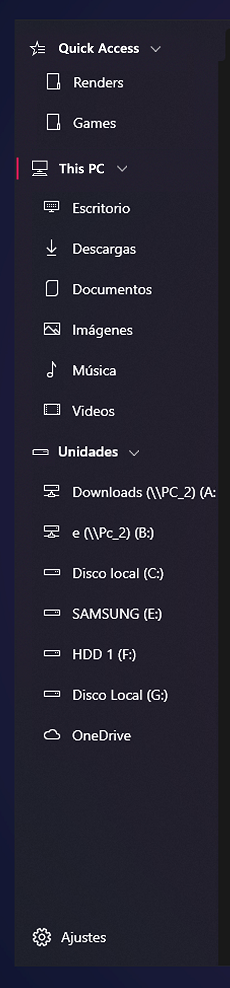
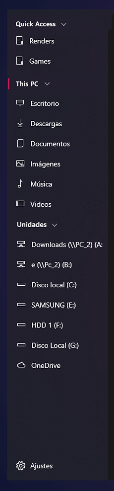
@xPoppyx That's an interesting take-having the drives go under This device.
Originally, I was proposing something like this, with three sections:

(Ignore the new tab page stuff for now)
 duke7553
on 25 Apr 2020
duke7553
on 25 Apr 2020
It looks great, maybe with an option to choose the order? for example first "pinned items", then "This device" and "Drives"
XPoppyX
on 25 Apr 2020
I don't know how hard it would be but ideally it should be possible to rearrange the items in the sidebar. Additionally, the home page shouldn't prevent improving the sidebar.
 yaichenbaum
on 26 Apr 2020
yaichenbaum
on 26 Apr 2020
concept updated
XPoppyX
on 10 Jun 2020
I would have sections for
- Quick Access/Favourites (add to favourites)
| user folders - Drives and Devices
- OneDrive/Online Storage (perhaps add support for webviews with iCloud or DropBox etc)
These would use the new Heirachical NavigationView.
I would also like to see an option to display a TreeView for folder navigation within a tab, maybe using a separator to resize that and the Icon/Detail view.
 mdtauk
on 10 Jun 2020
mdtauk
on 10 Jun 2020
@mdtauk There are native apps for iCloud and Dropbox. We can pin their folders if the native client is installed on the device.
 Jaiganeshkumaran
on 23 Jun 2020
Jaiganeshkumaran
on 23 Jun 2020
@duke7553 I took the liberty to modify your idea to propose a slightly different version.
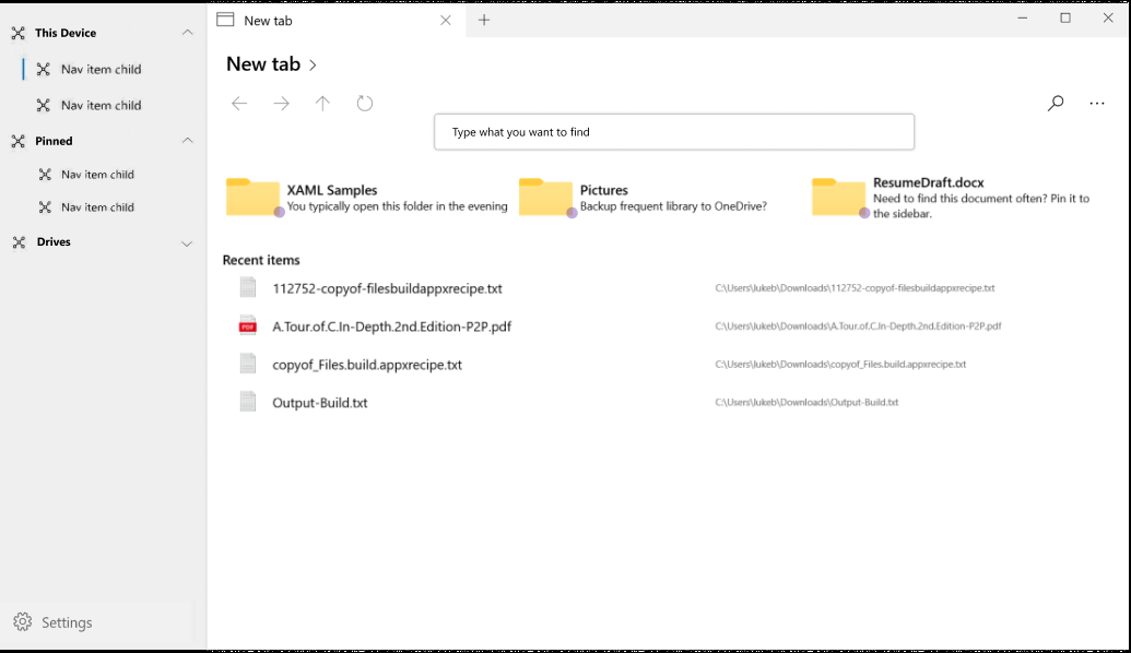
Idea
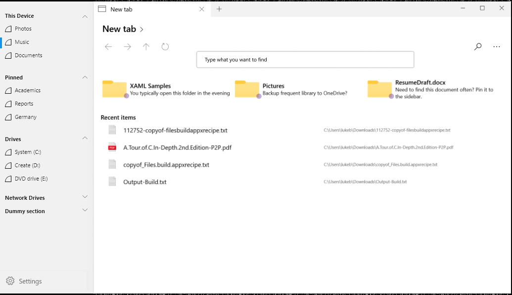
Proposed
The sidebar looks streamlined and the blue marking is not floating far from the left edge. (like in the current design, which is good) (important for quickly identifying which folder the user is currently in) After a while, the user forms a mental model of what group is where and they only search for the actual folder or drive. Pushing it into the right to make it a subgroup is in my opinion unnecessary.
I feel having an icon in the sections is also redundant because, for example, the drives section doesn't need a drive icon when all its children have the drive icon. It adds to visual complexity and most of the time the headers are not the main thing the user is looking at. Its the actual drives and folders instead.
Instead of subgrouping like a tree, increasing the spacing between sections improves the grouping a bit better; the extra space can be removed when the sections are minimized (as can be seen in the dummy section). Maybe the actual spacing can be tweaked to make it a little denser to fit more.
 jayasio
on 1 Jul 2020
jayasio
on 1 Jul 2020
Option 2
XPoppyX
on 4 Aug 2020
I like the idea of having a bit more separation like the previous concept, with either padded nesting for each header or space between headers. I think it makes a potential long list cleaner/easier to navigate.
 generalguy41
on 4 Aug 2020
generalguy41
on 4 Aug 2020
Regardless, we'll be using the default hierarchical nav view design with little/no customizations to the padding or item indentations.
duke7553
on 4 Aug 2020
Regardless, we'll be using the default hierarchical nav view design with little/no customizations to the padding or item indentations.
Is that the design shown in "Option 2"?
generalguy41
on 4 Aug 2020
Will there be an optional to disable Quick Access?
 ArtexJay
on 17 Nov 2020
ArtexJay
on 17 Nov 2020
I think so
XPoppyX
on 17 Nov 2020
Related issues
 rashil2000
·
24Comments
duke7553
·
75Comments
rashil2000
·
24Comments
duke7553
·
75Comments
 ArttuLai
·
24Comments
ArttuLai
·
24Comments
 Taras-Parfeniuk
·
24Comments
XPoppyX
·
36Comments
Taras-Parfeniuk
·
24Comments
XPoppyX
·
36Comments
Most helpful comment
I don't know how hard it would be but ideally it should be possible to rearrange the items in the sidebar. Additionally, the home page shouldn't prevent improving the sidebar.