The metaphor I'm trying to convey is a file with it's top-left corner folded down. Of course, taking inspiration from the modern Office icons. Please let me know what you think and what direction you want to see the icon design move towards.
 duke7553
All 75 comments
This is after I tweaked it for clarity.
duke7553
on 8 Jun 2019
Hey, the project's a nice effort (came here from HN)
Don't follow the office icons, IMO. Use some version of a folder (or look at the icons for Thunar, Nautilus, etc for inspiration)
 kumarharsh
on 8 Jun 2019
kumarharsh
on 8 Jun 2019
Or if you do want to follow the office style, try putting a folder in the bg. This looks kinda similar to MS Word.
kumarharsh
on 8 Jun 2019
@kumarharsh I think the new office icon is OK, it looks beautiful and unified.:smiley:
 ghost
on 9 Jun 2019
ghost
on 9 Jun 2019
I always monitor this project, I think this is a good prospect. I am a graphic designer and I want to help. This is a slight revision of the existing concept. if you like it please contact me.
 yusrilibnu
on 10 Jun 2019
yusrilibnu
on 10 Jun 2019
and this another concept based on basic uwp icon
yusrilibnu
on 10 Jun 2019
@yusrilibnu I really like these. The community can can consider them when leaving feedback.
duke7553
on 10 Jun 2019
After seeing the feedback so far, I'm leaning towards a folder-shaped icon. My reasoning is that "utility apps" like file explorers, etc. need certain icons because they're what we're trained to look for.
duke7553
on 10 Jun 2019
Taking a leaf out of the fluent design icons... How does this look?
kumarharsh
on 10 Jun 2019
in my own opinion, i think its more appealing and smooth transtition if the app icon reflects a close resemblance of the current Windows File Explorer icon. ofcourse with a little bit of twist and some fluent design finishes. just saying. :)

 chrisquim
on 25 Jun 2019
chrisquim
on 25 Jun 2019
Looks delicious!, but I think MS might have a problem with an icon looking too similar to theirs? What if you modify the holder into some other form...
Also, the number of tabs might not translate well to lower resolutions, though I haven't tried to scale them myself.
kumarharsh
on 25 Jun 2019
thanks for the commentary. :)
• yea it could also trigger copyright implications due to close resemblance (if Microsoft will really take a heat on a solo-yet-cool-innovative developer.). Tho a metaphor design and more subtle tweaks can be done for defense.
• Currently i dont have any better alternative idea for the holder., [open for suggestions/modifications].
• I kinda worried to about the tabs representation for lower resolution, i think it can be resolve thru color tweak, custom subtle outline for small icon and pixel-perfect aligning.
nevertheless, its just an initial proposal if the developer might find a taste on this. there's always a room for improvement.
chrisquim
on 26 Jun 2019
@chrisquim looks amazing! As @kumarharsh pointed out being similar to the file explorer one may cause some issues if Microsoft decides they don't want that. What do you think about removing the holder?
 yaichenbaum
on 7 Jul 2019
yaichenbaum
on 7 Jul 2019
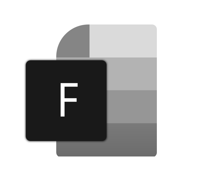
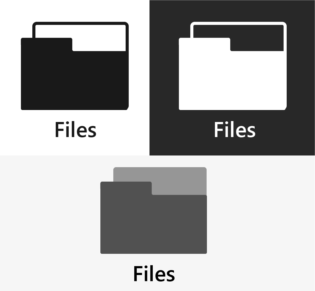
I tried going for a middle ground between all the concepts posted here, what do you guys think?
 SOI7
on 14 Jul 2019
SOI7
on 14 Jul 2019
Really nice, the question that comes to mind with that concept is do we need to have the 'F' there?
yaichenbaum
on 14 Jul 2019
I'm not gonna lie, I'm not really into the new MS icons design language, I preferred the old white, minimalistic icons, but since they're going towards that direction... shrugs
That said, the F is there for two purposes:
1) Replacing the handle in the original File Explorer icons
2) Following the new Office icons design, which has the initial of the app in a square above the other icon layers
I mean, it's not mandatory, but I kept it for consistency.
P.S. @yaichenbaum (Hopefully I'm not asking a too personal question) I saw you're the one in charge of the repo now, are you also contributing to the coding as well now that Duke is gone?
SOI7
on 14 Jul 2019
I am not in charge, I currently don't have enough experience for that. I have been doing very small changes to the code base that I know will not mess anything up, Duke is still looking for a new lead dev. What I am doing is keeping track of issues and hopefully taking care of the store release when ready.
I am also merging pull requests so please keep them coming.
About the icon, not all of the new icons ie the your phone icon have the initial of the app. Neither does the terminal icon. I think if we end up using your concept there should be a vote if we keep the initial or not.
yaichenbaum
on 14 Jul 2019
I'll leave the decision to you guys for the inclusion of the F, then
SOI7
on 14 Jul 2019
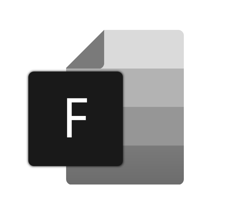
Love that last icon, would look great.
 ArtexJay
on 20 Jul 2019
ArtexJay
on 20 Jul 2019
@chrisquim can you see if you can keep the idea but tweak it just a little to look a little more different then the built in file explorer?
yaichenbaum
on 23 Jul 2019
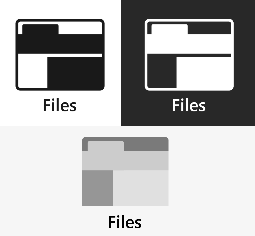
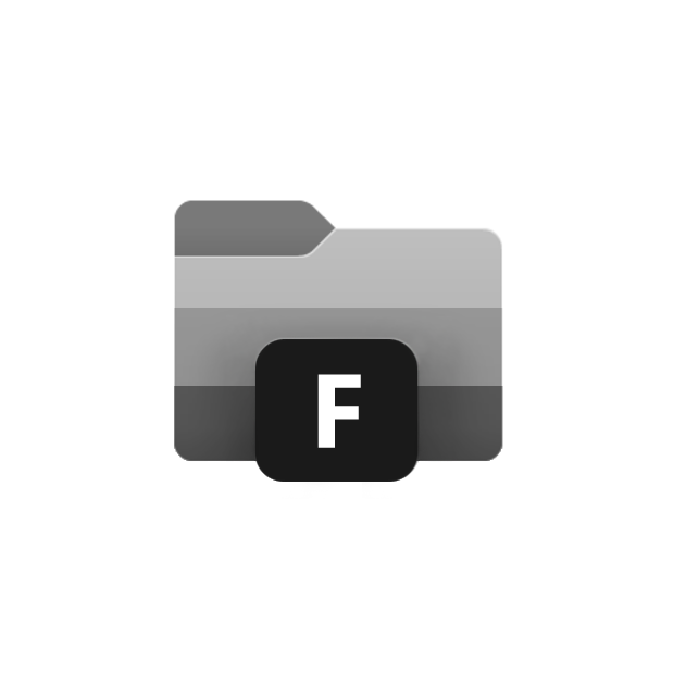
@yaichenbaum @SOI7 why not remove the Black box with "F" completely and use just folder? like Terminal and YourPhone app?
 avknaidu
on 31 Jul 2019
avknaidu
on 31 Jul 2019
Up to @duke7553 , he had the F box in his original concept and I kept it to be loyal to his idea. If he wants it to go, I can spin off another concept
SOI7
on 31 Jul 2019
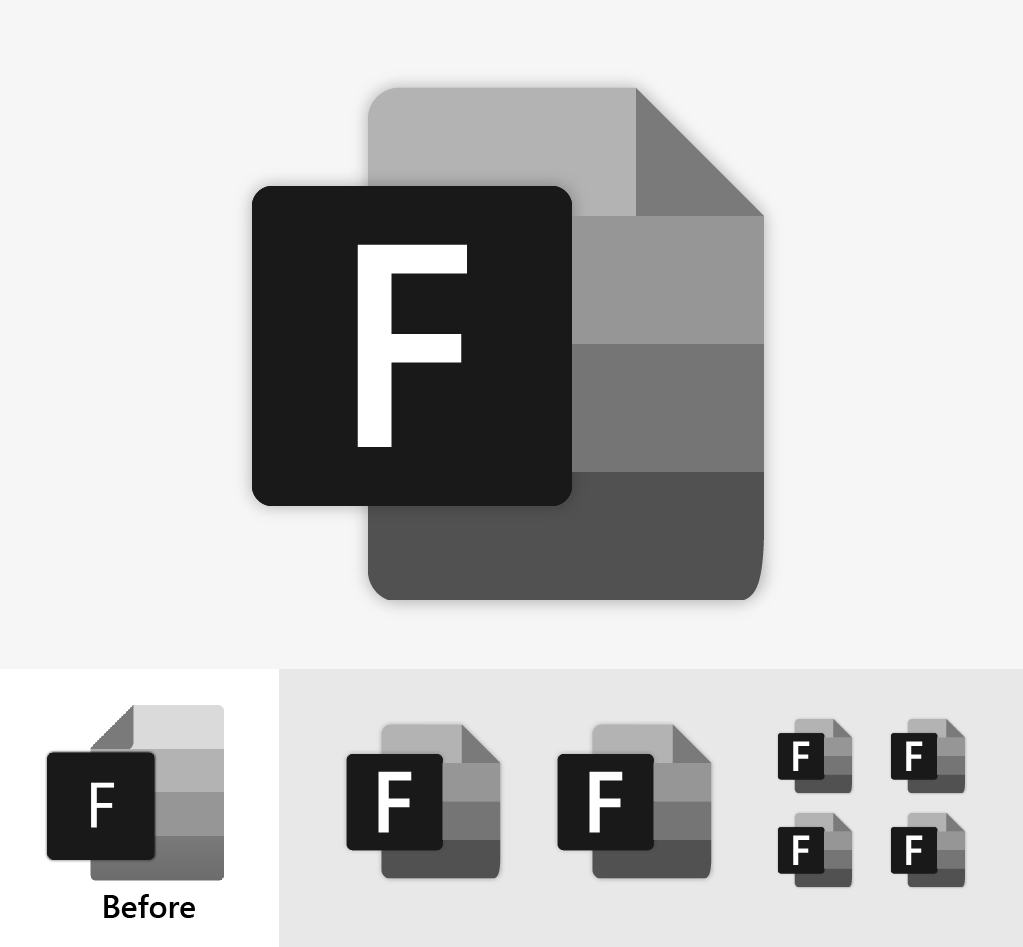
I've received design feedback that advises not to include the F box because certain utility apps don't need them for recognition
duke7553
on 31 Jul 2019
Final verdict, then:

Maybe I should add an outer shadow
SOI7
on 31 Jul 2019
@SOI7 That looks incredible. Great work everyone, but I think for now, this seems like the leading choice.
duke7553
on 31 Jul 2019
Question to address: Will it blend in too much on a dark taskbar?
duke7553
on 31 Jul 2019
Thank you! I guess the gradients and the grey should make it neutral for both light and dark modes, but a test should be mandatory to figure it out I believe.
Side note: in which format and layouts do you need this icon?
SOI7
on 31 Jul 2019
Nope. Terminal icon is also dark shade. but on Dark Taskbar, It looks fine. Because its lighter shades of Black / Grey. And the color choice on this icon is also similar to that of Terminal New Icon. So it should be fine.
avknaidu
on 31 Jul 2019
I think a holder is important to have, just a plane folder looks like... just a folder, with the holder it indicates its a storage location that can have folders within it.
yaichenbaum
on 1 Aug 2019
I won't be at my pc for the following three days, but I was thinking about a possible folder holder with a completely different shape, to stand out more from the Windows Explorer icon. Maybe a semi-triangular holder on the bottom right?
SOI7
on 1 Aug 2019
I thought about the designs thus far and I probably would put myself in agreement with @yaichenbaum . Files as an app takes pride in meaningful design choices. So we should add some kind of triangle-shaped folder holding device to the icon. Ideally, with a color that stands out well, but doesn't look too playful.
I'll experiment with this more when I get a chance today.
duke7553
on 1 Aug 2019
and this another concept based on basic uwp icon
I think the bottom icon with almost the same colours as the native File Explorer added would be neat!
 2JYkqQkem3
on 2 Aug 2019
2JYkqQkem3
on 2 Aug 2019
I'm back! I had the time to brainstorm two possible holders. One is the triangle shape we thought earlier, the other one is a more complex shape that I tried to do following the shapes of the whole icon for consistency reasons. The color palette is still black/white for neutrality and zero risks of Windows 10 themes conflicts:


Feedback is welcome as always
SOI7
on 4 Aug 2019
Both are amazing!
yaichenbaum
on 4 Aug 2019
I'd prefer the one with the triangular holder as long as it's shifted more inwards. The holder should almost line up with the edges of the folder, right? Otherwise, it looks like we've found our new icon.
duke7553
on 4 Aug 2019
Like this?

I'm including also a no-shadow variant, because I guess the shadowed one would be better for the splash screen and this one for the taskbar:

SOI7
on 4 Aug 2019
Based off @SOI7 concept but stays a little closer to the existing icon, just a rough sketch, not everything is aligned nicely in this idea but its just to see what others think.

yaichenbaum
on 4 Aug 2019
I don't like this icon, because Office 2019 icons seems to be ugly IMHO. In my opinion you should not change the icon. It's beautiful as it is.
Outsider and your best friend
Nate (BaRRaKudaRain) Marshall
(1995-present time)
On Jun 7, 2019, at 11:04 PM, Luke Blevins notifications@github.com wrote:
The metaphor I'm trying to convey is a file with it's top-left corner folded down. Of course, taking inspiration from the modern Office icons. Please let me know what you think and what direction you want to see the icon design move towards.
—
You are receiving this because you are subscribed to this thread.
Reply to this email directly, view it on GitHub, or mute the thread.
 BaRRaKudaRain
on 5 Aug 2019
BaRRaKudaRain
on 5 Aug 2019
@BaRRaKudaRain the issue with keeping as is, the app is not from Microsoft, by using the same icon it can run in to copyright issues. The idea is to keep it similar but changing the style of the holder for example. If you have any concepts or feedback on the existing ones please share it.
yaichenbaum
on 5 Aug 2019
After some discussion, I designed the tweaked version of what we have above.
URL for high resolution:
https://drive.google.com/file/d/1YDcD1RCpB0HbdyHsLOIEOm_dt3AjA4rD/view?usp=drivesdk
duke7553
on 5 Aug 2019
I like the office 2019 style theme the best, but that's just me. I'm honestly not a fan of the "traditional" colour theme, and thing it should be something else, maybe just a monotone version. I also like the solid folder holder thing as opposed to one with a hole in it.
 generalguy41
on 5 Aug 2019
generalguy41
on 5 Aug 2019
Are we allowed to use the Windows 10 File Explorer color palette to begin with? I thought it was not copyright-friendly
SOI7
on 6 Aug 2019
@SOI7 I asked about the same question to some other designers and they felt as long as the style was changed somewhat it is ok, if others here feel differently then we can definitely change it.
yaichenbaum
on 6 Aug 2019
Well, I did all I could to improve my icons, the last thing I could do is recoloring mines to match the yellow-blue palette, but it's up to you if you want yours or mine. It's your project.
EDIT: This will be my last iteration:


SOI7
on 6 Aug 2019
Well, I did all I could to improve my icons, the last thing I could do is recoloring mines to match the yellow-blue palette, but it's up to you if you want yours or mine. It's your project.
EDIT: This will be my last iteration:
I do prefer it with color.
 Henboy10
on 8 Aug 2019
Henboy10
on 8 Aug 2019
@SOI7 the last iteration is the bomb! Ship it!
kumarharsh
on 9 Aug 2019
maybe it could be based on the new terminal icon?
 theotheroracle
on 20 Aug 2019
theotheroracle
on 20 Aug 2019
so it's too late to make revisions at this point?
theotheroracle
on 20 Aug 2019
@SaturnSoftware Absolutely not, the icon by @SOI7 and https://drive.google.com/file/d/1YDcD1RCpB0HbdyHsLOIEOm_dt3AjA4rD/view are just the ones we like the most so far, if someone has a better idea then we will definitely look in to it.
yaichenbaum
on 20 Aug 2019
Suggestion: The cutoff rectangle on @SOI7 's post looks like a decent icon for an sdcard. Use an icon that works with overlays, then apply overlays to different drives, like MS itself does. Overlays needed depend on current/future functionality, but could include: desktop, hdd, downloads, docs, pictures, videos, music, network drive, internet, network pc, user folder, cloud storage, favorites, network, etc.
 Efreak
on 2 Sep 2019
Efreak
on 2 Sep 2019
could i ask what the triangle is supposed to represent?
i don't really understand it's purpose and by further extent i don't think your average user would either
theotheroracle
on 4 Sep 2019
The triangle is meant to represent a file holder. This indicates it is like a cabinet with multiple folders and files.
yaichenbaum
on 4 Sep 2019
could i ask what the triangle is supposed to represent?
i don't really understand it's purpose and by further extent i don't think your average user would either
I, personally, got it right away. It's like one of these
Henboy10
on 4 Sep 2019
oh i've never seen one of those
i thought it was like a protractor or something
theotheroracle
on 4 Sep 2019

yaichenbaum
on 4 Sep 2019
When will the next version be released? We could get a survey out asking people to select their favorite icon/variation. That winning vote would be the icon on the next Microsoft Store release.
Henboy10
on 4 Sep 2019
Great idea! I want to keep this issue open for a little longer to give some time for a few more concepts. Once a few finalists are chosen I will create a Microsoft Forms survey to choose from the list. If @duke7553 agrees I would like to choose a deadline for this.
yaichenbaum
on 5 Sep 2019
Community Survey Thoughts and Some Ground-Rules
I think a community survey would be a great idea. We can get the agreed upon app icon as soon as the next update which will be relatively-minor and geared towards bug fixes. No deadlines yet, but we will use the data gathered from the survey to influence the next icon. However, we should hold off on the survey until the contributors in this thread at least agree on our top three or so favorite icons and then include them as survey choices. In the event the community picks an icon we weren't expecting, we'll iterate upon the chosen design to create a "compromise icon."
_Disclaimer: By submitting your icon here, you are contributing the entire design to this project. While there will never be a paid version of the app, Files, that includes your icon design submission, the developers and users of Files are under no obligation to give you credit for any uses and/or derivatives. I will provide a "Special Thanks (Credits)" section for the designer(s) who's submission is ultimately voted on. If you have any questions please let me know, or if you no longer agree to these principles for whatever reason, you are responsible for deleting your post and/or notifying me._
duke7553
on 5 Sep 2019

yaichenbaum
on 20 Oct 2019
Update 10/20/2019
I would love to get some feedback which of these icons you like better. We love all of the icons shared here and picking one is a hard choice. We would like to start the process on picking a final version that we will fine tune to work in different resolutions.
Thank you.
yaichenbaum
on 20 Oct 2019
I Like this one the most:

 szaimen
on 20 Oct 2019
szaimen
on 20 Oct 2019
Update 10/20/2019
I would love to get some feedback which of these icons you like better. We love all of the icons shared here and picking one is a hard choice. We would like to start the process on picking a final version that we will fine tune to work in different resolutions.
Thank you.
The one on the right
generalguy41
on 22 Oct 2019
I prefer the one on the left. Although I'd be happy with either.
Henboy10
on 22 Oct 2019
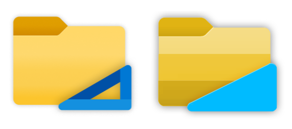
Update 10/20/2019
I would love to get some feedback which of these icons you like better. We love all of the icons shared here and picking one is a hard choice. We would like to start the process on picking a final version that we will fine tune to work in different resolutions.
Thank you.
How about the left "holder" with the right folder?
 jeffsieu
on 23 Oct 2019
jeffsieu
on 23 Oct 2019

yaichenbaum
on 23 Oct 2019
Fusion of both on the right seems the perfect compromise to me
SOI7
on 23 Oct 2019
I like the one on the right, but perhaps the colors for each of the strips (excluding the blue holder) should be slightly tweaked to match that of the left icon.
duke7553
on 23 Oct 2019
I like the one on the right, but perhaps the colors for each of the strips (excluding the blue holder) should be slightly tweaked to match that of the left icon.

Like these?
SOI7
on 24 Oct 2019
These look great! Well, then it looks like the consensus is around the second one in the comment above. I suppose we can implement it this weekend.
duke7553
on 24 Oct 2019
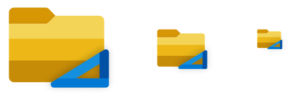
@SOI7 those look amazing! Do you have versions in smaller sizes as well so we can start tweaking for other resolution's?
yaichenbaum
on 24 Oct 2019
@SOI7 those look amazing! Do you have versions in smaller sizes as well so we can start tweaking for other resolution's?
No, but I can spin them off easily. Which formats/resolutions do you need?
SOI7
on 24 Oct 2019
Do you have a Figma or other source file?
yaichenbaum
on 24 Oct 2019
Never heard about Figma before, I made my icons using Gimp
SOI7
on 24 Oct 2019
yaichenbaum
on 24 Oct 2019
Thank you everyone for the amazing feedback that far exceeded my expectations! We've now decided on a brand-new icon for Files that will show up in the next release. This truly great icon was only possible due to the suggestions from the community; especially: @SOI7 @jeffsieu and @yaichenbaum
duke7553
on 3 Nov 2019
Related issues
 rashil2000
·
24Comments
rashil2000
·
24Comments
 R3voA3
·
26Comments
R3voA3
·
26Comments
 ArttuLai
·
24Comments
szaimen
·
18Comments
ArttuLai
·
24Comments
szaimen
·
18Comments
 XPoppyX
·
18Comments
XPoppyX
·
18Comments
Most helpful comment
I tried going for a middle ground between all the concepts posted here, what do you guys think?