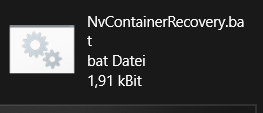
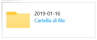
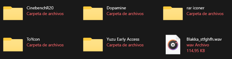
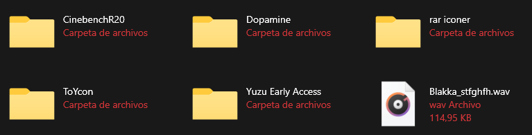
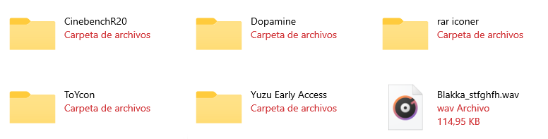
Files: File Type in Grid View should have different font
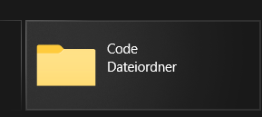
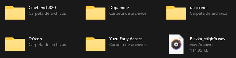
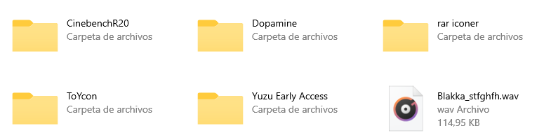
The file type and the folder name have the same font size, type and color and it's hard to distinguish them from one another at first glance.
I'd suggest to maybe use a light grey for the item type and size.
 R3voA3
All 26 comments
Issue-Label Bot is automatically applying the label feature_request to this issue, with a confidence of 0.65. Please mark this comment with :thumbsup: or :thumbsdown: to give our bot feedback!
Links: app homepage, dashboard and code for this bot.
![issue-label-bot[bot] picture](https://avatars2.githubusercontent.com/in/27079?v=4&s=40) issue-label-bot[bot]
on 27 Jul 2020
issue-label-bot[bot]
on 27 Jul 2020
R3voA3
on 27 Jul 2020
We can have opacity as 6 for those other details.
 Jaiganeshkumaran
on 27 Jul 2020
Jaiganeshkumaran
on 27 Jul 2020
Alternatively, instead of making it use a different font, they could use the same font, but the system accent color
 SOI7
on 27 Jul 2020
SOI7
on 27 Jul 2020
That looks very nice as well. Maybe as an option in Appearance?
R3voA3
on 27 Jul 2020
Up to the devs, although I think the app in general could use more color here and there
SOI7
on 27 Jul 2020
Alternatively, instead of making it use a different font, they could use the same font, but the system accent color
Other users will like that there is a little more color, because I have read many complaints that the app is very monochromatic
 XPoppyX
on 27 Jul 2020
XPoppyX
on 27 Jul 2020
I think it should be coloured as well but with the option to change the color in the appearance settings.
R3voA3
on 27 Jul 2020
Could run into contrast issues if default color is subtle against white are dark background, so would need a way to handle that (or just pick a color each for light and dark mode and go with that). File Explorer does the sub-details in gray vs black for the file/folder name, which I like even though it's monochrome. Adding a color to the secondary information could giveit more visual prominence than the name, which is what you're mostly going to want to focus on.
 Talisman39ar
on 27 Jul 2020
Talisman39ar
on 27 Jul 2020
Using the Accent colour makes it appear as if it would be a link or button
But dimming the text to make the folder/file name stand out, is a sensible idea
 mdtauk
on 27 Jul 2020
mdtauk
on 27 Jul 2020
XPoppyX
on 27 Jul 2020
Looks very good and it adds a neat accent.
Using the Accent colour makes it appear as if it would be a link or button
But dimming the text to make the folder/file name stand out, is a sensible idea
That might be true, but how much sense does it make to have a link there?
R3voA3
on 27 Jul 2020
different color tone will need to be used depending on whether it is in dark or light mode, the color tone that I used in that screenshot for example looks good in light mode, but not so much in dark mode
XPoppyX
on 27 Jul 2020
Tbf this is a problem with Windows 10 as a whole
SOI7
on 27 Jul 2020
Take the text foreground colour, and set the alpha to 60%
mdtauk
on 27 Jul 2020
Color: SystemAccentColorLight1
Color: SystemAccentColor
Opacity: 60%
Color: SystemAccentColor
XPoppyX
on 27 Jul 2020
SystemAccentColor seems the best to me, unless there's a way to make the tint theme-aware. In that case I'd use SystemAccentColorLight1 for Dark Mode and 60% opacity for Light Mode
SOI7
on 27 Jul 2020
SystemAccentColor seems the best to me, unless there's a way to make the tint theme-aware. In that case I'd use SystemAccentColorLight1 for Dark Mode and 60% opacity for Light Mode
You use a ThemeDictionary and set the colour of the brush resource for Light, Dark, and High Contrast themes. The correct value is applied when the system theme changes.
I still think using the Accent colour is a mistake, as it implies there is an action or importance to what is essentially an inactive caption for the folder and file items.
mdtauk
on 27 Jul 2020
I still think using the Accent colour is a mistake, as it implies there is an action or importance to what is essentially an inactive caption for the folder and file items.
I agree with this as good UX practice. Adding a color to the less important item makes it more visually prominent, which is going to make it harder to scan the list quickly, not easier. (Unless you do something else to rebalance the visual hierarchy, such as making the primary item larger, bold, etc. But that seems overkill). Since the original request here was about making the tiles easier to scan by adjusting the visual hierarchy, to me it's a step backward to add prominence to the secondary elements.
Talisman39ar
on 27 Jul 2020
XPoppyX
on 27 Jul 2020
Perfect @XPoppyX
mdtauk
on 27 Jul 2020
Gotta agree with mdatuk on second thought, and that seems the most practical and logical approach. I'm pretty sure we can find other areas to use more color in the future
SOI7
on 27 Jul 2020
Gotta agree with mdatuk on second thought, and that seems the most practical and logical approach. I'm pretty sure we can find other areas to use more color in the future
If you have performed a search, the letters searched for could be displayed in the Accent Colour. Also for the Details view, the currently selected header, the text in that column should probably be in the Foreground colour, and everything else being in the faded colour.
mdtauk
on 27 Jul 2020
the problem is in details view, when selecting an item, gray does not look good depending on the accent color
as I had said in #1170,
for dark mode: white 60% opacity
for light mode: black 60% opacity
XPoppyX
on 27 Jul 2020
I thought you could bypass this issue by altering the opacity instead of the tint
SOI7
on 27 Jul 2020
could merge with #1170 and close this
XPoppyX
on 2 Aug 2020
Related issues
 Taras-Parfeniuk
·
24Comments
Taras-Parfeniuk
·
24Comments
 szaimen
·
18Comments
szaimen
·
18Comments
 ArttuLai
·
24Comments
ArttuLai
·
24Comments
 KaKi87
·
31Comments
KaKi87
·
31Comments
 zbalkan
·
25Comments
zbalkan
·
25Comments
Most helpful comment